7 Onboarding Screen Design Patterns Used by Top Apps in 2026
Study 7 onboarding screen design patterns from shipped iOS, Android, and web apps, with real examples, implementation considerations, and source-linked references.

Seven onboarding screen patterns worth studying in 2026 are progressive disclosure, value-first onboarding, personalization questions, animated walkthroughs, social proof, permission priming, and checklist onboarding. Each pattern suits different product types, and products often combine two or three. The source-linked examples below come from Duolingo, Notion, Linear, Calm, and other apps in Gummble's onboarding flow examples from real apps.
Why Onboarding Design Makes or Breaks Your App
The onboarding experience is an app's first opportunity to explain value and reduce setup friction. Localytics research reported that 25% of users abandoned an app after one use in the cited study; that figure does not isolate onboarding as the cause.
On the flip side, well-designed onboarding flows can:
- Increase user activation by up to 50% (Source: Chameleon's Product Benchmarks)
- Reduce time-to-value from days to minutes
- Improve 7-day retention rates dramatically
- Set user expectations and build trust from the first tap
This editorial selection groups source-linked onboarding screens in our library into 7 recurring patterns, each suited to different product types and user contexts. Here is what they are, where they appear, and when to consider each one.
What is progressive disclosure in onboarding?
Progressive disclosure breaks a complex setup process into small, focused steps, revealing only what's needed at each moment so users don't feel overwhelmed. It works because humans process information best in chunks of 3-5 items — apps like Calm, Notion, and Linear all use it to make multi-step setup feel achievable rather than exhausting.
Progressive disclosure breaks a complex setup process into small, focused steps — preventing users from feeling overwhelmed by only revealing what's needed at each moment.
Why it works: Cognitive load research shows that humans process information more effectively in chunks of 3-5 items (George Miller's "magic number"). By breaking onboarding into bite-sized steps, each screen feels achievable, maintaining momentum through the flow.
Apps that do it well:
- Calm — introduces meditation types one at a time during setup, asking "What brings you to Calm?" before progressively narrowing down content recommendations
- Notion — asks about use case first (personal, team, school), then tailors workspace templates based on your answer — never showing all options at once
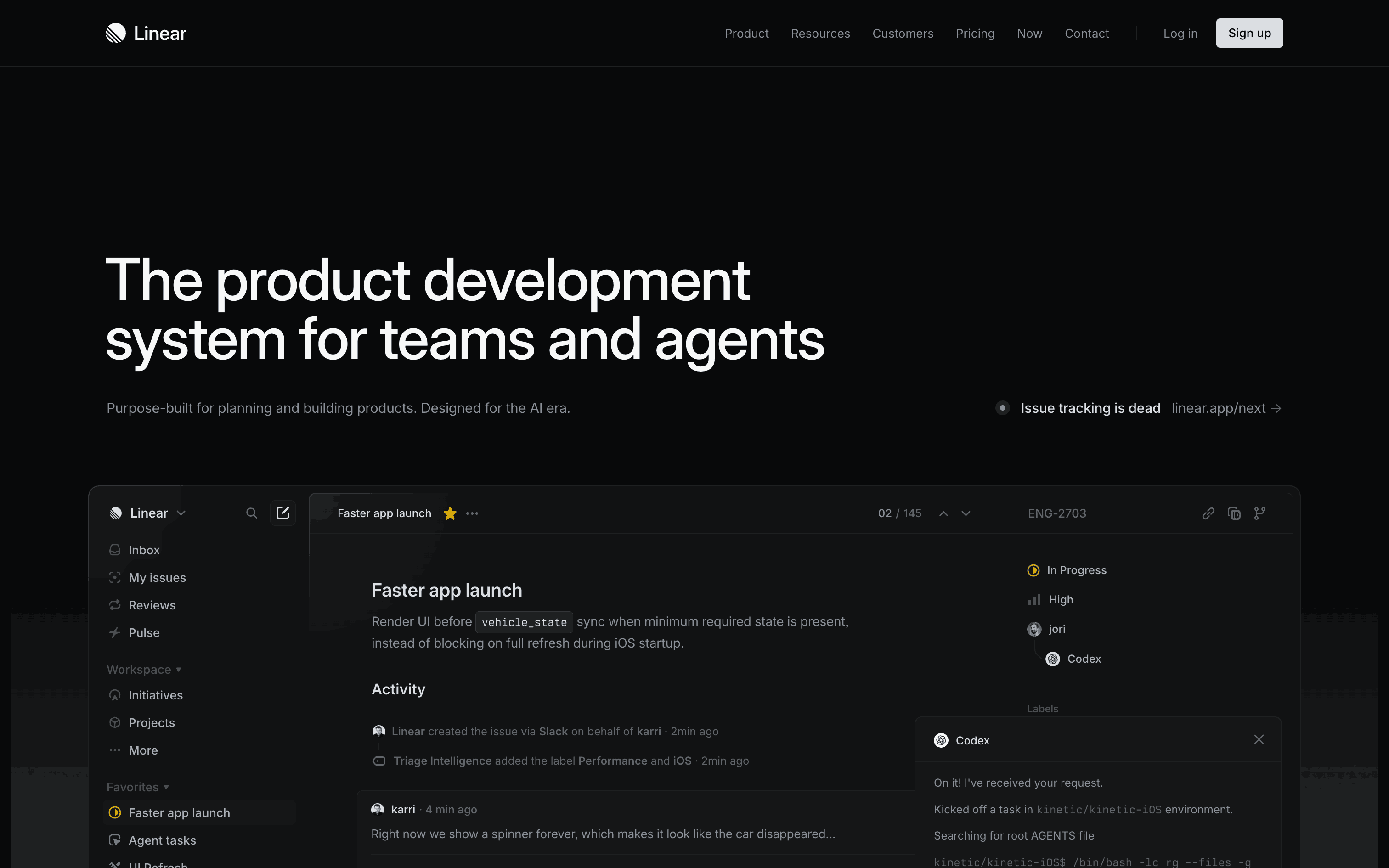
- Linear — workspace setup flows through team name → invite members → create first project, with a clear progress indicator throughout
→ See all onboarding screens curated from these apps in Gummble's library.
Implementation tips:
- Keep each step to one decision or one input group
- Show a progress indicator (dots, steps, or "2 of 4") to set expectations
- Allow going back without losing data — this reduces the anxiety of committing to a choice
- Consider auto-advancing after selection to maintain flow
When to use this: Apps with complex setup requirements (workspace tools, project management, CRM) where dropping all options on a single screen would overwhelm new users.
What is value-first onboarding?
Value-first onboarding flips the traditional model by letting users experience the product's core value immediately, before creating an account — then asks for sign-up once they're invested. Duolingo lets you finish a full lesson first; Canva and Figma drop you straight into the editor. It works because of the endowment effect: once someone has created or experienced something, they're reluctant to walk away from it.
Value-first onboarding flips the traditional model: instead of asking users to create an account before they see anything, it lets them experience the product's core value immediately — then asks for sign-up once they're invested.
The psychology: This leverages the endowment effect — once users have created something or experienced value, they're far more reluctant to walk away.
Apps that do it well:
- Duolingo — lets you complete an entire lesson before asking you to create an account. By the time the sign-up prompt appears, you've already invested 5 minutes and earned your first XP
- Canva — drops you directly into the editor with a template. You're designing before you've even registered
- Figma — opens a collaborative design file immediately, showcasing real-time collaboration before demanding credentials
Implementation tips:
- Identify your product's single most impressive moment — the "aha moment" — and move it before sign-up
- Save user progress during the anonymous session so nothing is lost after registration
- Frame sign-up as "saving your work" rather than "creating an account" — the motivation is different
When to use this: Products where the core value can be demonstrated without account data (editors, tools, content platforms). Less suitable for apps that require personal data to function (banking, health).
Why do apps ask personalization questions during onboarding?
Apps ask personalization questions to customize the experience and to signal they care about individual needs rather than offering a one-size-fits-all flow. Fitbod asks about fitness level and equipment, Pinterest uses a visual topic grid, and Headspace asks about stress areas — the best implementations keep it to 3-5 screens and use visual selectors instead of text forms.
Asking users about their goals, experience level, or preferences during onboarding allows you to customize the experience. But more importantly, it signals that you care about their individual needs rather than offering a one-size-fits-all experience.
Apps that do it well:
- Fitbod — asks about fitness level, available equipment, workout frequency, and physical goals. The result is a personalized first workout that feels tailor-made
- Pinterest — topic selection grid where users tap interests to personalize their feed. The visual, multi-select format makes it feel lightweight rather than interrogating
- Headspace — asks about meditation experience and stress areas before recommending a starting course, making beginners feel welcome and experts feel respected
Implementation tips:
- Keep questions to 3-5 screens maximum — more than that and completion rates drop sharply
- Use visual selectors (cards with illustrations, icon grids) instead of text dropdowns or radio buttons — they're faster to process and more engaging
- Show a "Why we ask" explanation to build trust — users are more willing to share information when they understand the benefit
- Make the personalization visibly affect the next screen — this validates that their input mattered
When to use this: Apps with diverse user segments (fitness, learning, productivity) where the same default experience would feel generic to everyone.
When should you use an animated walkthrough?
Animated walkthroughs work best for apps with genuinely novel interactions that users wouldn't discover on their own — gesture-based apps or new interaction paradigms. Revolut, Arc Search, and Duolingo all keep each animated screen under 5 seconds with a visible skip button. Overused on self-explanatory UI, they feel like unskippable ads rather than useful onboarding.
Animated walkthroughs use motion — illustrations, transitions, and micro-interactions — to demonstrate features. When done well, they're engaging and memorable. When overdone, they feel like unskippable ads.
The fine line: NNGroup research on carousel usability shows that auto-advancing content is often ignored. The same applies to walkthroughs — users skip them aggressively unless each screen delivers immediate, obvious value.
Apps that do it well:
- Revolut — smooth card-flip animations that show spending features as the card visually transforms between views
- Arc Search — playful, personality-driven animated intro that explains unique features (Browse for Me, Tab Suggestions) in under 30 seconds total
- Duolingo — character-driven animated walkthrough with haptic feedback teaching gesture interactions
Implementation tips:
- Keep each screen under 5 seconds of animation
- Add a clearly visible "Skip" button — never hide it
- Use the actual product UI in animations, not separate illustrations, so the walkthrough doubles as UI familiarization
- Test completion rates: if >50% of users skip, your walkthrough isn't earning attention
When to use this: Apps with genuinely novel interactions that users wouldn't discover on their own (gesture-based apps, new interaction paradigms). Avoid for apps where the UI is self-explanatory.
Why does social proof work during onboarding?
Social proof reinforces the user's decision to try your app at the exact moment they're most uncertain — the window between download and first use. Tactics include "Join 10M+ users" badges (Duolingo, Headspace, Calm), App Store ratings, press badges, and testimonial cards (Noom), best placed on commitment screens like email entry or plan selection rather than purely informational ones.
Embedding social proof within the onboarding flow reinforces the user's decision to try your app at the exact moment they're most uncertain.
Why it matters: The moment between download and first use is peak vulnerability for drop-off. Social proof during this window transforms "Am I sure about this?" into "10 million people already use this — I should stick around."
Tactics used by top apps:
- "Join 10M+ users" badges on the sign-up screen — Duolingo, Headspace, and Calm all do this
- App Store ratings (★ 4.8) shown during the onboarding flow — leverages external credibility
- "As featured in TechCrunch / Forbes" press badges — especially effective for newer, less-known apps
- Testimonial cards between onboarding steps — Noom inserts real user stories between setup questions
- Live user count ("1,234 people joined today") — creates urgency and FOMO
Implementation tip: Place social proof on screens where users need to make a commitment (entering email, choosing a plan, granting permissions) — not on informational screens where it feels irrelevant.
What is permission priming?
Permission priming is showing users a custom screen that explains why a permission improves their experience, before triggering the system dialog — instead of cold-asking. Apps using this approach see 2-3x higher opt-in rates for push notifications, according to CleverTap. Uber and Airbnb both prime with specific, user-centric benefit copy rather than generic requests.
Smart apps never cold-ask for permissions. Instead, they prime users with a custom screen that explains why the permission improves their experience, before triggering the system dialog.
The data: According to CleverTap, apps that use permission priming screens see 2-3x higher opt-in rates for push notifications compared to cold system prompts.
Real examples:
- Uber — "Turn on notifications so you know when your driver arrives" → clear, specific benefit
- Airbnb — Shows notification preview with benefit copy: "Get notified about booking updates and host messages"
- Weather apps — "Allow location to get forecasts for where you are right now" → ties permission to immediate value
Implementation tips:
- Show a custom pre-permission screen explaining the benefit in user-centric language
- Use action-oriented copy: "Get notified when prices drop" not "We need notification access"
- Always offer a "Not now" option — forced permissions feel aggressive and damage trust
- If the user declines, respect the decision and remind them later in context (e.g., when they try to use a feature that requires the permission)
When to use this: Any app that needs camera, notifications, location, or contacts. This is table stakes in 2026 — cold system prompts are an anti-pattern.
What is checklist onboarding?
Checklist onboarding is a post-signup list of setup tasks that users complete at their own pace, in any order, rather than a forced linear walkthrough. Slack, Linear, Figma, and Notion all use progress-ring or "3 of 5 complete" checklists capped at 3-5 items. It works via the Zeigarnik effect — people remember unfinished tasks better than finished ones, which nudges users to come back and complete the list.
Post-signup checklists help users complete key setup tasks at their own pace. Unlike linear walkthroughs, checklists let users choose what to do first and return later to finish remaining items.
The psychology: The Zeigarnik effect — people remember uncompleted tasks better than completed ones. An unfinished checklist quietly nags users to come back and complete it.
Apps that do it well:
- Slack — workspace setup checklist ("Invite your team", "Create your first channel", "Set your status") with a progress ring that fills as items complete
- Linear — guided workspace creation with milestone checks that feel productive rather than instructional
- Figma — sidebar checklist for first project setup that disappears once all items are done
- Notion — template quickstart that combines checklist with pre-built content
Implementation tips:
- Show 3-5 items maximum — longer checklists feel like homework
- Pre-complete the first item (e.g., "✅ Create account") — this gives users a sense of momentum
- Use a progress indicator (ring, bar, "3 of 5 complete") to leverage completion bias
- Make the checklist dismissible — don't force it into the UI permanently
When to use this: SaaS and productivity tools where "setup" is ongoing (inviting team, configuring integrations, importing data). Less suitable for consumer apps with simpler activation.
What do all great onboarding screens have in common?
The highest-rated flows share 5 traits: brevity (3-5 screens), a clear value proposition at each step, visible progress indicators, escape hatches like "Skip," and consistent visual polish. None of the 7 patterns above work in isolation — the best onboarding flows combine 2-3 patterns while still respecting these shared traits.
After studying hundreds of onboarding patterns in our library, we've found these 5 traits appear consistently in the highest-rated flows:
- Brevity — 3-5 screens maximum for initial onboarding. Every additional screen costs you users.
- Clear value proposition — users know what benefit they'll get by completing each step, not just what information you need.
- Progress indicators — visual steps, progress bars, or contextual "2 of 4" labels create a sense of forward motion.
- Escape hatches — "Skip" and "Do this later" options reduce the pressure of commitment. Counter-intuitively, offering a skip option often increases completion rates.
- Visual polish — clean typography, subtle animations, and consistent branding signal that the product itself will be equally well-crafted.
Pattern comparison at a glance
| Pattern | Best for | Key implementation detail |
|---|---|---|
| Progressive disclosure | Complex setup tools (workspace, project management, CRM) | One decision per screen, visible progress |
| Value-first onboarding | Editors, tools, content platforms | Delay sign-up until after the "aha moment" |
| Personalization questions | Apps with diverse user segments (fitness, learning) | 3-5 screens max, visual selectors |
| Animated walkthrough | Apps with novel gestures/interactions | Under 5 seconds per screen, visible skip |
| Social proof | Sign-up and plan-selection screens | Place at commitment moments, not info screens |
| Permission priming | Any app needing camera, location, notifications | Custom pre-permission screen with a "Not now" option |
| Checklist onboarding | SaaS/productivity with ongoing setup | 3-5 items, dismissible, progress ring |
Where can you see onboarding flows from real apps?
Gummble's onboarding flow examples from real apps index screenshots and flow records from shipped iOS, Android, and web apps, filterable by category and available metadata. The broader flows collection covers other parts of the product experience.
You can also save your favorites to collections for quick reference during your design process.
More design inspiration: Login screen trends · Checkout flow guide · SaaS pricing designs
Founder of Gummble. I build and maintain the Gummble catalog — UI screenshots and UX flows from 1,500+ real iOS, Android, and web apps — and write about the design patterns I see across them.
See these patterns in action
Browse 1,500+ apps across shipped iOS, Android, and web products.
Browse the Library →