Empty State Design Patterns: How Top Apps Handle Zero-Data Moments
Empty states are missed opportunities in most apps. Learn how top products turn blank screens into onboarding moments, trust builders, and conversion drivers — with real examples from 700+ apps.

Empty States Are Not Empty — They're Opportunities
Every app has moments where there's nothing to show. No messages, no search results, no saved items, no transactions. Most designers treat these as edge cases. The best designers treat them as critical UX moments that can:
- Reduce churn — a confused user staring at a blank screen is one tap away from uninstalling
- Drive activation — guide users toward their first meaningful action
- Build brand personality — show character when it's least expected
- Educate — teach users what a feature does before they've used it
After analyzing hundreds of empty state screens in our library, we've categorized the patterns that work — and the anti-patterns that don't.
The 6 Types of Empty States
1. First-Use Empty States
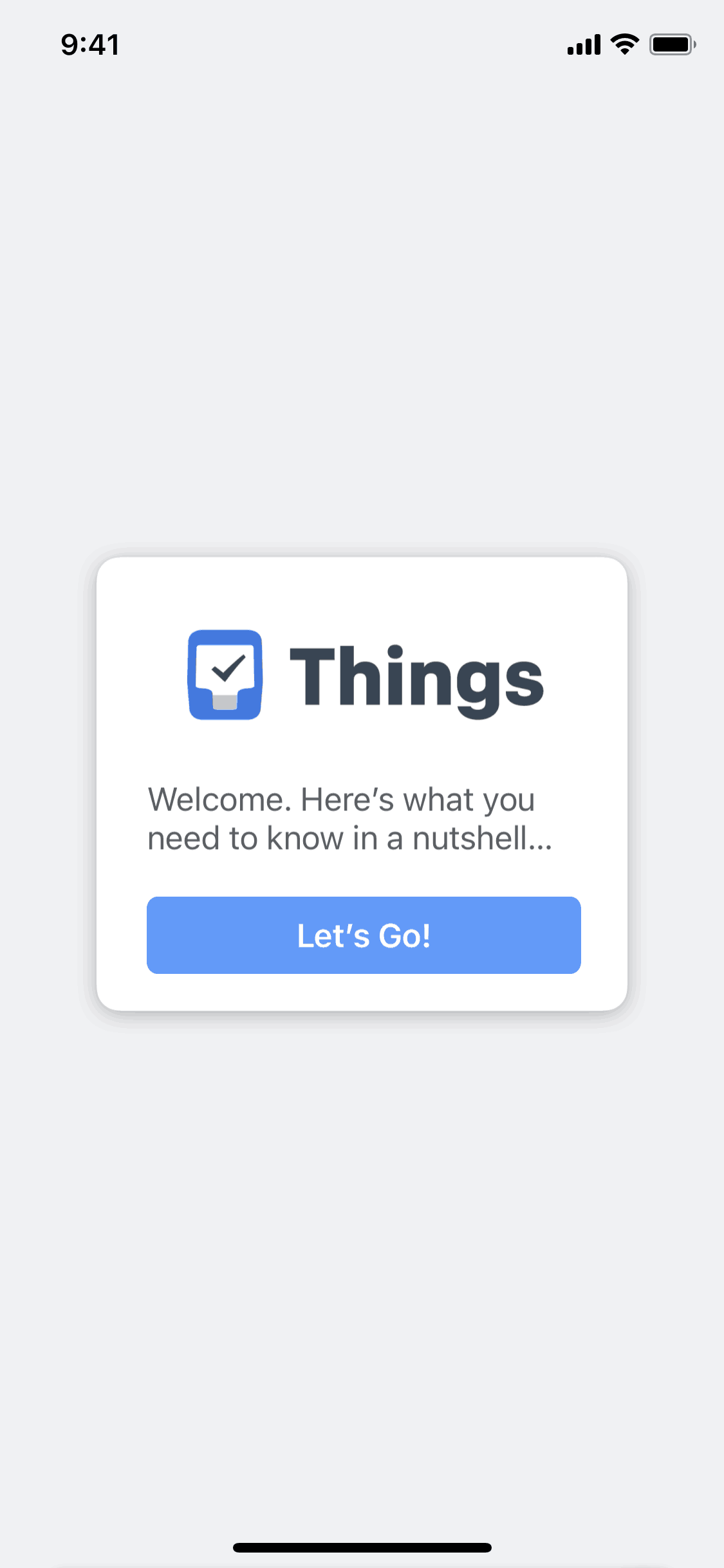
These appear when a user opens a feature for the first time and has no data yet. This is the most important type because it directly affects activation.
What great first-use empty states include:
- Clear explanation of what this screen will show once populated
- Single CTA to create the first item or perform the first action
- Visual preview showing what the populated state looks like
Apps that do it well:
- Notion — empty workspace shows a friendly illustration with "Press Enter to start writing" and suggested templates. The empty state is the onboarding
- Slack — empty channel shows "This is the very beginning of #channel-name" with a warm welcome message and suggested actions
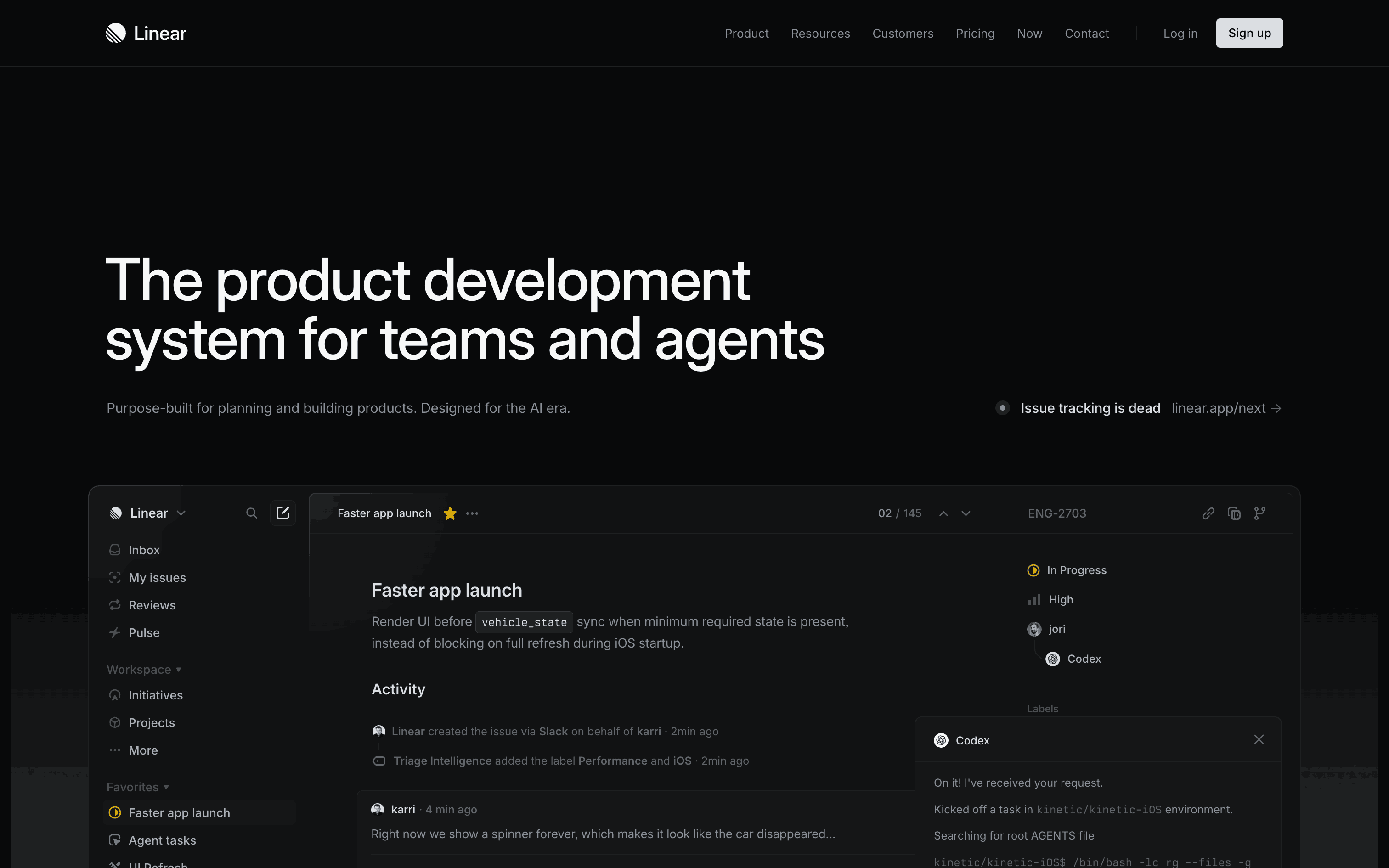
- Linear — empty project view shows a centered illustration with "No issues yet" and a prominent "Create Issue" button, plus keyboard shortcut hint (C)
- Figma — empty file browser shows "Create your first design" with template suggestions
Anti-pattern: A completely blank white screen with just a "+" button in the corner. Users don't know what they're adding or why.
2. No-Results Empty States
When a search or filter returns zero results. These need to be especially helpful because the user had a clear intent that wasn't fulfilled.
Best practices:
- Acknowledge the search term — "No results for 'wireframe templates'" is better than generic "No results"
- Suggest alternatives — "Try searching for 'prototyping' or 'mockup' instead"
- Offer a fallback action — "Browse all templates" or "Clear filters"
- Check for typos — "Did you mean 'wireframe'?"
Apps that handle this well:
- Spotify — no search results shows the query with spelling suggestions and trending searches as fallback
- Airbnb — no listings shows "Try adjusting your search" with specific filter suggestions (change dates, expand area, remove filters)
- Pinterest — no results still shows visually related pins as "You might like" suggestions
3. User-Cleared Empty States
When the user deliberately empties a list — inbox zero, completed all tasks, cleared notifications. This is a celebration moment.
What works:
- Congratulatory messaging — "You're all caught up!" instead of "No notifications"
- Celebration animations — subtle confetti, checkmark animation, or a playful illustration
- Next step suggestion — "Explore new content" or "Check back later"
Apps that celebrate completion:
- Gmail — inbox zero shows a sun illustration with "You're all done! Enjoy your day" — one of the most iconic empty states in product design
- Todoist — all tasks complete shows a calming illustration with "Enjoy the rest of your day"
- Slack — "You're all caught up" with a subtle animation when all unreads are cleared
4. Error Empty States
When data can't be loaded due to a network error, timeout, or server issue. These need to communicate the problem without alarming the user and offer a clear recovery action.
Essential elements:
- Explain what happened in plain language — "Can't connect right now" not "Error 503"
- Retry button — always offer one-tap retry
- Offline fallback — show cached data if available, with a banner saying "Showing offline data"
Apps that handle errors gracefully:
- Twitter/X — network error shows a simple illustration with "Something went wrong" and a "Retry" button. Previously loaded tweets remain visible
- Instagram — "Couldn't refresh feed" as a subtle top banner that auto-retries, keeping the last loaded content visible
5. Permission-Required Empty States
When a screen needs a permission (contacts, photos, location) the user hasn't granted. These must explain why the permission improves the experience.
Pattern:
- Show what the feature does with sample data or an illustration
- Explain the permission in user benefit terms ("Allow photos access to share your memories")
- Provide a prominent "Allow Access" button and a secondary "Not now" option
Apps that prime well:
- WhatsApp — contacts tab empty state shows "To message friends on WhatsApp, allow access to your contacts" with sample conversation bubbles
- Google Maps — location permission shows a map preview with your approximate area and "Turn on location for better directions"
6. Paywalled Empty States
When a feature requires a paid plan. This is a conversion moment — the empty state IS the upsell.
What works:
- Show a preview of what the feature looks like for paid users (blurred screenshots, sample data)
- Communicate value, not just price — "Unlock unlimited exports" not "Upgrade to Pro"
- Social proof — "Join 50,000 teams using Premium"
Design Principles for Empty States
Keep It Visual
An empty state with only text feels like a dead end. Even a simple illustration transforms "nothing here" into "something intentional."
Illustration approaches:
- Custom illustrations — unique, on-brand characters or scenes (high effort, high personality)
- Abstract graphics — geometric shapes, gradients, or patterns (medium effort, modern feel)
- Icon + text — a simple line icon with descriptive text (low effort, always works)
One CTA, Not Three
The empty state should drive one primary action. If you offer "Create New," "Import," and "Browse Templates" simultaneously, users freeze. Choose the most common first action and make it prominent. Offer alternatives as text links below.
Match the Emotional Context
The tone of an empty state should match the user's likely emotional state:
- First use → encouraging, optimistic ("Let's get started!")
- No results → helpful, solution-oriented ("Try these alternatives")
- Error → calm, reassuring ("We'll be back shortly")
- Completion → celebratory ("You did it!")
- Permission → transparent, trust-building ("Here's why we need this")
Don't Forget Dark Mode
Empty state illustrations that look great on white backgrounds often become invisible or jarring in dark mode. Always test empty states in both themes.
The Empty State Checklist
Use this checklist when designing empty states:
- Does it explain what goes here? — Users should understand the screen's purpose even with no data
- Is there a clear next action? — One primary CTA that resolves the empty state
- Does the tone match the context? — Celebratory for completion, helpful for no results, calm for errors
- Is it visually intentional? — Some illustration, icon, or graphic that signals "we designed this"
- Does it work in dark mode? — Test both themes
- Is it responsive? — The empty state should look good on all screen sizes
Browse Real Empty State Examples
Study empty state patterns from hundreds of real apps in our curated empty states collection. Filter by app category, platform, and style.
See also: Dashboard design examples · Settings screen patterns · Onboarding flow examples
Discover more design patterns: Browse 1,500+ apps on Gummble — with real screenshots from shipped iOS, Android, and web products.
Founder of Gummble. I build and maintain the Gummble catalog — UI screenshots and UX flows from 1,500+ real iOS, Android, and web apps — and write about the design patterns I see across them.
About Azura →See these patterns in action
Browse 1,500+ apps across shipped iOS, Android, and web products.
Browse the Library →