Notion Mail
Start from the user’s job
Role or use-case selection can route people to the right template instead of teaching every feature.
Browse 15+ of the best app onboarding flows from shipped iOS, Android, and web products — Duolingo, Notion, Linear, Headspace, Streaks, Superhuman, and more. Real screenshots, complete flow sequences, and design commentary for designers, PMs, and growth teams.
Gummble research snapshot
Collected July 27, 2026
Sample
200 flows
Apps
142 unique
Median
16 screens
Range
2–68 screens
101 of 200 sampled flows used 11–20 screens; only 47 used 10 screens or fewer. The search returned 1,835 matching flows; these figures describe the stated sample, not every product in the market.
Desktop & responsive
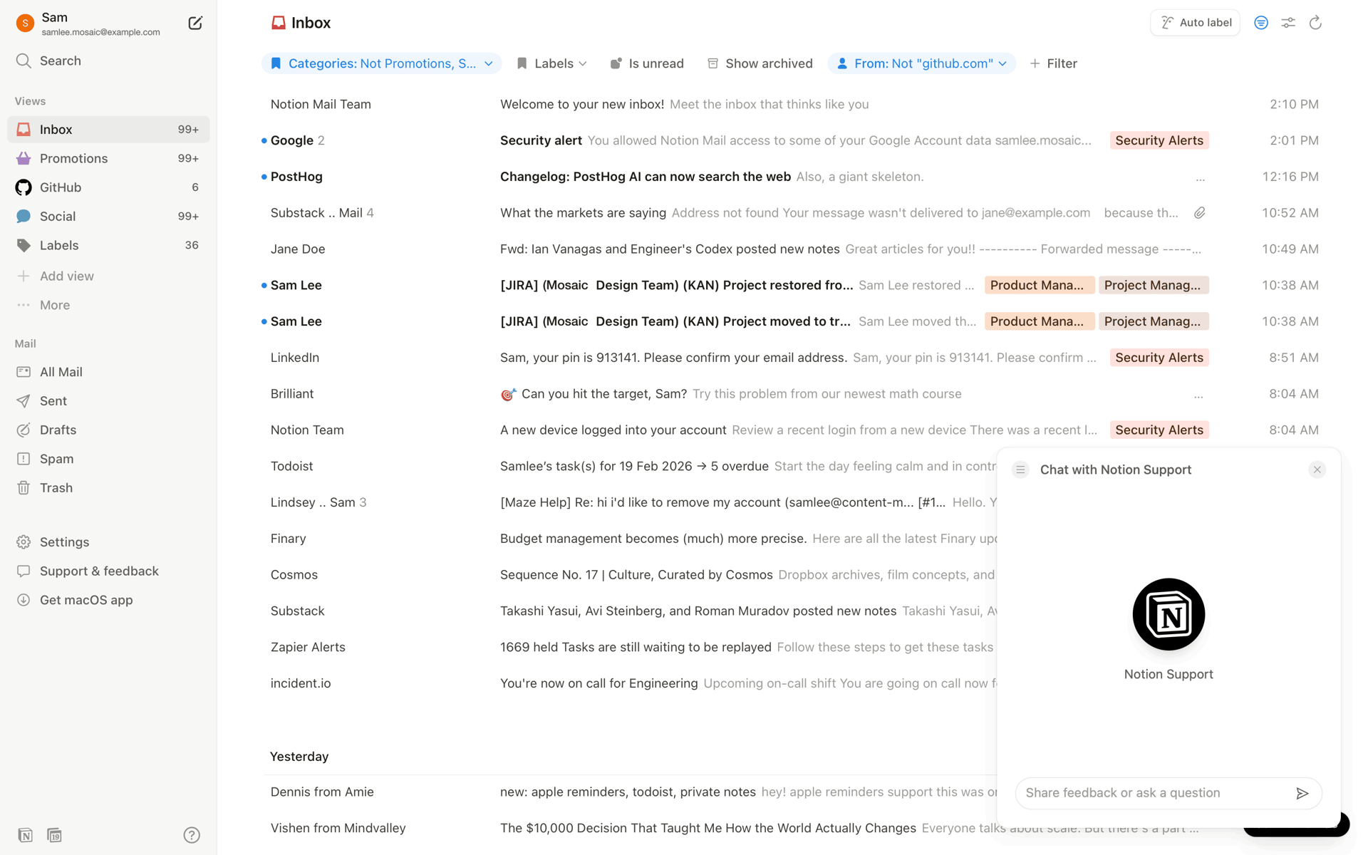
Production web onboarding screens for role selection, templates, empty states, and first-run guidance.
Notion Mail
Role or use-case selection can route people to the right template instead of teaching every feature.
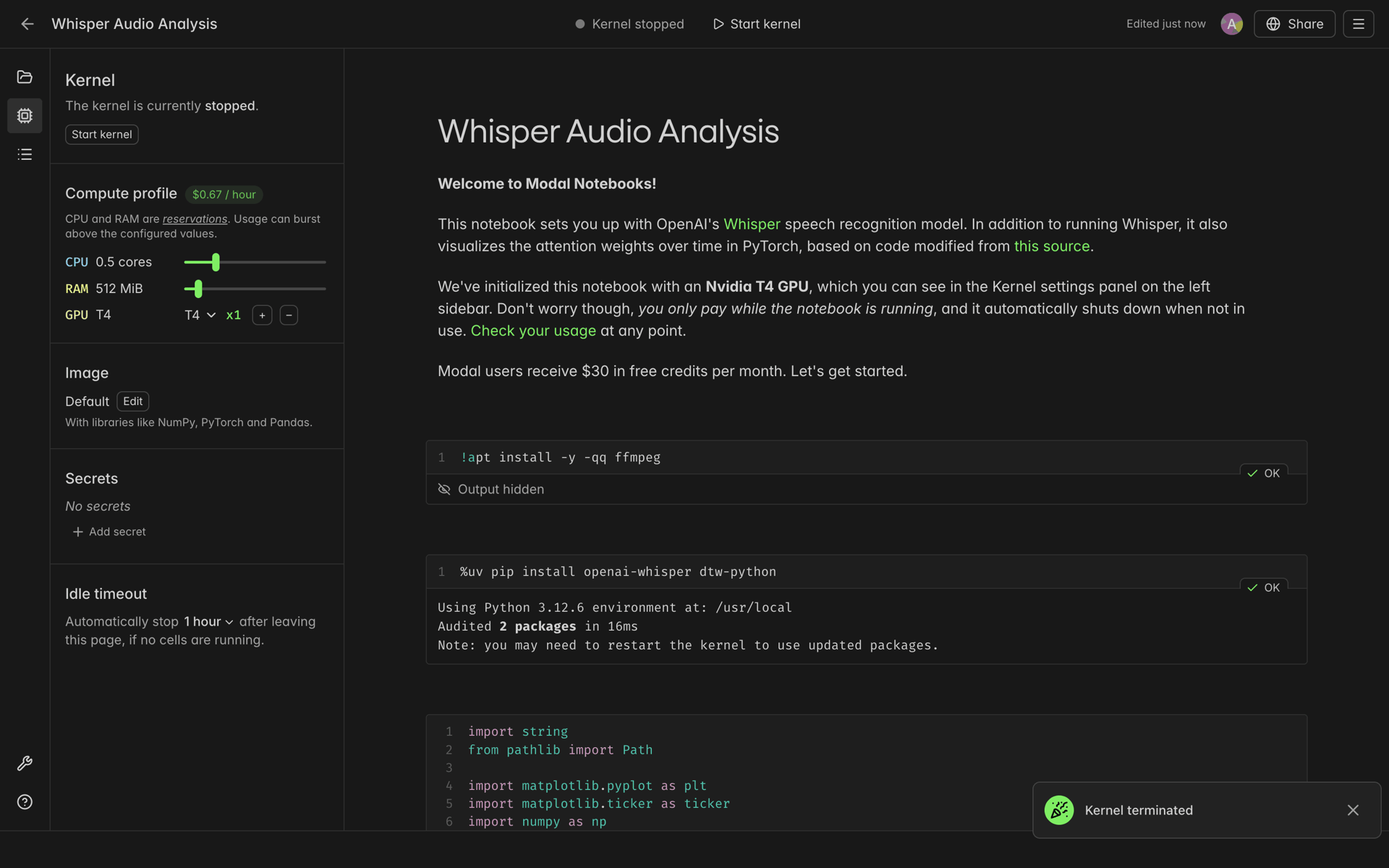
Modal
Let users learn inside the interface with contextual prompts, not a detached marketing carousel.
Activation systems
Workspace setup patterns that move a new account toward an observable activation milestone.
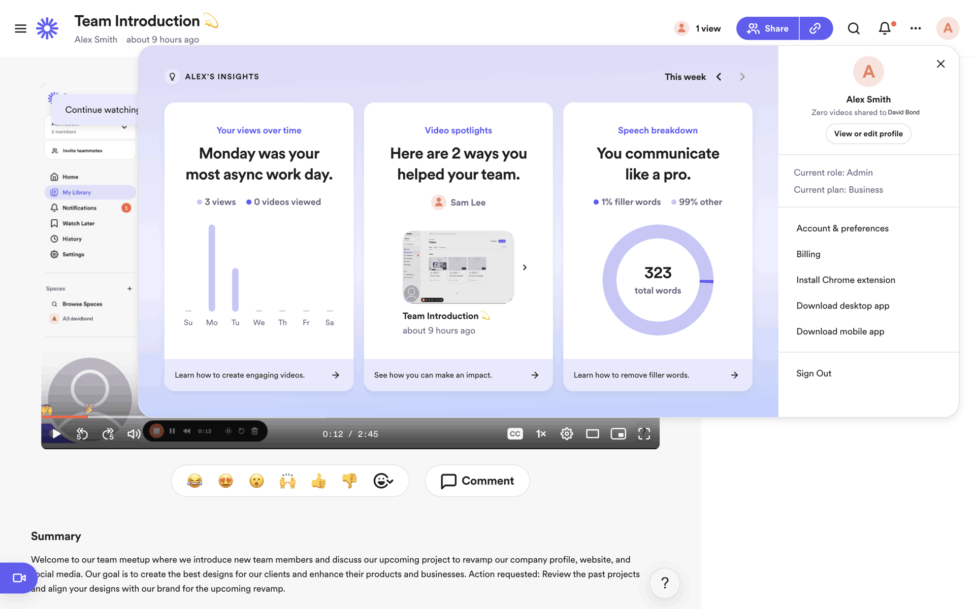
Loom
Team size, function, and goal should change the setup path rather than becoming CRM-only questions.
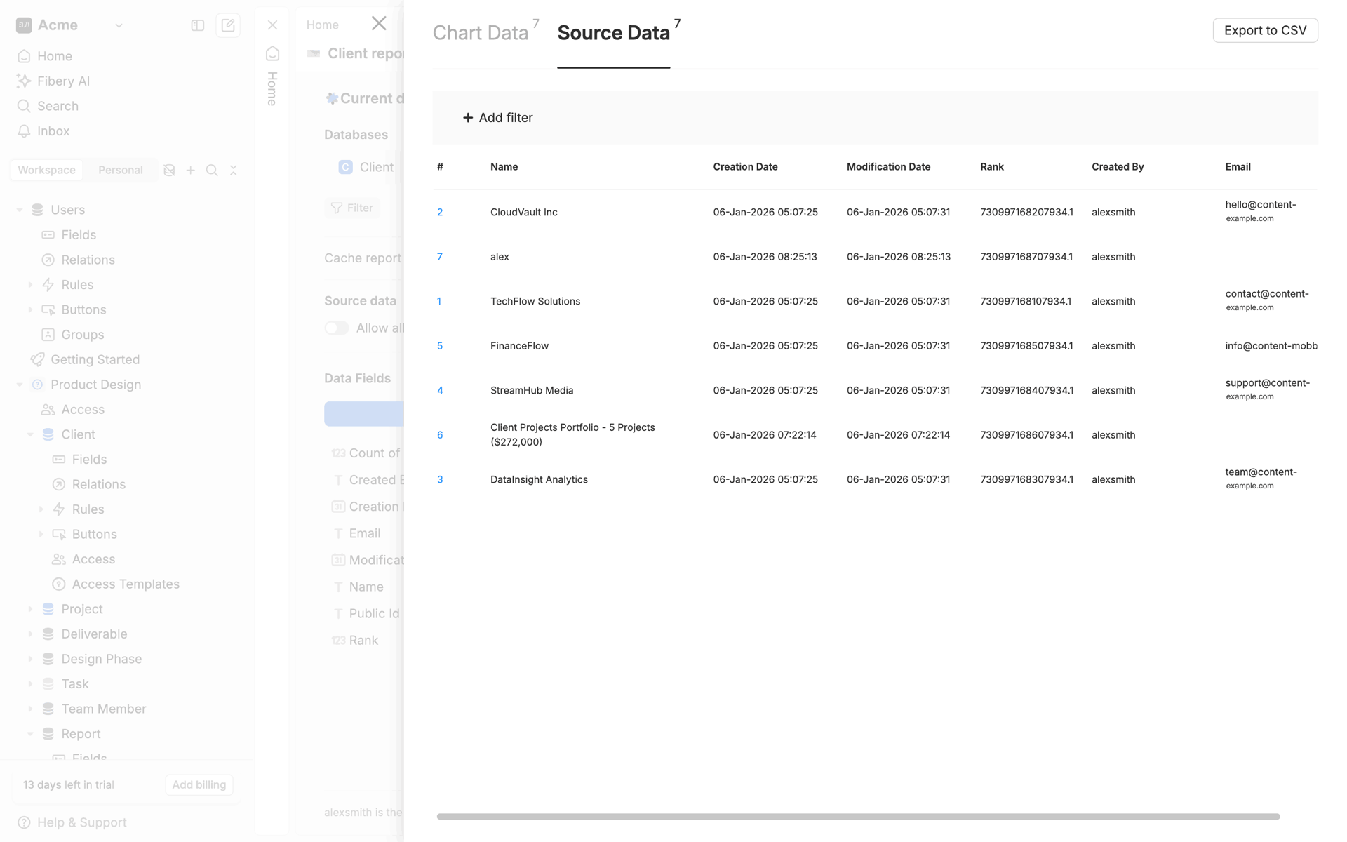
Fibery
Use three to five outcome-based tasks and make the next best action obvious from the product home.
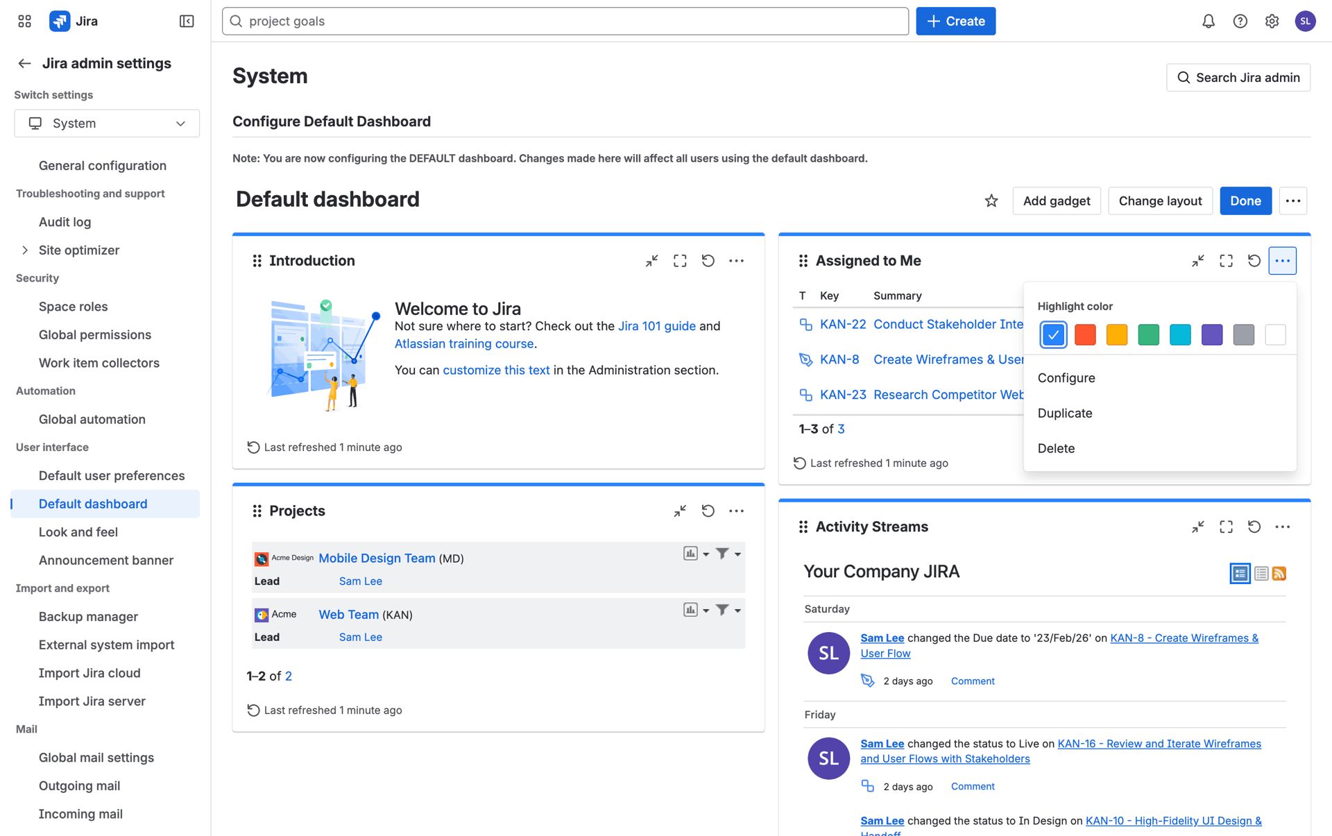
Jira
A useful CSV, integration, or template import can compress hours of configuration into one successful step.
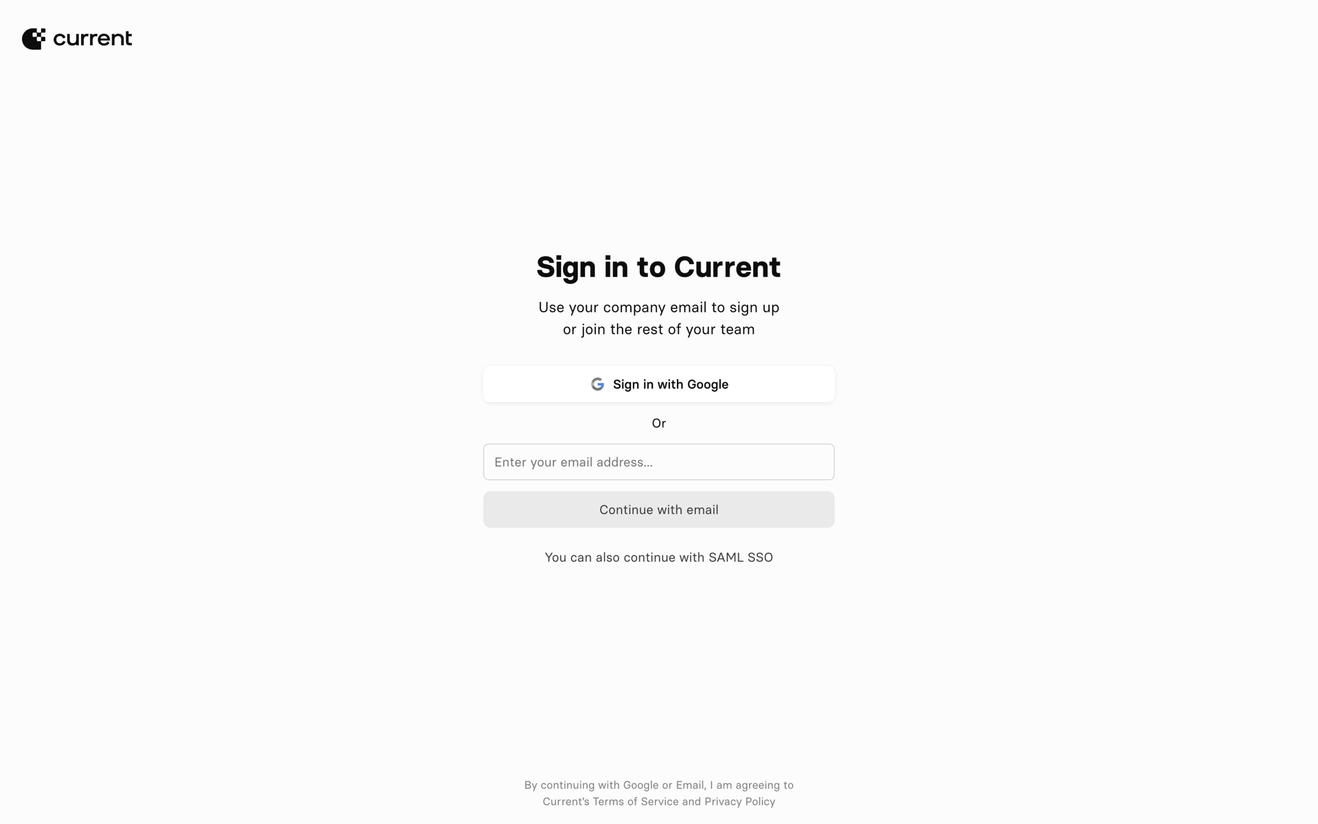
Current
End when the user has produced, imported, or published something—not when they have merely dismissed the tour.
Onboarding shapes the path to a user's first meaningful outcome. Completion and retention are related differently across products, so measure both by cohort instead of assuming a fixed conversion. Here is an evidence-oriented design process for 2026:
Define your activation metric
Use your own cohort data to identify an early action associated with retained use. Document the definition, observation window, and correlation limits before optimizing onboarding around it.
Map the shortest path to value
List every step between install and the activation metric, then remove anything that does not help the user progress. Screen count alone is not a quality score: Gummble's July 2026 sample had a 16-screen median, with successful products using both short and long journeys.
Choose your onboarding archetype
Pick one: (1) value-first (let users try, then sign up), (2) progressive disclosure (reveal features as users need them), (3) personalization questions (build a customized experience), (4) animated walkthrough (story-driven), or (5) checklist (gamified).
Design permission priming
Ask for notifications, location, or camera access when the benefit is clear and the feature needs it. Explain why before showing the system prompt, then measure opt-in and downstream value in your own product.
Add verifiable proof at decision points
At sign-up or plan selection, use only substantiated counts, attributed ratings, or permissioned testimonials. Never invent proof; test whether it helps your audience.
Build a progress indicator
For bounded multi-step setup, show users where they are with dots, step counts, or a progress bar. Validate whether it improves completion for your flow.
Measure drop-off per step
Instrument every onboarding step and compare drop-off by source, device, and cohort. Investigate material changes against your own baseline rather than applying a universal threshold.
Plan the post-onboarding moment
What happens after onboarding ends? An empty workspace, a checklist, a guided tour, a populated demo? Bad onboarding ends at "Welcome!" — great onboarding ends with the user already producing value.
An app onboarding flow is the sequence of screens between app install (or sign-up) and the user's first 'aha' moment — when they experience the core value of the product. Great onboarding minimizes friction to that moment.
Widely-cited examples include Duolingo (value-first), Notion (personalized templates), Linear (clean progressive disclosure), Headspace (animated, story-driven), Streaks (3-screen minimalism), and Superhuman (white-glove human onboarding). Browse all examples on Gummble.
There is no universal target. In Gummble's July 2026 snapshot of 200 onboarding flows, the median was 16 screens and the observed range was 2–68. Count complete journeys consistently, including permissions and personalization, then remove steps that do not move the user toward first value.
Value-first onboarding can reduce commitment before users see the product, while sign-up-first may be necessary for regulated, personal-data, or collaborative workflows. Test the ordering against activation and retention in your own cohorts.
Start with the shortest path to a meaningful first outcome. Personalization, progressive disclosure, or a pre-populated workspace may help depending on the product; validate the choice with step-level analytics rather than assuming one universal winner.
Use animations to (1) draw attention to the next CTA, (2) reward completion of a step, and (3) communicate spatial relationships (where the user is in a flow). Avoid decorative animations that delay user input — they feel slow even when they are technically fast.
Collect onboarding examples by archetype, export to Figma, and share with your team. Plans start at $9.99/month with a 7-day refund window for eligible first web payments.
See pricing →