Mobile UI Design Trends 2026: Observed Patterns in Shipped Apps
Observational analysis of real app screenshots across finance, health, education, social, commerce, travel, and productivity. Patterns, limitations, and supporting research.

About This Report
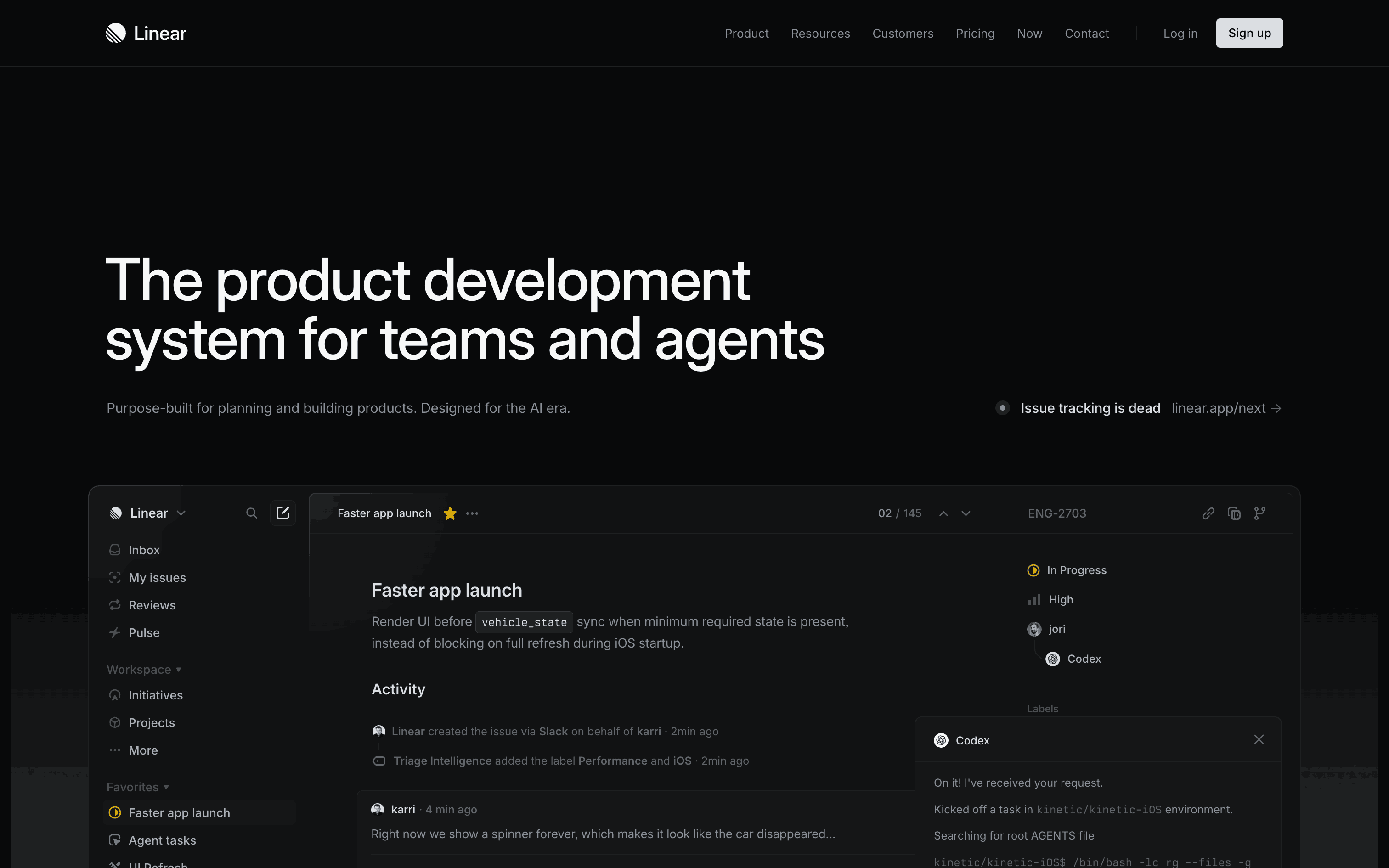
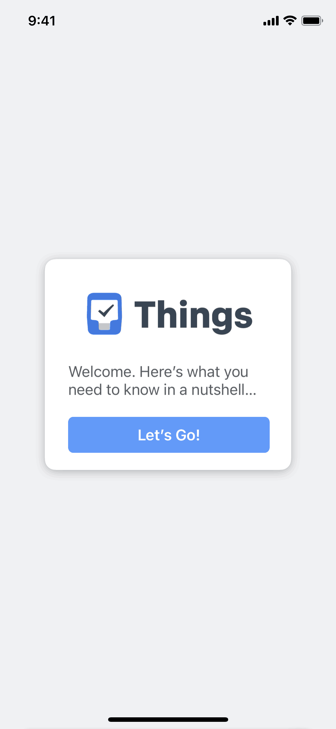
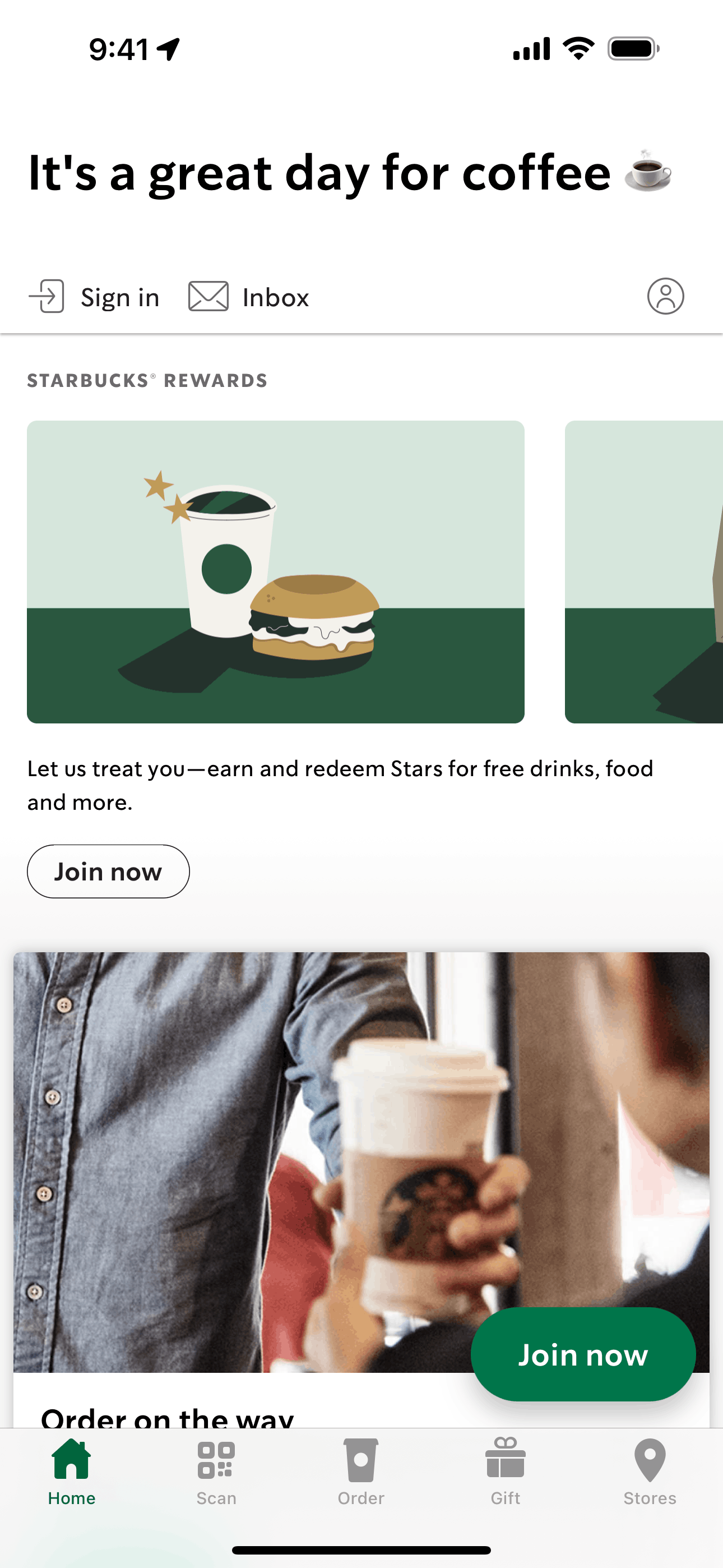
This is an editorial synthesis, not a prevalence study. The Gummble catalog contains more than 1,500 iOS, Android, and web apps, but this article does not claim that every app or a frozen representative sample was reviewed. We selected examples while browsing categories including finance, health, education, social, e-commerce, travel, and productivity.
Where specific statistics exist from published research, we cite them. Where we're sharing our own observations, we say so explicitly.
Method limitation: Examples were browsed by app type, screen function, visual treatment, and interaction pattern. We did not use a coded sampling protocol, so words such as “common” below describe recurring examples rather than measured market share.
Key Observations at a Glance
- Bottom tab bars recur in multi-section mobile examples
- System fonts appear frequently in iOS references
- Dark mode is often offered, commonly alongside a light or system-controlled default
- Solid-color CTAs recur more often than decorative gradients in the examples discussed
- Bottom sheets appear frequently for filters, quick actions, and detail views
- Skeleton screens are common in captured content-loading states
- Card-based layouts remain a recurring content-container pattern
Trend 1: Bottom Navigation Is a Recurring Convention
Across the examples selected for this article, bottom tab bars recur when an app exposes several primary sections. This observation should not be read as a measured percentage of the full catalog.
This aligns with the general usability principle that visible navigation is easier to discover than hidden navigation. Treat the captured screens as design references, not proof that a navigation choice caused an engagement lift.
Editorial labels in the selected examples (not measured prevalence):
| Category | Bottom Tab Bar | Hamburger/Side Menu | Other |
|---|---|---|---|
| Finance | Dominant | Rare | Rare |
| Social | Dominant | Very rare | Top tabs occasionally |
| Shopping | Very common | Occasional | Rare |
| Productivity | Common | Still used in content-heavy apps | Tab bars + "More" |
| Education | Common | Used in content-heavy platforms | Varies |
Four or five tabs recur in the selected references. Check Apple's current Human Interface Guidelines and test the information architecture with your own users rather than treating this article as a universal count rule.
Browse navigation pattern examples →
Trend 2: System Typography Renaissance
System typography appears frequently in the selected iOS references, while custom typefaces appear in some brand-forward consumer examples. This article did not measure a catalog-wide percentage or a year-over-year decline.
Apple's own typography guidelines explicitly recommend SF Pro as the default, and the practical advantages are significant:
- Performance — zero font loading time, no layout shift
- Accessibility — SF Pro automatically respects the user's Dynamic Type settings on iOS
- Consistency — apps feel native and integrated with the operating system
- Smaller bundle size — custom fonts add 50-200KB per weight to the app binary
Notable exceptions: Brand-forward consumer apps still invest in custom typography as a core brand asset. Spotify uses Circular, Airbnb uses Cereal, and Netflix uses Netflix Sans — all cases where the typeface is central to the brand identity, not just a stylistic choice.
Trend 3: The Dark Mode Paradox
The selected references include dark-mode settings as well as light or system-controlled defaults. We did not measure the share of the catalog that supports or defaults to either mode.
For implementation guidance, follow Apple's current dark-mode recommendations and honor the user's system preference where appropriate.
Patterns we notice by category:
| Category | Dark Mode Availability | Default to Dark |
|---|---|---|
| Finance/Banking | Very common | Rare |
| Social Media | Very common | Occasional |
| Productivity | Common | Occasional |
| Shopping | Less common | Very rare |
| Health/Fitness | Common | Rare |
Why shopping apps lag: Product photography generally looks better against white or light backgrounds, which likely explains the lower dark mode adoption among e-commerce apps.
Trend 4: Solid-Color CTAs Prevail
Solid, single-color primary actions recur in the selected references. Gradients also appear, particularly in brand-forward or marketing surfaces; this article does not quantify their relative share.
What we observe:
- Solid fill (single color) — the most common pattern. Black-on-white CTAs appear frequently
- Gradient fill — less common on mobile; more prevalent on web landing pages
- Outlined/ghost buttons — used primarily for secondary actions
- Full-width bottom-anchored buttons — recurring in checkout and confirmation examples
Why solids dominate on mobile: Both Material Design 3 and Apple's design language emphasize clean, high-contrast button styles. On mobile specifically, solid fills offer clearer affordance and better readability at small sizes.
Trend 5: Bottom Sheet Everything
Bottom sheets and half-modals recur for secondary interactions in the selected references, including:
- Filters and sorting — especially in shopping and marketplace apps
- User profile previews — in social apps
- Payment method selection — in finance and checkout flows
- Quick actions (share, save, report) — nearly universal
Why bottom sheets work:
- Context preservation — the user can still see the screen behind the sheet
- Gestural navigation — swipe down to dismiss feels natural on mobile
- Incremental disclosure — show a summary first, expand for details
- Lower cognitive load — partial screens feel less committal than full-screen transitions
The iOS UISheetPresentationController and Android's BottomSheetDialogFragment provide native building blocks for this pattern. Their existence does not, by itself, prove why a product team chose a sheet.
Trend 6: Skeleton Screens Appear Alongside Spinners
Many selected content-heavy examples use skeleton loading screens (placeholder shapes that mirror the page layout), while spinners and progress indicators still appear for other loading jobs.
The Nielsen Norman Group discussion of skeleton screens explains their role in perceived performance. Choose a loading treatment based on task duration, progress certainty, and whether the placeholder accurately represents the incoming layout.
Recurring implementation pattern in the selected examples: neutral rounded placeholders with a restrained shimmer animation.
What's replacing what:
| Pattern | Typical job in the selected examples |
|---|---|
| Skeleton screens | Layout-shaped content loading |
| Spinner/activity indicator | Indeterminate local action |
| Progress bar | Uploads, downloads, or known progress |
Trend 7: Card-Based Layouts Remain King
Card-based layouts recur on listing and browse screens in the selected references. That observation does not establish catalog-wide prevalence or prove that cards are optimal for every product.
Variations worth comparing:
- Corner radius — selected references range from subtle to pronounced rounding
- Elevation — flat borders, tonal separation, and light shadows all appear
- Content density — cards may combine price, rating, distance, and availability or keep one dominant datum
- Aspect ratio — media, product grids, and screenshots use different shapes
What These Trends Mean for Designers
Embrace Conventions, Not Novelty
The selected examples suggest convergence around several familiar conventions. Use that as a research prompt, then validate navigation, typography, and layout choices against your own audience and task.
Familiar Patterns Can Reduce Learning Cost
Recurring conventions may reduce the amount a user must relearn, but they are not a substitute for usability testing or accessibility review.
Balance Content and Chrome
Navigation, typography, content quality, and information density work together. Compare references, then test how much information your audience can act on without becoming overwhelmed.
Explore These Patterns
Browse examples related to these observations:
Related reads: 7 Onboarding Screen Design Patterns · Login Screen Trends 2026 · Checkout Flow Guide
Evidence note: this is an editorial selection of catalog examples, not a frozen or statistically representative sample. Want to inspect the references yourself? Start browsing →
Founder of Gummble. I build and maintain the Gummble catalog — UI screenshots and UX flows from 1,500+ real iOS, Android, and web apps — and write about the design patterns I see across them.
See these patterns in action
Browse 1,500+ apps across shipped iOS, Android, and web products.
Browse the Library →