What Makes a Great App Onboarding in 2026 — 7 Principles + 12 Examples
What separates great app onboarding from forgettable ones. We break down 7 principles (defer signup, manufacture quick wins, personalization questions) with 12 real-world examples from Duolingo, Linear, Notion, and more.

TL;DR — 7 Principles of Great App Onboarding
Great app onboarding defers signup until after users feel value (30-50% conversion lift), manufactures a quick win within 90 seconds, asks 3-5 personalization questions, sets useful defaults, uses animated reveals, celebrates small actions, and caps screens at 7-12 — past that, drop-off accelerates. The masters: Duolingo, Streaks, Headspace (consumer); Linear, Notion, Stripe (B2B). Browse all on the onboarding pillar.
- Defer signup until after the user feels value (30-50% conversion lift)
- Manufacture a quick win within the first 90 seconds
- Ask personalization questions to create commitment
- Default to the most useful path (users rarely change defaults)
- Use animated reveals to manufacture anticipation
- Celebrate small actions (streaks, achievements, progress bars)
- Cap at 7-12 screens — past that, drop-off accelerates
What are the 7 principles of great app onboarding?
The 7 principles are: defer signup until after value delivery, manufacture a quick win within 90 seconds, ask personalization questions, default to the most useful path, use animated reveals, celebrate small actions, and cap onboarding at 7-12 screens. Each is broken down below with real examples from Duolingo, Streaks, Linear, Notion, and other apps that apply it well.
1. Defer signup until after value delivery
The single biggest conversion lever in 2026.
Old playbook: Signup screen → onboarding → first lesson.
New playbook: Onboarding → first lesson → "Save your progress! Sign up."
Why: Users who've already invested 90 seconds and earned something don't want to lose it. Asking for an email feels reasonable when it's framed as "save what you earned" rather than "give us your data."
Examples:
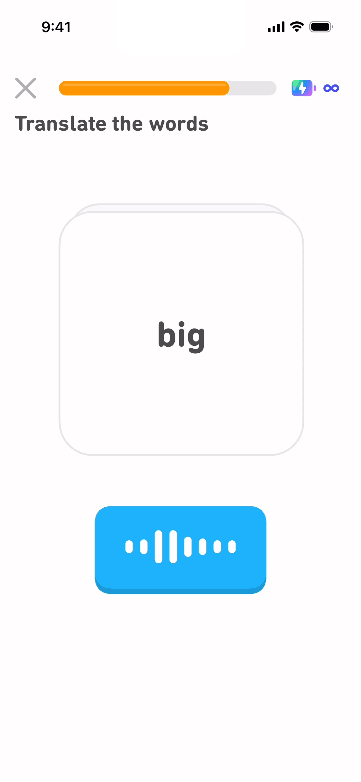
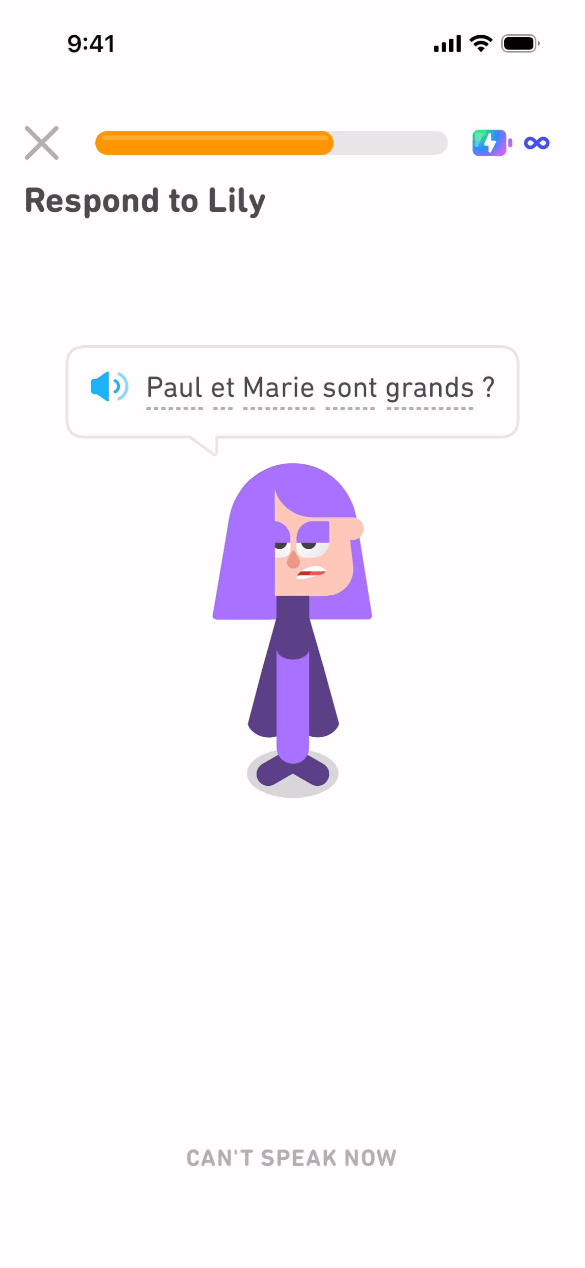
- Duolingo defers signup until after lesson 1
- Streaks defers signup indefinitely (works without an account)
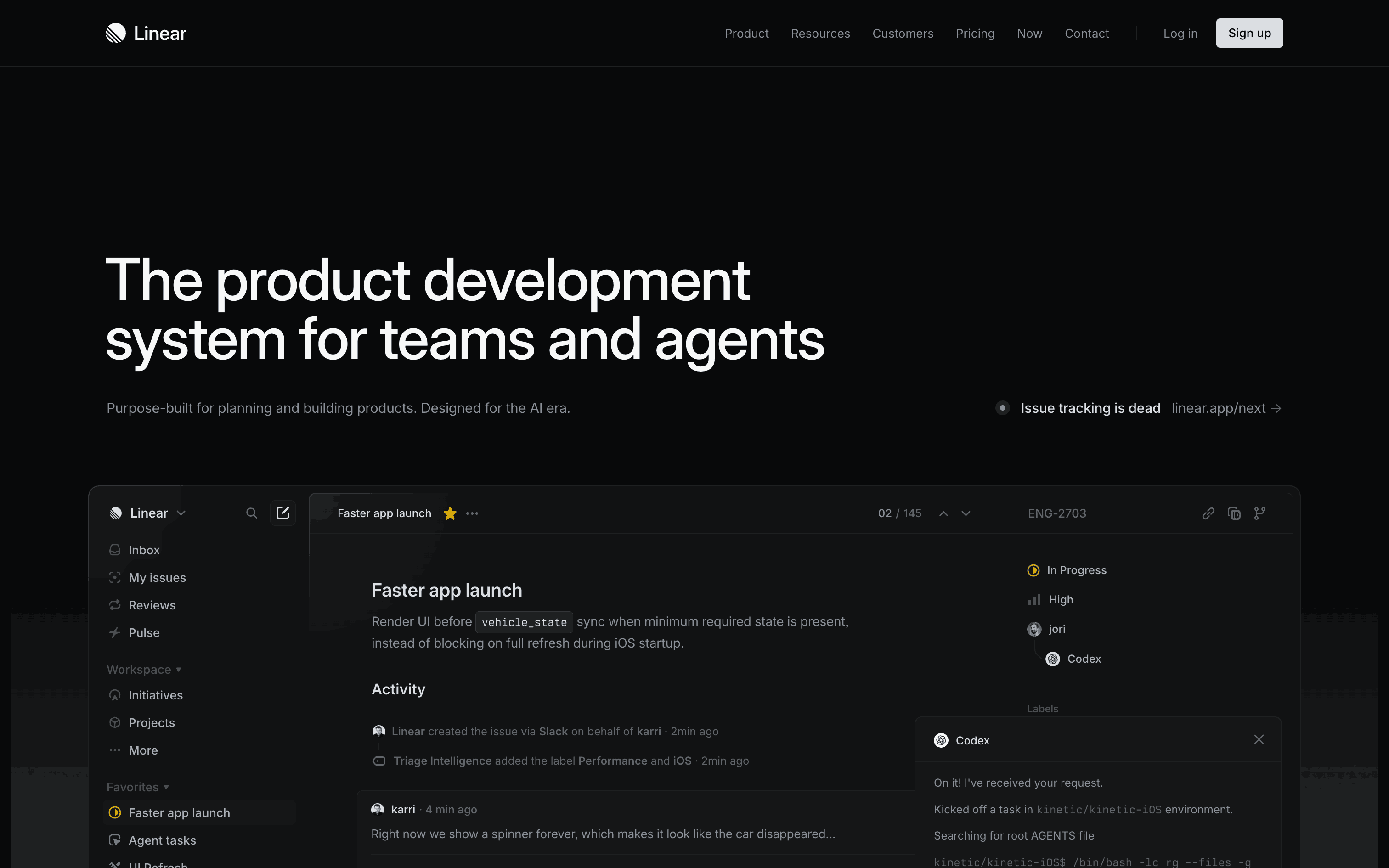
- Linear defers until workspace is created
Browse onboarding flow examples →
2. Manufacture a quick win within 90 seconds
Users decide to keep using your app within ~3 minutes of install. The first quick win has to land fast.
What counts as a quick win:
- Lesson completed (Duolingo)
- First task added (Streaks)
- First meditation finished (Headspace)
- First doc created (Notion)
- First payment processed (Stripe Demo)
Anti-pattern: Tutorial-only onboarding that ends with "now you're ready to start." Users want to do something, not learn about doing something.
3. Ask personalization questions
Even if you don't use the answers for product logic, the questions create:
- Commitment — "I said I'm learning for career, so I should follow through"
- Self-identity — "I'm a serious user"
- Reciprocity — "They're personalizing for me, I should reciprocate by paying attention"
Common patterns:
- Duolingo: "Why are you learning?" "How much per day?"
- Calm: "What brings you to Calm?" Stress, sleep, focus, etc.
- Notion: "What will you use this for?" Personal, team, projects
Pick 3-5 questions. Don't go to 10 — diminishing returns past 5.
4. Default to the most useful path
Users rarely change defaults. Use this:
- Duolingo's "10 min/day" default sets the user's identity assumption
- Linear's default workspace name + first project shape future use
- Streaks' default habits (Drink water, Meditate, Exercise) become the user's actual habits
Designer lesson: What you put as the default is the user's eventual behavior.
5. Use animated reveals to manufacture anticipation
Loading screens are storytelling opportunities.
Bad: 3-second loading spinner with no message.
Good: 3-second loading screen with text scrolling: "Building your personalized course → Setting your level → Preparing first lesson..."
The "calculation" is mostly theater, but users feel the system is working for them. Reciprocity follows.
Examples: Duolingo's personalization animation, Spotify Wrapped reveals, Headspace's onboarding journey animations.
6. Celebrate small actions
Habits form fastest with small celebrations after small actions (BJ Fogg's behavior model).
Celebrations to manufacture:
- Streak milestones (1-day, 3-day, 7-day, 30-day)
- Achievement badges (first lesson, first share, first export)
- Progress bars (you're 20% through onboarding)
- Confetti animations (Apple, Streaks, Duolingo all use this)
The trick: these need to land within the first 90 seconds. Late celebrations don't form the habit.
7. Cap at 7-12 screens
Onboarding longer than 12 screens loses 20-40% of users to drop-off.
The sweet spot:
- Consumer apps: 7-12 screens (Duolingo: 12, Headspace: 10)
- B2B SaaS: 5-8 screens (Linear: 6, Notion: 7)
- Habit trackers: 3-5 screens (Streaks: 4)
- Utilities: 2-3 screens (Things 3: 3)
If you have more than 12 screens, ask: which ones can be deferred to settings or contextual onboarding?
Which apps have the best onboarding flows in 2026?
Duolingo, Streaks, Headspace, Notion, Linear, Superhuman, Stripe, Cash App, Things 3, Flighty, Discord, and Loom all rank among the best onboarding flows in 2026, each representing a different style — from gamified personalization to demo-driven and minimal single-screen approaches. The table below breaks down what makes each one notable.
| App | Style | What's notable |
|---|---|---|
| Duolingo | Gamified personalization | 5 archetypes combined |
| Streaks | Habit picker | Shortest onboarding, no signup |
| Headspace | Value-first | First meditation in 60 sec |
| Notion | Personalized templates | Use-case selection drives setup |
| Linear | Workspace builder | Defaults to best practices |
| Superhuman | Live-trained | Concierge onboarding (high touch) |
| Stripe | Demo-driven | Sandbox first, sign up later |
| Cash App | Single-purpose | Send money in 60 sec |
| Things 3 | Minimal | 3 screens, ships with sample data |
| Flighty | Personalization-rich | Asks travel preferences first |
| Discord | Server-based | Joins community, signs up later |
| Loom | Quick-win | Records 30-sec video before signup |
Browse the full pillar with annotated screens: /ux-flows/onboarding.
What are the most common onboarding anti-patterns?
The most common anti-patterns are tutorial-first flows, a signup wall before value, asking for permissions early, a missing skip option, and too many slides explaining nothing. Each one causes measurable drop-off — tutorial-only flows lose users by slide 3, and signup walls before trust is earned cause outright abandonment.
Tutorial-first
"Let me show you 8 features before you do anything." Users tune out after slide 3.
Fix: Replace tutorial with a hands-on first-action.
Signup wall before value
"Sign up to continue." Users abandon at this screen if you haven't earned trust yet.
Fix: Defer signup. Show value first.
Asking for permissions early
"Allow notifications?" before the user has done anything. Most users say no — and you can't ask twice.
Fix: Wait until after the first quick win to ask permissions.
Skipping option missing
"Skip" should be visible but not aggressive. Hidden skip = anger. Aggressive skip = users miss key info.
Fix: Small "Skip" link in top-right, not a modal "Are you sure?"
Too many slides explaining nothing
5 marketing slides explaining "AI-powered productivity" before the user does anything = abandonment.
Fix: 1 slide max for marketing copy. The rest is action.
How do you test your own onboarding?
Test onboarding by installing your own app fresh and timing the quick win (under 90 seconds?), watching 5 first-time users for pauses or confusion, checking analytics for per-screen drop-off above 20%, and A/B testing deferred vs. upfront signup — most apps see a 30-50% lift from deferring.
- Install your own app with a fresh device. Time to first quick win — under 90 sec?
- Watch 5 first-time users complete onboarding. Note where they pause/confuse.
- Check your analytics — drop-off per screen. Any screen >20% drop is a problem.
- A/B test deferred signup vs upfront signup. Most apps see 30-50% lift from deferring.
What tools help you study onboarding?
Gummble, Mobbin, Page Flows, and manual install-and-capture are the main options for studying onboarding, ranging from free-but-time-consuming to paid curated libraries. For many designers, organized screen and flow references are faster than installing and capturing every app.
| Tool | What it gives | Cost |
|---|---|---|
| Gummble | Curated onboarding flows + editorial commentary | $9.99/mo or free |
| Mobbin | Largest library of onboarding screens | Check live pricing |
| Page Flows | Video walkthroughs of complete onboarding | $10/mo |
| Install + capture | Full control, all 12 screens | Free + time |
For most designers: Gummble's onboarding pillar is a direct starting point. Real apps, curated screens, and editorial commentary are also browsable through the flow-sequence library and the onboarding pattern breakdowns for screen-by-screen detail.
FAQ
How long should app onboarding be?
7-12 screens for consumer apps, 5-8 for B2B SaaS, 3-5 for utilities. Past 12, drop-off accelerates significantly.
Should I defer signup in my onboarding?
Yes — this is the single biggest conversion lever. Users who've delivered value are 30-50% more likely to sign up than users who haven't.
What's the most important onboarding principle?
Manufacture a quick win within 90 seconds. Without this, users decide to abandon before the rest of your onboarding can land.
How many personalization questions should I ask?
3-5. More than 5 hits diminishing returns. Less than 3 misses commitment-device benefits.
Where can I see great onboarding examples?
Gummble's onboarding pillar curates 30+ flows from top apps with editorial commentary. The Duolingo deep-dive breaks down one flow screen-by-screen.
Should I use animations in onboarding?
Yes — animated reveals manufacture anticipation. Loading states are storytelling opportunities. Spotify Wrapped, Duolingo's personalization animation, Headspace's journey reveals all do this well.
Bottom line
Great onboarding in 2026 follows 7 principles: defer signup, quick win in 90 sec, personalization questions, useful defaults, animated reveals, celebrate small actions, cap at 7-12 screens.
The masters: Duolingo, Streaks, Headspace (consumer); Linear, Notion, Stripe (B2B). Study these flows on the onboarding pillar.
For a deep-dive on one flow: Duolingo Onboarding Flow Analysis.
Related:
Founder of Gummble. I build and maintain the Gummble catalog — UI screenshots and UX flows from 1,500+ real iOS, Android, and web apps — and write about the design patterns I see across them.
About Azura →See these patterns in action
Browse 1,500+ apps across shipped iOS, Android, and web products.
Browse the Library →