How to Design a SaaS Dashboard in 2026 — 8-Step Framework + 12 Examples
Step-by-step framework for designing a SaaS dashboard that drives action. Learn the 8 principles top SaaS apps follow (Linear, Stripe, Vercel, Notion) with annotated examples.

TL;DR — How to Design a SaaS Dashboard
The 8-step framework top SaaS designers use:
- Identify the 3-5 metrics that matter to your specific user role
- Design empty state first (most users see it before they see the loaded version)
- Lead with the next best action, not raw data
- Use 1 hero metric + 4-6 supporting metrics (not 20)
- Default to relevant time range (today / 7-day, not all-time)
- Make every chart click-through to detail (no dead-ends)
- Show team activity if multi-player matters
- Test with users who have 0 data and 1 year of data (different needs)
Best-in-class examples: Linear, Stripe, Vercel, Notion, Figma, Mixpanel, Posthog. Browse all dashboard patterns on Gummble's pattern hub.
Pricing references in this post accurate at publish time (May 2026).
Why most SaaS dashboards fail
Common failures:
- Too many metrics — 20 widgets in a 2-column grid. User picks none.
- No next action — pure data display. User leaves.
- Bad empty state — "Nothing here yet." User assumes the product is broken.
- Wrong time range default — "All time" when user wants today.
- Charts that don't drill down — visualization without depth.
The framework below avoids all five.
Step 1 — Identify the 3-5 metrics that matter
Different roles care about different metrics:
| Role | Hero metric | Supporting metrics |
|---|---|---|
| Founder (B2B SaaS) | MRR | New signups, churn, ARPU, growth rate |
| PM | Active users | Feature adoption, retention curve, NPS |
| Engineer (DevOps) | Uptime / errors | P95 latency, deploy frequency, error rate |
| Marketer | Conversions | Traffic sources, funnel stages, CPC |
| Sales | Pipeline value | Deals closed, MQL→SQL rate, velocity |
Don't try to serve all roles in one dashboard. Build role-specific dashboards or persistent filters.
Step 2 — Design empty state first
Most new users see your dashboard with 0 data. Design for this case first.
A great empty state:
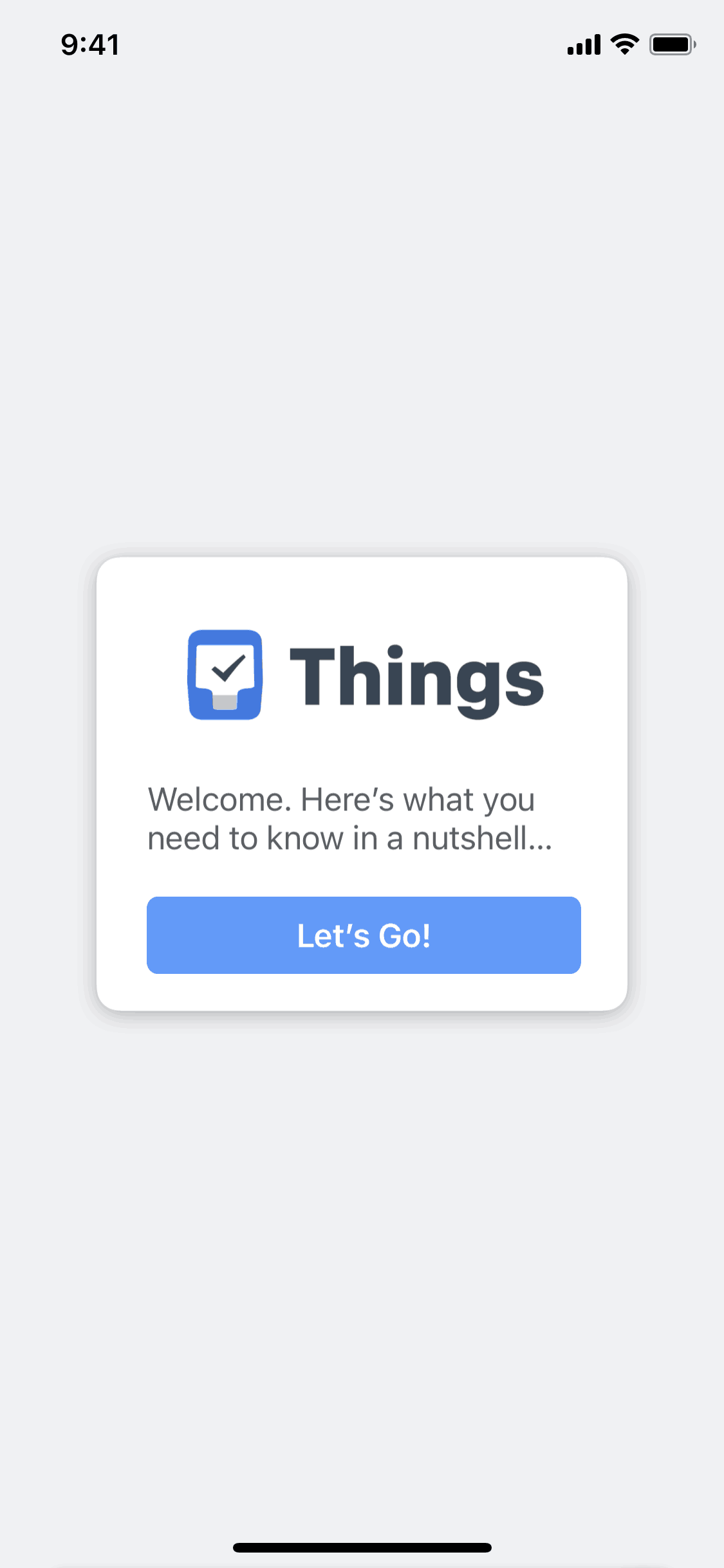
- Explains what will appear here ("Your monthly revenue chart will show here once you have your first sale")
- Provides a next action ("Add your first product →")
- Optionally shows sample data so the user can imagine the loaded state
Anti-pattern: "No data yet." with no context or action. Users assume the product is broken.
Examples to study: Linear's empty issues view, Stripe's empty payments view, Notion's empty database view.
Step 3 — Lead with the next best action
Dashboards that just display data don't drive product use. The user should see what to do next immediately.
Examples of "next best action" patterns:
- Stripe Dashboard: "Process your first payment" CTA above the chart
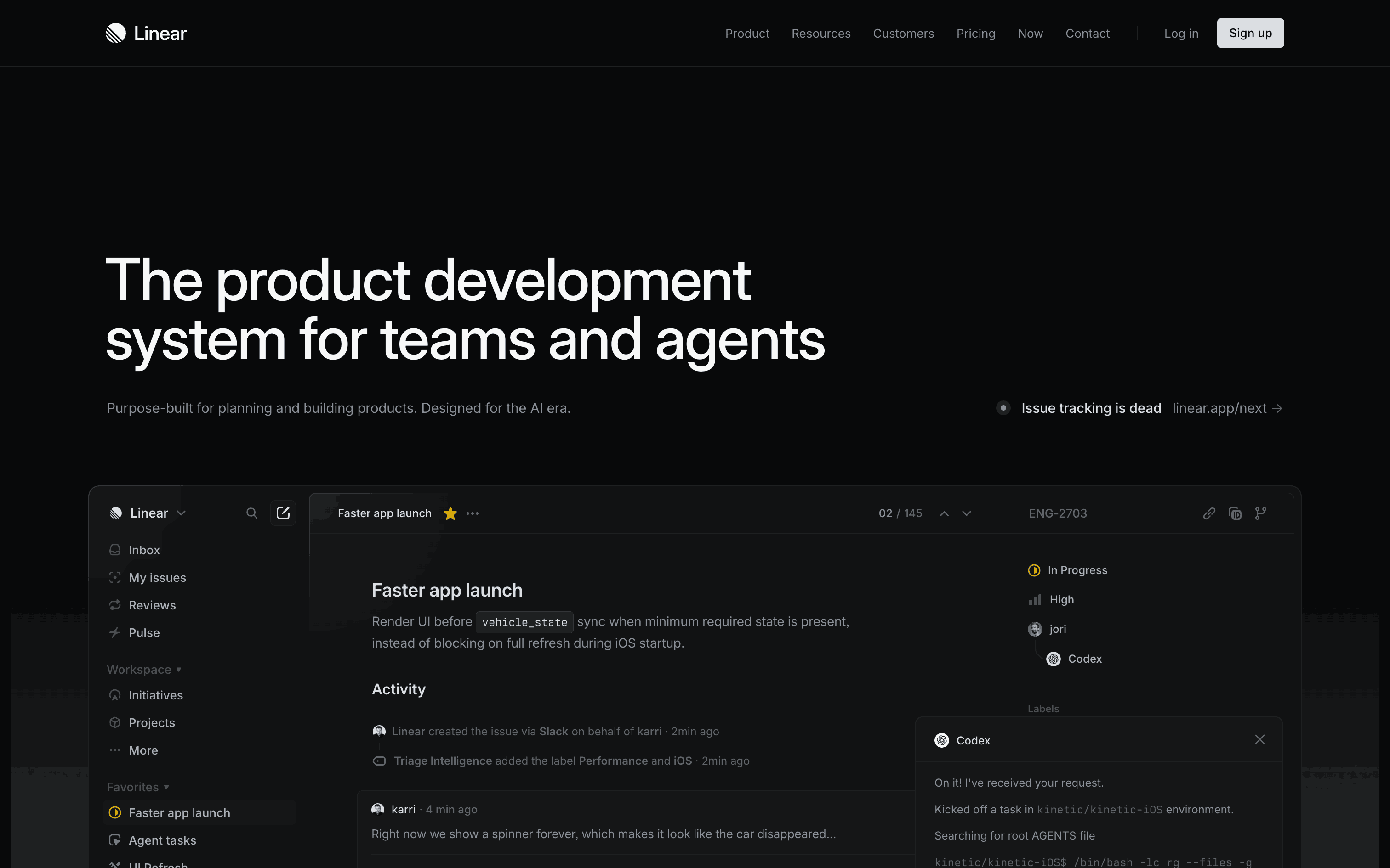
- Linear: "Add an issue" pill at the top of an empty board
- Notion: "Continue working on [last edited doc]" card at top
- Mixpanel: "Set up your first event" wizard if no events exist
Place this above or beside the hero metric, not buried.
Step 4 — Use 1 hero metric + 4-6 supporting
Cognitive load research: 7 ± 2 items is the human working-memory limit. Dashboards with 15-20 widgets fail this test.
Layout:
- Top center: 1 hero metric, large, with delta from previous period
- Top row: 3-5 supporting metrics, smaller
- Below: 1-2 charts (trends over time)
- Bottom: Recent activity feed
Avoid 4-column grids of 20 metrics. They feel comprehensive but they're noise.
Step 5 — Default to relevant time range
90% of dashboard sessions look at the last 7 or 30 days, not all-time. Default to the most-used range.
Specific patterns:
- B2B SaaS: 30-day default, with toggles for 7d / 90d / 1y
- Habit trackers: today's view default, week/month toggles
- Analytics tools: 24h / 7d / 30d / 90d (Stripe, Mixpanel, Posthog all do this)
Anti-pattern: All-time as default. Useless for active users.
Step 6 — Every chart drills down to detail
A chart that's just a picture is wasted screen real estate.
Every chart should:
- Be clickable (tap a bar → see that day's data)
- Have hover states with exact values
- Link to a filtered detail view ("View all signups from Tuesday")
Best-in-class: Stripe Dashboard charts → click → filter the table below. Mixpanel charts → click → see the underlying user list.
Step 7 — Show team activity if multi-player
For team SaaS tools (Linear, Figma, Notion, Slack), seeing teammate activity drives engagement:
- Recent comments
- Updates from others
- Mentions
- Activity feed
Place this in a sidebar or below the hero. Not in the hero — that's for the user's own metrics.
Step 8 — Test with 0 data and 1 year of data
These are very different experiences. Test both:
- 0 data: Does the empty state explain + guide?
- 1 year of data: Does the dashboard remain readable, fast, and useful? Or does it become noise?
Common failure: dashboards that look great with sample data fail at scale.
12 best SaaS dashboards in 2026
| App | What it does well |
|---|---|
| Linear | Empty states + clear hero metric per view |
| Stripe | Time range default + drill-down on every chart |
| Vercel | Fastest dashboard load (under 200ms) |
| Notion | Personalized "continue working on" cards |
| Figma | Activity feed + recent files prominent |
| Mixpanel | Powerful filters without overwhelming UI |
| Posthog | Customizable tiles + free tier |
| Datadog | Dense but readable for engineers |
| Stripe Dashboard | Best B2B SaaS dashboard, period |
| Cron (Notion Calendar) | Personal task hero metric |
| Tinybird | Minimal — just the data that matters |
| Plausible | Privacy-first analytics with clean UI |
Browse more dashboard examples → on Gummble's pattern hub.
Tools comparison for designing dashboards
| Need | Best tool |
|---|---|
| Reference dashboards from real SaaS apps | Gummble Pattern Hub — Dashboard |
| Charting library | Recharts (React) or Visx |
| Data viz reference | Datavizproject.com |
| Empty state references | Gummble — Empty States |
Common dashboard mistakes
1. Designing for the founder, not the user
Founders want to see "everything." Users want to see "what matters to me." Design for users.
2. Loading slow
A dashboard that takes 3 seconds to load loses 50% of sessions. Cache aggressively, lazy-load below-fold widgets.
3. No hierarchy
If everything is the same size, nothing is important. Use visual hierarchy: hero metric is 2× larger than supporting.
4. Mixing metric units carelessly
$ next to % next to count next to time. User has to mentally re-scale every widget. Group similar units together.
5. No "what's new" indicator
Users don't know what changed since their last visit. Add a "since you last visited" delta or activity feed.
FAQ
How many widgets should a SaaS dashboard have?
5-7 widgets max for the main view. 1 hero + 4-6 supporting. More than 7 hits the cognitive load ceiling.
What's the best dashboard layout?
Hero metric center-top → supporting metrics in a row → 1-2 trend charts → recent activity feed. Single column or 2-column.
Should dashboards show real-time data?
For ops dashboards (uptime, errors): yes, real-time. For business dashboards (MRR, signups): hourly or daily refresh is fine — real-time is misleading on lagging metrics.
What dashboard tool should I copy?
Stripe Dashboard for B2B SaaS, Linear for productivity tools, Mixpanel for analytics-heavy products. Browse Gummble's dashboard pattern hub for full curation.
How long does it take to design a SaaS dashboard?
For an MVP: 2-3 days of research + 3-5 days of design. For a polished v1: 2-3 weeks total.
What's the most common dashboard mistake?
Too many widgets. 15-20 widgets with no hierarchy = users see nothing. Cut to 5-7 with one clear hero.
Bottom line
Great SaaS dashboards in 2026 lead with one hero metric + 4-6 supporting metrics, design empty states first, default to 7- or 30-day ranges, and make every chart drill down to detail.
The masters: Linear, Stripe, Vercel, Notion, Figma. Study them on Gummble's dashboard pattern hub.
Related:
Founder of Gummble. I build and maintain the Gummble catalog — UI screenshots and UX flows from 1,500+ real iOS, Android, and web apps — and write about the design patterns I see across them.
About Azura →See these patterns in action
Browse 1,500+ apps across shipped iOS, Android, and web products.
Browse the Library →