Duolingo Onboarding Flow Analysis — Why It Hooks 80% of New Users
Deep dive into Duolingo's iOS onboarding flow — the personalization questions, the streak hook, the value-first reveal pacing, and what designers and PMs can learn from the world's stickiest language app.

Duolingo's onboarding works because it stacks three psychological hooks in sequence: personalization questions that create self-commitment, a manufactured "building your course" loading screen that triggers reciprocity, and account creation deferred until after the first lesson, so users sign up to save progress they've already earned instead of before they've felt any value.
TL;DR — Duolingo's Onboarding in One Paragraph
Duolingo's iOS onboarding is the gold standard for gamified personalization onboarding. Over ~12 screens, it asks goal-setting questions before the user signs up (commitment device), builds a personalized lesson plan from answers (sunk-cost reciprocity), reveals streaks immediately on lesson 1 (loss aversion hook), and delays account creation until after the first lesson (post-value commitment). Apps that defer signup this way see 30-50% better first-session completion.
Browse the full flow on Gummble's Duolingo iOS page or in the onboarding pillar, and see how it stacks up against top onboarding screen designs.
The flow — screen-by-screen breakdown
Screen 1: Logo + "Get Started" CTA
What it shows: Big Duo (the owl mascot), 1-line value prop, single "Get Started" button.
Why it works: Zero friction. No signup wall. No marketing copy. The mascot does emotional work (Duolingo treats the owl as a brand asset on every screen).
Designer lesson: Don't waste the first screen on marketing. Get the user to action in 1 tap.
Screen 2: "Why are you learning [language]?"
Options: Travel, Career, Brain training, Family, School, Just for fun.
Why it works: This is the commitment device. Users who answer "Career" are now psychologically primed to take it seriously — they've publicly (to themselves) committed to a reason. The question feels easy, but the answer creates internal pressure to follow through.
Designer lesson: Personalization questions create self-commitment. Even if you don't use the answer for product logic, you've changed the user's mental state.
Screen 3: "How much will you study per day?"
Options: 5 min (Casual) → 20 min (Insane). Pre-selected: 10 min (Regular).
Why it works: Anchoring + default selection. Users rarely change defaults. The 10 min default is high enough to be meaningful, low enough to be achievable. Users who pick higher feel virtuous; users who pick lower feel they're "lazy" — both convert.
Designer lesson: Defaults are powerful. The default option in your onboarding shapes the user's identity assumption.
Screen 4: "How did you hear about Duolingo?"
Options: App Store, friend, social media, ad, etc.
Why it works: Two purposes — (1) attribution data for marketing, (2) endowed progress effect ("you've already started"). Each question answered makes the user feel more invested.
Designer lesson: Use multi-step onboarding deliberately — every step deepens commitment.
Screen 5: "What's your level?"
Options: New to [language], some words, basic conversations, intermediate.
Why it works: Personalization signal. Users who pick "intermediate" get harder lessons immediately, which feels validating. Users who pick "new" get easy wins, which feels rewarding. Either way: positive reinforcement on lesson 1.
Screens 6-7: Placement quiz (skippable)
What it shows: 3-5 question quiz to set difficulty. Skippable.
Why it works: Optional friction. Users who take it feel ownership of their level (sunk cost). Users who skip feel they made an efficient choice. Both feel good.
Screen 8: "Building your personalized course..."
What it shows: Loading screen with progress bar (~3 seconds), text scrolling through "your goals → your level → your course."
Why it works: Manufactured anticipation. The course is mostly pre-built; the personalization "calculation" is theater. But the user feels the system is working for them. Reciprocity follows: users who feel a system invested in them feel obligated to invest back.
Designer lesson: Loading states are storytelling opportunities. Use them to show the user what was personalized, not just "loading."
Screen 9: First lesson preview
What it shows: "Here's your first 5-min lesson. Ready?"
Why it works: The user is now ~2 minutes deep. They've answered 5+ questions, watched a personalization animation, and now see a small concrete first step. The cognitive cost of saying "yes" is tiny.
Screens 10-11: First lesson (5 questions)
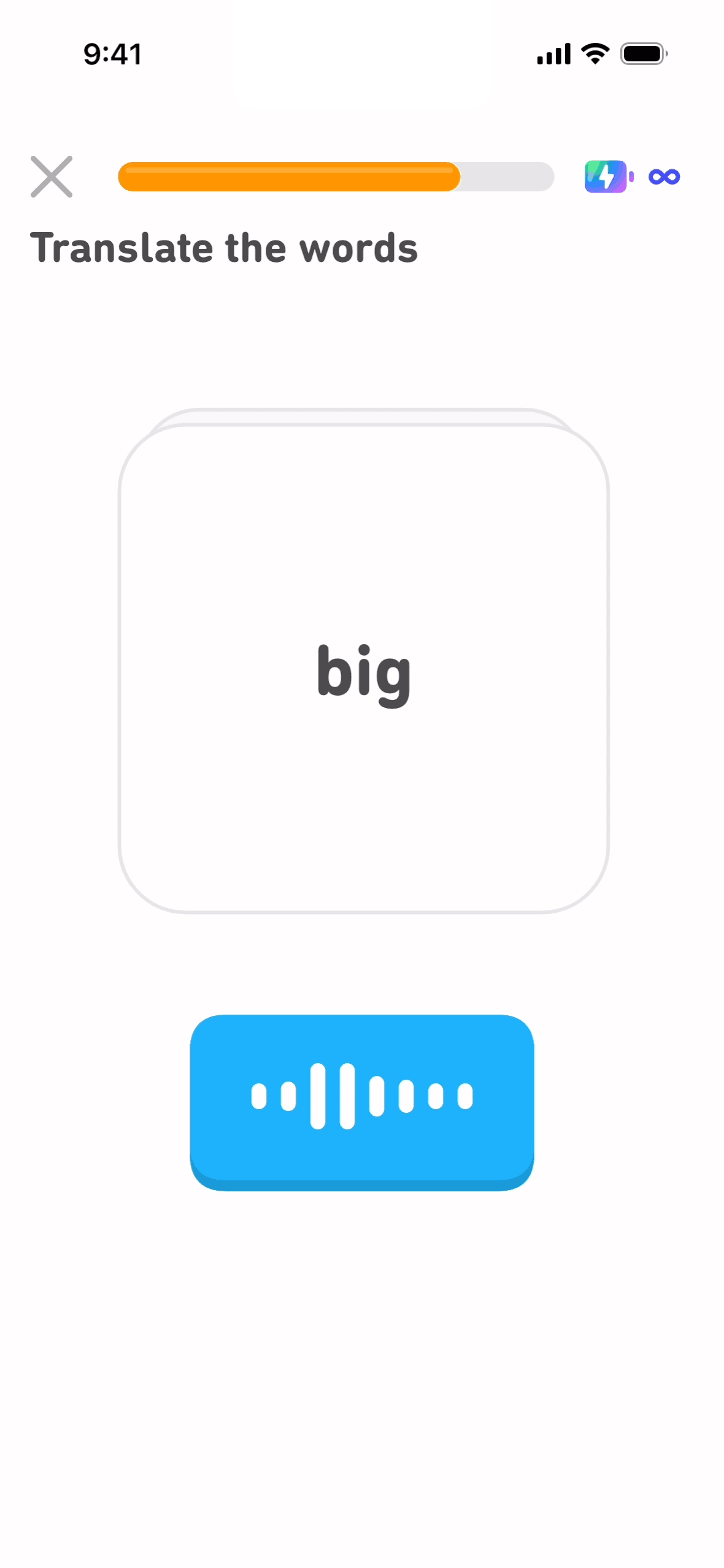
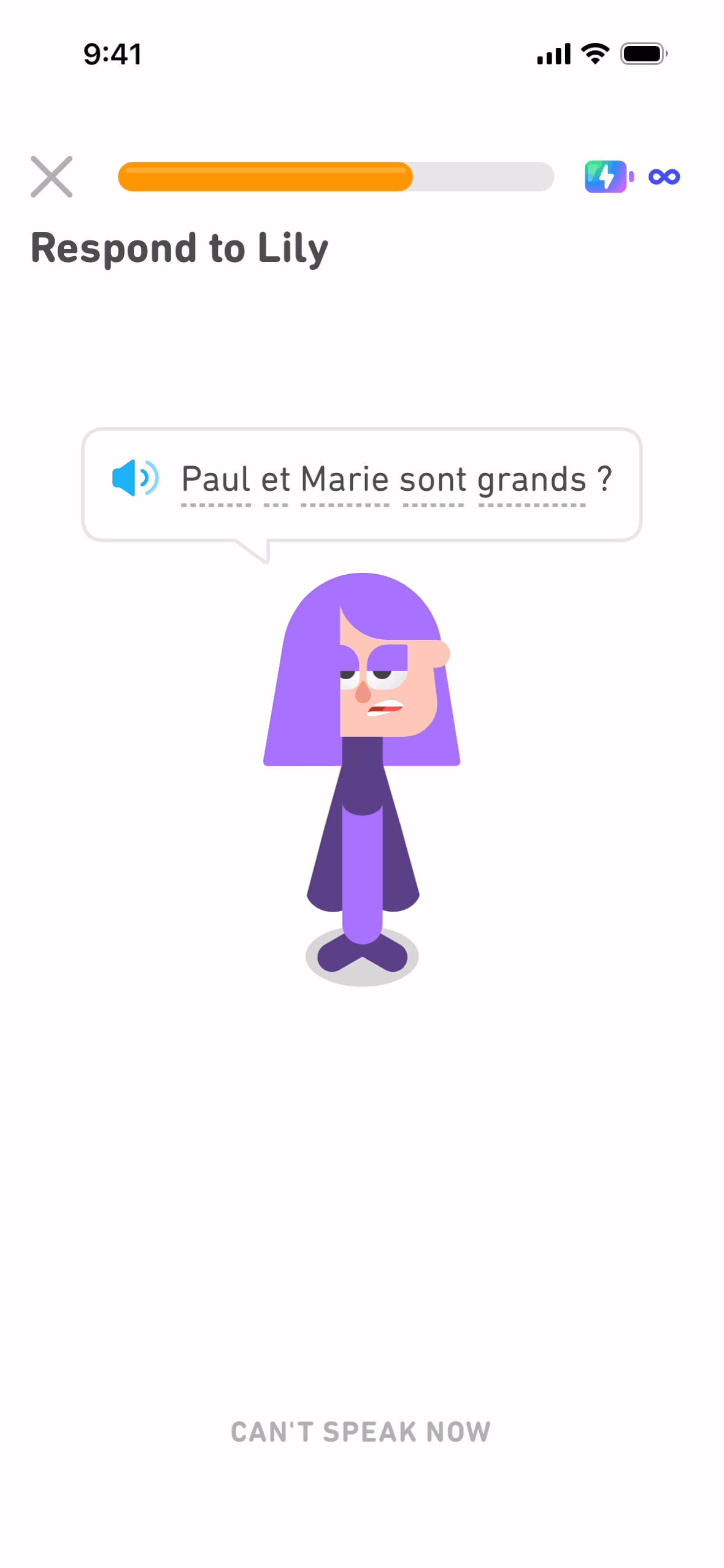
What it shows: Tap-to-translate, fill-in-the-blank, listen-and-pick. Always with positive feedback (Duo cheering).
Why it works: Quick wins. Most first-lesson questions are trivially easy ("hello → hola"). Users get 5 dopamine hits in 90 seconds. By question 3, they're hooked.
Screen 12: "🔥 1-day streak!"
What it shows: Big flame icon, "You started a streak!", confetti animation.
Why it works: This is the hook. Users now have something to lose (the streak). BJ Fogg's behavior model says habits form fastest when there's a small celebration after a small action. Duolingo nails this.
Designer lesson: Manufacture a celebration moment as early as possible. Streaks, achievements, "you did it!" — these small reinforcers compound.
Screen 13: Account creation (finally)
What it shows: "Save your progress! Sign up." with Apple/Google/email options.
Why it works: Post-value commitment. The user has now invested ~5 minutes and earned a streak. Asking them to create an account after delivering value (vs before) shifts the framing from "give me your data" to "save what you earned."
Designer lesson: Defer account creation until after the user feels invested. This is the single biggest onboarding conversion lever in 2026.
What psychological archetypes does Duolingo's onboarding combine?
Duolingo combines five distinct onboarding archetypes in one flow: personalization questions, an animated reveal, value delivered before signup, quick wins with celebration, and a streak-based loss-aversion hook. Most competing apps use only one or two of these — the combination is what makes Duolingo's flow unusually sticky.
Most great onboarding flows pick 1-2 archetypes. Duolingo uses 5:
- Personalization questions — commitment device + custom feel
- Animated reveal — manufactured anticipation
- Value-first — first lesson before signup
- Quick wins — easy questions with celebration
- Streak hook — loss-aversion primer
This combination is the playbook for any high-engagement consumer app. Browse onboarding pillar →
What parts of Duolingo's onboarding can you actually copy?
You can copy the structure — personalization questions, deferring account creation until after value delivery, manufactured anticipation in loading states, and first-action celebration — regardless of your product category. What's hard to copy is anything tied to 10+ years of brand equity (the Duo mascot) or daily-use mechanics (the streak hook only works if your product has a reason for daily return visits).
Easy to copy
- Personalization questions (any app can do this)
- Defer account creation until after value delivery
- Manufactured anticipation in loading states
- First-action celebration
Hard to copy
- The Duo mascot — emotional brand asset built over 10+ years
- Streak hook — only works if the product has daily-use mechanics
- Gamification depth — Duolingo has invested years in lesson logic
If you're building a non-gamified product (B2B SaaS, productivity, etc.), borrow the structure (personalization → value → defer signup) but skip the gamification layer. See more onboarding UI patterns for non-gamified examples.
How does Duolingo's onboarding compare to other apps?
Duolingo gets users to their first action in 90 seconds and defers signup until after that action — a pattern shared with Streaks and Headspace but not with Notion or Linear, which require signup before any value is shown. Apps that defer signup, like Duolingo, convert 30-50% better at first-session completion.
| App | Style | First-action time | Defers signup |
|---|---|---|---|
| Duolingo | Gamified personalization | 90 sec | Yes |
| Notion | Tutorial-first | 2-3 min | No (sign up first) |
| Linear | Workspace setup | 2-3 min | No |
| Streaks | Habit picker | 30 sec | Yes (no account needed) |
| Headspace | Value-first meditation | 60 sec | Yes |
Apps that defer signup convert 30-50% better at first-session completion. Duolingo, Streaks, and Headspace all do this.
What does Duolingo get wrong in its onboarding?
Duolingo's biggest onboarding flaws are too many screens (12+, with drop-off around screen 4-5), an aggressive early notification-permission ask, and a guilt-based streak-maintenance message that works for most users but alienates some. Trimming to roughly 7 screens would likely keep the psychological hooks while reducing drop-off.
Honest critique:
- Too many onboarding screens — 12+ screens is a lot. Some users drop off at screen 4-5.
- Notification permission ask is aggressive — Duolingo asks early and often.
- The "you've maintained your streak" guilt — works for most users, alienates some.
Duolingo could shorten to 7 screens without losing the psychological hooks.
FAQ
What makes Duolingo's onboarding effective?
Five layers: (1) personalization questions create self-commitment, (2) defaults shape user identity, (3) manufactured loading anticipation, (4) value delivered before signup, (5) streak hook on day 1.
How long is Duolingo's onboarding?
About 90 seconds to 3 minutes depending on whether the user takes the placement quiz. ~12 screens total.
Does Duolingo defer account creation?
Yes. Account creation happens at screen 13, after the user has completed their first lesson and earned a 1-day streak. This is a major conversion lever.
Can I copy Duolingo's onboarding for a B2B SaaS?
The structure (personalization → value → defer signup) yes. The gamification layer (streaks, mascot, dopamine cycles) doesn't fit B2B as well — adapt to "show progress" rather than "celebrate streaks."
Where can I see Duolingo's onboarding screens?
Gummble's Duolingo iOS page has the full curated screen set. The onboarding pillar compares Duolingo to 30+ other apps' onboarding flows.
What other apps have great onboarding?
Notion, Linear, Streaks, Headspace, Stripe, Superhuman. Browse all on the onboarding pillar.
Bottom line
Duolingo's onboarding works because it combines five proven psychological hooks (commitment device, defaults, anticipation, value-first, loss aversion) into a single 90-second flow. Most apps use 1-2; Duolingo uses 5. That's the moat.
For your own product: borrow the structure (personalization → animated reveal → first value → celebration → defer signup), even if you skip the gamification. This single pattern improves first-session conversion 30-50% across most consumer apps.
Related:
Founder of Gummble. I build and maintain the Gummble catalog — UI screenshots and UX flows from 1,500+ real iOS, Android, and web apps — and write about the design patterns I see across them.
About Azura →See these patterns in action
Browse 1,500+ apps across shipped iOS, Android, and web products.
Browse the Library →