State of Mobile Onboarding 2026: 137 Real Flows Analyzed
Original Gummble research on 137 iOS and Android onboarding flows from 100 apps: screen-count distribution, platform medians, real examples, and a transparent methodology.

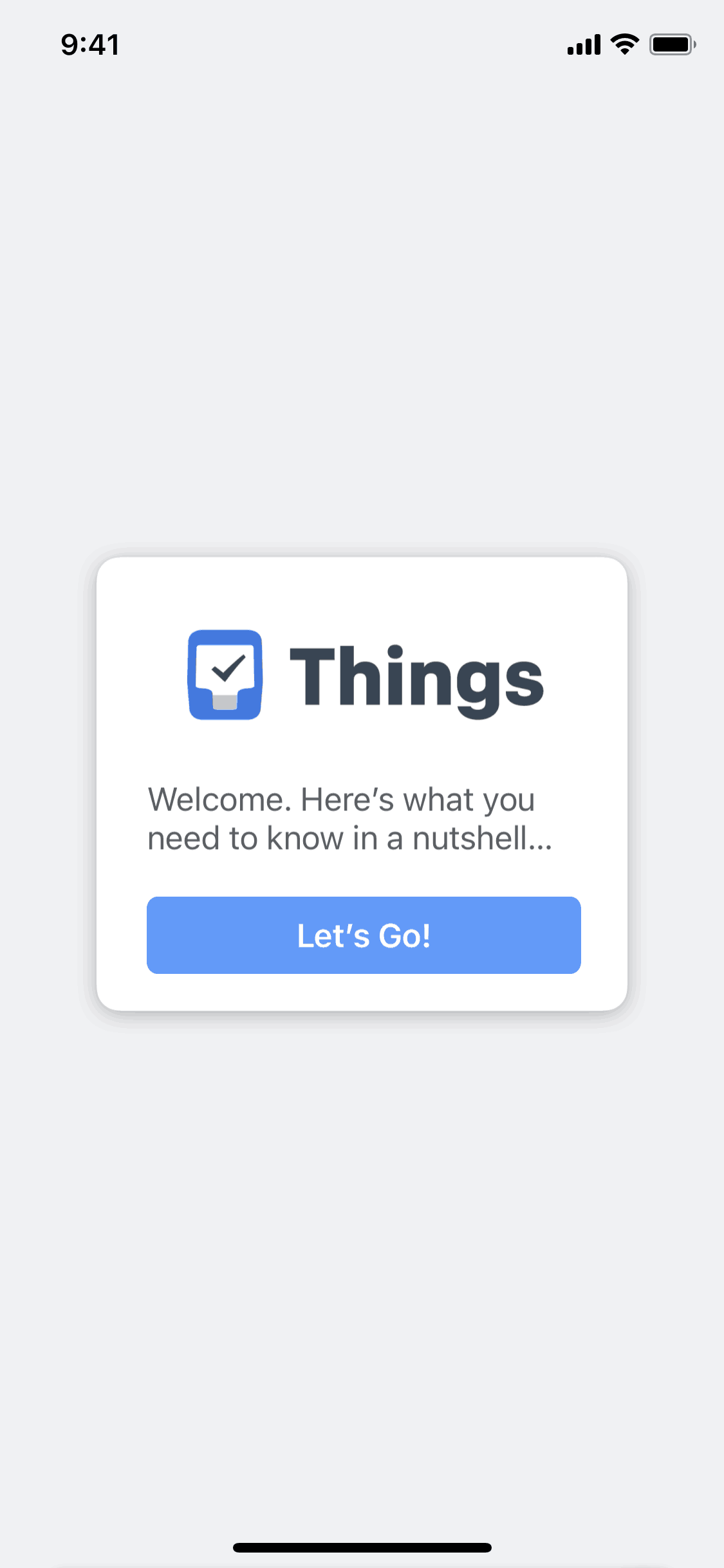
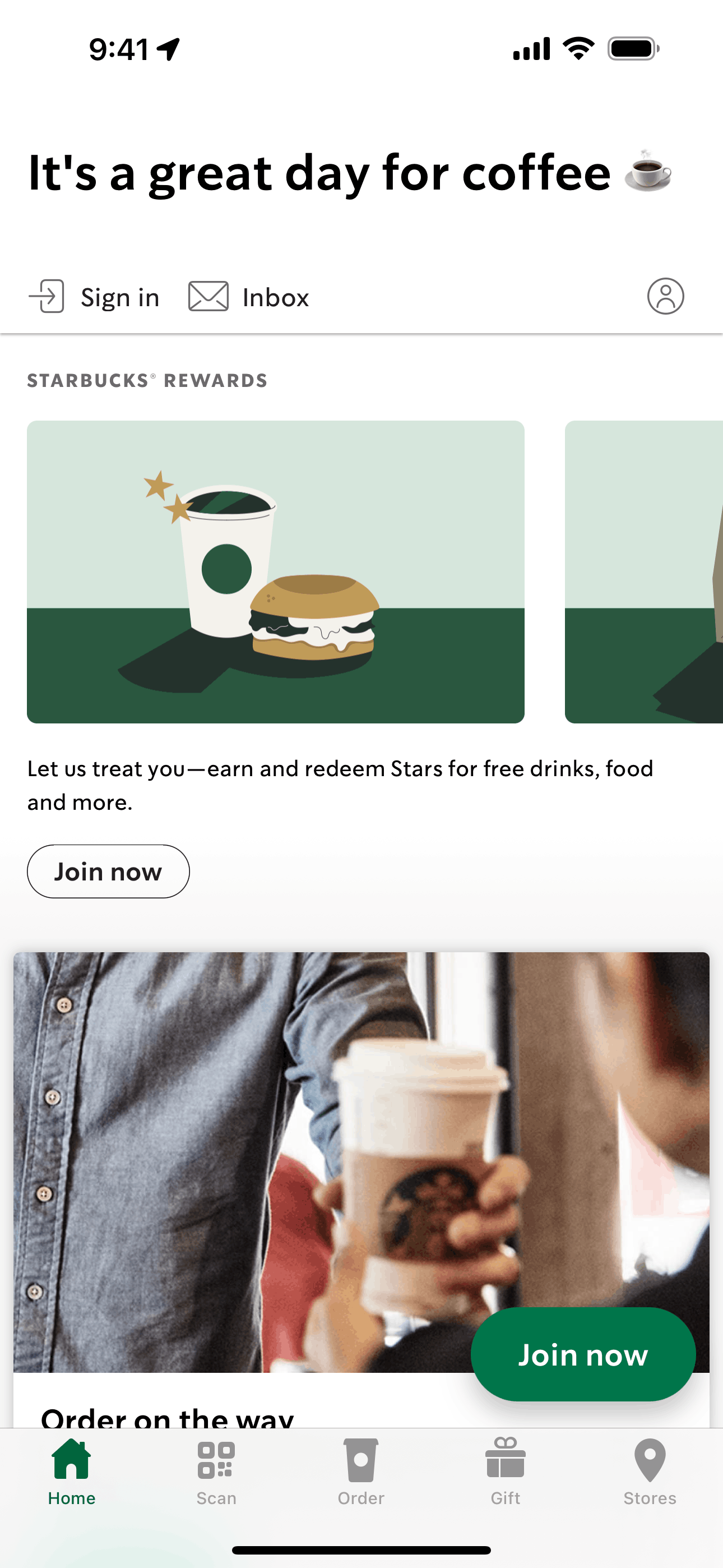
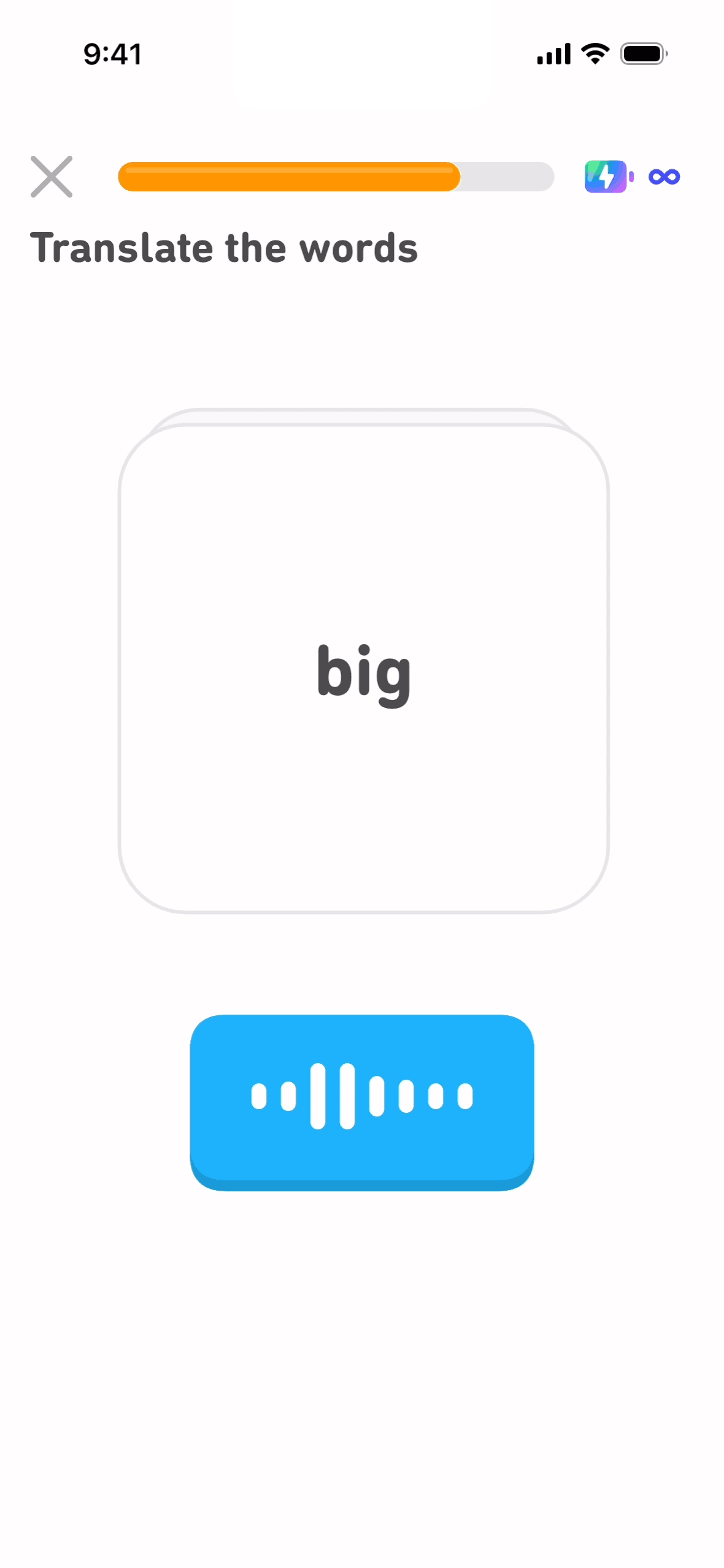
We analyzed 137 mobile onboarding flows from 100 apps in Gummble's design library to establish a transparent baseline for how long captured onboarding journeys are in 2026. The median flow contained 16 screens. Only 34 of the 137 flows used ten screens or fewer.
The important caveat: screen count is not a conversion score. A captured journey can include sign-up, permissions, personalization, a first task, and multiple decision states. This report describes what shipped products show, then explains how to use that evidence without copying a number blindly.
Key findings
- 16 screens was the median across the mobile sample; the mean was 18.
- 45.3% of sampled flows contained 11–20 screens.
- 29.9% contained more than 20 screens.
- iOS and Android medians were close: 16 screens on iOS and 14 on Android.
- The observed range was 2–68 screens, showing that "onboarding" covers very different product jobs.
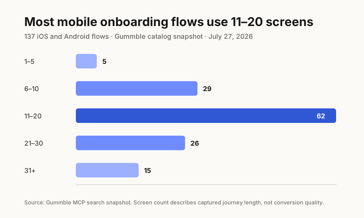
The 3–5 screen rule does not describe most complete journeys
Advice about onboarding often treats three to five screens as a universal target. That can be sensible for a welcome carousel, but it is a poor description of many complete first-run journeys. In this sample, only five flows stopped within five captured screens.
| Captured flow length | Flows | Share of sample |
|---|---|---|
| 1–5 screens | 5 | 3.6% |
| 6–10 screens | 29 | 21.2% |
| 11–20 screens | 62 | 45.3% |
| 21–30 screens | 26 | 19.0% |
| 31+ screens | 15 | 10.9% |
Longer does not automatically mean worse. A banking app that verifies identity and explains permissions has a different first-run job from a single-purpose utility. The useful question is whether every step advances the user toward first value, not whether the flow hits an arbitrary count.
Platform medians are similar; the tails differ
The iOS subset contained 89 flows with a 16-screen median and 17.8-screen mean. The Android subset contained 48 flows with a 14-screen median and 18.3-screen mean. Android's higher mean despite a lower median came from a longer upper tail, including the 68-screen maximum in this snapshot.
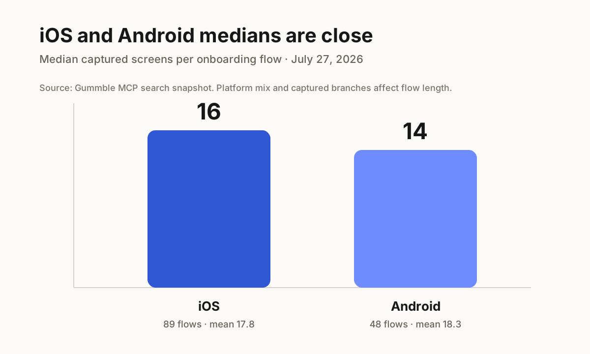
These numbers should not be read as an iOS-versus-Android performance contest. The samples contain different apps and captured paths. They are most useful as a warning against assuming the platform alone determines journey length.
Four real flows, four different scopes
| App | Platform | Captured screens | What to inspect |
|---|---|---|---|
| Things 3 | iOS | 6 | A compact first-run sequence |
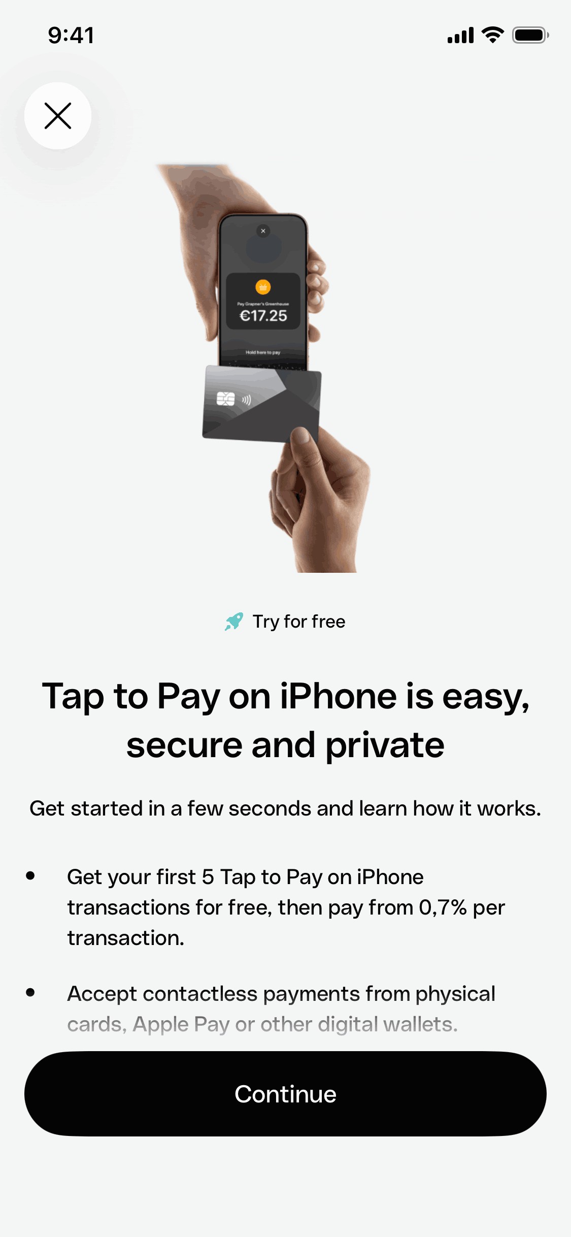
| Starbucks | iOS | 10 | Account and product-value setup |
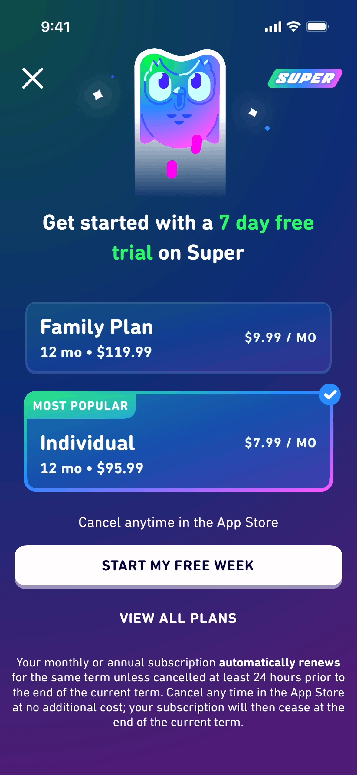
| Duolingo | iOS | 20 | Goal selection and learning personalization |
| Notion | Android | 28 | Workspace setup across a broader product |
Use the linked flow sequences as screen evidence. Compare hierarchy, progress cues, when account creation appears, how permissions are framed, and whether the captured final state puts the user inside a useful product context.
How teams should use this benchmark
- Define the journey boundary. Decide whether your audit ends after the welcome screens, after account creation, or at first value. Do not compare flows with different endpoints.
- Tag the job of every screen. Separate required setup, personalization, education, permission priming, and product action.
- Measure branches separately. A single linear screen count hides skipped steps, optional permissions, and different user goals.
- Instrument progress. Track completion and time-to-value per step. A long flow with strong progression can outperform a short flow that asks for commitment before showing value.
- Use real references as hypotheses. Study the onboarding examples pillar, then test the pattern in your own product rather than copying its length.
Methodology
The snapshot was collected on July 27, 2026 with Gummble MCP:
- Query:
onboarding - Source result set: 1,835 matching flows at collection time
- Sample: the first 200 returned results, 50 per page across four pages
- Mobile subset used in this report: 137 flows — 89 iOS and 48 Android
- Unique app names in the mobile subset: 100
- Unit measured: the
screen_countattached to each captured flow - Web flows: 63 of the 200-result source sample, excluded from the mobile charts
Limitations: this is a catalog snapshot, not a random sample of every app in the market. Multiple platforms or captured variants can exist for one app. Screen count does not measure completion, activation, retention, or design quality. Product versions can also change after capture.
Reuse and citation
Newsletters, blogs, and research roundups may republish the two charts with attribution to Gummble, State of Mobile Onboarding 2026 and a link to this report. For the underlying screen evidence, link to the named Gummble flow so readers can inspect the complete journey.
Suggested citation:
Gummble Research. "State of Mobile Onboarding 2026: 137 Real Flows Analyzed." July 27, 2026.
For related evidence, browse the canonical checkout UI and flow examples and paywall design examples, which now publish their own dated Gummble research snapshots.
Founder of Gummble. I build and maintain the Gummble catalog — UI screenshots and UX flows from 1,500+ real iOS, Android, and web apps — and write about the design patterns I see across them.
See these patterns in action
Browse 1,500+ apps across shipped iOS, Android, and web products.
Browse the Library →