State of Checkout UX 2026: 100 Real Flows Analyzed
Original Gummble research on 100 checkout flows from 54 shipped apps: flow-length distribution, real examples, methodology, and design implications.

We analyzed 100 checkout flows from 54 shipped apps in Gummble's design library. The median captured checkout contained 4 screens, and 71 of 100 journeys used five screens or fewer.
This is a descriptive catalog snapshot, not a conversion benchmark. A short captured flow is not automatically effective, and screen count alone says nothing about payment success, trust, form effort, error recovery, or purchase completion.
Browse the canonical checkout UI and flow examples →
Key findings
- 4 screens was the median captured flow; the mean was 5.2.
- 71% of sampled flows used 1–5 screens.
- 20% used 6–10 screens.
- 9% used more than 10 screens.
- The observed range was 1–18 screens.
- The 100-flow sample represented 54 unique apps.
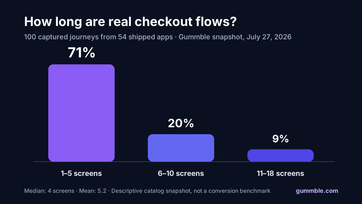
Most captured checkout journeys were five screens or fewer
| Captured flow length | Flows | Share |
|---|---|---|
| 1–5 screens | 71 | 71% |
| 6–10 screens | 20 | 20% |
| 11–18 screens | 9 | 9% |
The distribution is useful for defining a comparison set, but it should not become a universal “five-screen rule.” A one-screen digital purchase, a food-delivery order, and a travel booking have different requirements and risk.
When comparing flows, count the product jobs as well as the screens:
- cart or order review;
- delivery or fulfillment choice;
- address and contact information;
- payment method;
- identity, authentication, or risk checks;
- confirmation and next steps;
- inline errors and recovery states.
Three real checkout flows to inspect
| App | Platform | Captured screens | Research question |
|---|---|---|---|
| KakaoTalk | iOS | 4 | How much context can remain on a compact mobile path? |
| Airbnb | Web | 5 | How are price, booking details, and commitment sequenced? |
| PayPal | Web | 8 | Where do identity and payment states add necessary steps? |
Open each linked flow and inspect the complete sequence. The count gives you a starting point; hierarchy, information timing, defaults, trust, and recovery determine whether the experience is usable.
What product teams should benchmark
1. Required effort, not page count
Two screens with fifteen fields can require more effort than five screens with good defaults and progressive disclosure. Count required inputs, decisions, and context switches.
2. Cost clarity before commitment
Record the first point at which the user sees the full price, recurring terms, taxes, fees, shipping, and cancellation rules. A visually short checkout can still hide expensive surprises.
3. Guest and returning-user paths
Separate first-time and returning-user flows. Saved addresses, stored payment methods, and express checkout can radically shorten the returning path.
4. Error recovery
Capture declined payments, address validation, unavailable inventory, expired sessions, and network failures. The happy path is only part of checkout UX.
5. Purchase completion
Define the endpoint before comparing products. Some captures end at the payment action; others include processing, confirmation, receipt, or post-purchase setup.
Use the checkout UI examples pillar to compare real flows, then connect the visual audit to your own start rate, completion rate, payment success, time to complete, and per-step drop-off.
Methodology
The snapshot was collected on July 27, 2026 with Gummble MCP:
- Query:
checkout - Source result set: 1,913 matching flows at collection time
- Sample: the first 100 returned results
- Unique apps represented: 54
- Unit measured: the
screen_countattached to each captured flow - Median: 4 screens
- Mean: 5.2 screens
- Observed range: 1–18 screens
Limitations: this is a Gummble catalog snapshot, not a random sample of every checkout in the market. Multiple platforms or captured variants can exist for one app. The sample includes mobile and web flows. Screen count does not measure conversion, accessibility, payment success, user trust, or design quality.
Reuse and citation
Newsletters, blogs, and research roundups may republish the chart with attribution to Gummble, State of Checkout UX 2026 and a link to this report.
Suggested citation:
Gummble Research. "State of Checkout UX 2026: 100 Real Flows Analyzed." July 28, 2026.
For adjacent evidence, see the State of Mobile Onboarding 2026 report and the canonical app onboarding examples.
Founder of Gummble. I build and maintain the Gummble catalog — UI screenshots and UX flows from 1,500+ real iOS, Android, and web apps — and write about the design patterns I see across them.
See these patterns in action
Browse 1,500+ apps across shipped iOS, Android, and web products.
Browse the Library →