Design Competitive Analysis for PMs — A Practical Framework for 2026
How product managers should run design competitive analysis. A 5-step framework focused on UX decisions, conversion patterns, and strategic positioning — not just pixel-level copying.

TL;DR — Design Competitive Analysis for PMs
PMs do design competitive analysis differently from designers. PMs care about:
- Strategic positioning — what UX decisions reveal about company strategy
- Conversion patterns — what's driving paid signups vs free
- Friction points — where users likely drop off
- Differentiators — what's unique vs commodity
- Buy-vs-build signals — what your team needs to ship vs skip
The framework: pick 8-13 competitors → screenshot 5-6 key flows → annotate with PM lens (not pixel lens) → build a strategic comparison artifact → write a 1-page recommendation memo.
Total time: 4-6 hours. Gummble Browse at $9.99/month can shorten the screenshot phase by replacing manual app installation and capture with an organized library.
How PM analysis differs from designer analysis
Designers ask: "What's the visual hierarchy here?" "How is the typography working?"
PMs ask: "What does Stripe putting payment volume on the homepage tell me about their positioning?" "Why does Notion's onboarding feel so different from Asana's?"
Both are valuable. PM analysis is upstream — it informs what to build, not how to design it.
The PM framework — 5 steps
Step 1 — Identify competitive set
Same as designer process: 5-8 direct + 3-5 adjacent best-in-class. But weight more toward strategic adjacents (e.g., a B2B SaaS PM should study consumer apps to learn engagement patterns).
Step 2 — Define the analysis questions
Before screenshotting, write 5-7 questions you're trying to answer:
- "How are competitors framing their value prop?"
- "What's the free → paid conversion path?"
- "Where do users likely drop off?"
- "What's the team activity pattern?"
- "What's the pricing model + how is it presented?"
Without questions, screenshots become decoration.
Step 3 — Screenshot 5-6 key flows per app
For PM analysis, focus on decision moments rather than every screen:
- Homepage (positioning, hero claim)
- Pricing page (model, anchoring, social proof)
- Signup → onboarding (commitment device, time-to-value)
- Empty state (what new accounts see — reveals product philosophy)
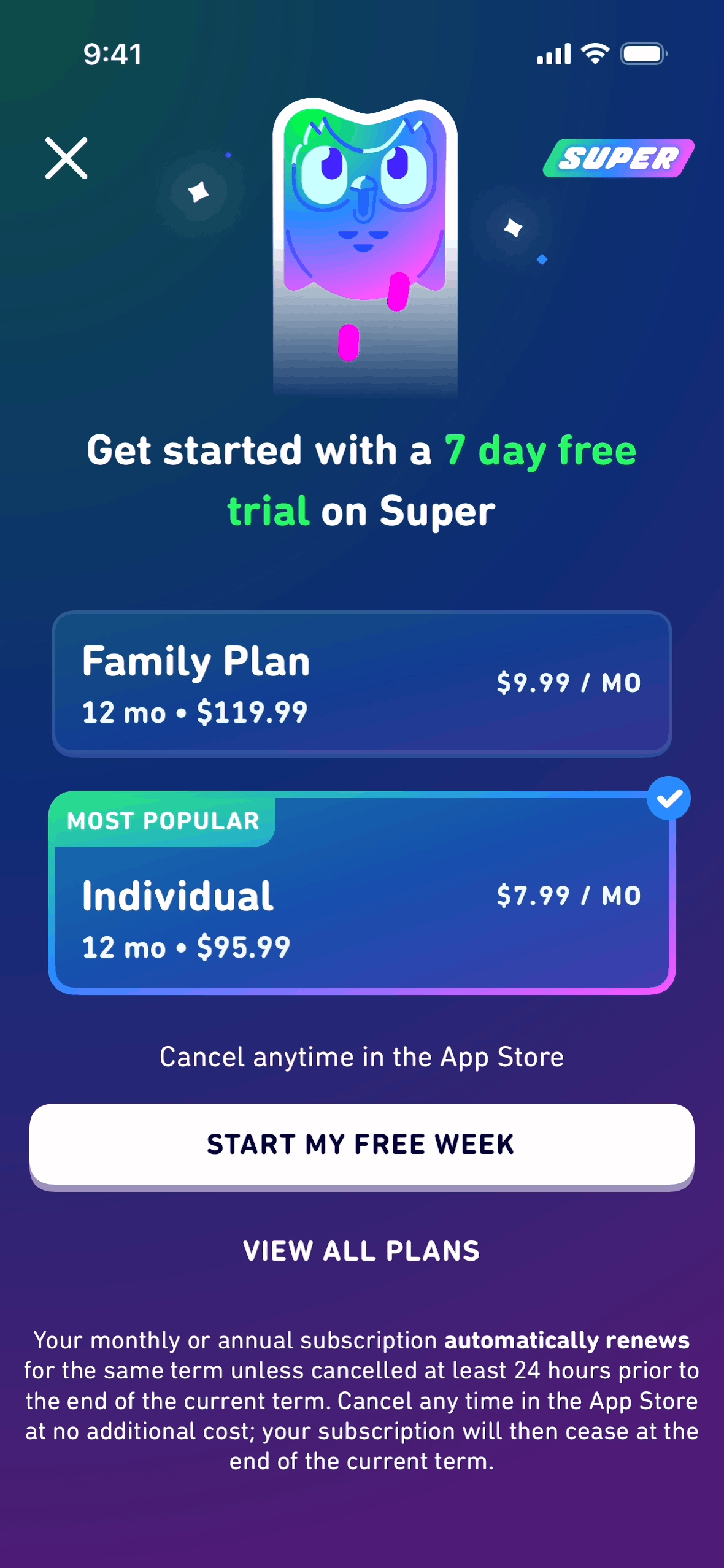
- Paywall / upgrade prompt (where + how + why)
- Settings (reveals what flexibility users have)
Use Gummble's UX flows for fastest access. App Store screenshots cover the marketing surfaces only.
Step 4 — Annotate with PM lens
For each screen, write 2-3 sentences answering:
- What strategic decision is this revealing? (e.g., "Stripe puts payment volume in the hero — they're targeting CFOs not developers")
- What's the assumed user state? (e.g., "Notion assumes users have a project before they sign up")
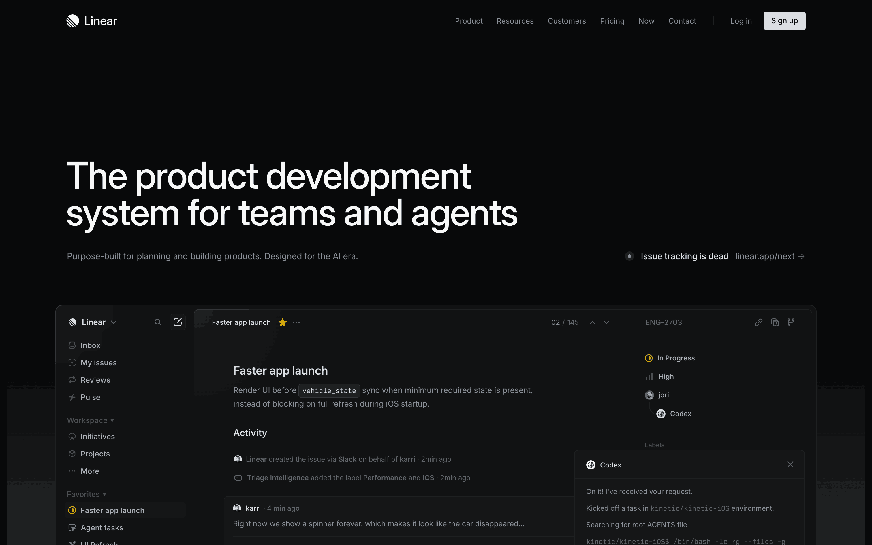
- What's the conversion mechanic? (e.g., "Linear defers signup until workspace creation — post-value commitment")
PM annotations focus on why not what. The visual elements are secondary.
Step 5 — Build the strategic comparison artifact
Output: a 4-7 slide presentation or 1-page memo answering:
- What competitors agree on (industry conventions — your defaults)
- Where competitors diverge (strategic decision points for your product)
- What's unique to one competitor (potential differentiators or anti-patterns)
- What we should copy / skip / invent
- What we don't know yet (gaps in the research that need user interviews)
This memo becomes input to product strategy meetings, roadmap prioritization, and design briefs.
Common PM mistakes in design competitive analysis
1. Copying tactics without strategic context
Notion's hierarchical structure works because Notion's data model is hierarchical. Slack's threading works because Slack's data is conversational. Don't copy a tactic to your different model.
2. Researching only direct competitors
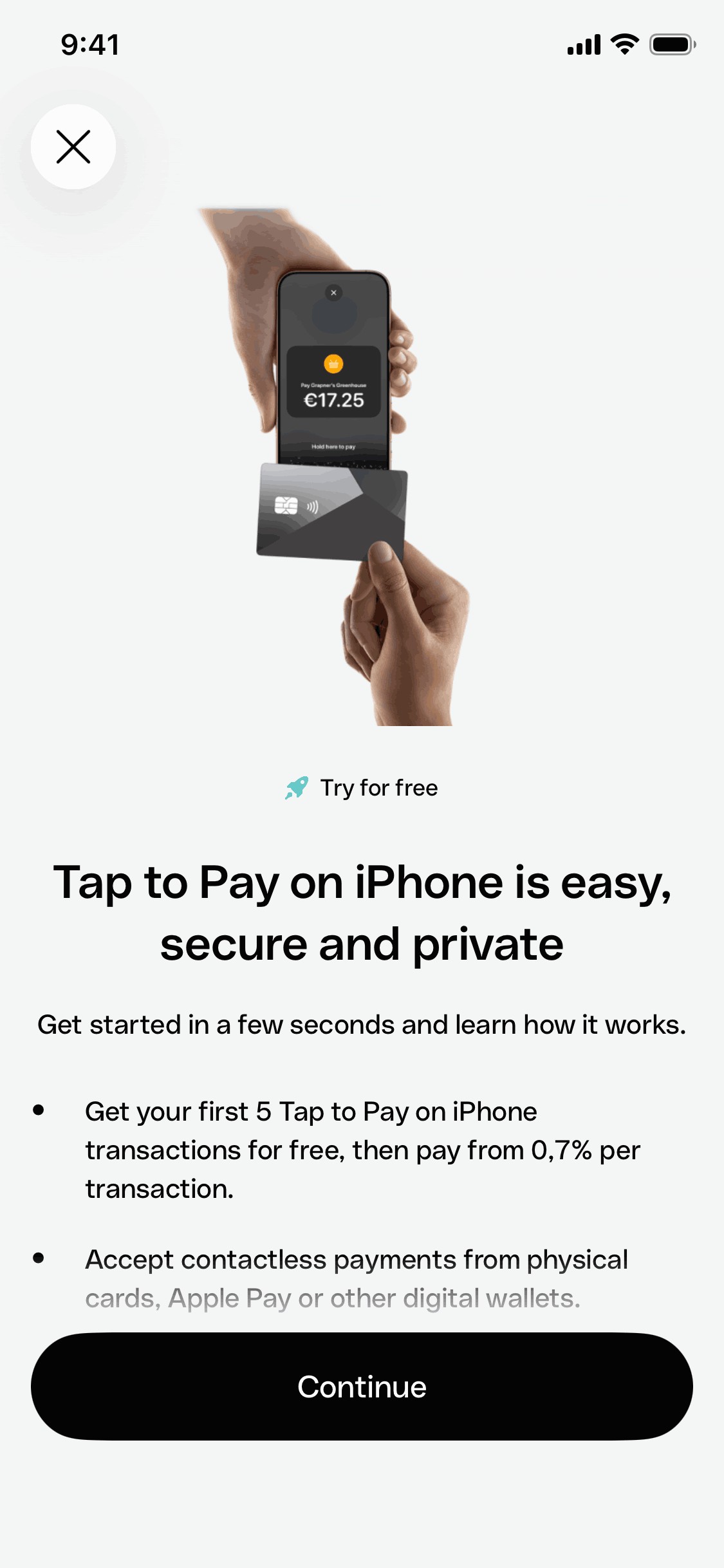
Direct competitors converge on similar patterns over time. Adjacent best-in-class apps (Stripe for B2B SaaS PMs, Duolingo for engagement PMs) reveal more strategic options.
3. Missing the "why now" question
Screenshots don't tell you why a competitor shipped a feature now. Cross-reference with their changelog, blog posts, and Twitter announcements for the strategic context.
4. Skipping pricing analysis
Pricing pages reveal everything: target customer, price elasticity assumptions, social proof tactics, anchoring strategies. PMs often skip pricing analysis. Don't.
5. Not testing assumptions with users
Design competitive analysis is input to user research, not a replacement. Validate competitor patterns with your actual users before shipping.
Tools for PM competitive analysis
| Need | Best tool |
|---|---|
| Screenshot competitor apps fast | Gummble Browse at $9.99/mo |
| Pricing page screenshots | Land-book free + manual capture |
| Strategic context (changelog, blog) | Manual research + RSS aggregator |
| Competitor mention tracking | Mention.com, Brand24 |
| Annotation | Figma or Notion |
| Sharing with team | Notion or Loom |
For most PMs, Gummble Browse at $9.99/mo covers the visual research layer. Combine it with manual research for strategic context.
Time budget
For a 10-app analysis:
| Step | With Gummble Pro | Manual |
|---|---|---|
| Identify competitors | 30 min | 30 min |
| Define questions | 30 min | 30 min |
| Screenshot all flows | 60 min | 4 hours |
| Annotate with PM lens | 90 min | 90 min |
| Build comparison memo | 90 min | 90 min |
| Total | ~5 hours | ~7-8 hours |
How often should PMs run this analysis?
- Before major roadmap planning: yes (quarterly)
- Before specific feature decisions: yes (when scoping)
- Before pricing changes: critical
- Continuously: skim competitor changelogs weekly, deep-dive analysis quarterly
FAQ
How is PM competitive analysis different from designer analysis?
PMs focus on strategic decisions and conversion patterns; designers focus on visual execution and interaction details. Both matter, but they serve different decisions.
How often should PMs do this?
Quarterly for full analysis, weekly for changelog skimming, before any major roadmap or pricing decision.
What's the most important step for PMs?
Step 4 (annotation) — without writing the strategic insight per screen, the research is just decoration.
How many competitors should I research?
8-13 total: 5-8 direct + 3-5 adjacent best-in-class. Diminishing returns past 13.
Where do I find pricing pages from competitors?
Direct visit, archive.org for historical, Land-book free for landing-page snapshots.
What's the best tool for the screenshot phase?
Gummble Browse at $9.99/month for app references and UX flows, plus Land-book for landing pages, covers a focused competitive scanning workflow.
Bottom line
Design competitive analysis for PMs is upstream of designer analysis. The framework: 8-13 apps → 5-7 strategic questions → 5-6 key flows → annotate with PM lens → 1-page strategic memo.
The biggest time saver is Gummble Browse at $9.99/month for organized screenshot and flow access instead of manual capture.
Try Gummble free → for browsing curated app references.
Related:
Founder of Gummble. I build and maintain the Gummble catalog — UI screenshots and UX flows from 1,500+ real iOS, Android, and web apps — and write about the design patterns I see across them.
About Azura →See these patterns in action
Browse 1,500+ apps across shipped iOS, Android, and web products.
Browse the Library →