TextNow App Design Analysis — UI Screenshots & Interface Patterns
Explore TextNow's app interface design. Screenshots, UI patterns, and UX analysis of the free calling and texting app used by millions.


TextNow App Design Analysis
TextNow provides free phone service — calling, texting, and a real phone number — supported by ads. With millions of users, its interface must balance monetization (ads) with usability (core communication features). Here's how they do it.
Browse all TextNow screenshots →
The Design Challenge
TextNow faces a unique tension: it needs to show ads to generate revenue, but ads in a communication app risk making conversations feel cheap or unreliable. The design must:
- Keep messaging feel fast and native despite being VoIP-based
- Integrate ads without disrupting conversation flow
- Compete visually with iMessage and WhatsApp
- Communicate "free" without feeling "cheap"
Messaging Interface
TextNow's chat UI follows established messaging conventions with some smart additions:
- Native-feeling bubbles with read receipts and typing indicators
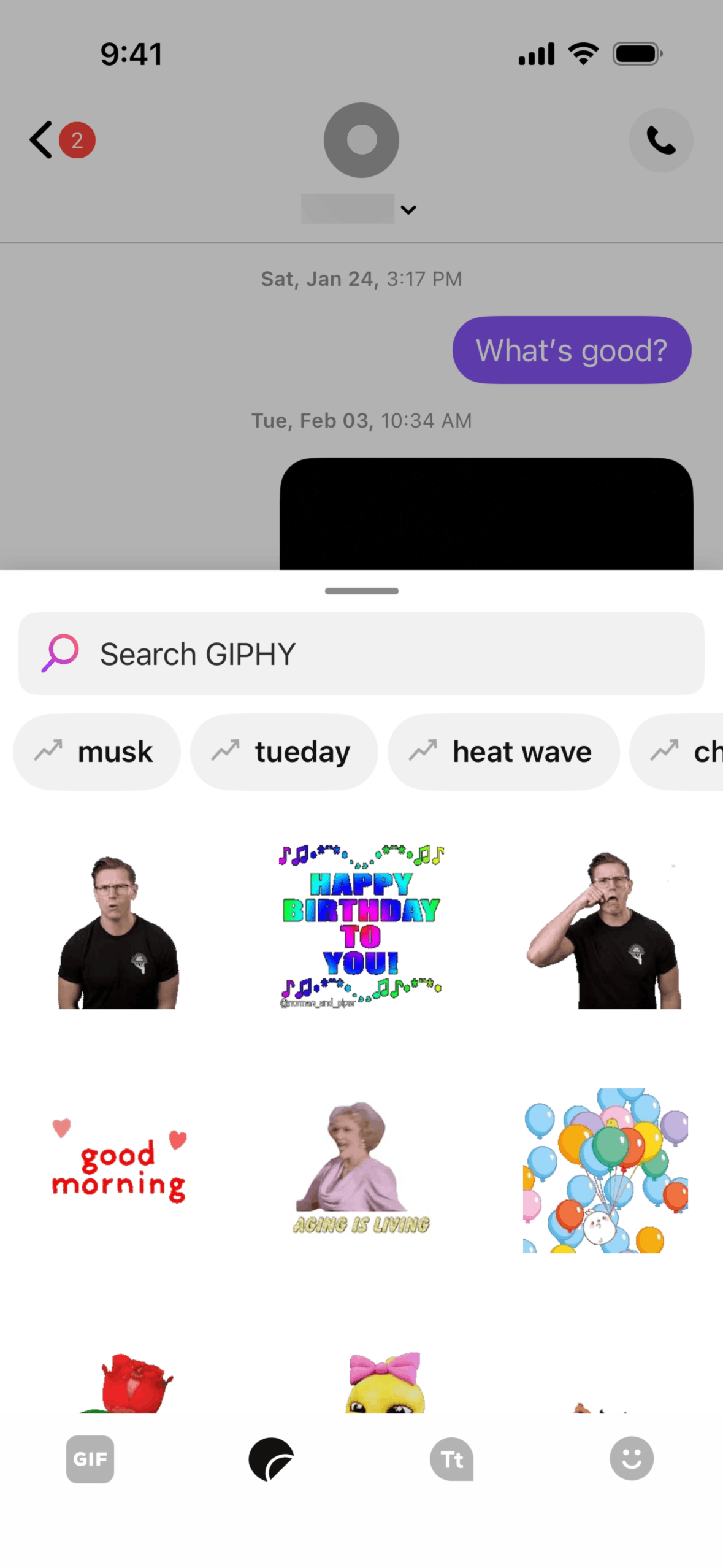
- Media sharing (photos, GIFs) with preview thumbnails
- Ad placement between conversations in the inbox, not within individual chats
- Group messaging with participant avatars
Key insight: Ads appear in the conversation list (like a "sponsored" contact), never inside an active conversation. This preserves the intimacy of 1-on-1 messaging.
Phone & Calling
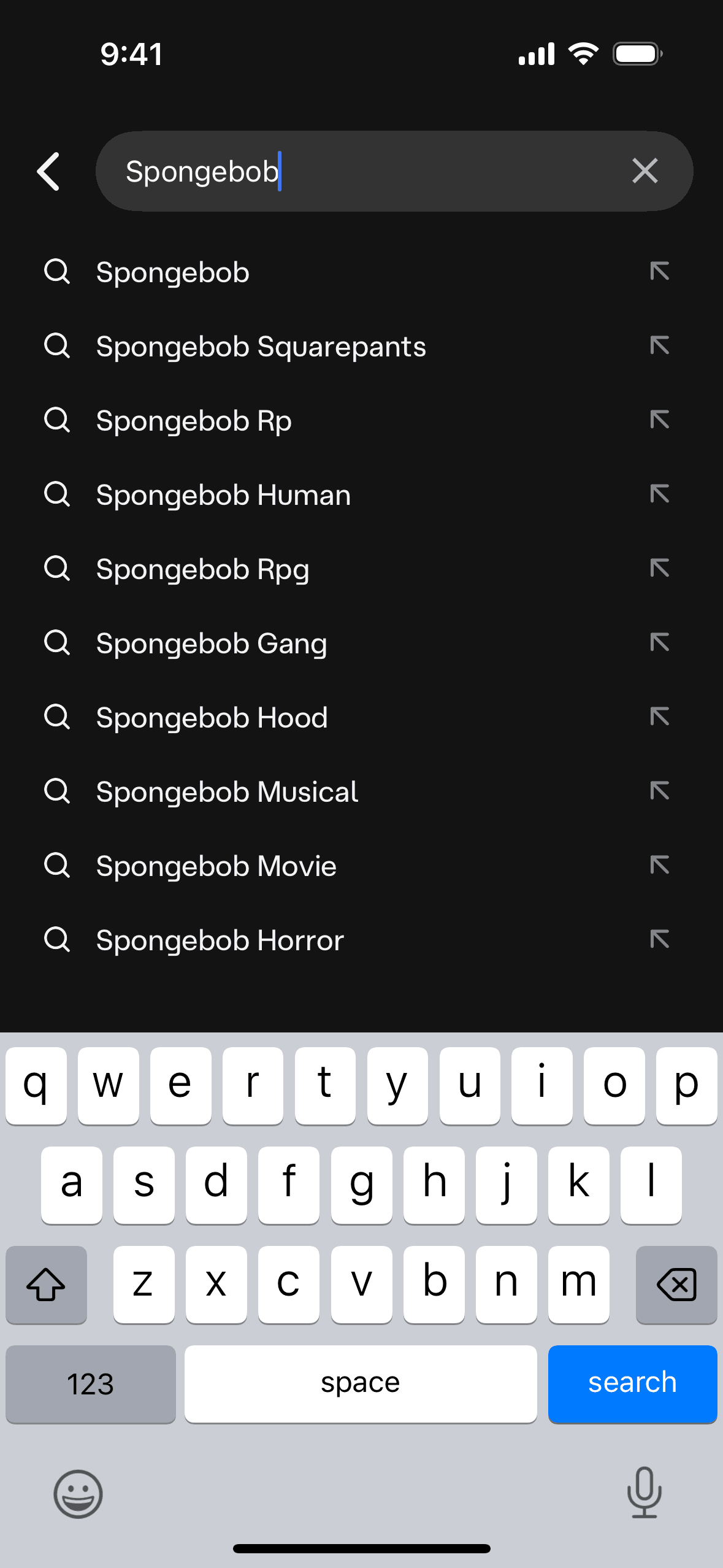
The dialer and call interface is clean and functional:
- Standard T9 dialer with contact search
- Call screen with large, accessible buttons
- Voicemail with visual voicemail transcription
- Call history with contact grouping
Settings & Account
TextNow's settings reveal the business model complexity — free users see upgrade prompts, while the settings themselves are straightforward:
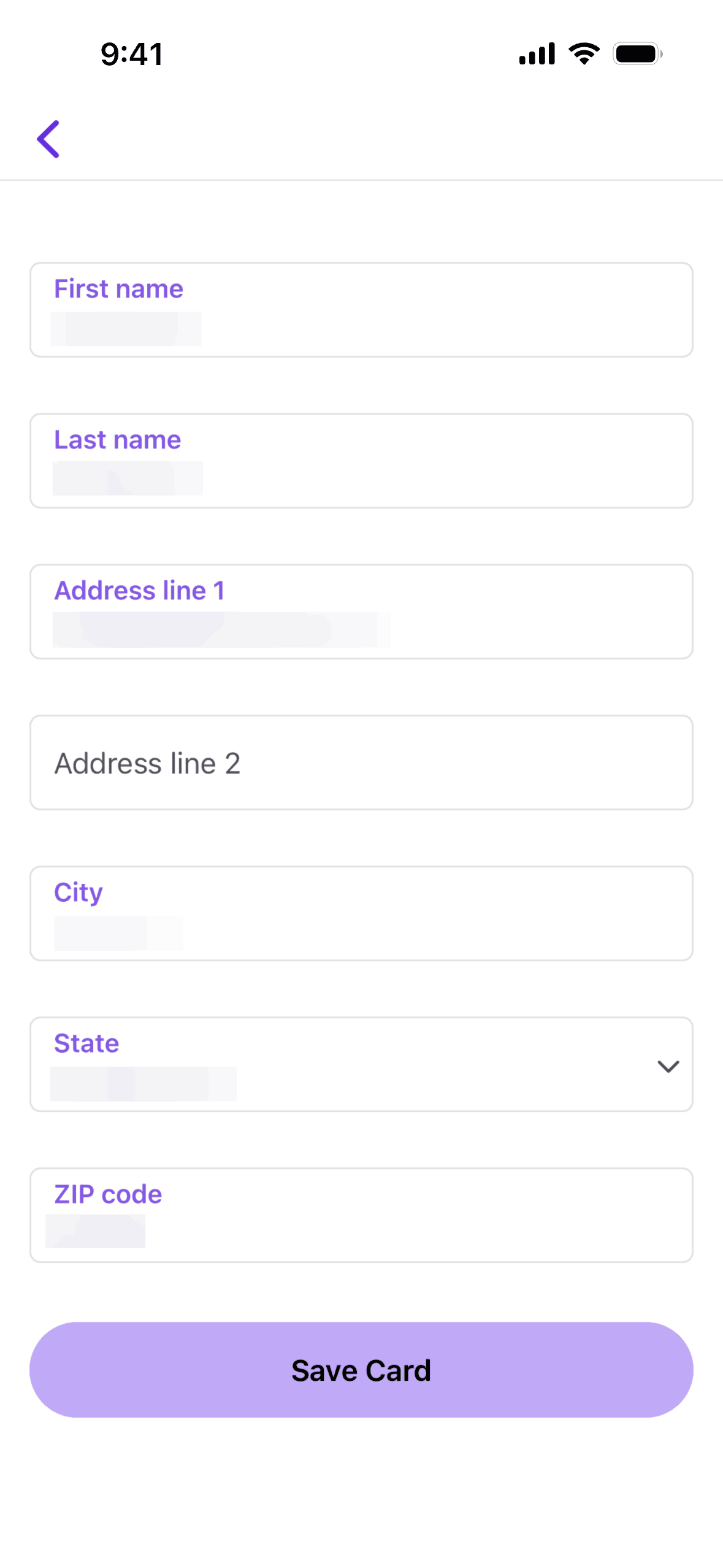
- Account management with phone number display
- Notification preferences
- Ad preferences and premium upgrade CTAs
- Privacy and blocking controls
What Other Apps Can Learn
- Monetize around, not within — Placing ads in list views rather than content views preserves the core experience quality.
- Match platform conventions — TextNow's iOS app looks like iOS Messages. Users don't need to learn a new interface.
- Upgrade paths, not walls — Free features work fully. Premium removes ads and adds features. The free product is genuinely useful.
Browse TextNow's full interface — See all TextNow app screenshots →
Related:
Founder of Gummble. I build and maintain the Gummble catalog — UI screenshots and UX flows from 1,500+ real iOS, Android, and web apps — and write about the design patterns I see across them.
About Azura →See these patterns in action
Browse 1,500+ apps across shipped iOS, Android, and web products.
Browse the Library →