Locket App UI Breakdown: Designing Intimacy on iOS
Deep-dive into the locket app UI: widget design, onboarding, and send flow. Design patterns from one of the most intimate and personal apps on iOS.
Most social apps are built on the same implicit promise: more followers, more reach, more content. Locket went the opposite direction. Its entire premise is a single, almost radical constraint — photos from the people you love, delivered directly to your iOS home screen widget, with no algorithm, no likes, and no strangers.
That constraint is also a design brief. The locket app UI has to earn home-screen real estate, earn camera access, and earn daily habits — all without a feed, a follower count, or any of the usual engagement scaffolding. When your product surface is a widget that can't be tapped, your social graph is capped at a handful of close contacts, and your bar is intimacy rather than entertainment, every design decision carries more weight than it would in a broadcast-social product.
This breakdown examines how Locket earns that trust through its onboarding, how it keeps daily sending frictionless enough to become a habit, how it works around the hard constraints of iOS widgets, and where it quietly monetizes without breaking the spell. If you build consumer apps — especially anything involving social graphs, permissions, or habitual engagement — there's a lot here to study.
The Design Problem Locket Solves
The iOS home screen is the highest-value real estate on any smartphone. Users see it dozens of times a day. Every icon on it has survived an implicit curation process — most downloaded apps never make it off the App Library. To place a widget on someone's home screen is to claim a piece of attention that no notification can match, because the widget is always there, not delivered.
Locket understood something most social apps miss: the home screen isn't a distribution channel, it's a relationship surface. The people whose photos land on your home screen are the ones you're choosing to think about every time you unlock your phone.
This creates a fundamentally different design problem than building for broadcast social:
- Scale of the social graph: Most users share with two to five people. There is no feed optimization problem to solve, no recommendations engine, no follower count to surface.
- Relational stakes per interaction: A photo from a long-distance partner or a best friend carries more weight than a post to five hundred followers. The UI has to match that weight without becoming heavy or slow.
- The widget engagement model: Traditional apps compete for active session time. Locket competes for passive presence — the feeling of someone being with you even when the app is closed. That shifts the success metric from DAU session length to widget impression frequency and photo send rate.
- Trust and access: To do its job, Locket needs your home screen layout, your camera roll, and your contacts. Earning those permissions from a first-time user requires a different kind of onboarding than a productivity app asking for push notifications.
The design system Locket built around these constraints is worth unpacking layer by layer.
Onboarding — Earning Permission for the Most Valuable UI Surface
Locket's onboarding is doing more work than most. It has to accomplish three things before a user sees any value from the product:
- Set up an iOS widget (a clunky, multi-step process that happens entirely outside the app in the iOS home screen editing mode)
- Grant camera and contacts access
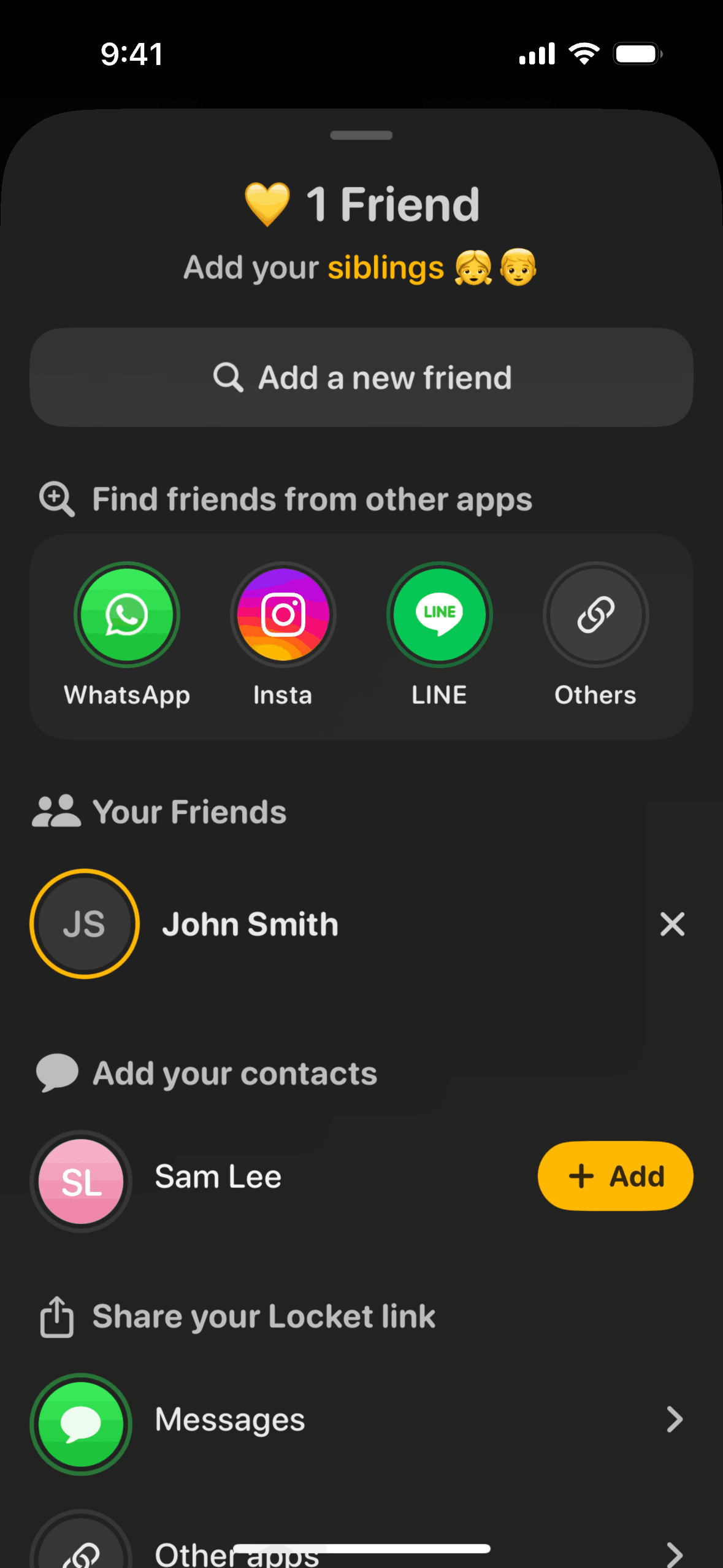
- Invite at least one other person — because the product literally does not work without a second user
That's a high friction path. Locket manages it with a few consistent techniques.
Motivation before each permission gate. Before every system dialog — camera access, contacts, widget setup — Locket shows its own interstitial screen explaining what the permission enables and showing the personal outcome, not the technical one. "See photos from your partner on your home screen" lands differently than "Allow camera access." The design invests a full screen in each motivation moment rather than firing the system prompt cold.
Visual preview of the end state. The widget preview shown during onboarding gives users a concrete picture of what their home screen will look like once setup is complete. The widget is unfamiliar to many users — seeing the finished state transforms an abstract permission into a legible goal.
The invite step as activation. Requiring a friend invite isn't a dark pattern here — it's structural. Locket communicates this honestly: the app needs someone on the other end. The invitation design treats this as an exciting moment rather than a chore, using a pre-written message users can send directly from the share sheet. Framing the invite as "bring your person in" rather than "we need you to recruit" changes the tone entirely.
Widget setup scaffolding. The iOS widget setup flow is entirely outside Locket's control — it involves long-pressing the home screen, entering jiggle mode, finding the Locket widget, and positioning it. Locket responds with an animated step-by-step guide shown inside the app before the user leaves — as close to in-context guidance as the iOS sandbox allows.
The result is an onboarding that feels coached rather than interrogative. Each permission moment is preceded by a reason, and each step has a visible next-step, so users rarely hit a dead end and wonder what happens next.
Camera and Sending Flow — Speed as Habit Design
Once onboarded, the core interaction is simple: open the app, take a photo, send it. The design makes this feel effortless because daily repetition requires it.
Camera-first entry. Locket opens directly to the camera. There is no feed, no notification tray, no social graph to navigate before you can capture something. The app's homepage is the shutter. This is a deliberate habit-engineering choice — removing any friction between the decision to share and the act of sharing reduces the likelihood that a user will abandon the flow mid-intention.
Lightweight capture. The camera UI is stripped back. No filters, no editing suite; text or emoji overlays may be available depending on the version, but the default flow is shutter-to-send. The brevity is part of the value proposition — Locket photos are supposed to feel like a text message, not a curated Instagram post. The low production bar is a feature.
Contact selection as intimacy signaling. Because the social graph is tiny, the recipient picker isn't a search-through-followers experience — it's a small list of faces. Choosing who to send to feels like a deliberate act rather than a broadcast. The UI makes this visible: each recipient gets a clear confirmation before the photo sends.
Send confirmation as reward. After sending, Locket gives a small visual confirmation that the photo was sent successfully. This micro-feedback loop closes the habit cycle — send, confirm, imagine your person seeing it — and it's the kind of detail that drives repeated behavior without needing a notification to prompt it.
Locket App UI: The Widget as Core Surface
The widget is the entire product, which makes it the strangest constraint in the design stack. iOS widgets are not interactive in any meaningful sense — they can't respond to swipes, can't animate freely, can't pull live data on demand. They're more like a digital photo frame with a refresh schedule than a live UI surface.
Locket's response to these loading and refresh constraints is elegant:
Filling the frame. The widget displays the most recently received photo as a full-bleed image with minimal chrome — just the sender's name in small text. This maximizes the impact of the photo itself and turns the widget into something that feels personal rather than app-like.
Managing refresh expectations. iOS controls how often widgets refresh, and Locket can't override this. Rather than fighting the constraint, the design treats each widget update as a moment of small surprise — you unlock your phone and there's a new photo. The unpredictable timing, within limits, is closer to receiving a message than watching a feed. This is an unusual example of a technical limitation enhancing the intimate feel of the product.
Tap-to-open behavior. Tapping the Locket widget opens the app to the full received photo with any attached reactions. The widget is the teaser; the full-screen in-app view is the payoff. This progression from passive widget impression to active app engagement is how Locket converts widget views into app sessions.
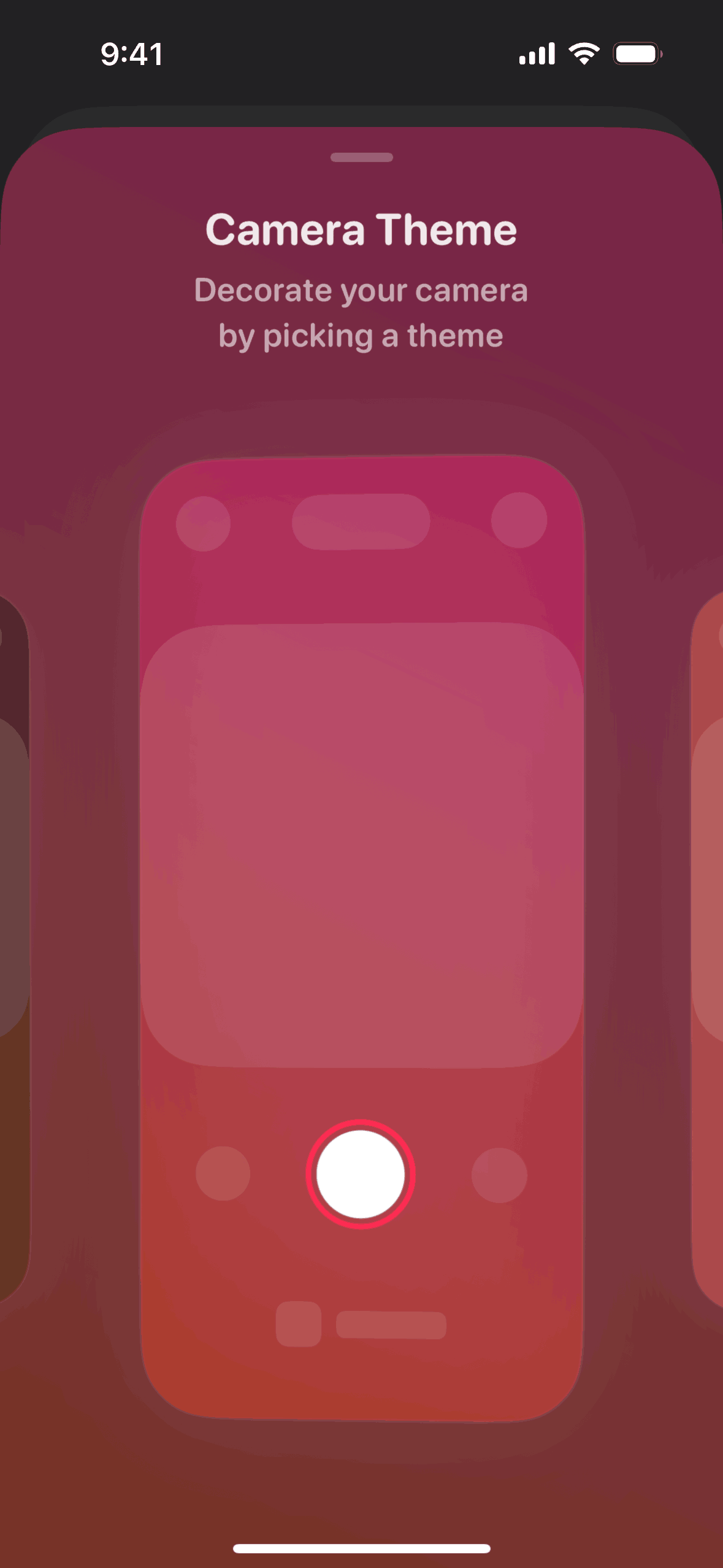
Size tiers. Locket supports small, medium, and large widget sizes. Each is designed for the photo to fill it completely, and the larger variants can show multiple recent photos — in some versions a collage layout — making the widget feel more alive across a day of sharing.
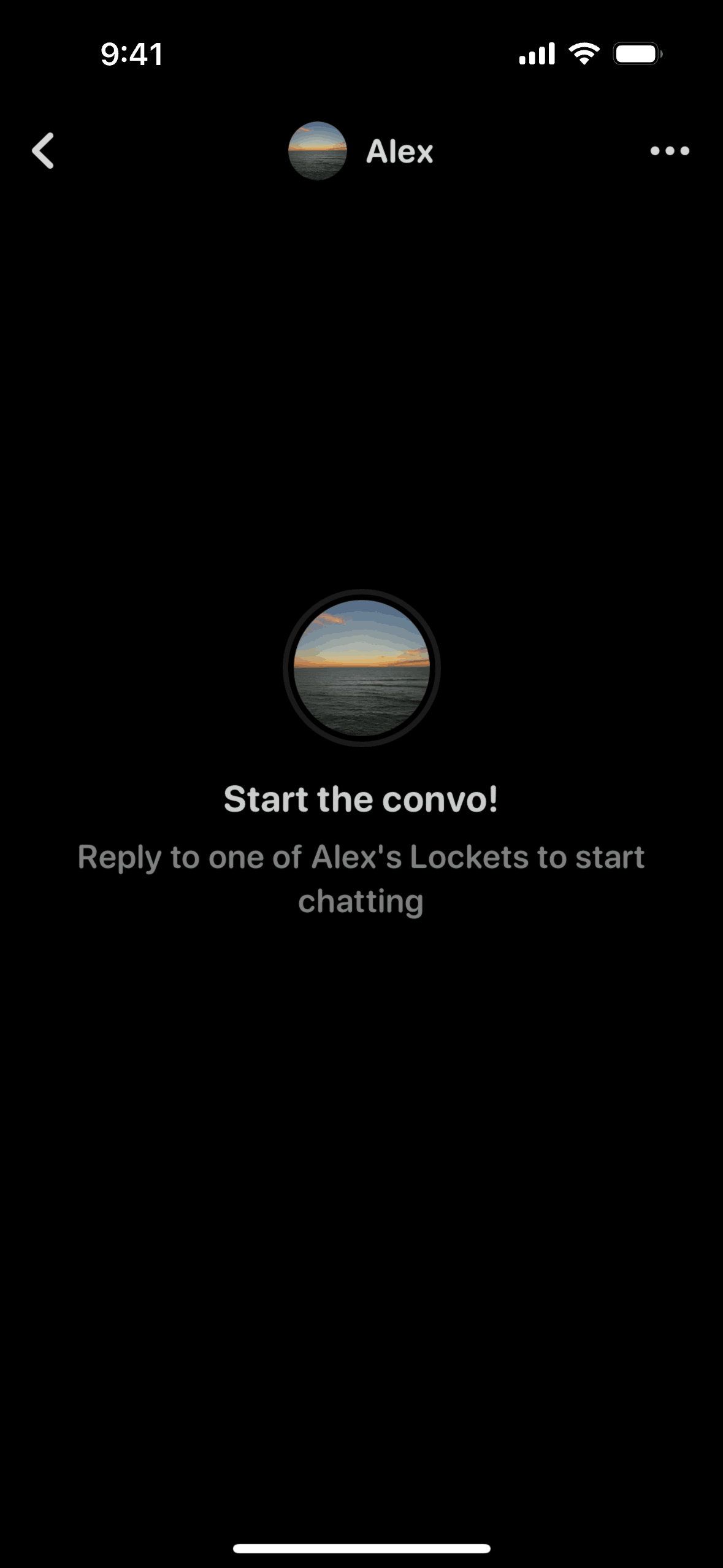
Inbox and Feed — Keeping the Loop Going
Locket's in-app feed is secondary to the widget but important for maintaining the two-way relationship.
Received photos as a timeline. The app keeps a history of photos exchanged with each person. This is less a social feed and more a shared photo album — browsable, personal, and sorted by recency. The design doesn't impose any algorithmic reordering or ranking; chronological is correct here because recency and sequence matter to close-social memory.
Reactions and messaging. Locket allows emoji reactions and short replies to received photos. The notifications from these reactions are the primary re-engagement driver — when someone reacts to your photo, the notification itself is a genuine reward. The UI surfaces reactions in-line on the photo rather than in a separate comment thread, which keeps the experience feeling immediate rather than forum-like.
Read receipts and delivery status. Knowing that a photo was received closes the feedback loop in a way that email-style delivery receipts never managed. This level of visibility is appropriate in a two-person sharing context and would feel invasive in a broadcast-social one. Scale of the social graph determines what counts as privacy-respecting transparency.
Monetization UI — Locket Gold
Locket's freemium model, called Locket Gold, is a good example of paywall design timed to emotional investment.
When the paywall appears. The upgrade prompt does not appear during onboarding. It surfaces after a user has already exchanged photos with a close contact — after the product has delivered its core value. By the time you see Locket Gold, you already understand why you'd want more of this.
What's gated. Locket Gold has included features like multiple active widgets, video sharing, custom widget frames, and extended photo history — though the exact set changes over time, so check the current App Store listing or the Locket screens on Gummble for what's available now. The gating logic is careful: the core experience — one widget, photo sharing, reactions — is free. The paid tier extends the canvas rather than paywalling the value proposition itself.
Visual design of the upgrade flow. The Locket Gold paywall uses warm, personal visual language consistent with the rest of the app — it does not switch into a "sales mode" aesthetic with dark gradients and countdown timers. The pricing is presented clearly, the benefits are specific, and the CTA is a single tap. The design trusts that a user who is already invested in the product doesn't need to be pushed.
Subscription pricing. Locket Gold sits in the impulse-purchase tier — the kind of subscription you approve quickly when you already love the product, rather than deliberating over. The pricing strategy converts on momentum rather than feature comparison.
4 Design Patterns for Your Own Close-Social or Widget Product
Synthesizing what makes Locket's design work, here are the principles most transferable to other products:
1. Claim the passive surface, not just the active session. If your product can live somewhere other than an active app session — a widget, a lock screen, a notification badge — design for that surface first. Locket's widget is where most of its value is delivered, not inside the app. Ask which passive surfaces your product could inhabit and what the minimum viable design for that surface looks like.
2. Design the empty state for the solo user, because you will always have solo users. Locket is worthless without at least one other person on the platform. This is a harder version of the standard empty-state problem. The design has to simultaneously acknowledge that the app doesn't work yet and motivate the user to take the action that will make it work — inviting someone. An empty widget that says "Waiting for a photo from your person" is better than a generic "Nothing here yet" because it describes the desired future state, not just the absence of data.
3. Earn permissions with motivation, not just explanation. Users on mobile have learned to distrust permission prompts because most apps ask for everything upfront and explain nothing. Locket's approach — one screen of motivation for every system dialog — is the right model for any product asking for high-trust access like contacts, camera, or location. The motivation screen should describe the personal or functional outcome, not the technical capability being granted.
4. Keep the core loop under three taps. For a habit-forming product, the core action — in Locket's case, taking and sending a photo — has to be fast enough that a user can complete it on impulse. Every additional tap in the critical path is an opportunity for abandonment. Camera-first, minimal editing, one-tap send. Count your taps and cut ruthlessly.
Study Locket's Screens on Gummble
If you want to see the actual UI patterns described here — widget previews, onboarding permission gates, camera flow, paywall design — the Locket collection on Gummble has curated screenshots from the app organized by screen type. It's a faster reference than reinstalling the app yourself, and it sits alongside comparison apps if you want to see how other close-social or widget-first products handle the same design problems. Gummble is a Mobbin alternative with screenshots from over 1,500 iOS and web products.
See also: What makes great app onboarding · Top onboarding screen designs · Focus app UI design breakdown
Want more design inspiration? Browse 1,500+ curated apps on Gummble — with screenshots from the world's best iOS and web products.
The Gummble editorial team curates UI design inspiration from thousands of real iOS and web apps. We write about design patterns, trends, and the craft of shipping great interfaces.
Follow on Twitter →See these patterns in action
Browse 1,500+ curated apps from the world's best iOS and web products.
Browse the Library →