Focus App UI Design Breakdown: Opal, QUITTR & Fabulous (2026)
How do you design friction that feels helpful, not annoying? We break down the UI of three focus and habit-change apps — Opal, QUITTR, and Fabulous — and the screen-time, streak, and onboarding patterns worth stealing.
Designing Friction That Feels Helpful
Most apps fight for your attention. Focus apps do the opposite — they exist to take attention away. That inverts almost every rule of consumer UX. A great focus or habit-change app has to interrupt you, restrict you, and sometimes outright block you, all while feeling like it's on your side rather than nagging you.
That's a genuinely hard design problem, and a small group of apps have gotten very good at it. We pulled three of the best-designed examples from our library — Opal, QUITTR, and Fabulous — and broke down what each does at the screen level. If you're building anything in productivity, wellness, recovery, or habit-tracking, these are the patterns worth copying.
What Makes Focus App UI Unique
Before the breakdowns, it helps to name the design constraints these apps share:
- The interruption moment. The most important screen in a focus app is the one a user sees when they're trying to do the thing you're helping them avoid. That moment has to feel like a gentle hand on the shoulder, not a slammed door — or users just uninstall.
- Permission-heavy onboarding. Screen-time and blocking apps need OS-level permissions (Screen Time, Focus modes, notifications, sometimes a VPN profile). Every permission prompt is a drop-off cliff, so the onboarding has to earn each one.
- Progress as the product. With no content feed to scroll, the dashboard is the experience. Streaks, timers, and progress visualizations carry the emotional weight that a media app gets from its content.
Keep those three in mind — every pattern below is a response to one of them.
1. Opal — Making Blocking Feel Premium
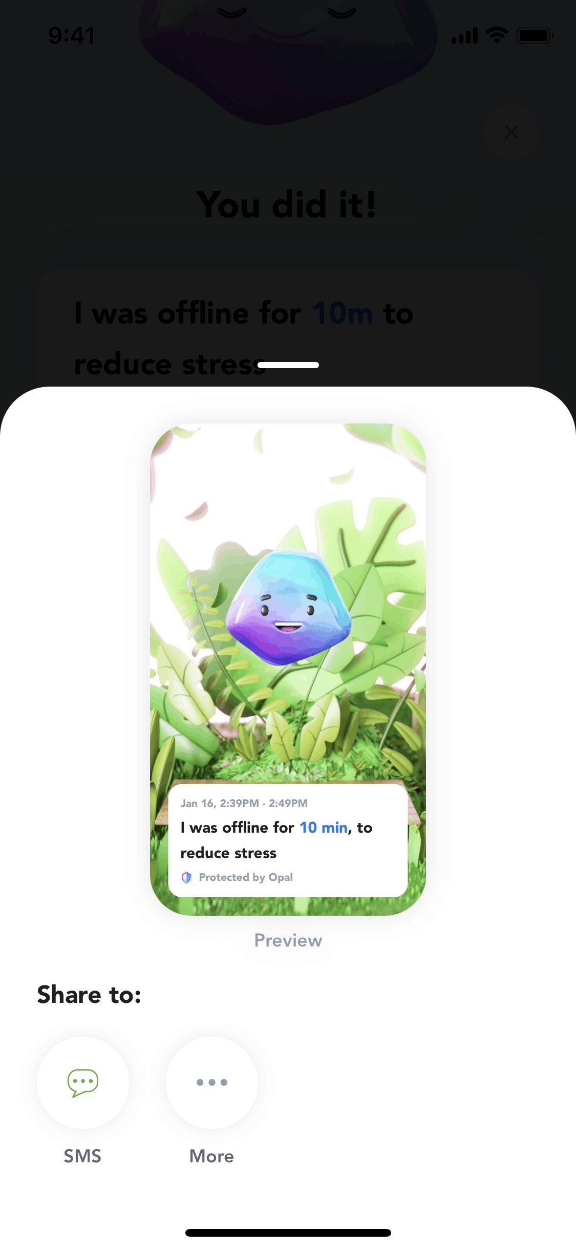
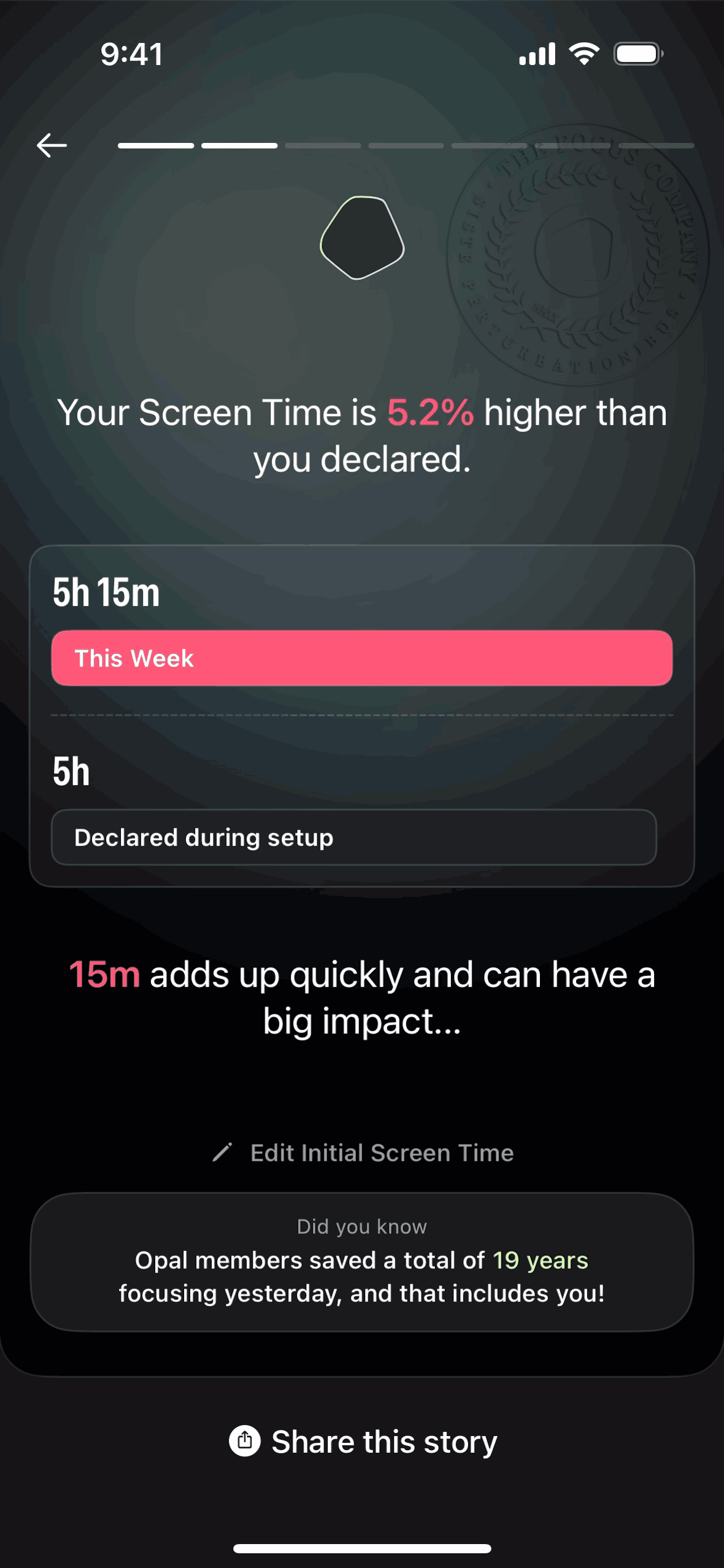
Opal is a screen-time and app-blocking tool, and its whole design thesis is that restriction can feel aspirational. Where most blockers look like system utilities, Opal looks like a high-end wellness product — soft gradients, generous whitespace, calm typography.
Onboarding flow: Opal front-loads the "why" before the "allow." It walks users through their current screen-time reality (often an uncomfortable number) before asking for the Screen Time permission. By the time the system prompt appears, the user is motivated rather than suspicious — a textbook example of earning a permission instead of demanding it.
The session screen: The core "focus session" screen leads with a live timer and a single, unmissable primary action. During a session, the UI gets quieter — fewer controls, more breathing room — reinforcing the calm it's trying to create.
Progress visualization: Opal turns abstract discipline into something you can see: focus scores, streaks, and trend charts that make "I used my phone less this week" feel like a win worth protecting.
Takeaway for designers: Match your visual language to the feeling you want the behavior to have. Opal makes self-control feel premium, and that emotional reframe does more work than any feature list. Study its flow on the onboarding and paywall pattern pages.
2. QUITTR — Gamification Meets Accountability
QUITTR is a recovery and habit-quitting app, and its UI leans hard into two forces that genuinely change behavior: streaks and accountability.
The streak counter as hero metric: The home screen is built around one number — days since you started. It's large, central, and emotionally loaded. Everything else on the screen exists to protect that number, which is exactly the right hierarchy for a habit-change product.
The panic / urge moment: QUITTR's most important design decision is a prominent, always-reachable "urge" button — the interruption moment done right. When a user is about to slip, the app is one tap from an intervention (breathing, a pledge, a distraction). Designing for the worst moment, not the average one, is what makes recovery apps work.
Social proof and progress framing: Community stats, milestones, and "brain rewiring" progress charts reframe a hard process as forward motion. Negative space is used deliberately here — uncluttered screens keep a stressed user calm instead of overwhelmed.
Paywall placement: QUITTR is also a sharp case study in paywall timing — the upgrade prompt lands after the user has felt the product's value and made an emotional commitment, not before.
Takeaway for designers: Build your hierarchy around the one number the user is emotionally invested in, and design your highest-stress screen first. The "urge button" pattern generalizes to any app with a moment of temptation or churn risk.
3. Fabulous — Behavior Science as Interface
Fabulous is a habit and routine-building app (originally incubated out of a behavioral-science lab), and its UI is a masterclass in warmth. Where Opal is premium-minimal and QUITTR is high-stakes, Fabulous is encouraging — illustrated, letter-like, almost coaching you by hand.
Journey-based onboarding: Instead of dumping a dashboard on you, Fabulous structures the whole experience as a guided "journey" — one small commitment at a time. The onboarding reads like a conversation, using full-screen illustrated cards and second-person copy that feels written to you.
Routines, not to-do lists: Habits are grouped into morning/evening routines rather than a flat checklist, which mirrors how habits actually stack in real life. The visual rhythm of a routine — a sequence of cards you move through — turns a chore list into a ritual.
Motivational micro-moments: Completion animations, warm color, and short affirming messages reward each step. It's gamification, but emotional rather than point-based.
Takeaway for designers: Copy and tone are part of the UI. Fabulous proves that a warm, second-person voice and an illustrated journey can carry as much behavior-change weight as any feature. Browse its flow alongside other onboarding examples.
Side-by-Side: Three Approaches to the Same Problem
| | Opal | QUITTR | Fabulous | |---|---|---|---| | Emotional register | Premium, calm | High-stakes, urgent | Warm, encouraging | | Hero element | Focus session timer | Streak counter | Daily routine | | Interruption moment | Block screen during focus | "Urge" panic button | Routine reminder | | Gamification style | Scores & trends | Streaks & milestones | Animations & affirmations | | Onboarding | Permission-earning, data-led | Commitment-led | Journey / conversational | | Paywall timing | After showing screen-time reality | After emotional commitment | After first routine |
Patterns Worth Stealing
Whatever you're building, three patterns from these apps generalize beyond focus:
- Earn the permission (Opal). Show the user why before triggering an OS prompt. Motivation before friction cuts drop-off dramatically.
- Design the worst moment first (QUITTR). Find the highest-stress or highest-churn moment in your app and make the right action one tap away. The "urge button" is just a great escape hatch.
- Let copy and tone do the work (Fabulous). A second-person, encouraging voice can change behavior as effectively as any feature — and costs nothing but craft.
And one anti-pattern to avoid: never lead with restriction. All three apps establish value or motivation before they limit, block, or charge. Flip that order and your install becomes an uninstall.
See These Screens for Yourself
Reading about UI only goes so far — study the actual screens. Browse the full flows for Opal, QUITTR, and Fabulous on Gummble, or jump straight to the paywall and onboarding pattern collections to compare how dozens of apps solve the same moments.
See also: What makes great app onboarding · Top onboarding screen designs · Empty state design patterns
Want more design inspiration? Browse 1,500+ curated apps on Gummble — with screenshots from the world's best iOS and web products.
The Gummble editorial team curates UI design inspiration from thousands of real iOS and web apps. We write about design patterns, trends, and the craft of shipping great interfaces.
Follow on Twitter →See these patterns in action
Browse 1,500+ curated apps from the world's best iOS and web products.
Browse the Library →