10 Best Productivity App Designs in 2026
The best productivity app UI designs in 2026. From Superhuman to Airtable — real screenshots and design analysis of task managers, note-taking apps, and workflow tools.

10 Best Productivity App Designs in 2026
Productivity apps live or die by their UI. If a task manager adds friction, people revert to sticky notes. If a note app loads slowly, people open a text file. The bar for productivity tool design in 2026 is higher than ever — these 10 apps clear it with room to spare.
Browse all productivity app screenshots →
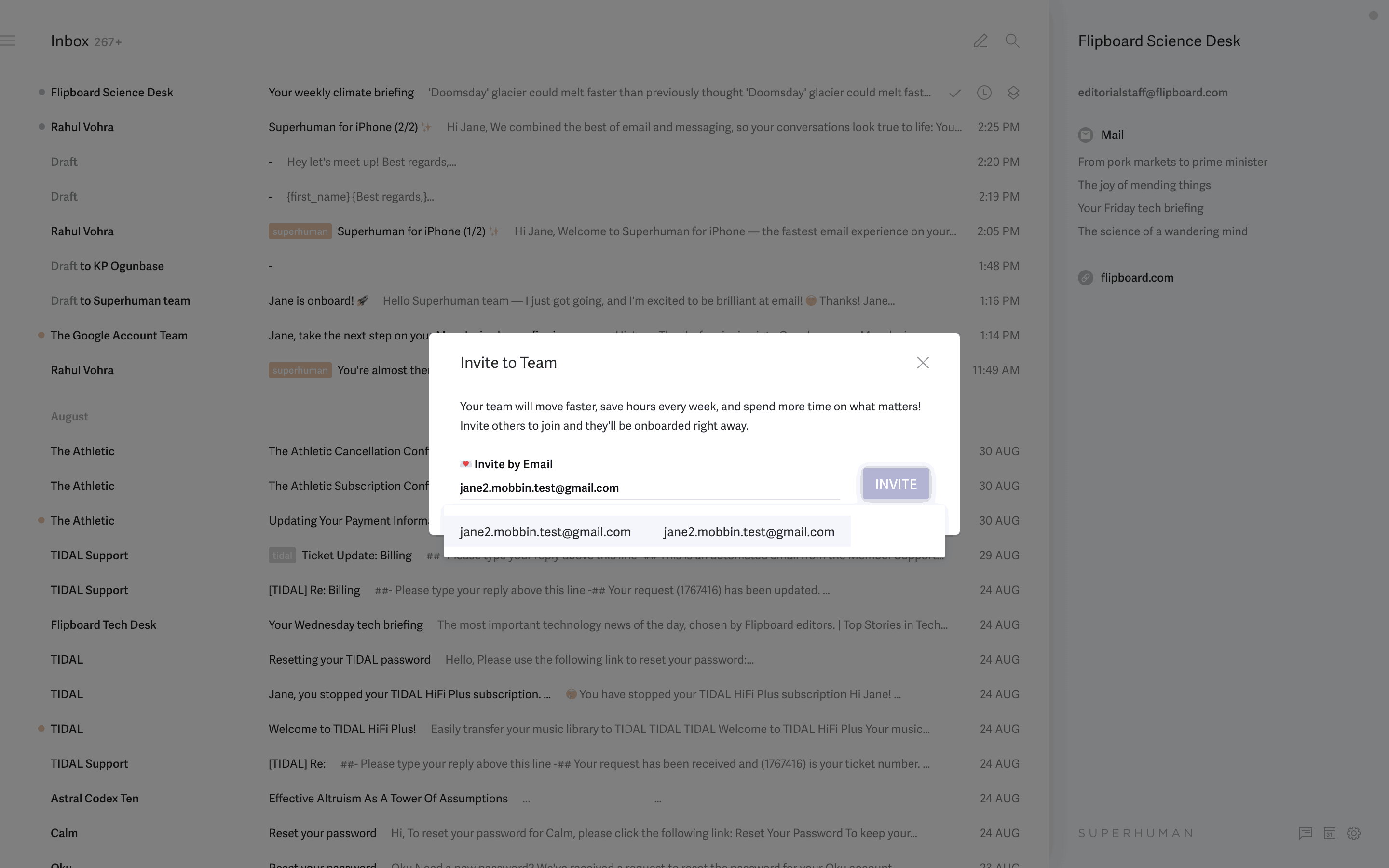
1. Superhuman
The gold standard for keyboard-first productivity. Superhuman's email client processes email 2x faster than Gmail through design alone — no AI gimmicks required (though they have those too).
Why it stands out: Command palette (Cmd+K) as primary navigation. Split-panel view with instant transitions. Keyboard shortcuts for every action. The "Superhuman speed" philosophy visible in every interaction.
Browse Superhuman screenshots →
2. Things 3
Things 3 by Cultured Code is possibly the most beautiful task manager ever made. Its design proves that "simple" and "powerful" aren't opposites.
Why it stands out: The magnetic "New To-Do" button. Drag-and-drop that feels physical. Headings as organization within projects. The "Evening" and "Anytime" scheduling concept.
3. Airtable
Airtable bridges the gap between spreadsheets and databases with a design that makes both concepts accessible. Multiple views of the same data (grid, kanban, calendar, gallery) without losing context.
Why it stands out: The field type system with 20+ data types. View switching without losing filters. The automations builder that makes workflows visual. Interface designer for building custom dashboards.
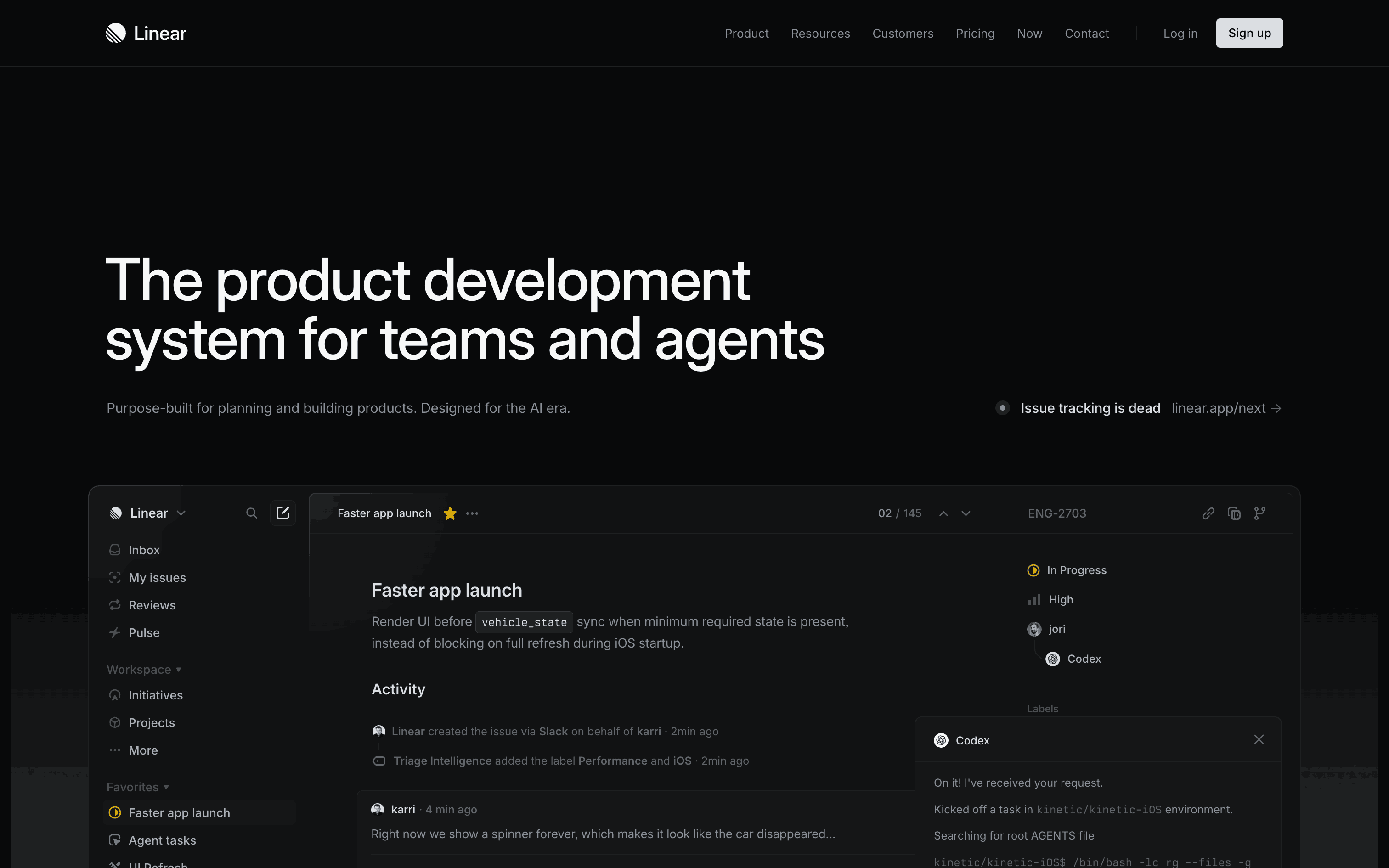
4. Linear
Linear redefined project management tool design with speed as the primary design principle. Every interaction feels instant — no loading spinners, no page transitions.
Why it stands out: Optimistic UI updates (actions appear before server confirms). Keyboard-navigable everything. The triage workflow for incoming issues. Status transitions with single-key shortcuts.
5. Craft
Craft brings document design quality to note-taking. Pages feel like designed artifacts, not plain text files. The attention to typography and spacing sets it apart.
Why it stands out: Block-based editing with drag handles. Nested pages with backlinks. The share page that generates beautiful public URLs. Native macOS/iOS feel despite being a custom renderer.
6. Notion
Notion's block-based workspace handles documents, databases, wikis, and project management in one tool. The design challenge of being "everything" without being "nothing" is handled through progressive complexity.
Why it stands out: The "/" command system. Inline databases within documents. Template gallery for jumpstarting new pages. The sidebar navigation that scales from personal notes to company wikis.
7. Raycast
Raycast replaced Spotlight as the macOS launcher of choice for developers. Its extension system turns a simple search bar into a productivity platform.
Why it stands out: Speed — results appear before you finish typing. The extension store with community contributions. Floating windows for quick actions. AI chat integrated into the launcher.
8. Figma
Figma's collaborative design tool runs entirely in the browser without sacrificing performance. The multiplayer cursor system and real-time collaboration set new standards.
Why it stands out: Multiplayer cursors with name labels. The component system with variants. Auto Layout that makes responsive design visual. Dev Mode that bridges design and engineering.
9. Todoist
Todoist has refined task management over a decade. Its natural language date parsing, project hierarchy, and cross-platform sync make it the reliable workhorse of productivity apps.
Why it stands out: Natural language input ("Buy groceries tomorrow at 3pm p1"). The karma system for habit building. Quick Add from anywhere. Filter views with custom queries.
10. Flighty
Flighty turns flight tracking into a beautiful, information-rich experience. The live flight map, delay predictions, and gate change alerts are wrapped in aviation-inspired design.
Why it stands out: The live flight progress bar with altitude data. Push notifications that arrive before airline apps. Historical on-time data for routes. The year-in-review flight map.
Productivity App Design Principles
-
Speed is a feature — Sub-100ms response times aren't optimization, they're product design. Users perceive delays as bugs.
-
Keyboard-first, mouse-compatible — Power users live on the keyboard. The best productivity apps make the mouse optional without making the keyboard required.
-
Progressive complexity — Day 1 should feel simple. Day 100 should feel powerful. The same app, different depths.
-
Offline-first mindset — Productivity doesn't stop on airplanes. The best apps work offline and sync when connected.
-
Respect for content — The interface should disappear when users are in flow. Chrome should recede; content should dominate.
Browse these productivity apps in detail. See all productivity app screenshots →
More design inspiration:
Explore Related Design Patterns
Dive into the UI patterns behind the best productivity tools:
- Dashboard design patterns → — Workspace overviews and project dashboards
- Search UI patterns → — Command palettes and universal search
- Onboarding design patterns → — Workspace setup and template selection
- Settings screen designs → — Workspace and account preferences
- Empty state designs → — New project and blank canvas states
- Login & authentication screens → — SSO and team sign-in flows
Founder of Gummble. I build and maintain the Gummble catalog — UI screenshots and UX flows from 1,500+ real iOS, Android, and web apps — and write about the design patterns I see across them.
About Azura →See these patterns in action
Browse 1,500+ apps across shipped iOS, Android, and web products.
Browse the Library →