Best Calorie Counter App Designs (2026) — UI & UX Breakdown
A design analysis of the best calorie counter and food tracking apps in 2026. Explore food logging flows, barcode scanning UX, and macro tracking interfaces.

Best Calorie Counter App Designs (2026)
Calorie counting apps are some of the most used — and most abandoned — apps on the market. The ones that survive have exceptional UX that makes food logging feel effortless. Here's what the best calorie counter apps get right in their design.
Key Design Patterns
1. Food Logging Flow
The core interaction of any calorie app is logging food. The best apps minimize taps:
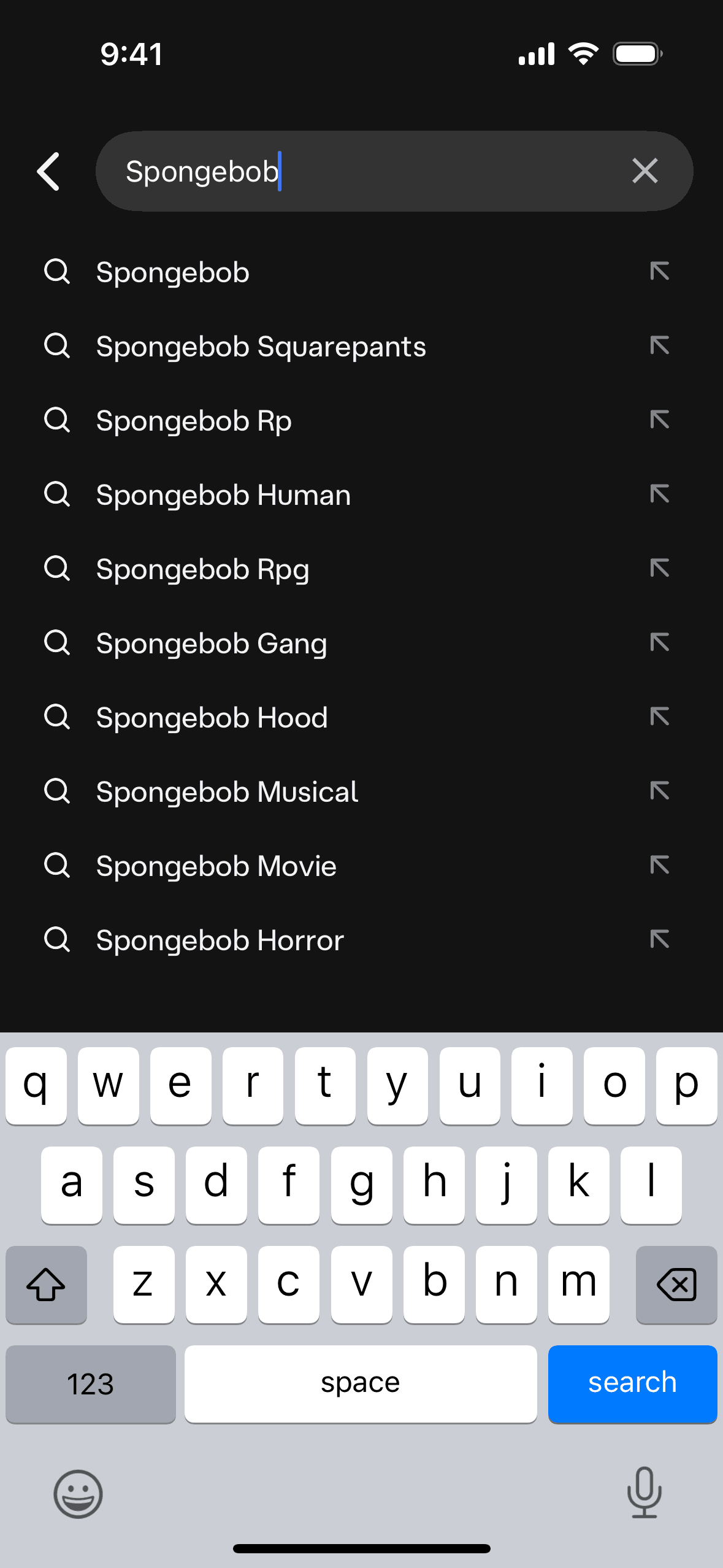
- Search with autocomplete — show popular foods as the user types
- Barcode scanning — one tap to scan, instant nutritional info
- Recent foods — the #1 speed optimization, since people eat similar meals
- Meal templates — save common meals for one-tap logging
MyFitnessPal pioneered this flow, but newer apps like Noom and Lifesum have refined it with smarter defaults and AI-powered food recognition from photos.
2. Macro Visualization
How you display calories and macros matters as much as how you log them:
- Ring/donut charts — show remaining calories at a glance
- Stacked bar charts — protein/carbs/fat breakdown
- Weekly trend lines — help users see consistency over time
- Color coding — green (under budget), yellow (close), red (over)
3. Barcode Scanner UX
The barcode scanner is a make-or-break feature. Best practices:
- Camera opens instantly — no loading screen
- Real-time overlay — show nutritional info while scanning
- Fallback search — when barcode isn't recognized, offer manual search
- Serving size adjustment — default to common portions, not 100g
Apps Worth Studying
Browse real screenshots from these calorie counter apps on Gummble:
Design Takeaways
- Speed is everything — if logging takes more than 10 seconds, users abandon the app
- Default to common portions — don't make users calculate grams
- Celebrate streaks — habit formation is the retention mechanism
- Dark theme for evening logging — many users log dinner in bed
The best calorie apps don't just track numbers — they build habits through thoughtful UX.
Explore Related Design Patterns
See more UI patterns used in health and fitness apps:
- Onboarding design patterns → — Goal-setting and personalization flows
- Dashboard design patterns → — Macro tracking and progress dashboards
- Search UI patterns → — Food search and barcode scanning UX
- Empty state designs → — First-time user experiences
- Paywall & subscription screens → — Premium feature upsell patterns
- Sign up flow examples → — Health app registration flows
Founder of Gummble. I build and maintain the Gummble catalog — UI screenshots and UX flows from 1,500+ real iOS, Android, and web apps — and write about the design patterns I see across them.
About Azura →See these patterns in action
Browse 1,500+ apps across shipped iOS, Android, and web products.
Browse the Library →