

Monzo iOS Finance interface screenshot 1
Monzo iOS Finance interface screenshot 2
Monzo iOS Finance interface screenshot 3
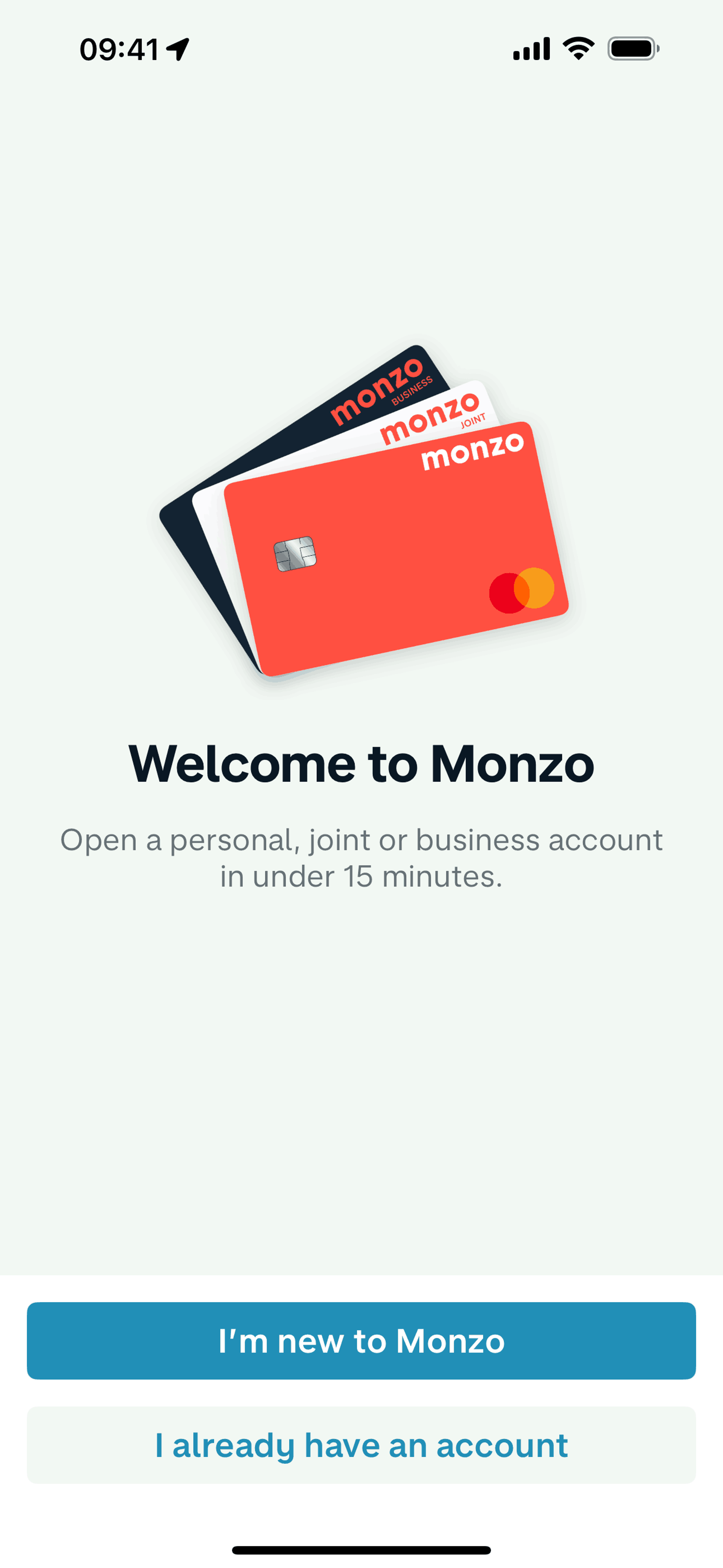
Onboarding on Monzo (ios) screen 1
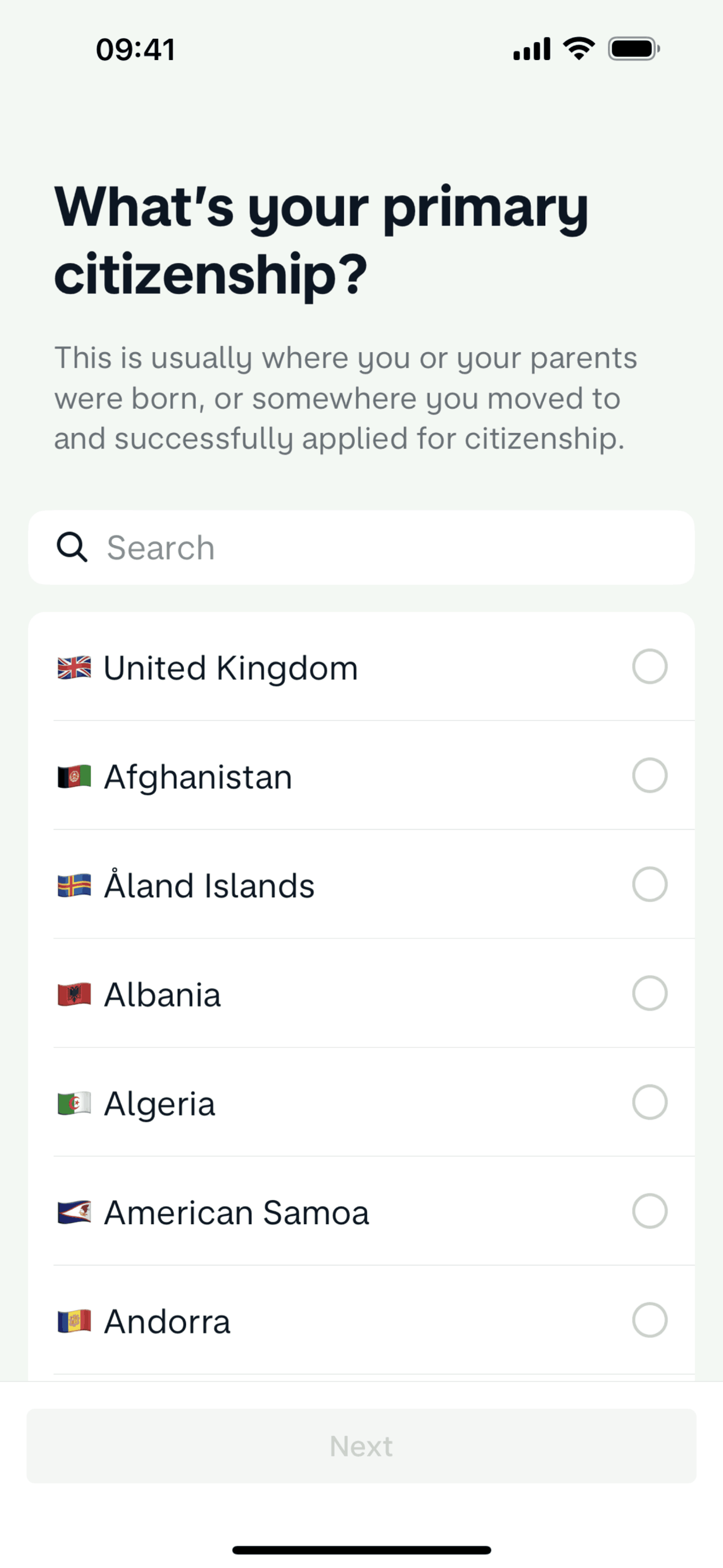
Setting up an account (About you) on Monzo (ios) screen 2
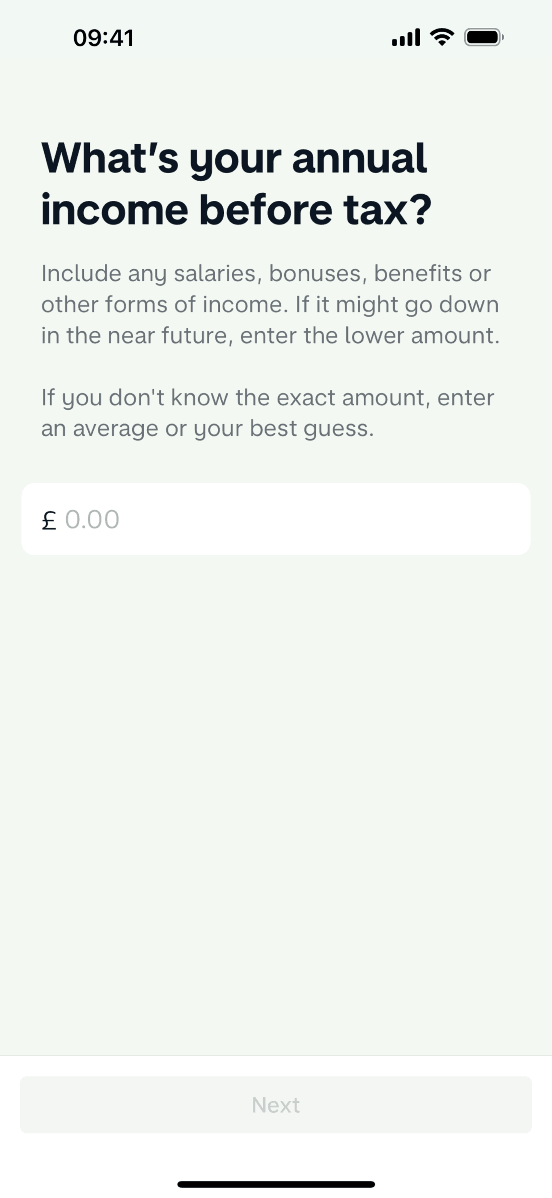
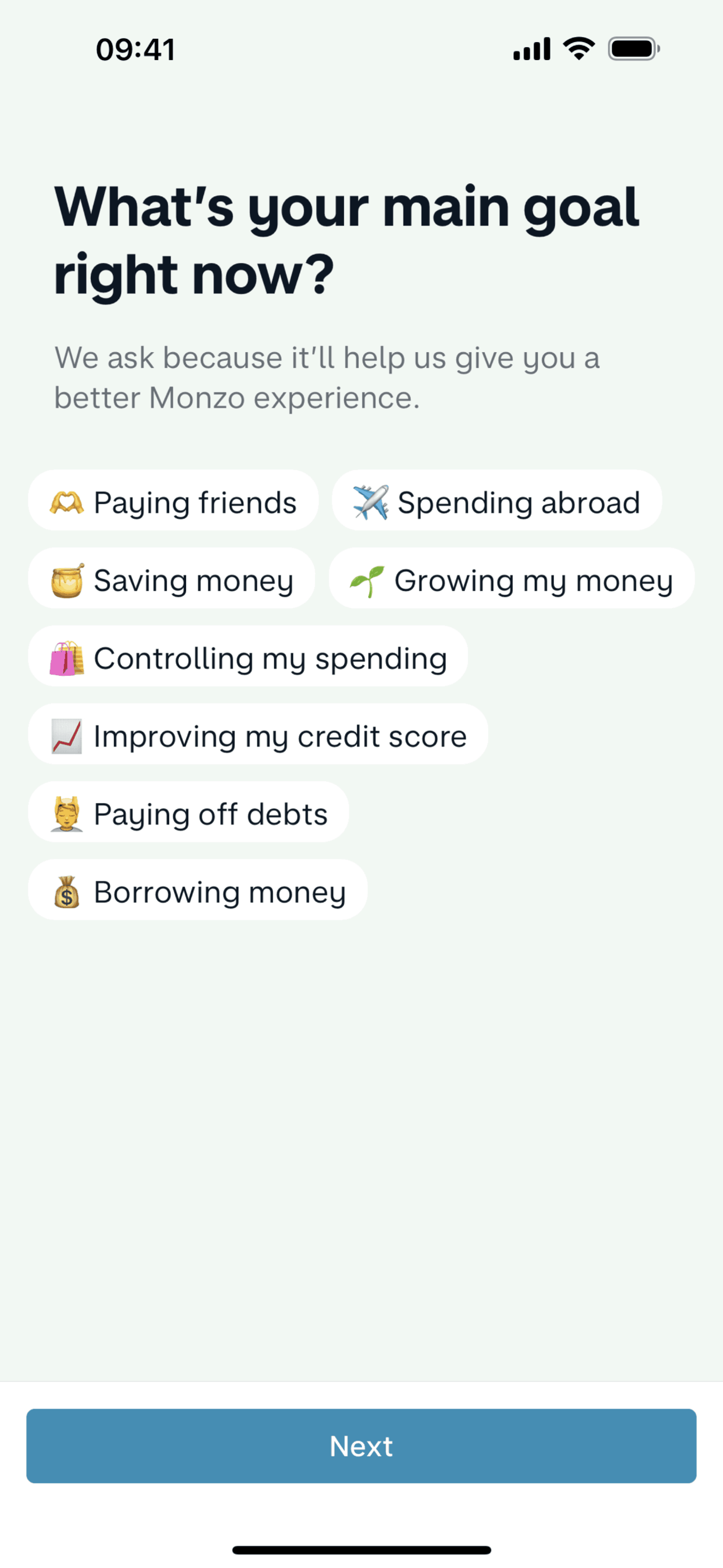
Setting up an account (Your finances) on Monzo (ios) screen 2
Setting up an account (Your account) on Monzo (ios) screen 2
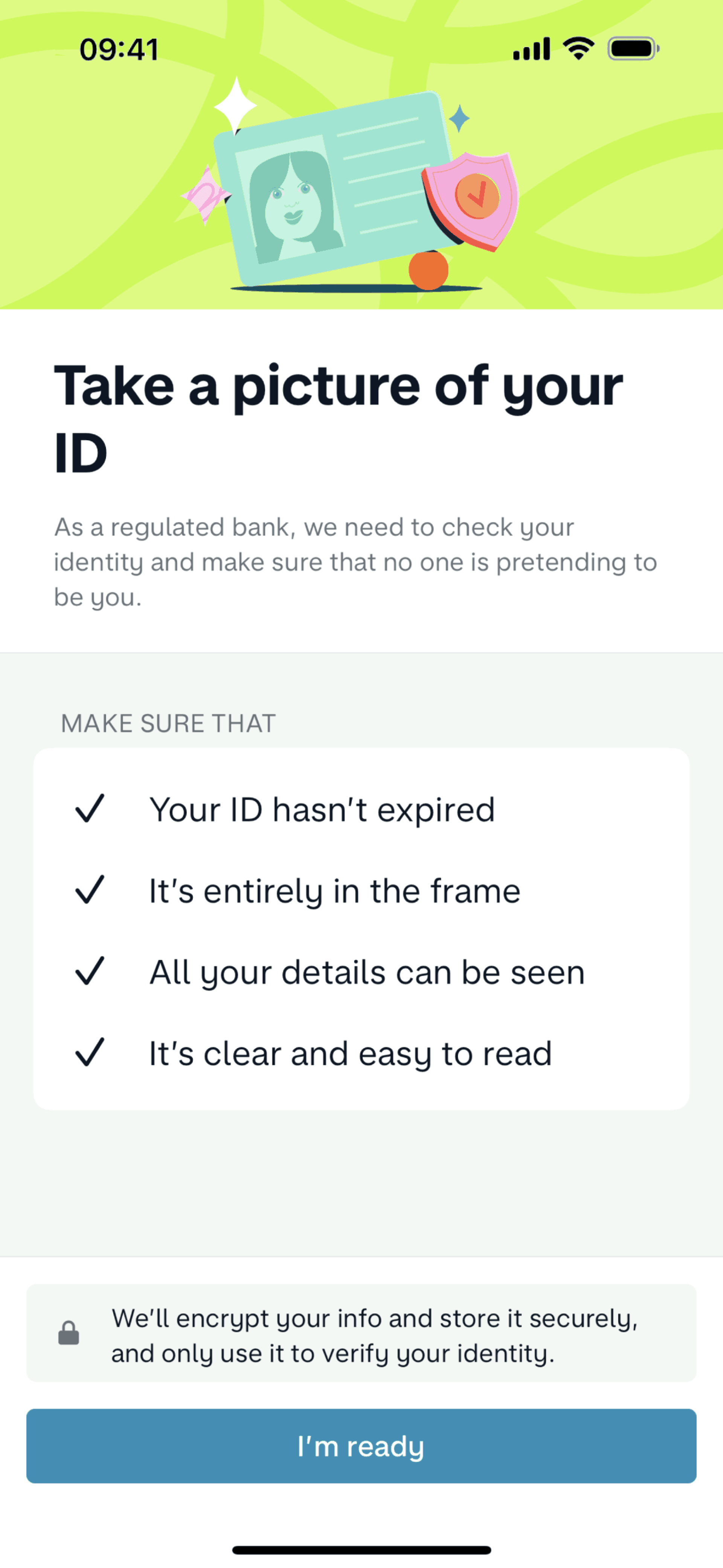
Verifying my identity on Monzo (ios) screen 2
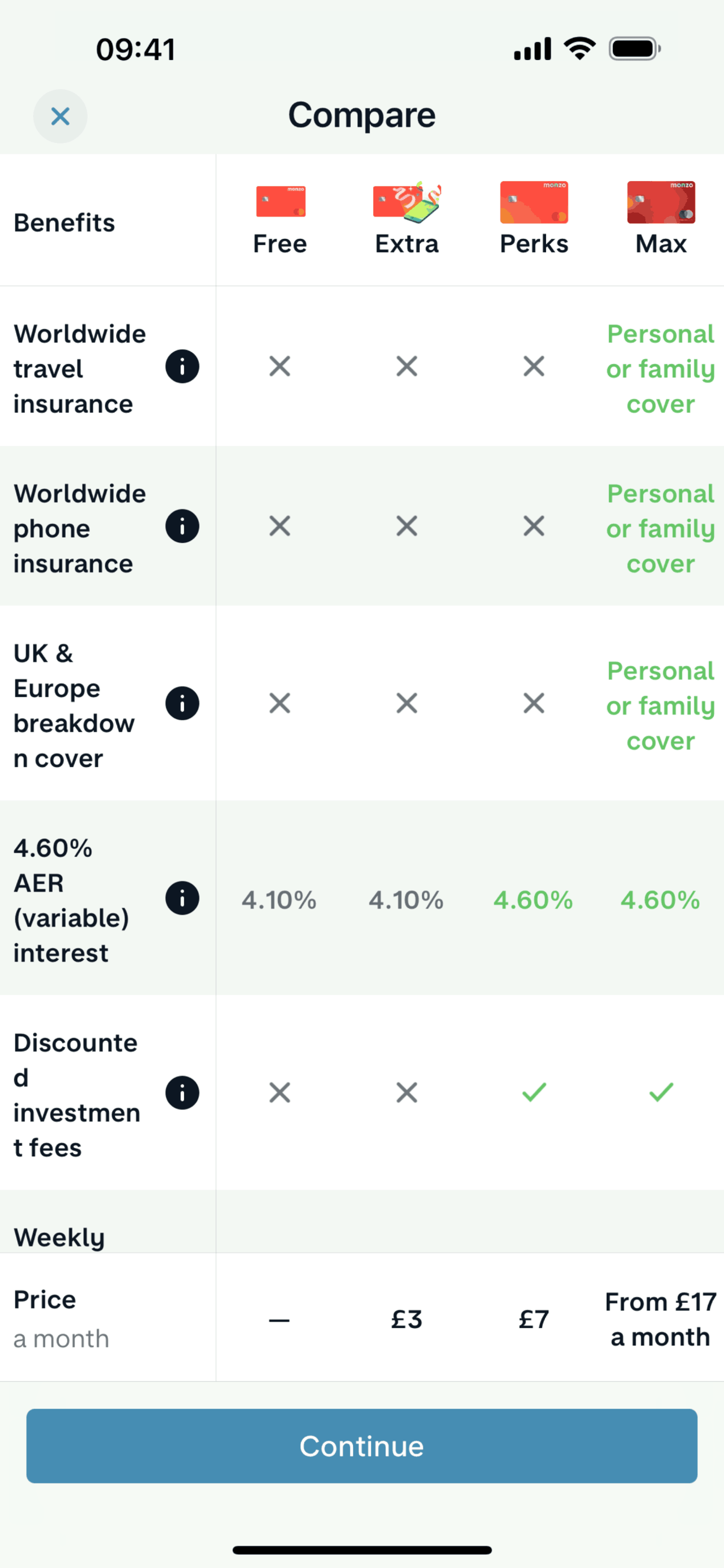
Choosing a plan on Monzo (ios) screen 2
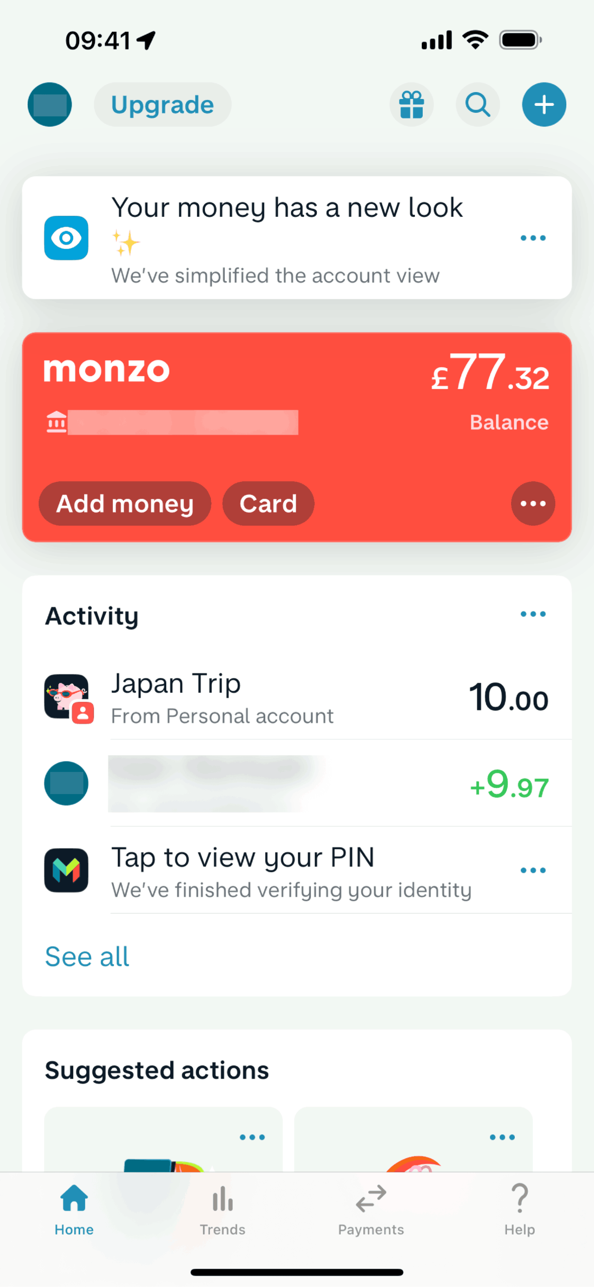
Home on Monzo (ios) screen 1
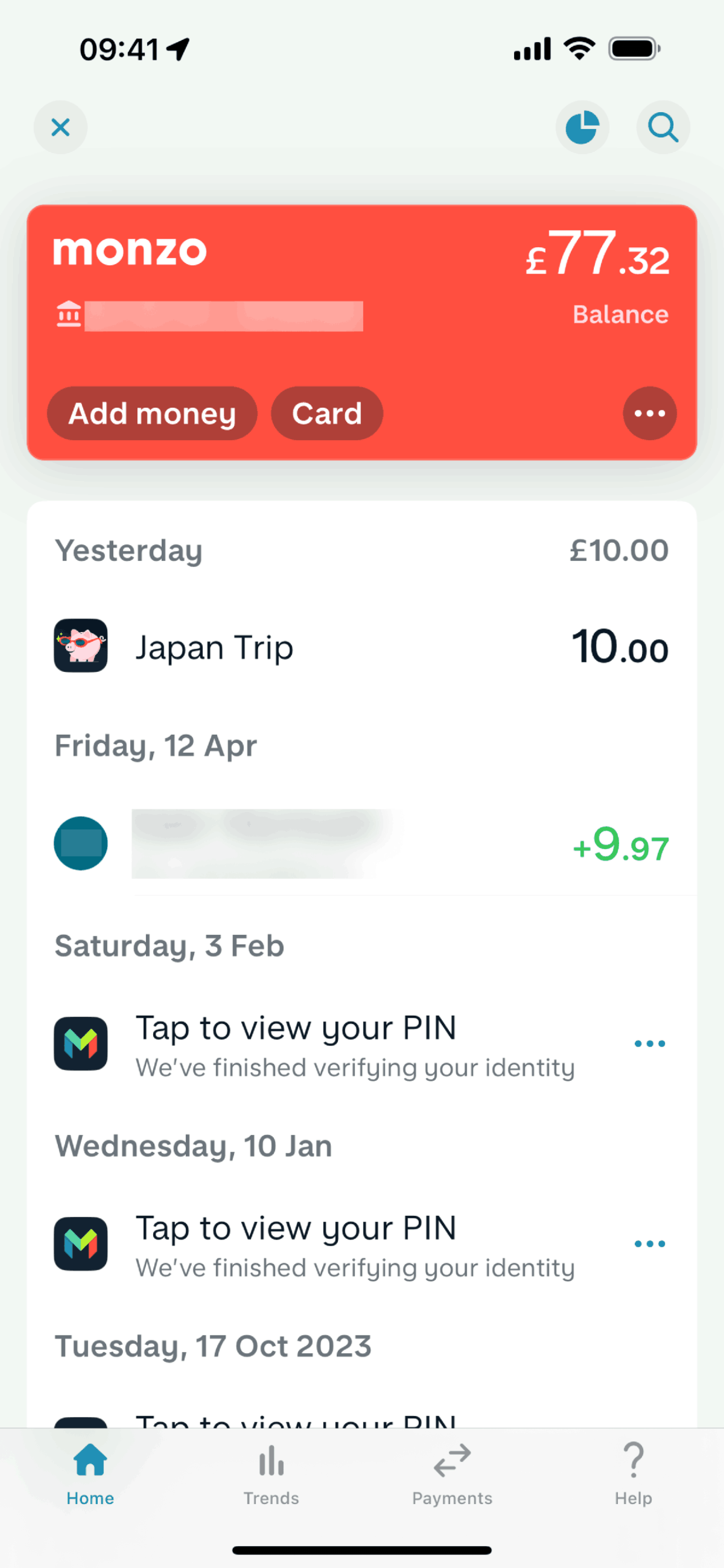
Activity on Monzo (ios) screen 2
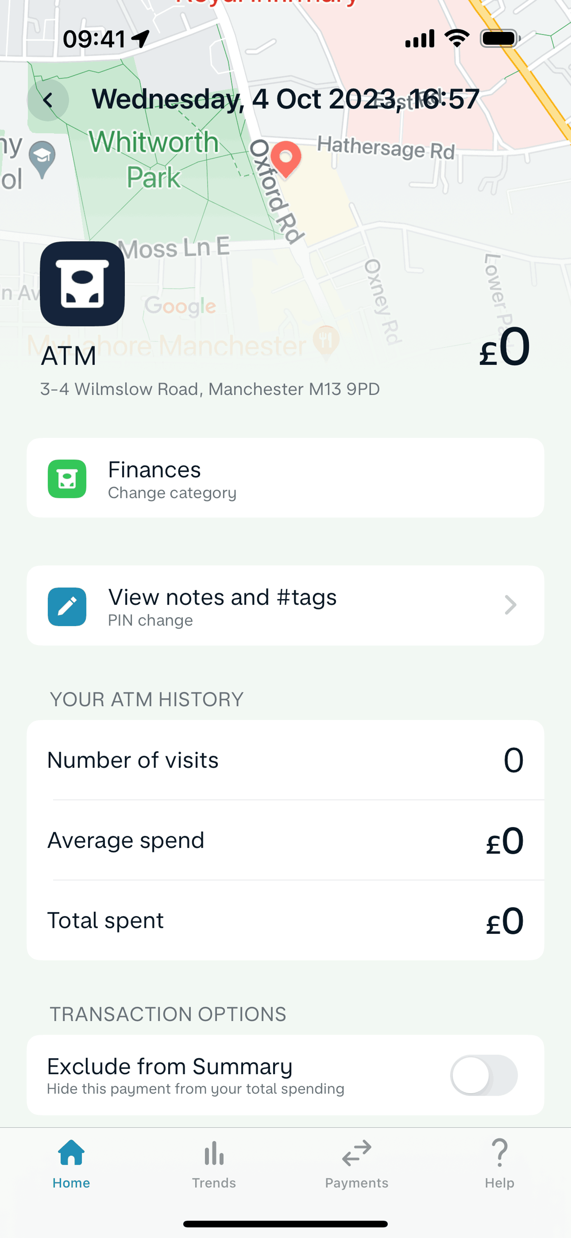
Transaction detail on Monzo (ios) screen 2
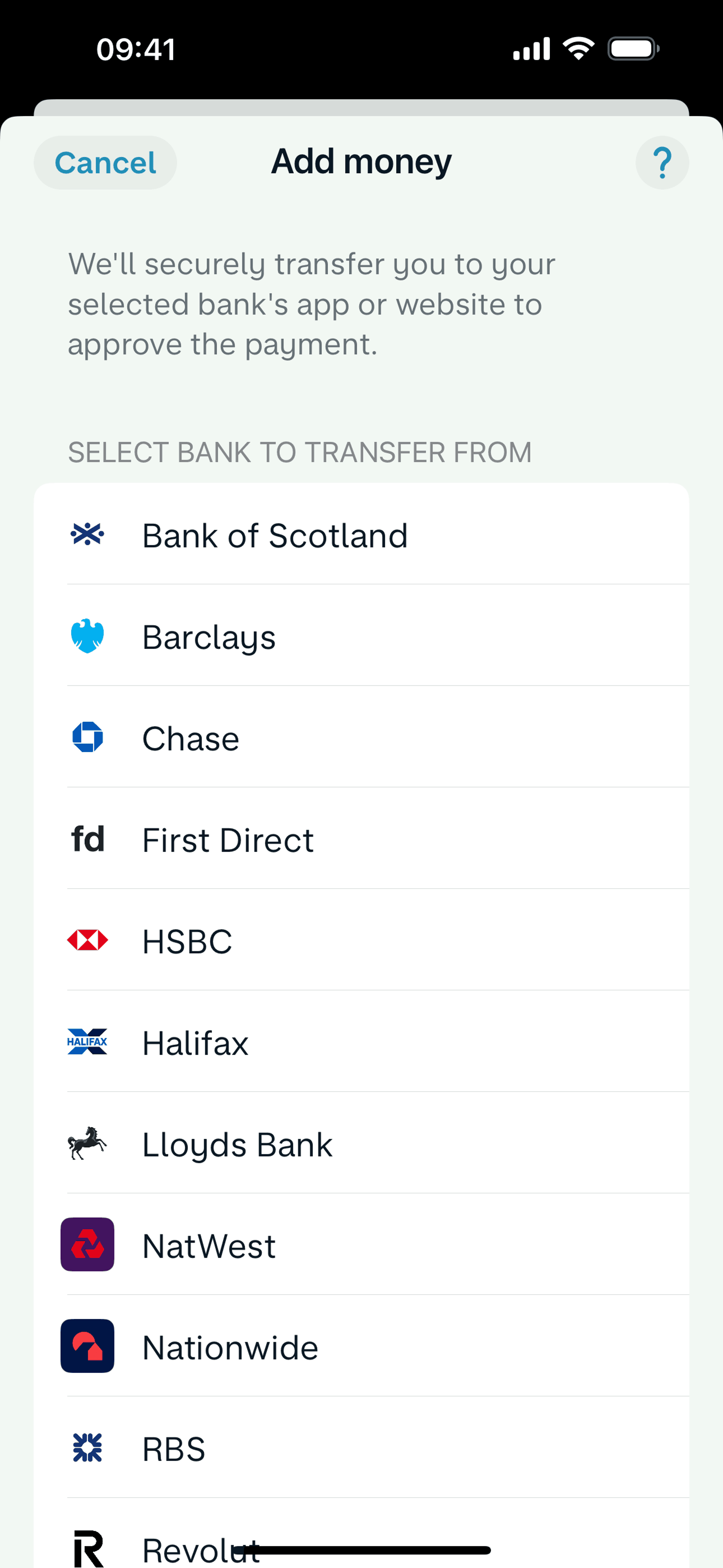
Adding money on Monzo (ios) screen 2
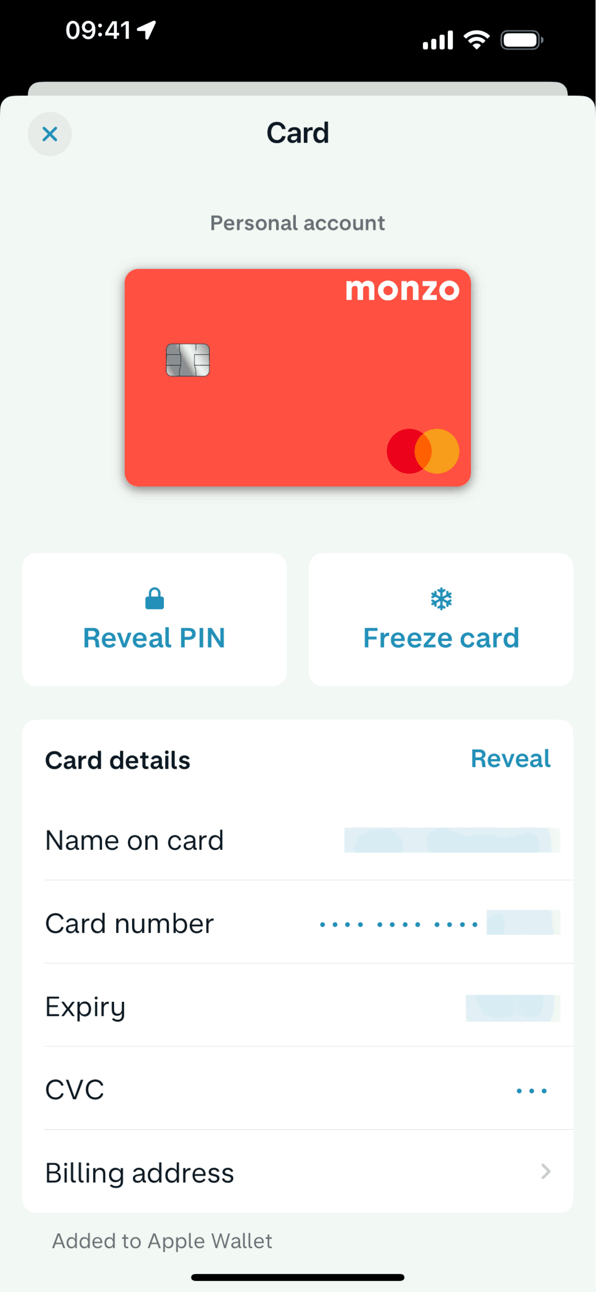
Card detail on Monzo (ios) screen 2
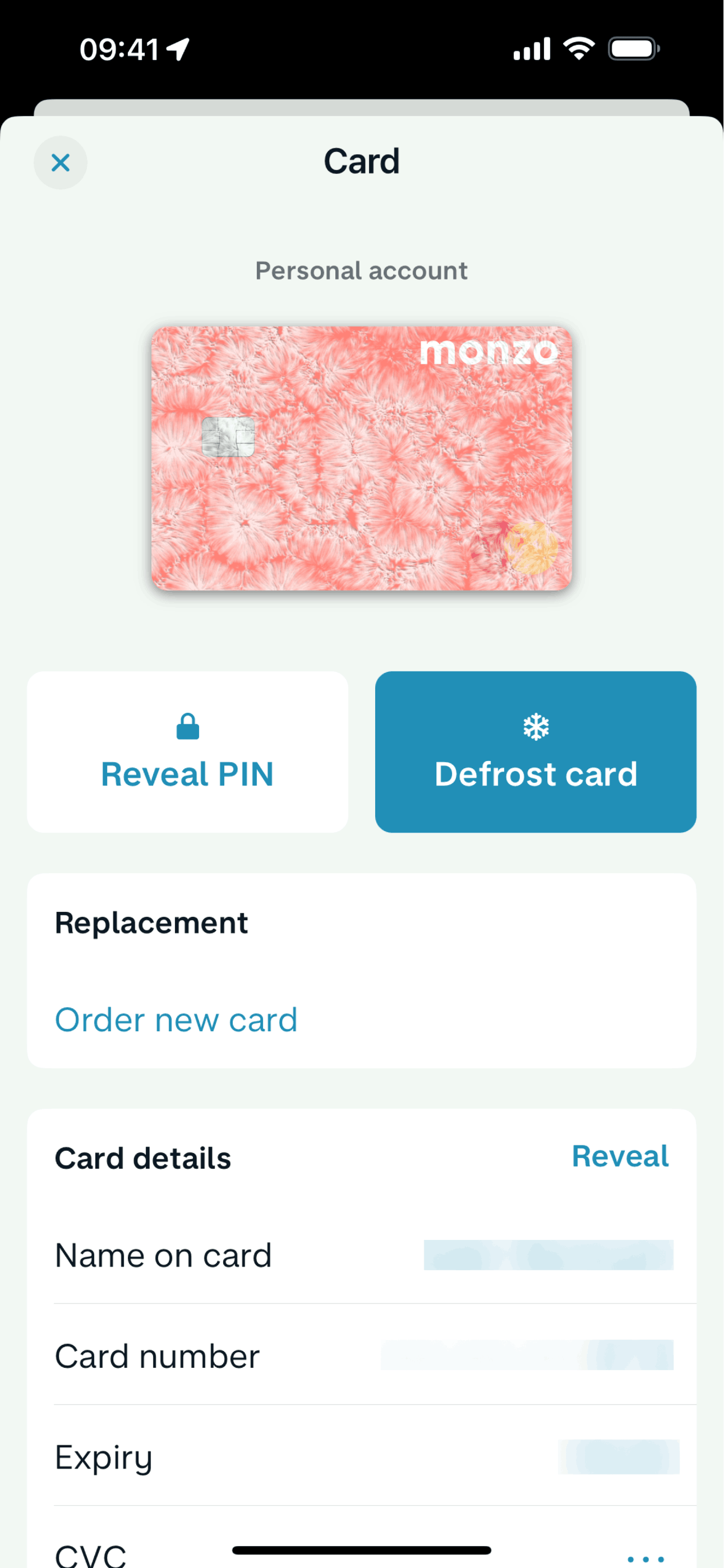
Freezing a card on Monzo (ios) screen 2
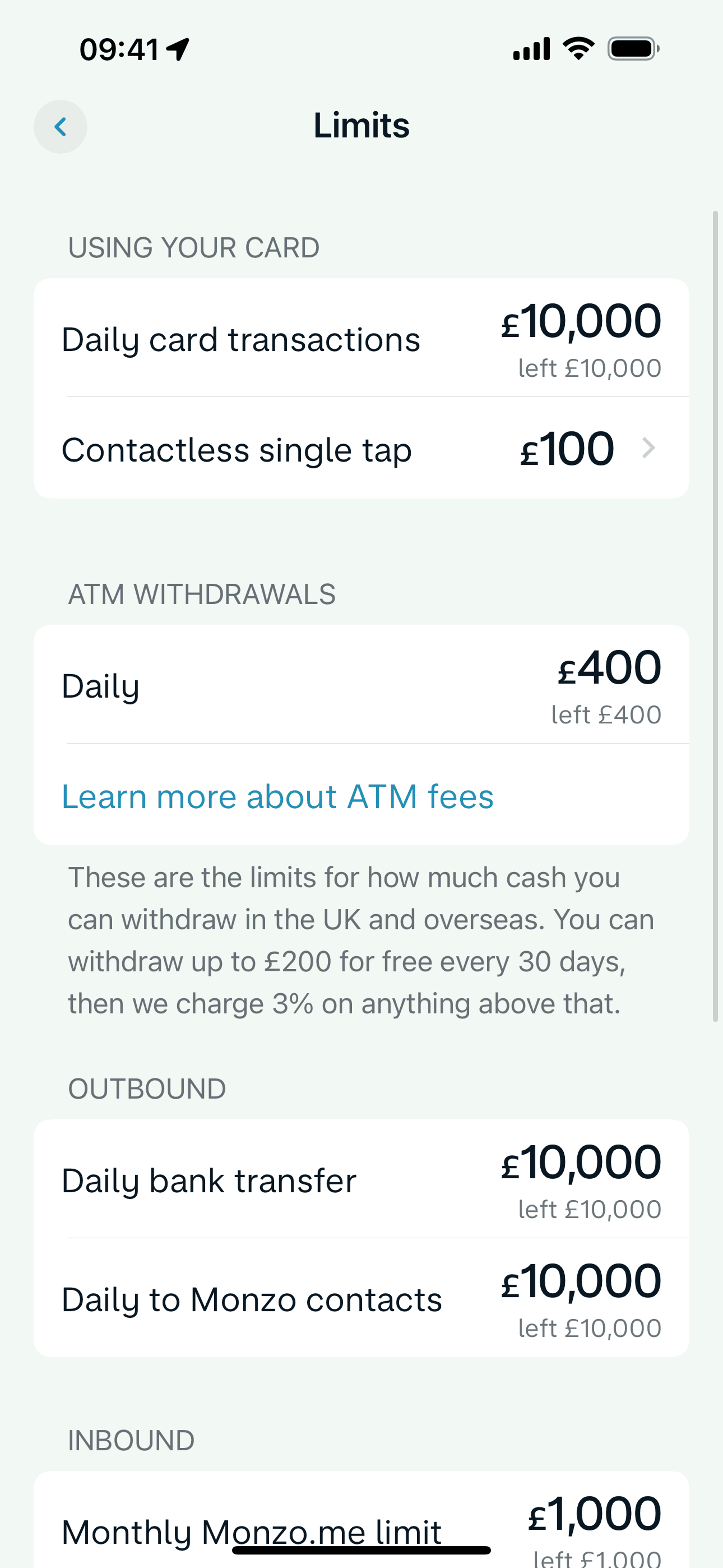
Limits on Monzo (ios) screen 2
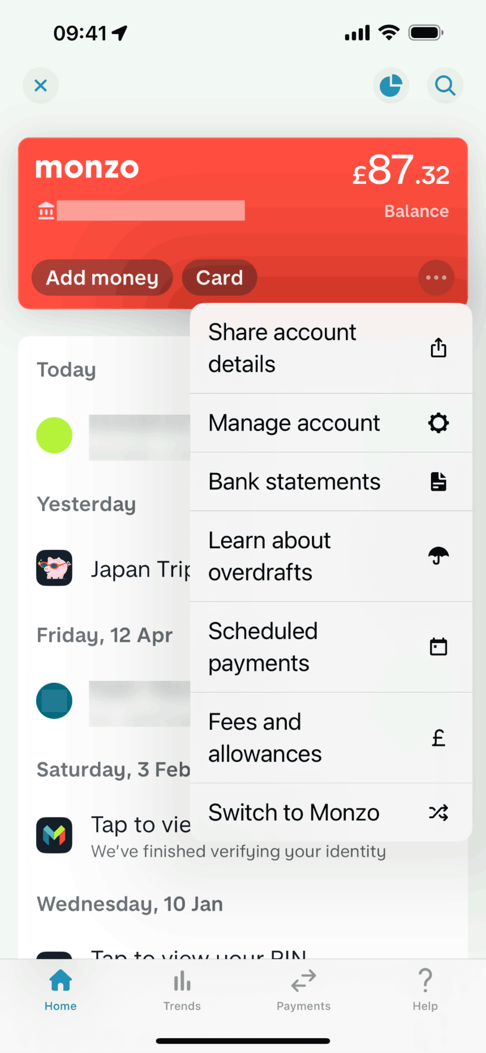
Action options on Monzo (ios) screen 2
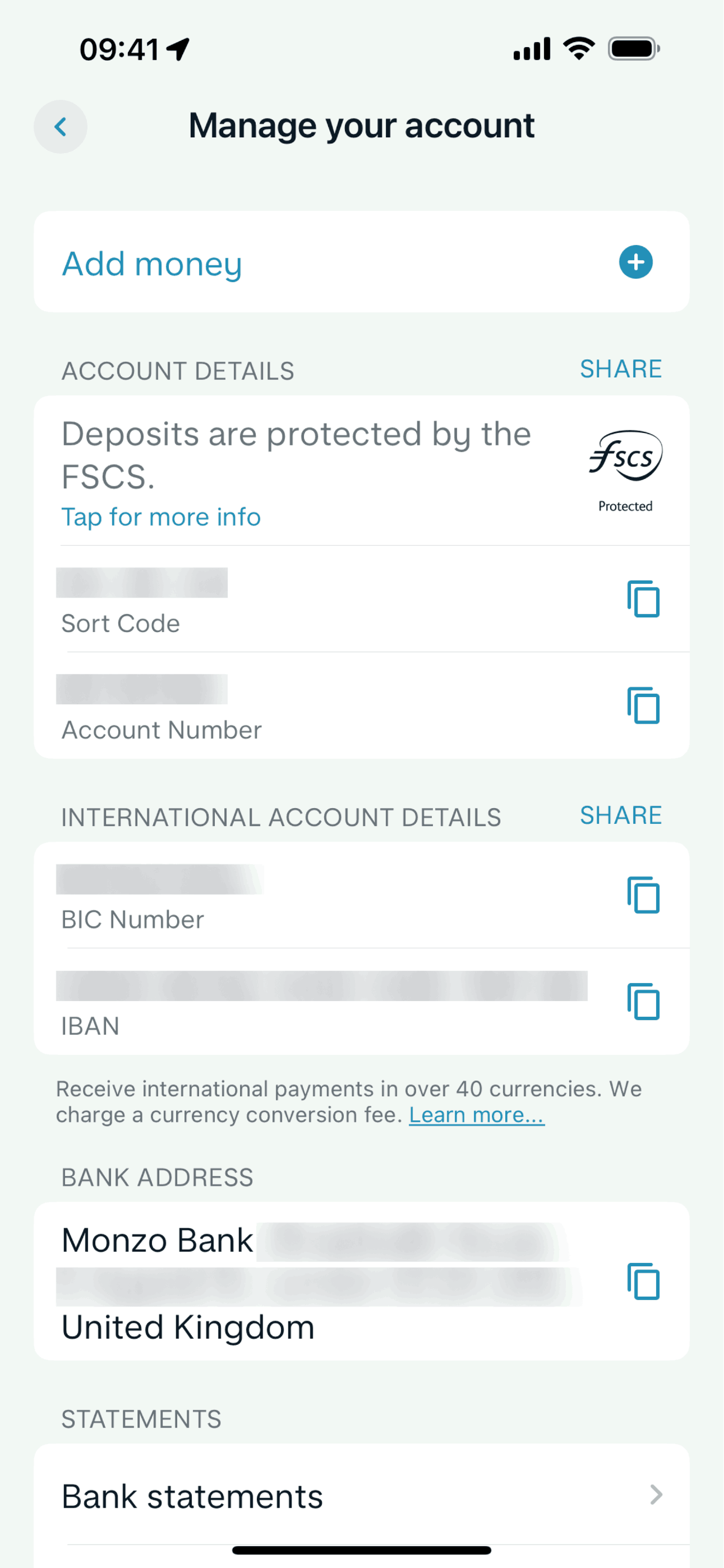
Manage account on Monzo (ios) screen 2
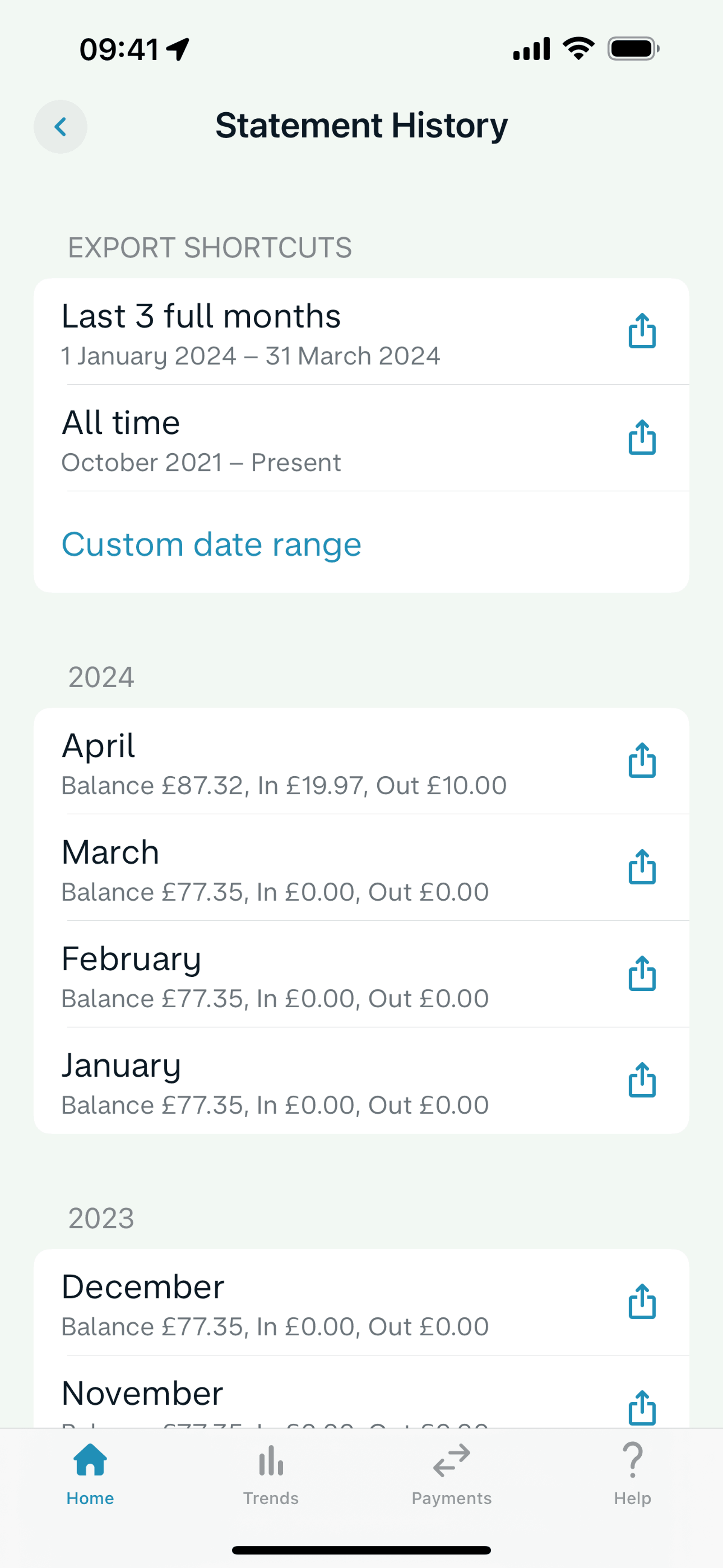
Bank statements on Monzo (ios) screen 2
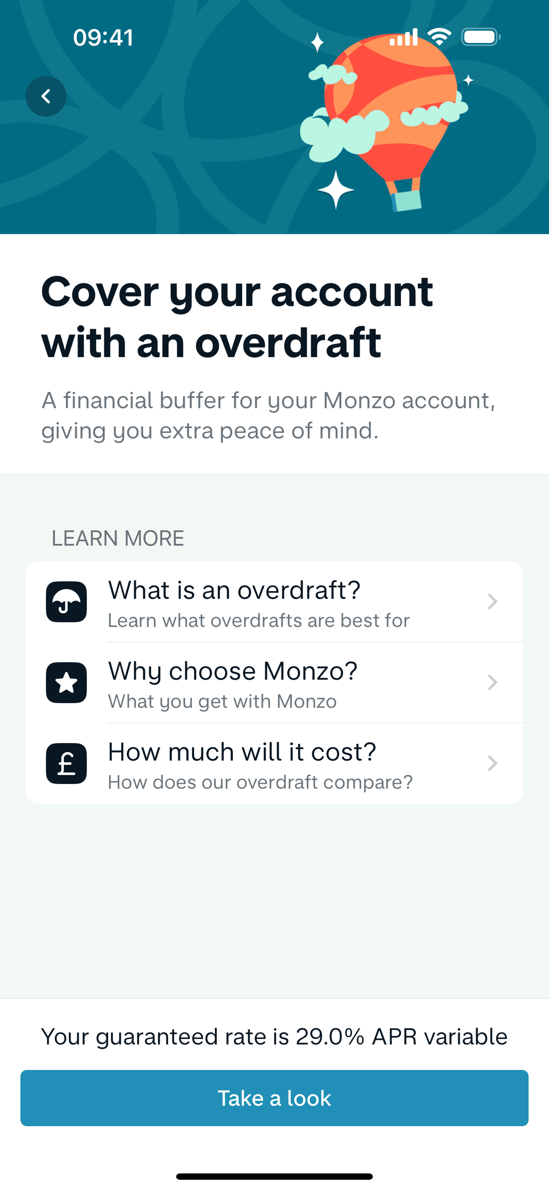
Setting up an overdraft limit on Monzo (ios) screen 2
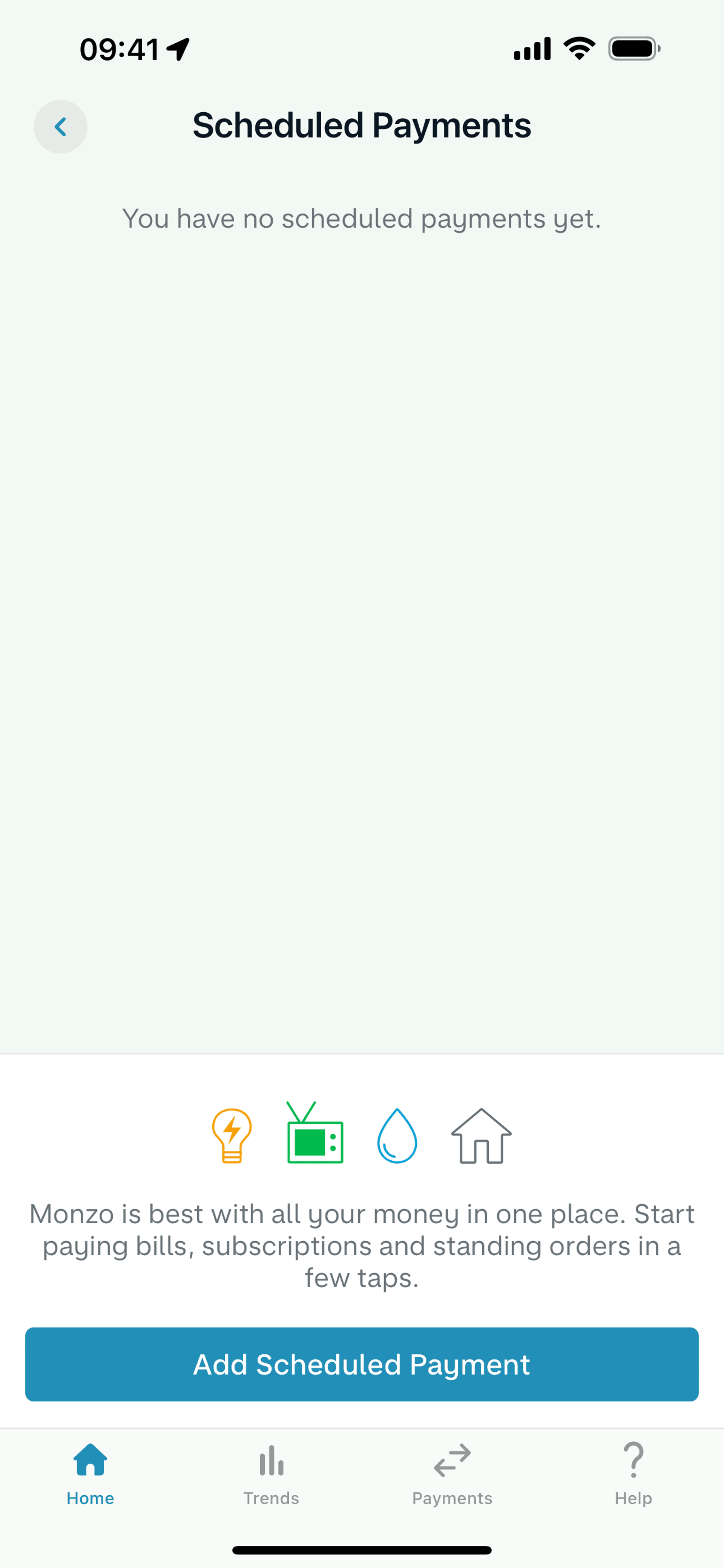
Scheduled payments on Monzo (ios) screen 2
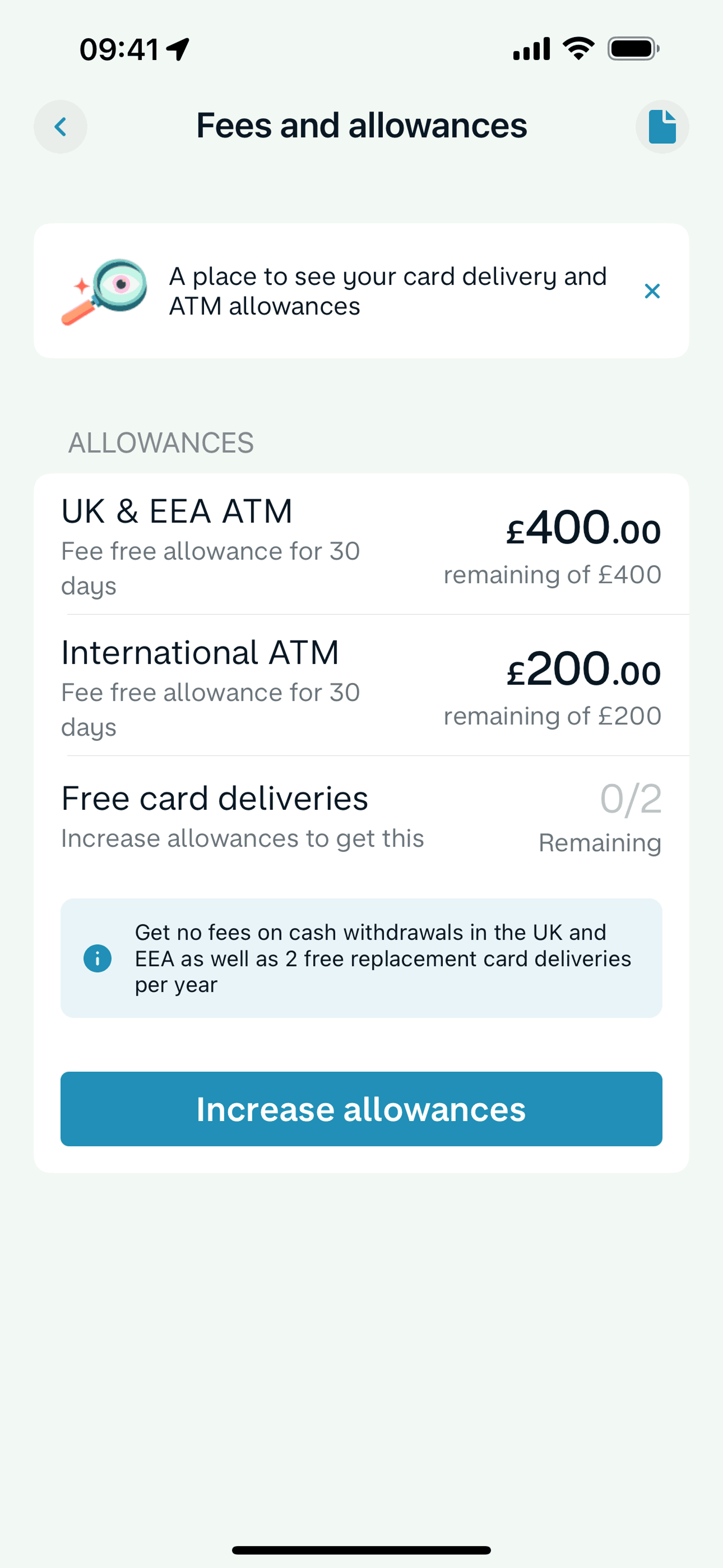
Fees and allowances on Monzo (ios) screen 2
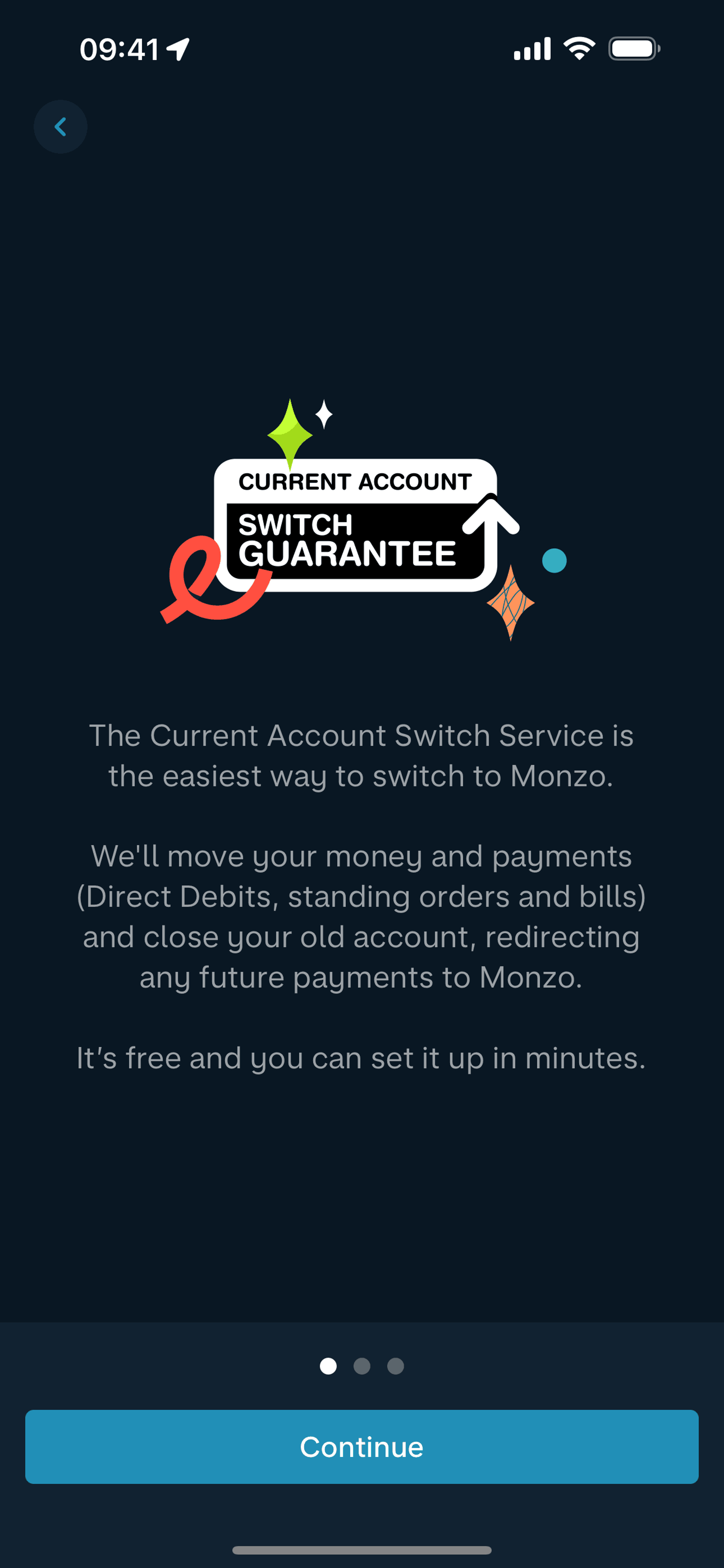
Switch to Monzo on Monzo (ios) screen 2
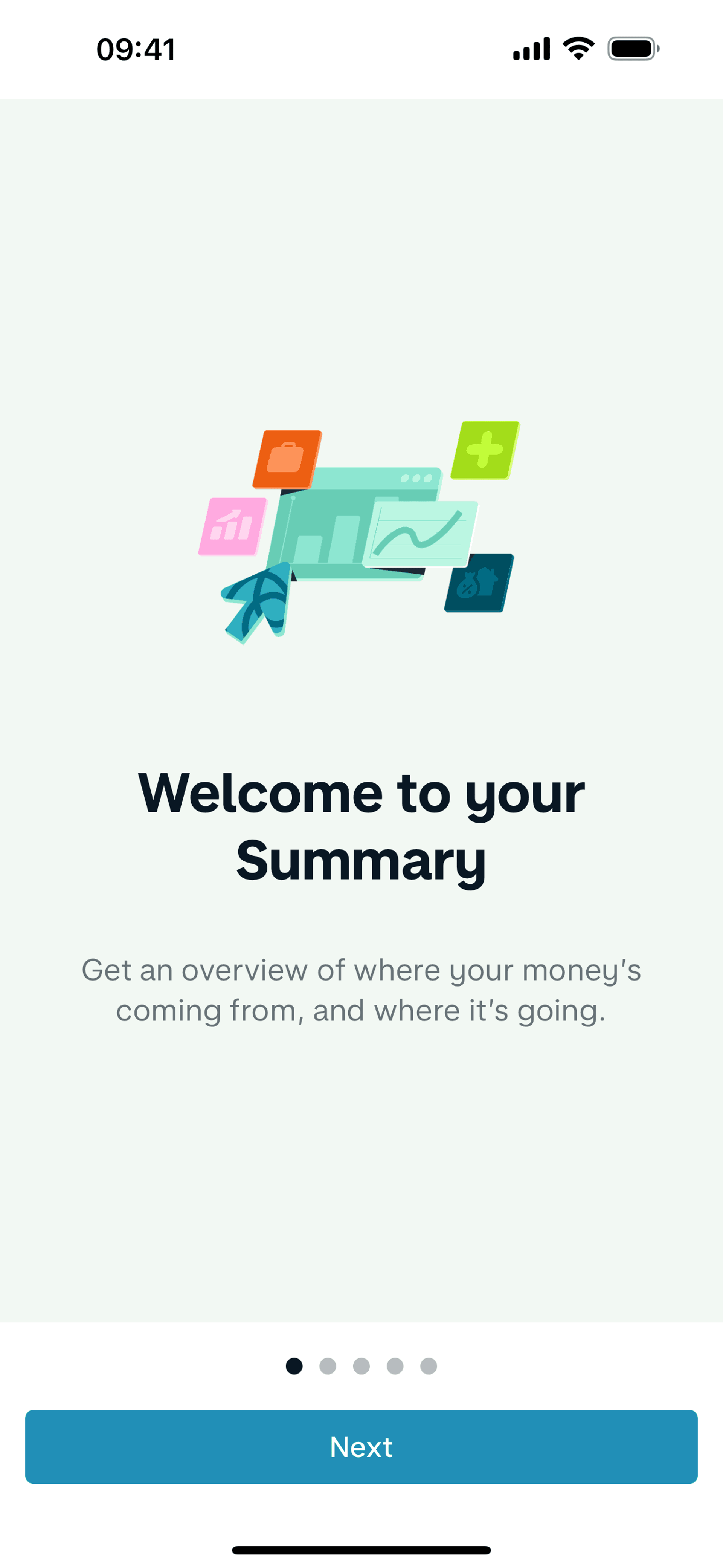
Summary on Monzo (ios) screen 2
Browse 684+ Monzo iOS screenshots on Gummble. Spend, manage and save money. Categorized under Finance. Study Monzo's onboarding flow, login screens, checkout process, navigation patterns, and more to inspire your next design project.
Gummble has 684+ Monzo iOS UI screenshots available for design inspiration. Browse the full collection to study Monzo's interface patterns, user flows, and design decisions.
In-depth UX teardown and design patterns
Monzo is a digital-only bank built for mobile from day one. The iOS app provides instant spending notifications, automatic categorization, budgeting tools, and fee-free international spending. There are no branches — everything from account opening to customer support happens in-app. Monzo targets users frustrated with traditional banking's opacity, offering real-time visibility into money that legacy banks' batch-processing systems cannot match.
Monzo's hot coral card and matching app accent create instant brand recognition in a sea of blue banking apps. The interface prioritizes clarity over feature density — the home screen shows balance and recent transactions without competing modules. Every transaction notifies instantly with merchant details, location, and amount, creating unprecedented spending awareness. The spending breakdown uses intuitive categories with custom emoji that make financial data approachable rather than intimidating. Support chat replaces phone trees, delivering banking help that feels like texting a friend.
Get unlimited access from $9.99/month — cancel anytime.
Monzo is categorized under Finance. You can study its onboarding flow, login screens, navigation patterns, and other UI elements on Gummble.
Yes, Gummble Pro users can download Monzo iOS screenshots for design reference. Free users can browse all screenshots and view detailed design analysis.
Monzo's current account is free, building scale through viral debit card adoption (the coral card is intentionally distinctive). Revenue comes from Monzo Plus/Premium subscriptions (£5-15/month) offering interest on savings, travel insurance, and advanced budgeting. Business accounts and lending products (overdrafts, loans) add financial services revenue. The strategy prioritizes growth and engagement over immediate monetization, betting that a trusted financial relationship enables future product adoption.
Monzo targets tech-savvy users aged 20-40 frustrated with traditional bank opacity and poor mobile experiences. The core user checks their phone constantly and expects financial information as real-time as social media. Secondary audiences include frequent travelers (fee-free foreign spending), budgeters who want spending visibility, and gig economy workers whose irregular income makes cash flow management crucial. The brand resonates with users who see banking as infrastructure rather than relationship.
Monzo proves that real-time feedback changes behavior. Instant notifications create spending awareness that monthly statements never could — information at the point of decision beats information in review. The coral card shows how physical brand presence (the card in your wallet) drives digital app usage and word-of-mouth. For fintech, the pots pattern demonstrates that mental accounting is a user need — separating money visually supports discipline better than one undifferentiated balance. In-app chat support proves that customer service design is product design.


