


Mint iOS Finance interface screenshot 1
Mint iOS Finance interface screenshot 2
Mint iOS Finance interface screenshot 3
Mint iOS Finance interface screenshot 4
Mint iOS Finance interface screenshot 5
Mint iOS Finance interface screenshot 6
Mint iOS Finance interface screenshot 7
Mint iOS Finance interface screenshot 8
Mint iOS Finance interface screenshot 9
Mint iOS Finance interface screenshot 10
Mint iOS Finance interface screenshot 11
Mint iOS Finance interface screenshot 12
Mint iOS Finance interface screenshot 13
Mint iOS Finance interface screenshot 14
Mint iOS Finance interface screenshot 15
Mint iOS Finance interface screenshot 16
Mint iOS Finance interface screenshot 17
Mint iOS Finance interface screenshot 18
Mint iOS Finance interface screenshot 19
Mint iOS Finance interface screenshot 20
Mint iOS Finance interface screenshot 21
Mint iOS Finance interface screenshot 22
Mint iOS Finance interface screenshot 23

Mint iOS Finance interface screenshot 24
Browse 163+ Mint iOS screenshots on Gummble. Track personal finance & money. Categorized under Finance. Study Mint's onboarding flow, login screens, checkout process, navigation patterns, and more to inspire your next design project.
Gummble has 163+ Mint iOS UI screenshots available for design inspiration. Browse the full collection to study Mint's interface patterns, user flows, and design decisions.
In-depth UX teardown and design patterns
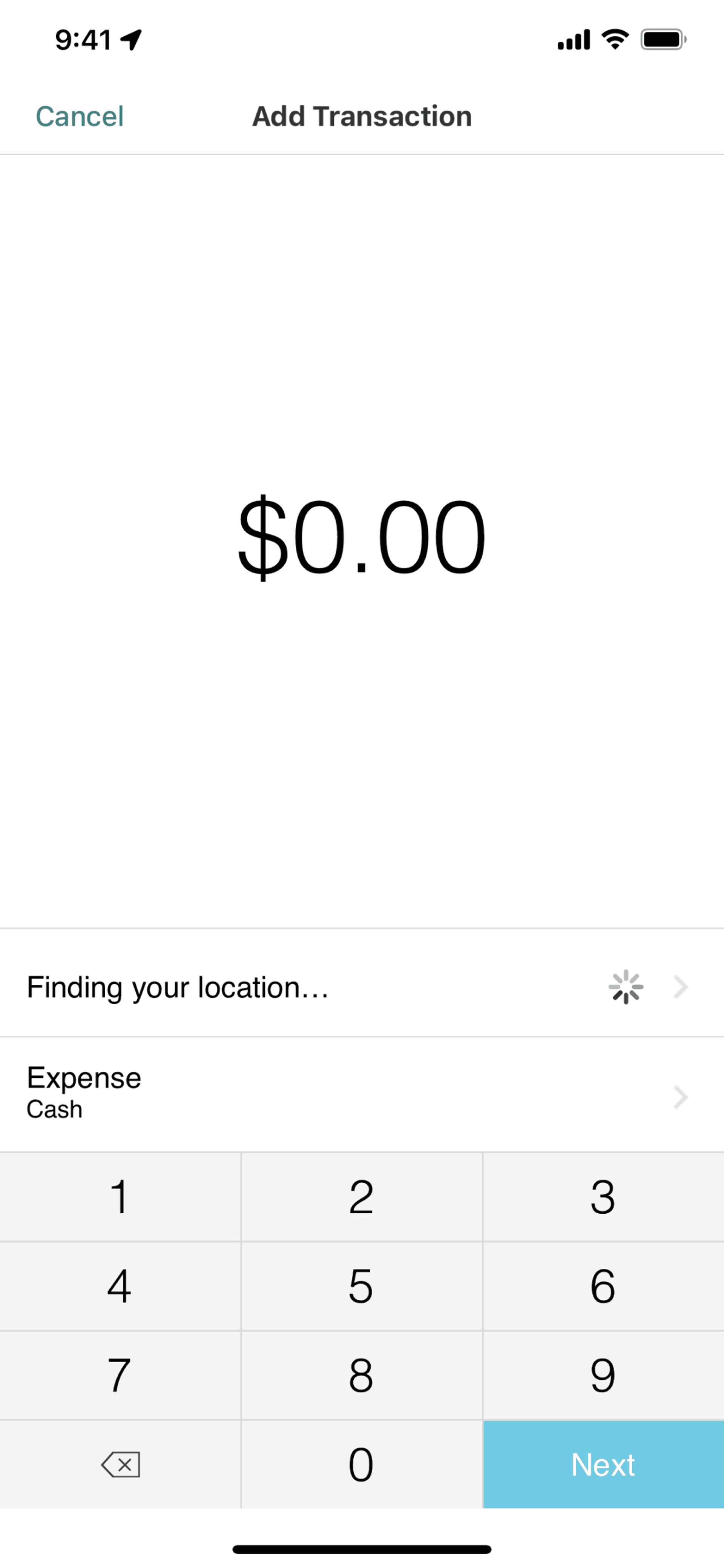
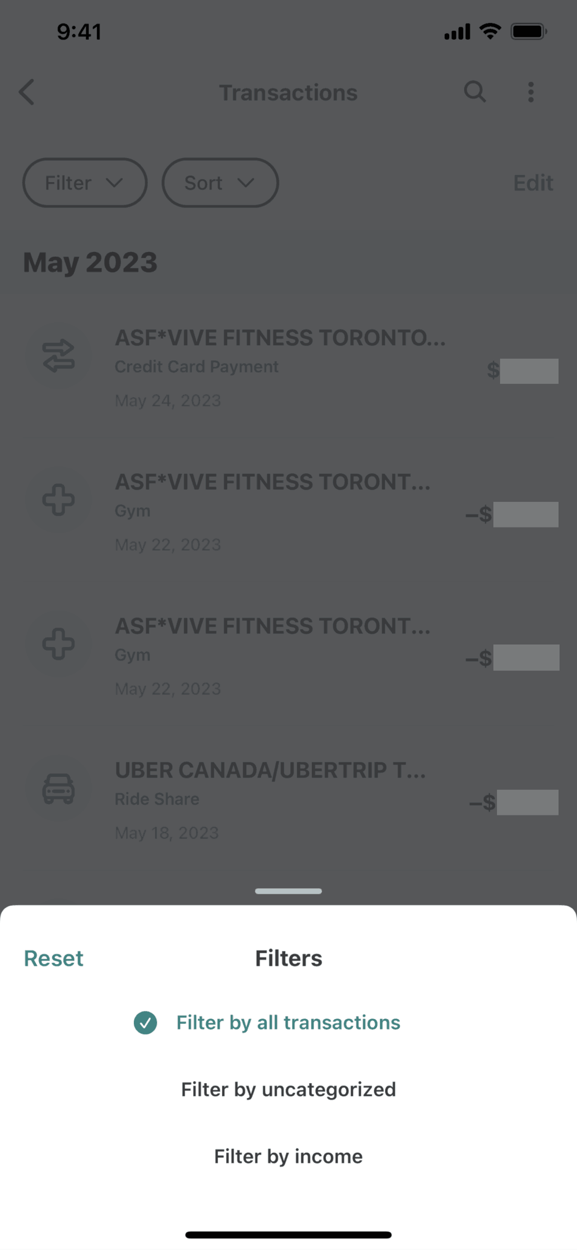
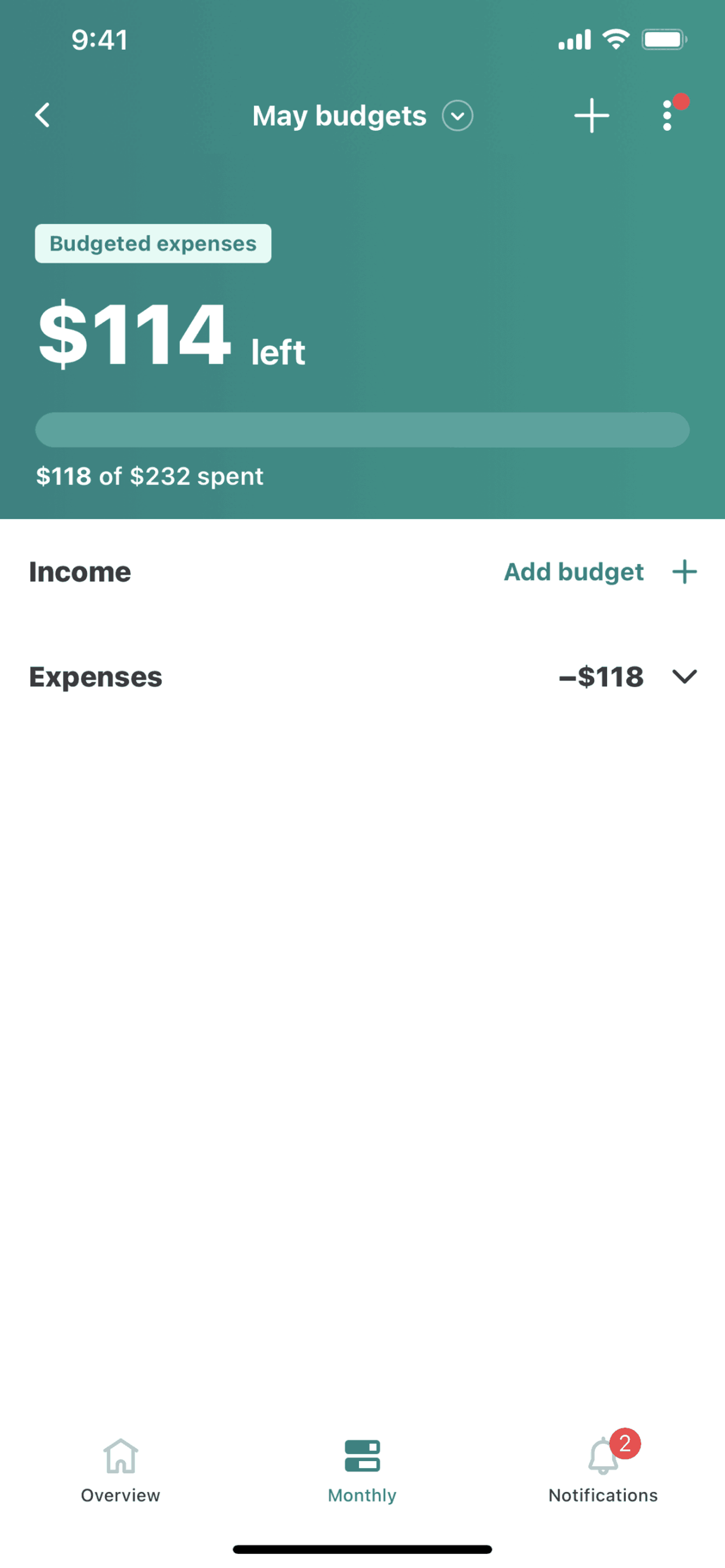
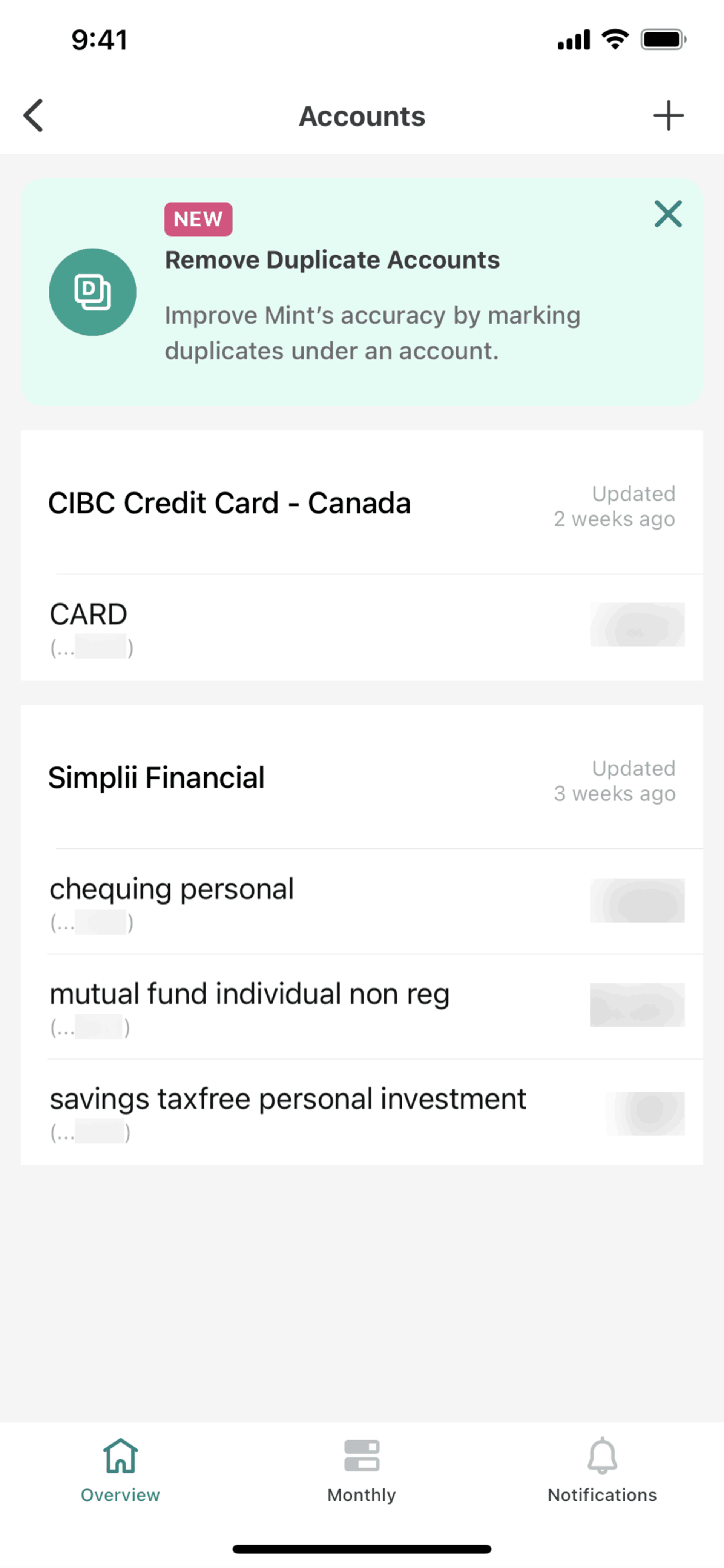
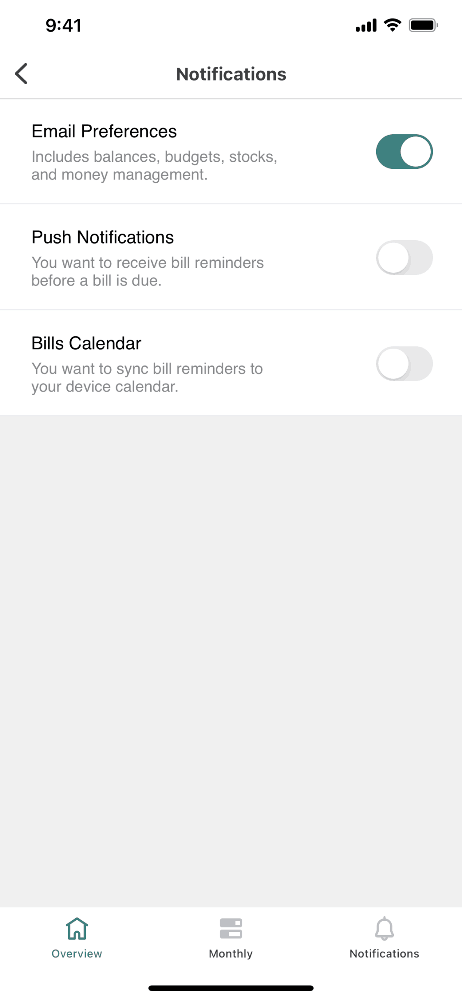
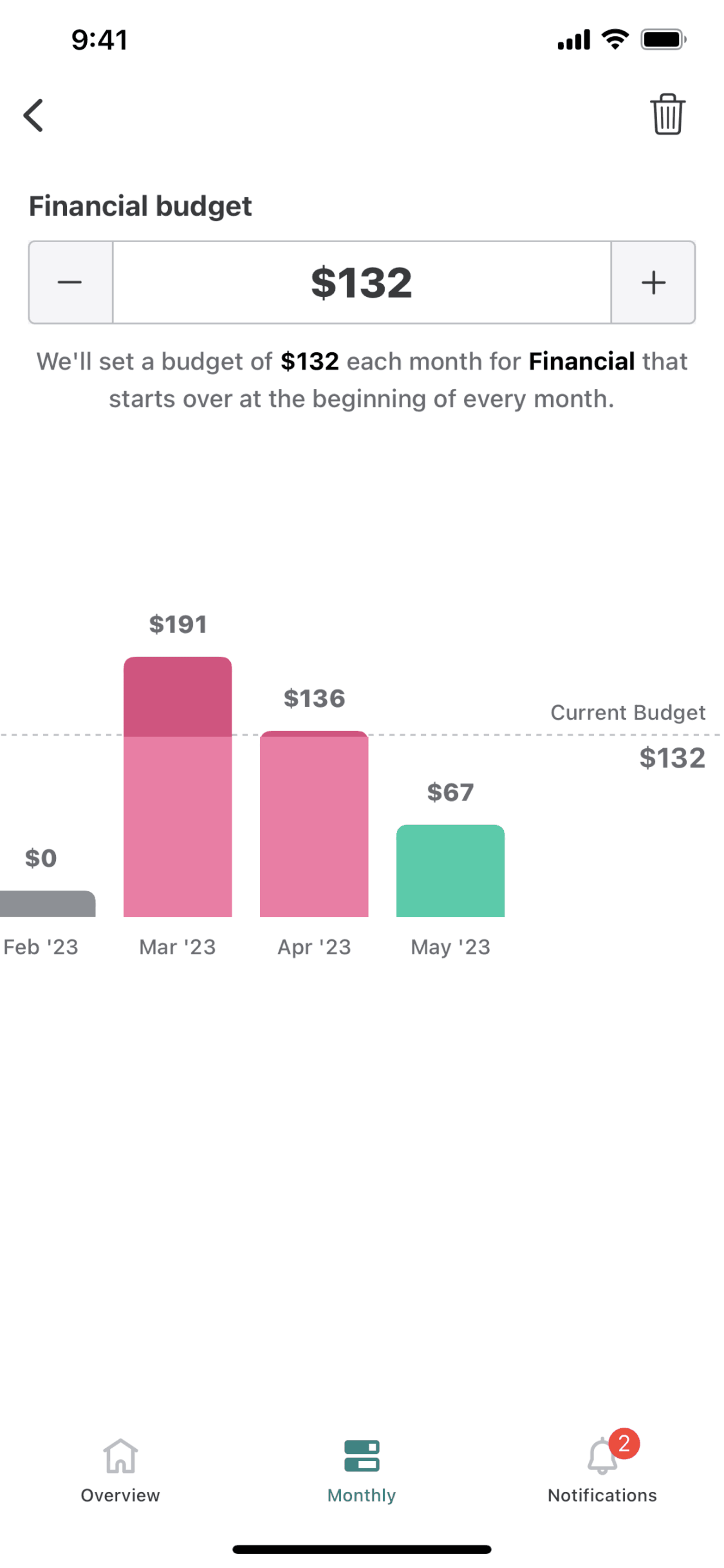
Mint is a personal finance app that aggregates all financial accounts into a single dashboard. The iOS app connects to banks, credit cards, loans, and investments to provide a complete picture of financial health. Users track spending by category, set budgets, monitor bills, and receive alerts for unusual activity. Mint automatically categorizes transactions, making financial awareness effortless compared to manual spreadsheet tracking. The app aims to be the one place users check to understand their complete financial situation.
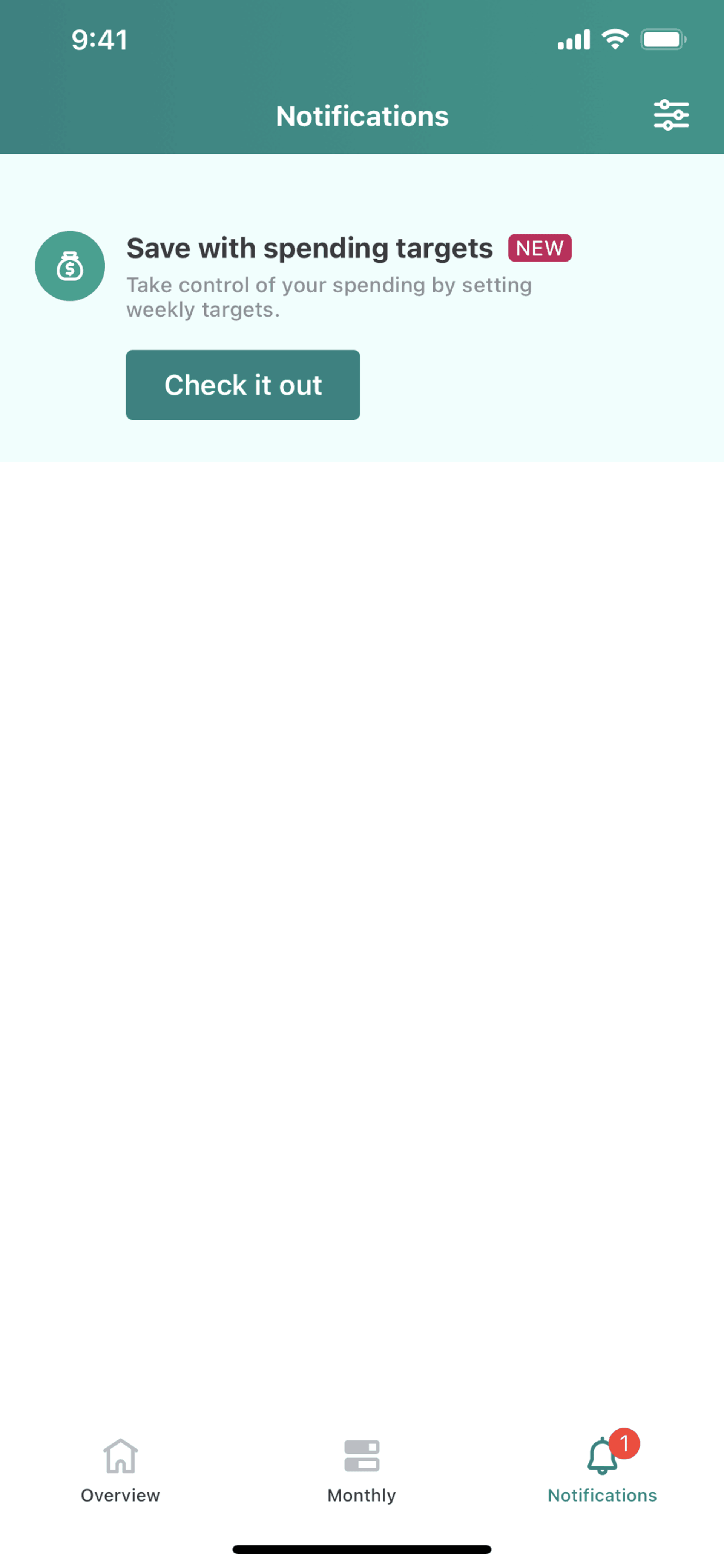
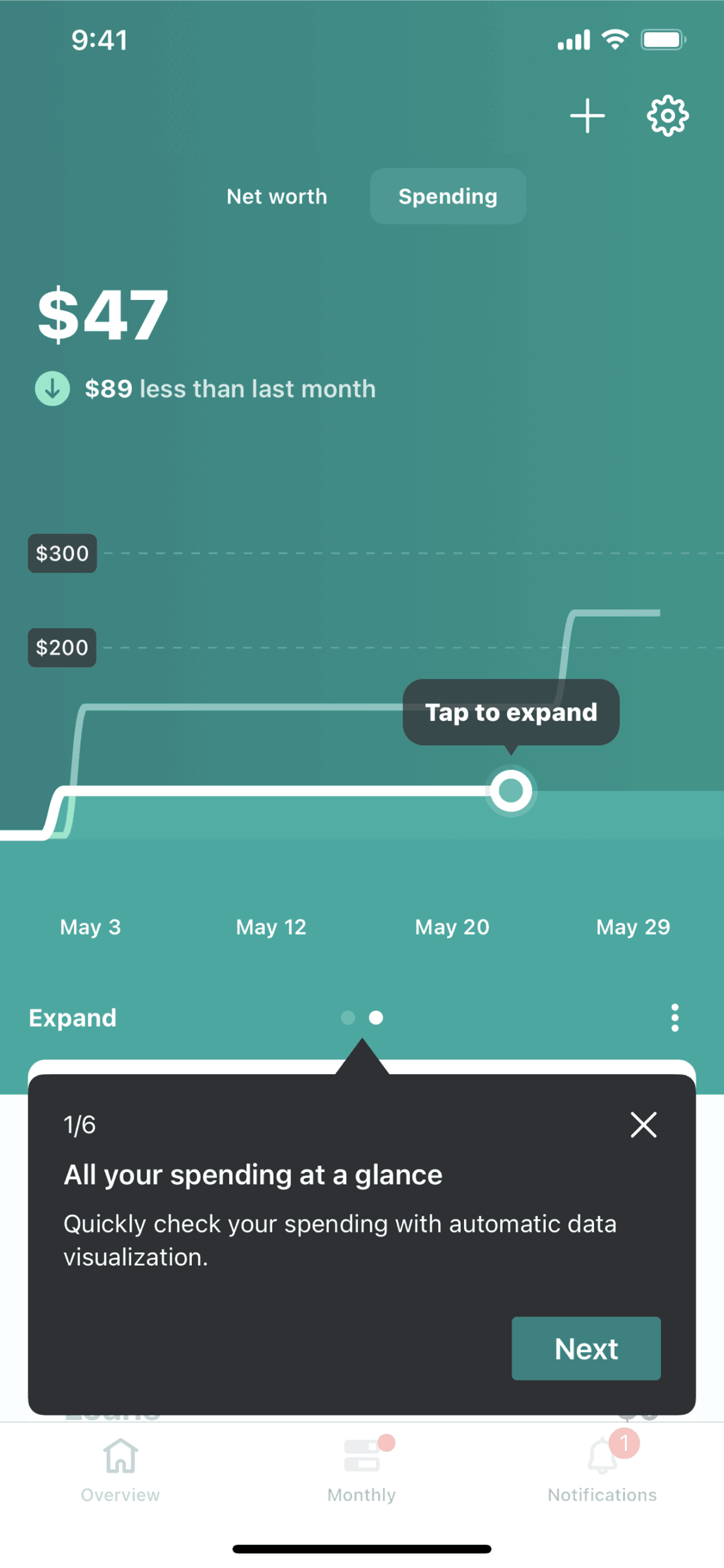
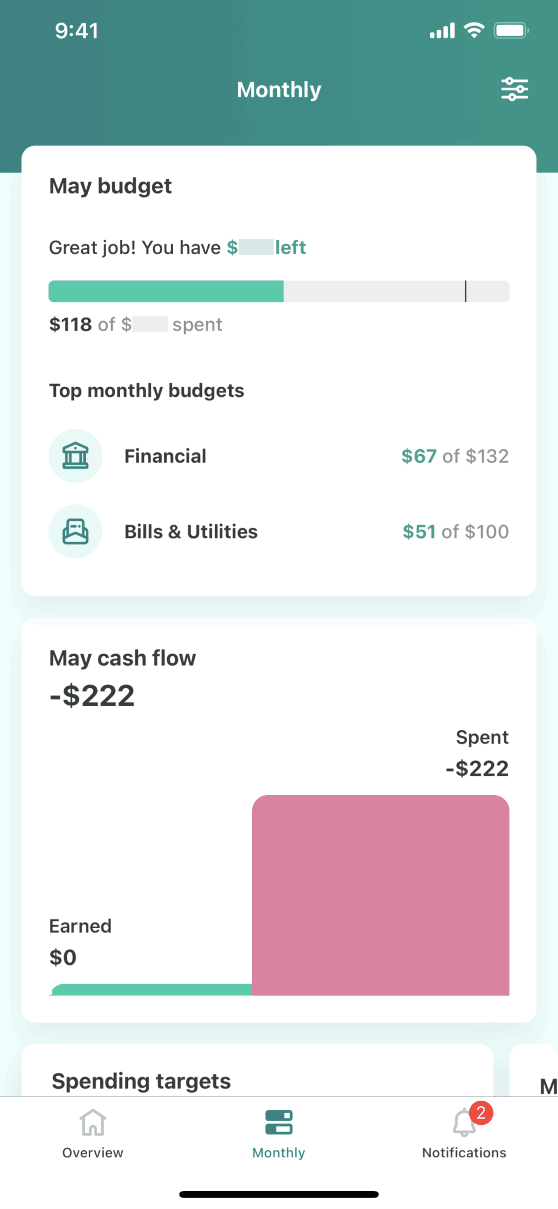
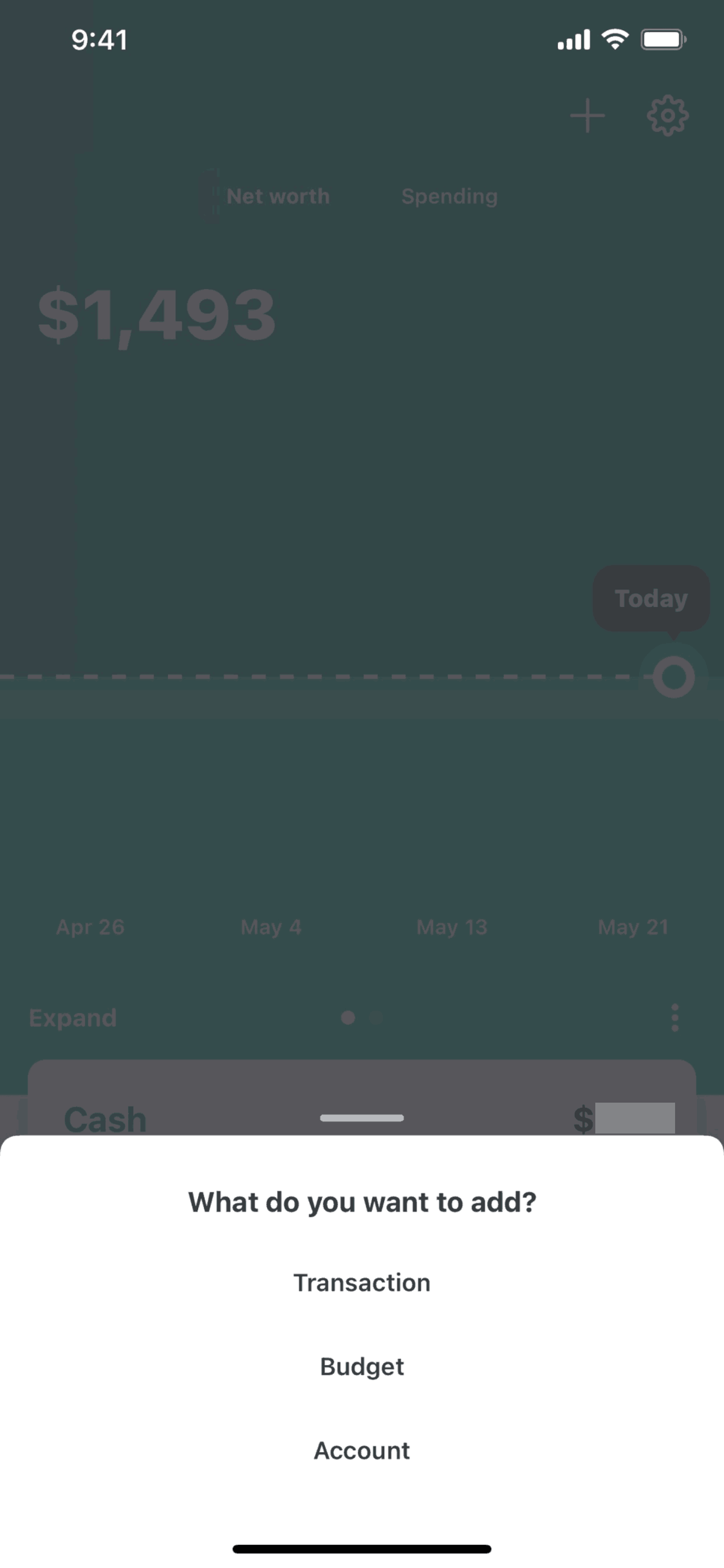
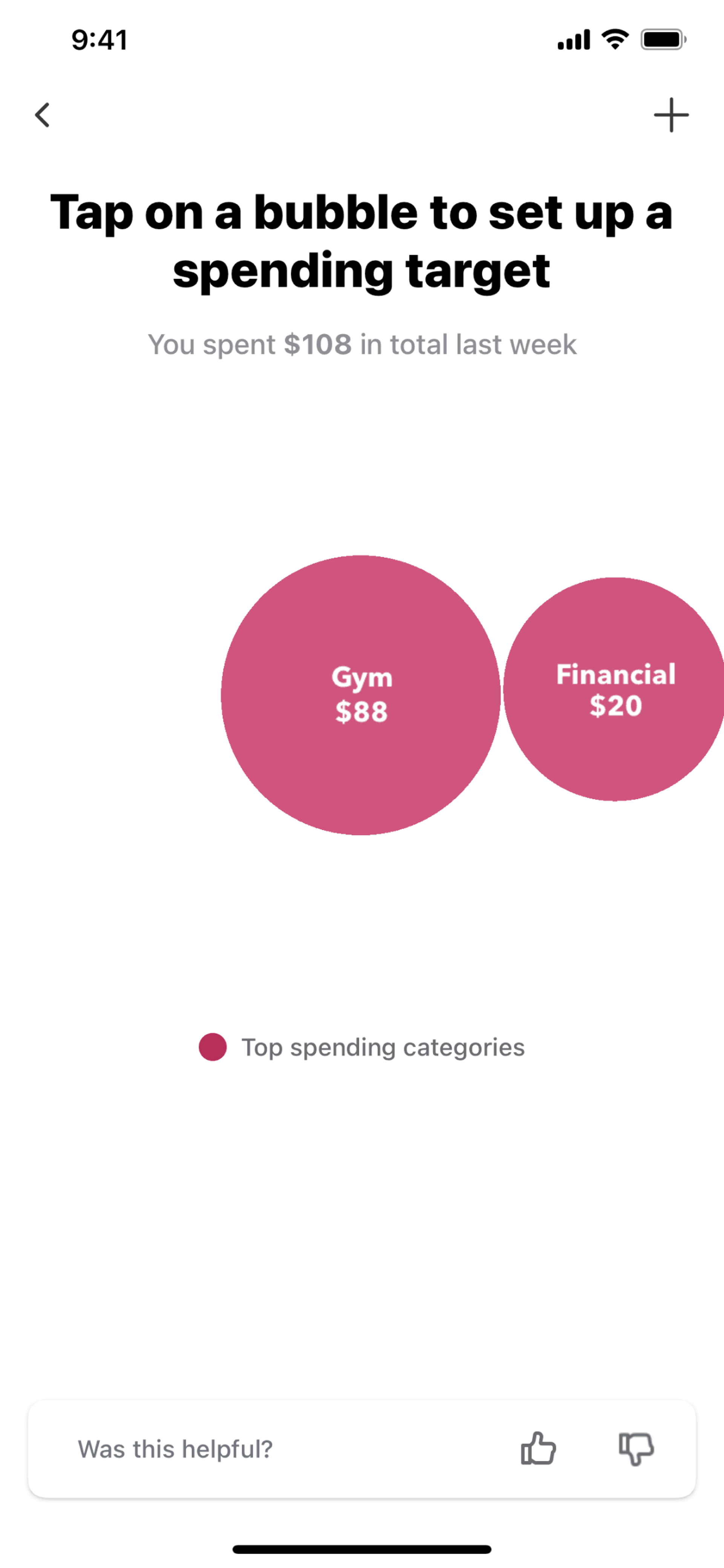
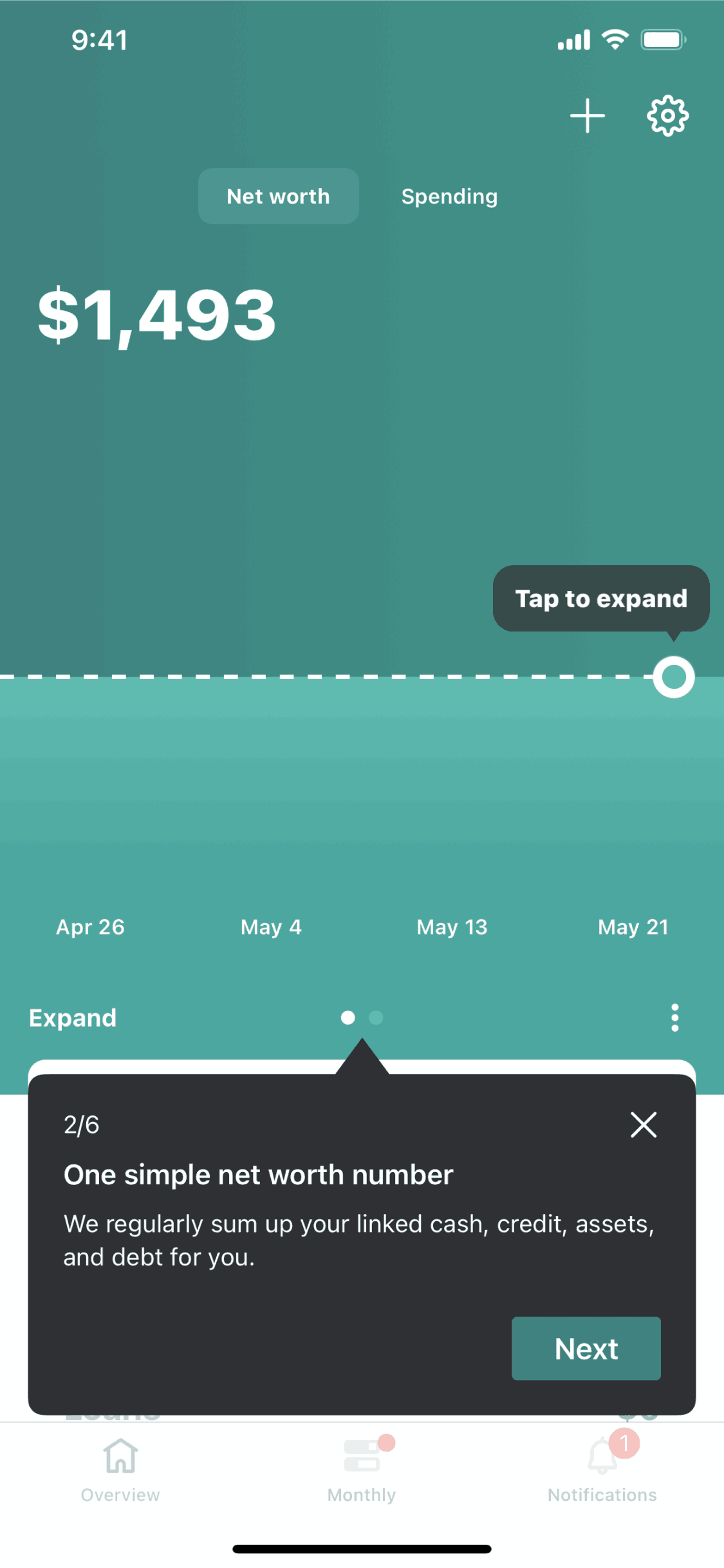
Mint's interface organizes financial chaos into clarity. The home screen surfaces the most important information — total net worth, spending vs budget, and upcoming bills. Green and white create a clean, money-positive aesthetic. Charts and graphs dominate, translating raw transaction data into visual insights users can understand at a glance. Category icons and color coding make expense breakdowns scannable. The design trusts that users want to see their finances clearly, even when the numbers aren't good — transparency is the product.
Get unlimited access from $9.99/month — cancel anytime.
Mint is categorized under Finance. You can study its onboarding flow, login screens, navigation patterns, and other UI elements on Gummble.
Yes, Gummble Pro users can download Mint iOS screenshots for design reference. Free users can browse all screenshots and view detailed design analysis.
Mint is free for users, monetizing through financial product recommendations (credit cards, loans, savings accounts) that earn referral fees. The business model aligns with user interests — recommendations surface when they might genuinely help (high-interest savings for idle cash, balance transfer cards for debt). Credit Karma (Mint's parent company) extends this model with tax services. The free access creates massive user bases that generate referral revenue at scale.
Mint serves adults who want financial awareness without active management effort. The core user has multiple accounts, irregular income patterns, or spending concerns — people whose financial lives are complex enough to benefit from aggregation. The demographic spans young professionals building financial habits, families managing household budgets, and debt-payers tracking payoff progress. Users value automation; they want insights delivered, not assembled manually.
Mint proves that aggregation can be the entire value proposition. By solving "where is my money and where does it go," the app becomes essential infrastructure for financial life. Automatic categorization shows that reducing manual work enables consistency that manual systems cannot maintain. For finance apps, visual progress indicators make abstract numbers emotionally resonant — a red bar feels different than a negative number. The credit score feature demonstrates how sticky utility features can drive engagement for otherwise periodic-use apps.


