

HEY iOS Productivity interface screenshot 1
HEY iOS Productivity interface screenshot 2
HEY iOS Productivity interface screenshot 3
HEY iOS Productivity interface screenshot 4
HEY iOS Productivity interface screenshot 5
HEY iOS Productivity interface screenshot 6
HEY iOS Productivity interface screenshot 7
HEY iOS Productivity interface screenshot 8
HEY iOS Productivity interface screenshot 9
HEY iOS Productivity interface screenshot 10
HEY iOS Productivity interface screenshot 11
HEY iOS Productivity interface screenshot 12
HEY iOS Productivity interface screenshot 13
HEY iOS Productivity interface screenshot 14
HEY iOS Productivity interface screenshot 15
HEY iOS Productivity interface screenshot 16
HEY iOS Productivity interface screenshot 17
HEY iOS Productivity interface screenshot 18
HEY iOS Productivity interface screenshot 19
HEY iOS Productivity interface screenshot 20
HEY iOS Productivity interface screenshot 21
HEY iOS Productivity interface screenshot 22
HEY iOS Productivity interface screenshot 23
HEY iOS Productivity interface screenshot 24
Browse 94+ HEY iOS screenshots on Gummble. Email at its best. Categorized under Productivity. Study HEY's onboarding flow, login screens, checkout process, navigation patterns, and more to inspire your next design project.
Gummble has 94+ HEY iOS UI screenshots available for design inspiration. Browse the full collection to study HEY's interface patterns, user flows, and design decisions.
In-depth UX teardown and design patterns
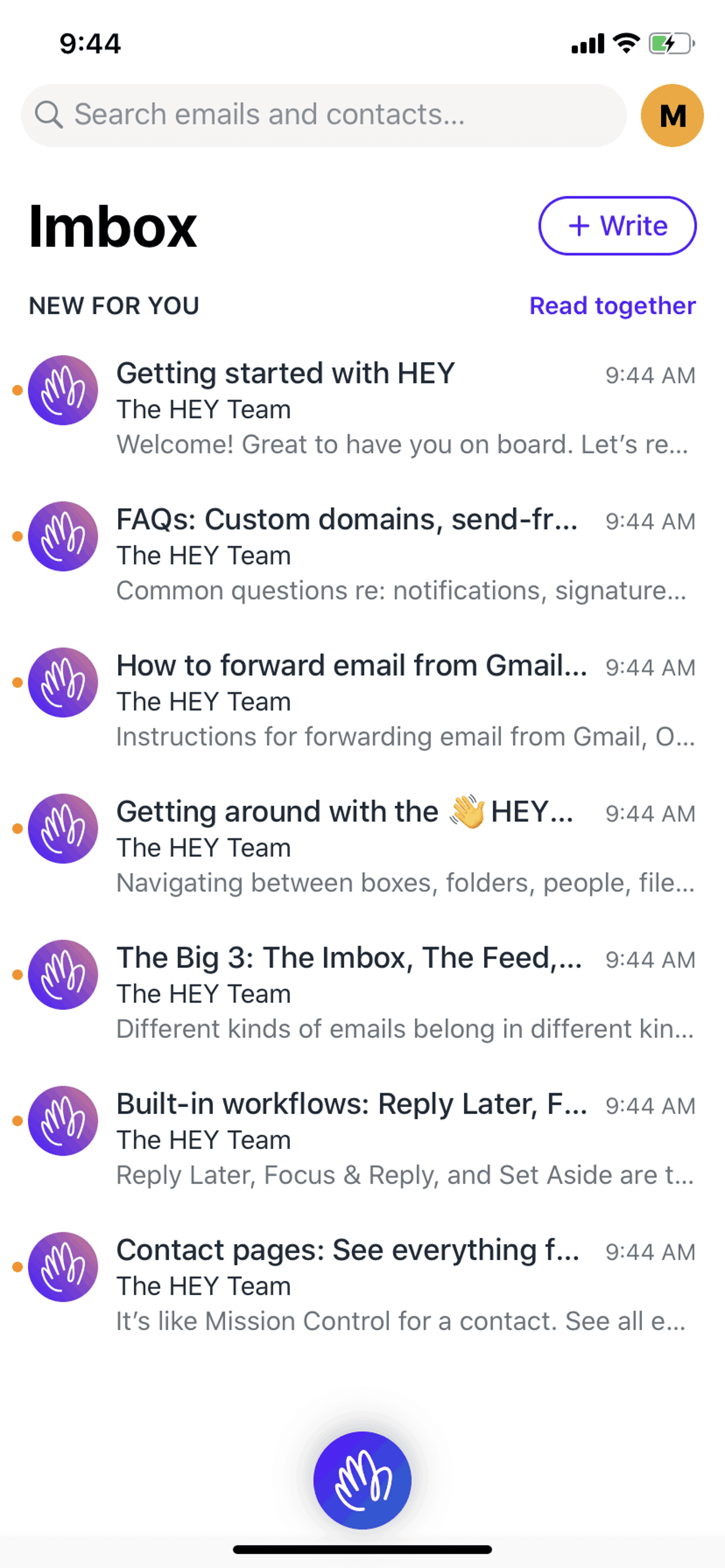
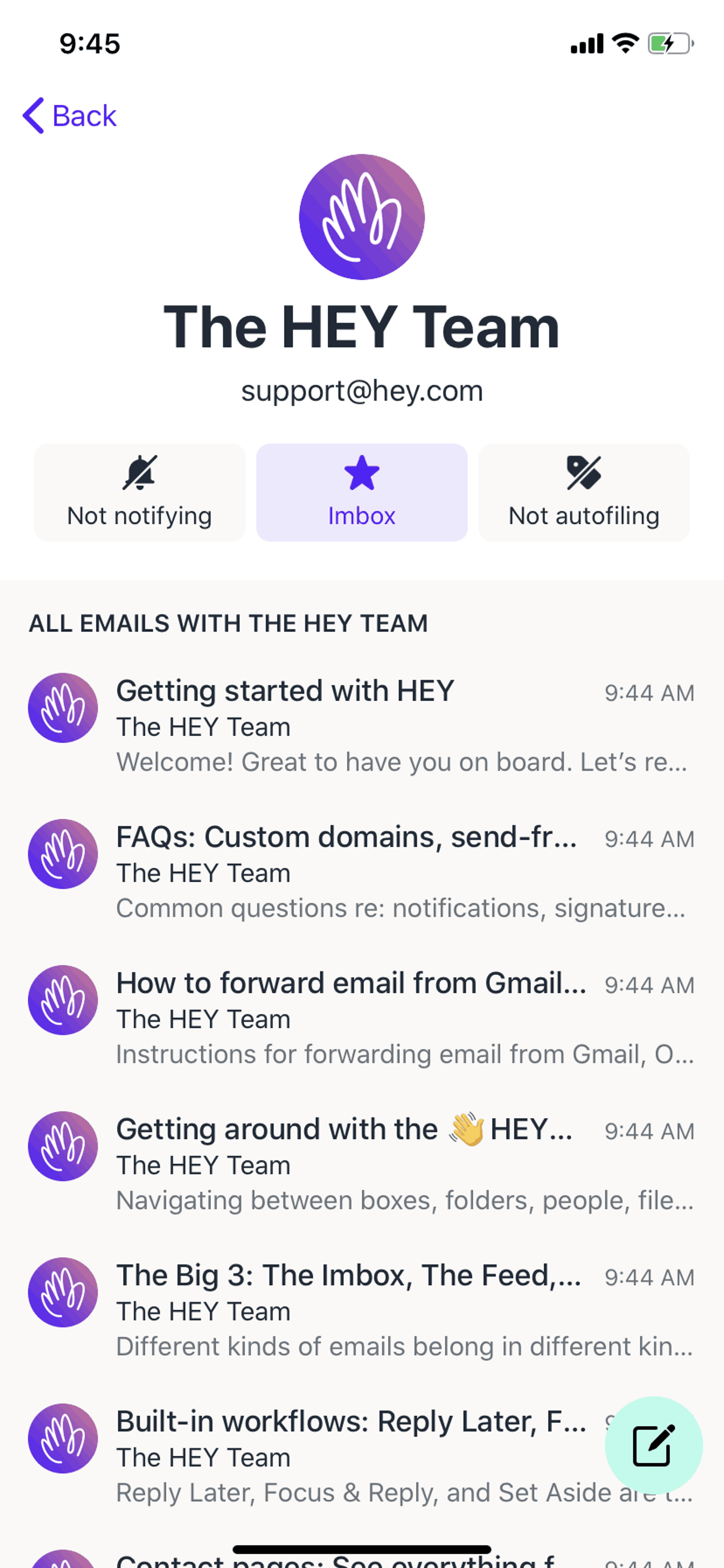
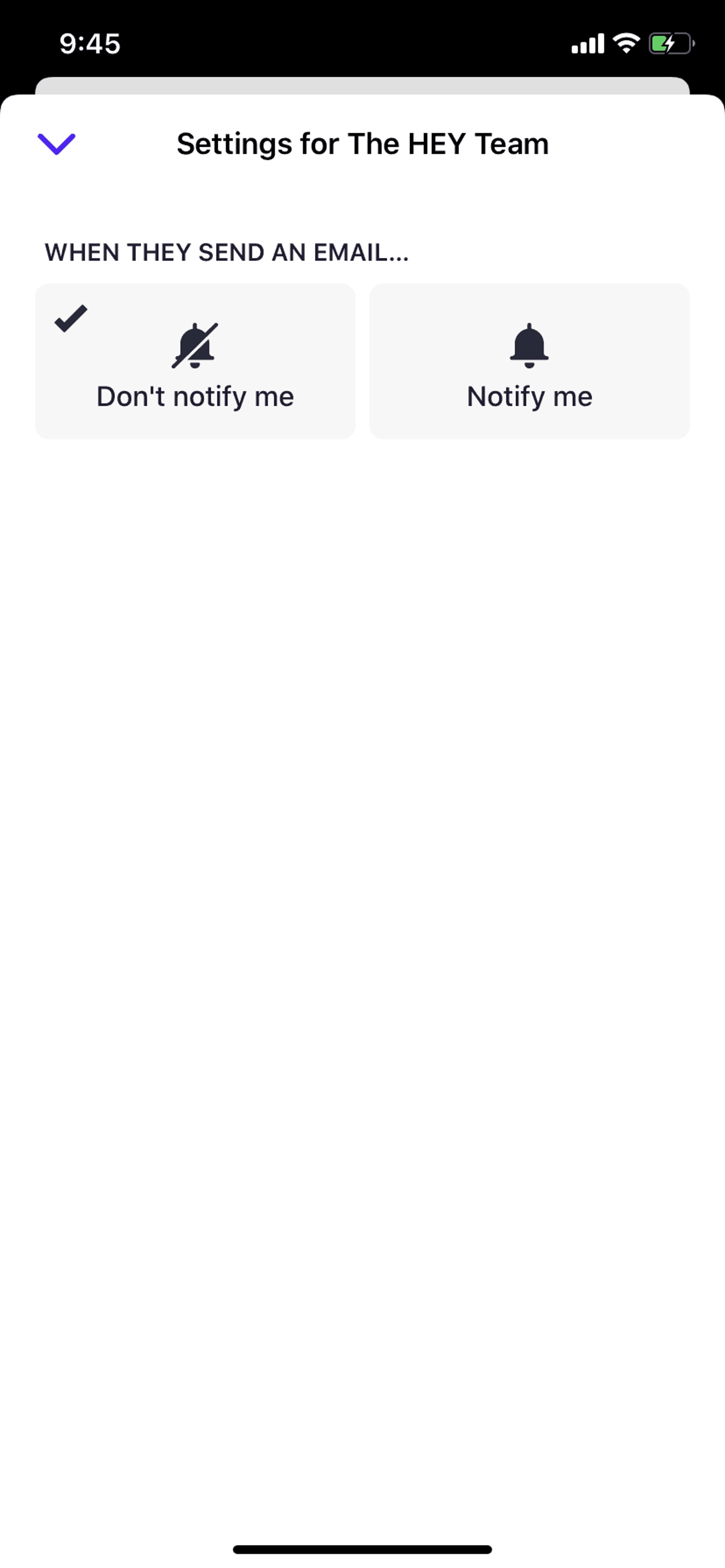
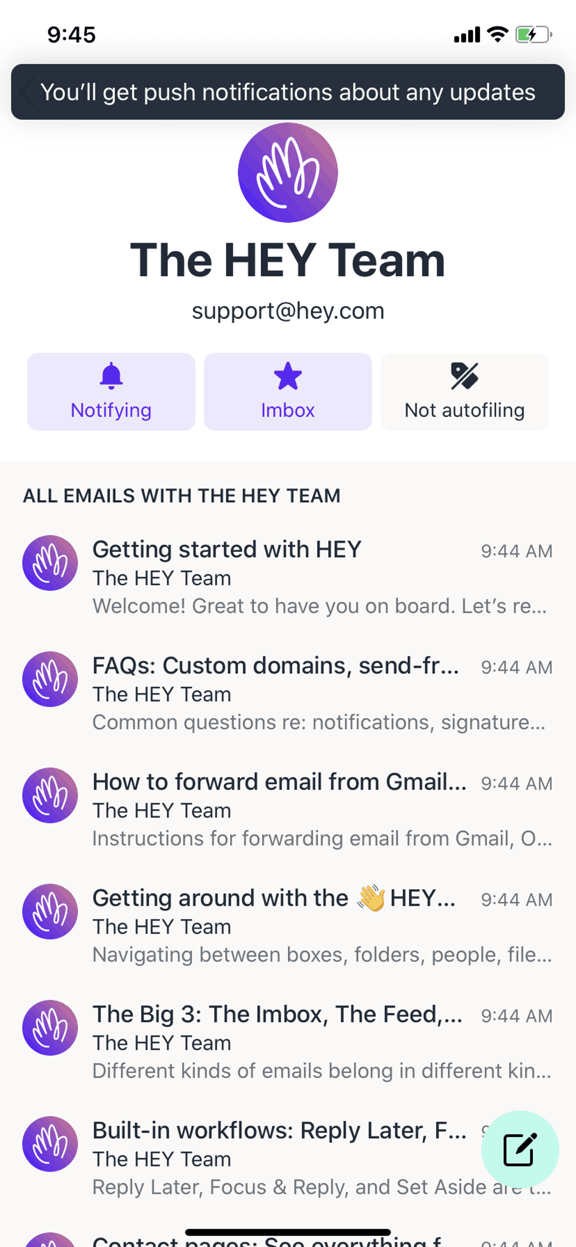
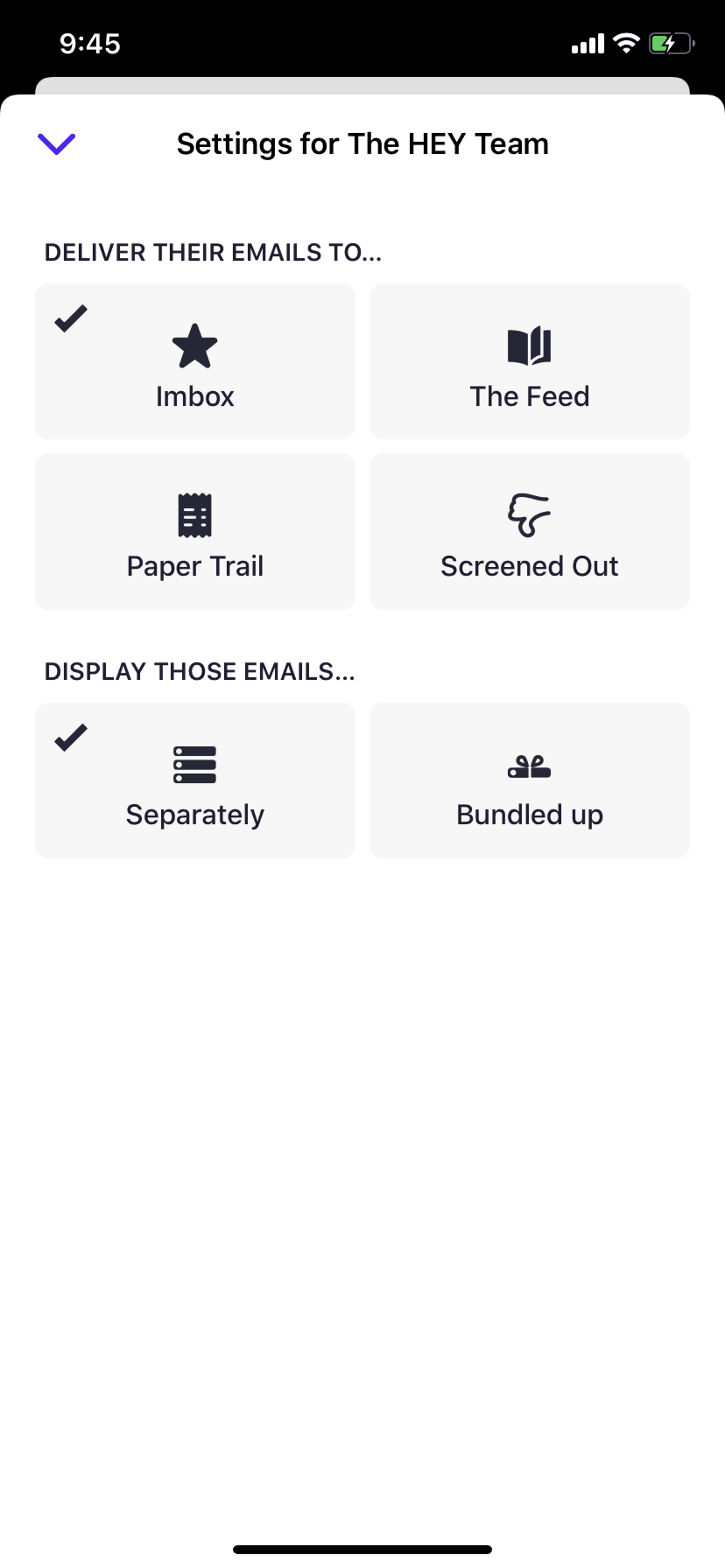
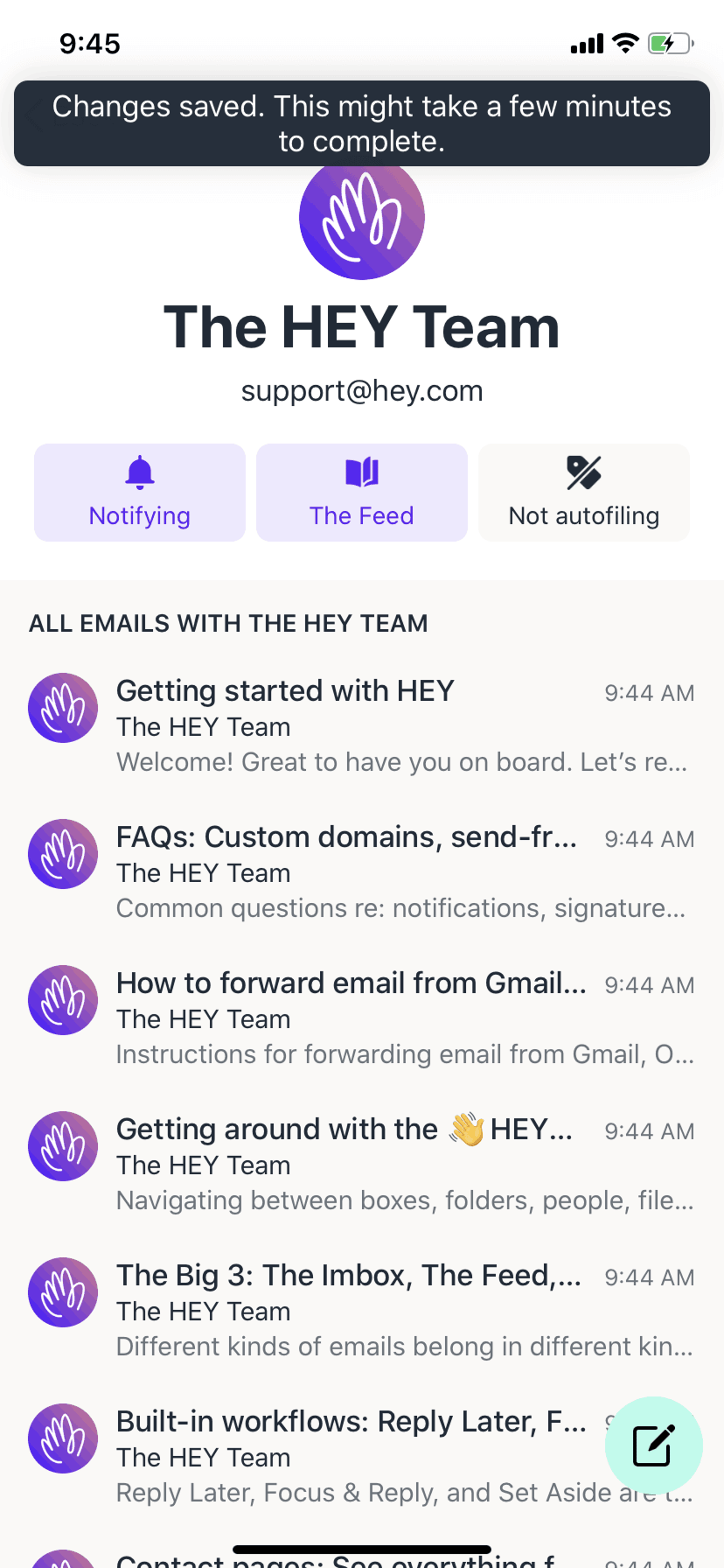
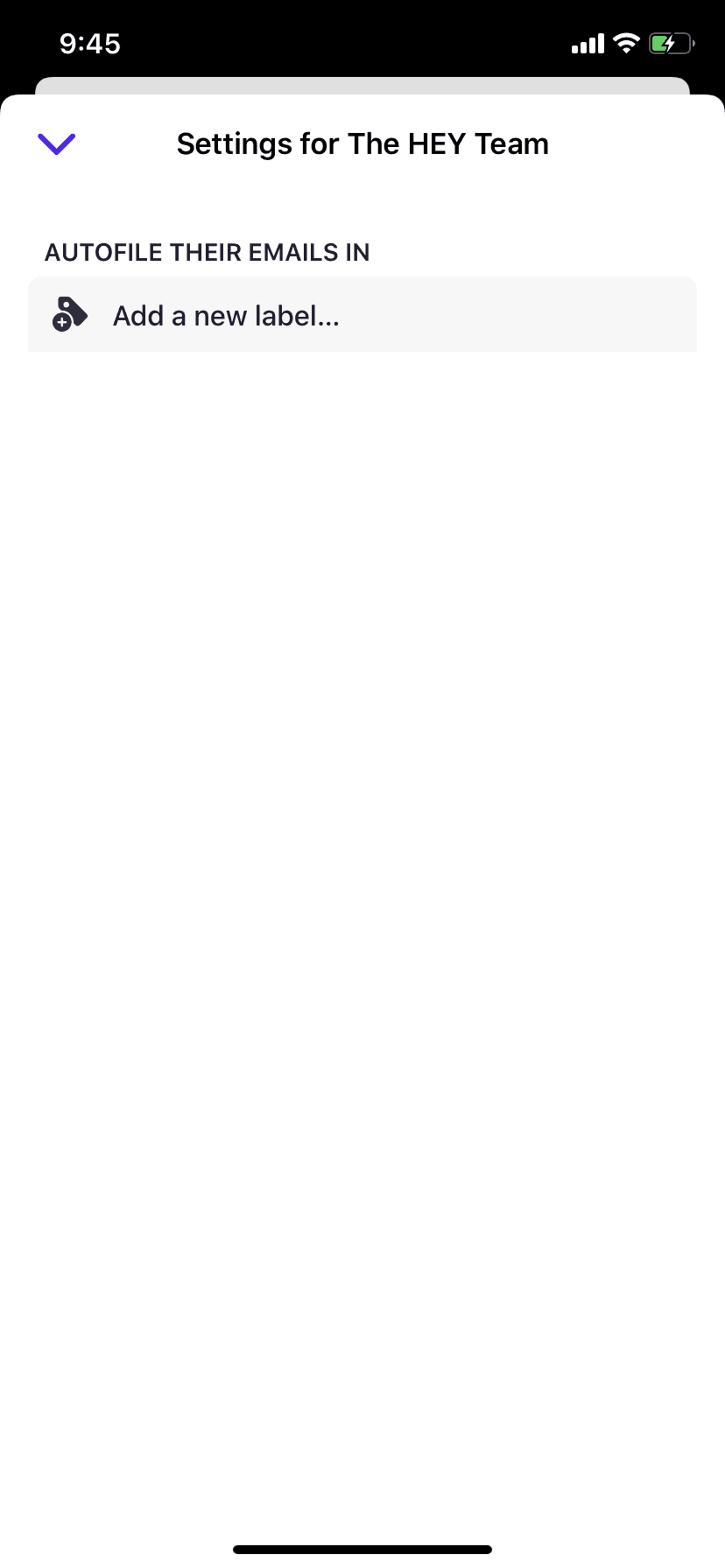
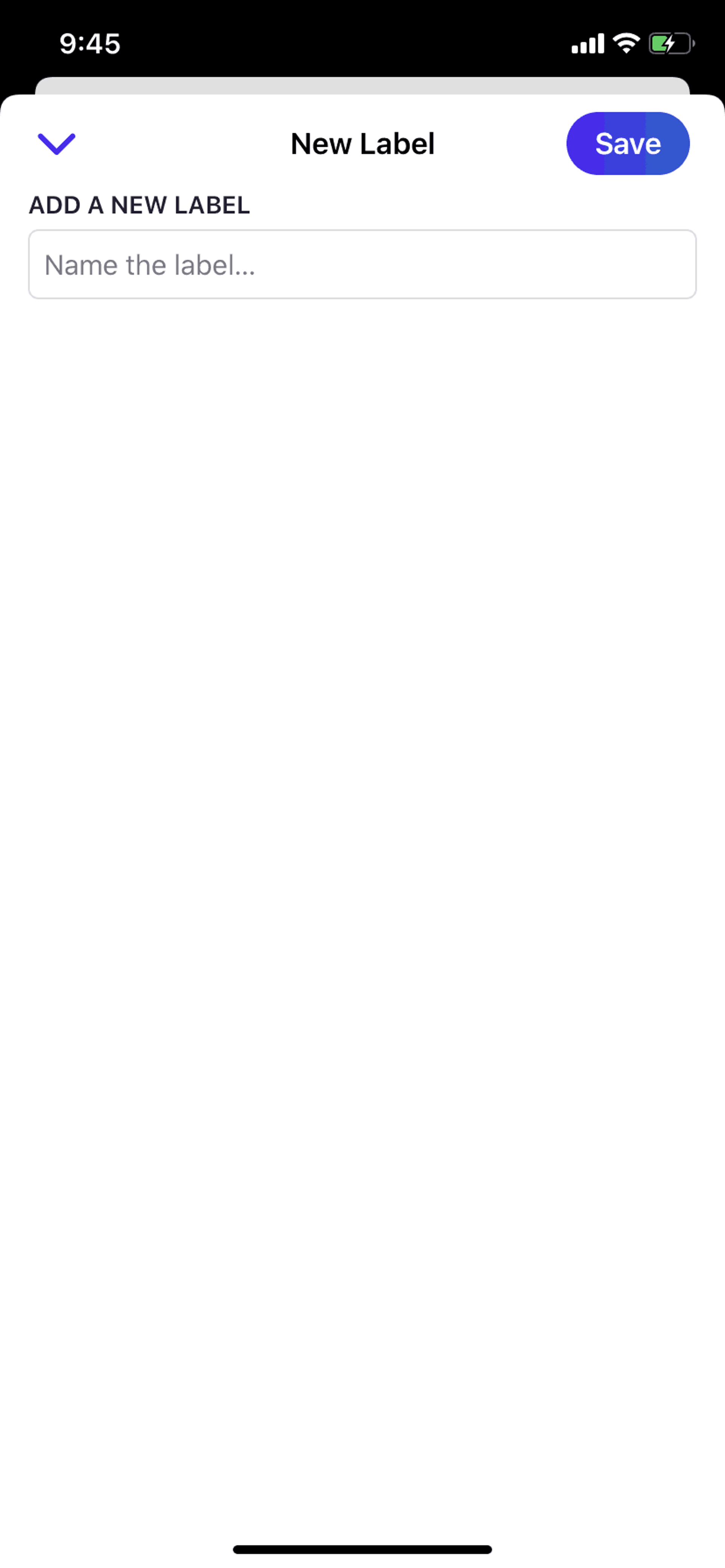
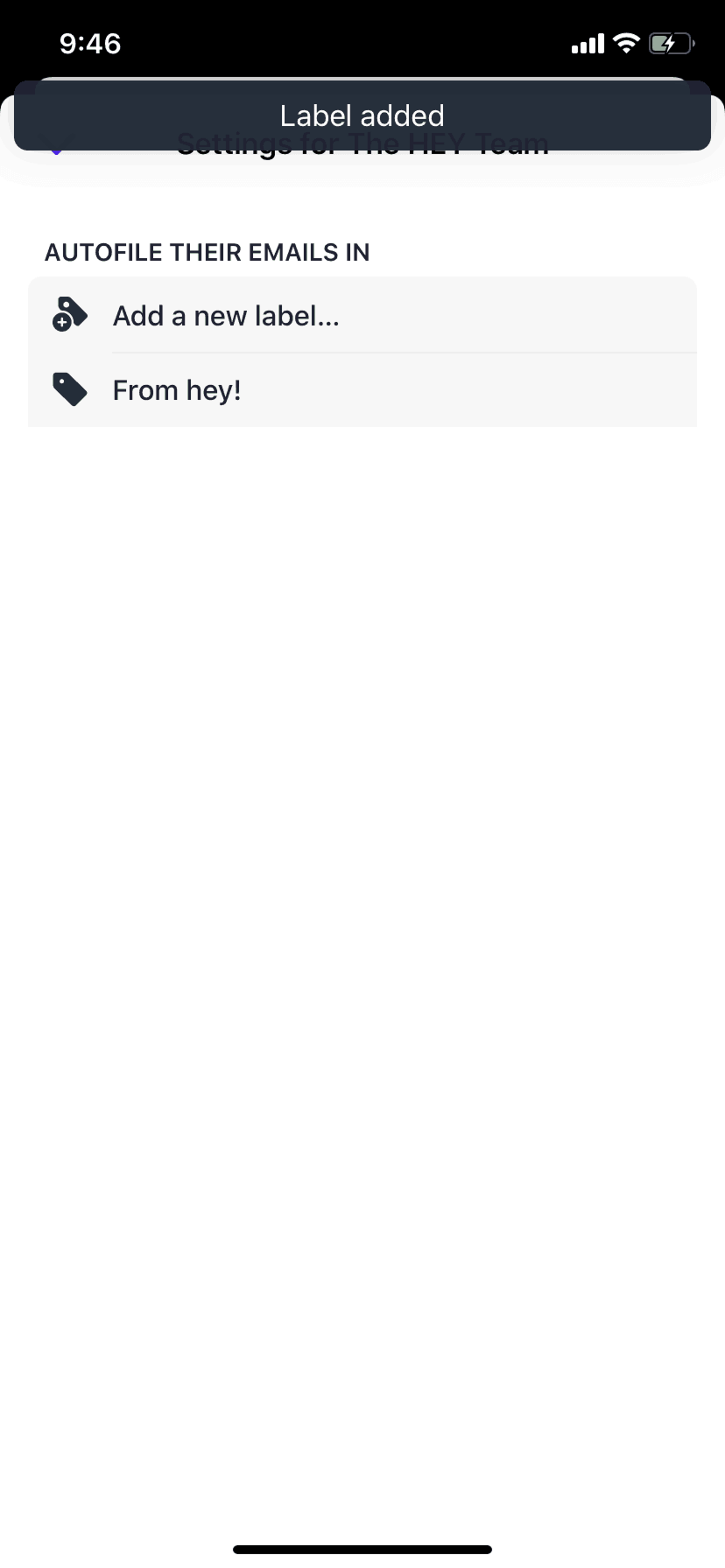
HEY is a radically redesigned email client from Basecamp that challenges conventional inbox management. Instead of a chronological feed of everything, HEY introduces a screener system where new senders must be approved before reaching your inbox. The app organizes emails into three distinct sections — Imbox for important messages, The Feed for newsletters, and Paper Trail for receipts and transactional emails. This opinionated approach forces users to reconsider how they interact with email daily.
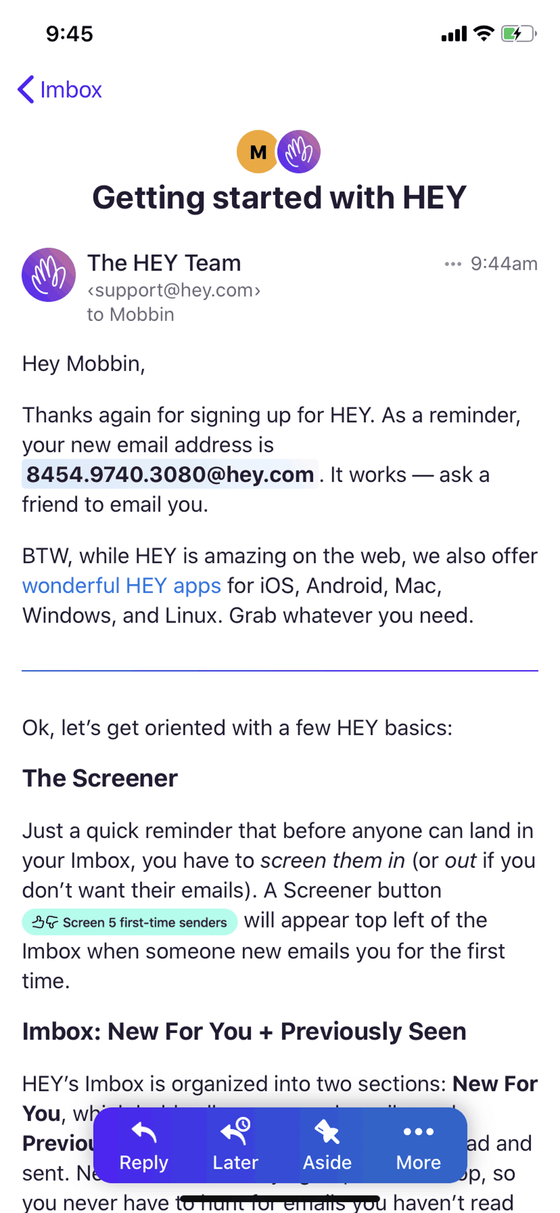
HEY's visual design deliberately breaks from the standard iOS Mail template. The interface uses bold typography, generous whitespace, and a distinctive orange accent color that reinforces brand identity throughout the experience. The screener flow — where users decide to approve or reject first-time senders — transforms a passive activity (receiving email) into an active, empowering choice. The "Reply Later" sticky note metaphor provides a tactile, skeuomorphic element that makes deferred actions feel intentional rather than forgotten. Navigation relies heavily on swipe gestures, reducing the need for explicit buttons and keeping the interface clean.
Get unlimited access from $9.99/month — cancel anytime.
HEY is categorized under Productivity. You can study its onboarding flow, login screens, navigation patterns, and other UI elements on Gummble.
Yes, Gummble Pro users can download HEY iOS screenshots for design reference. Free users can browse all screenshots and view detailed design analysis.
HEY operates on a premium subscription model at $99/year with no free tier — a deliberate choice that filters for committed users and funds ongoing development without advertising. The onboarding makes this clear upfront, positioning the price as an investment in productivity rather than a barrier. A 14-day trial lets users experience the full product before committing. This pricing strategy attracts professionals who value their time over casual users who might churn, resulting in a more sustainable customer base.
HEY is built for knowledge workers drowning in email who are frustrated with Gmail and Outlook's kitchen-sink approach. Early adopters, indie developers, writers, and founders — people who think critically about their tools — form the core user base. The opinionated design intentionally excludes users who want maximum customization; HEY works best for those willing to adopt its workflow rather than impose their own.
HEY demonstrates that constraints can be features. By removing reply-all, read receipts, and infinite customization, the app makes a statement about what healthy email behavior looks like. The screener concept — forcing active consent for each new sender — could apply to any notification-heavy product (messaging apps, social platforms, news feeds). For product designers, HEY shows that breaking category conventions requires confidence and clear communication of the "why" behind every unusual choice.


