

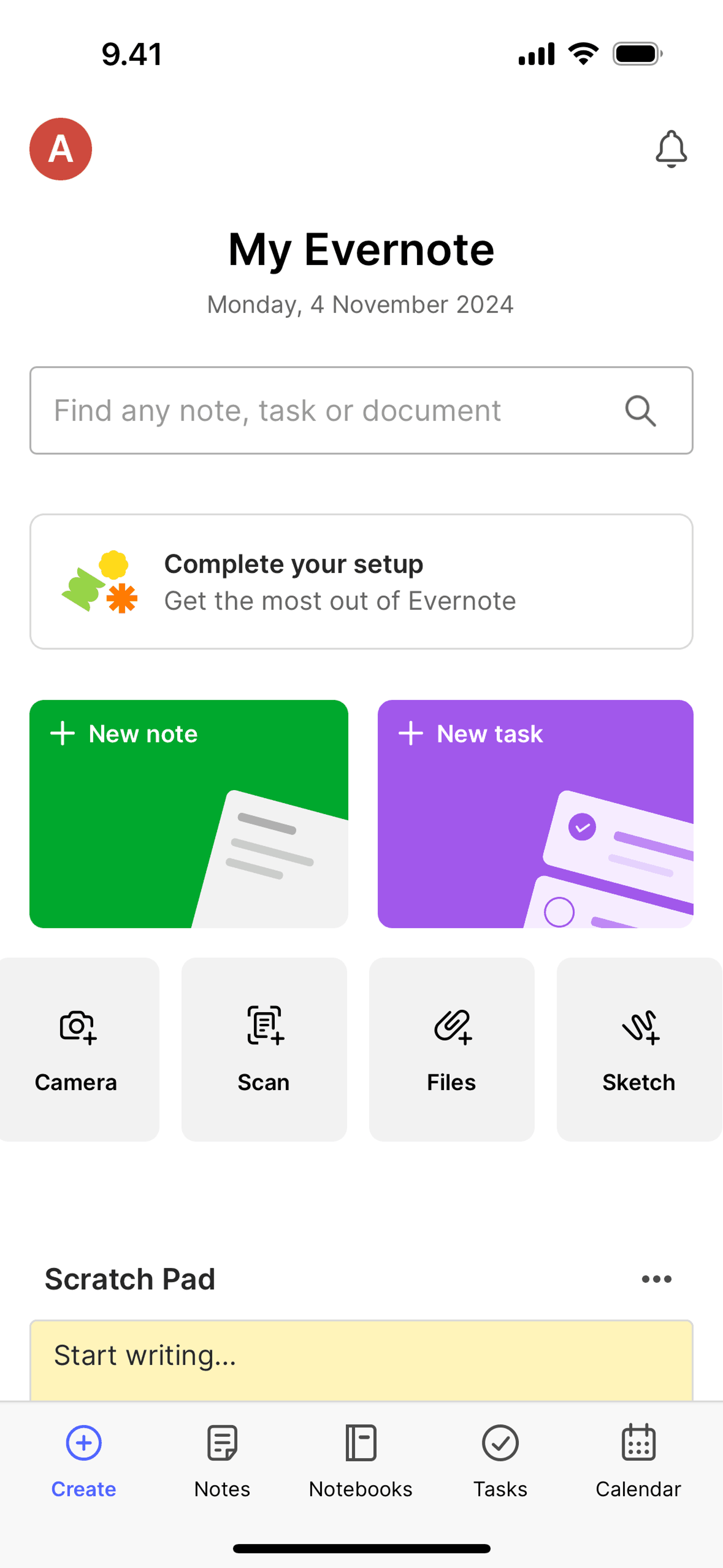
Evernote iOS Productivity interface screenshot 1
Onboarding on Evernote (ios) screen 1
Create on Evernote (ios) screen 2
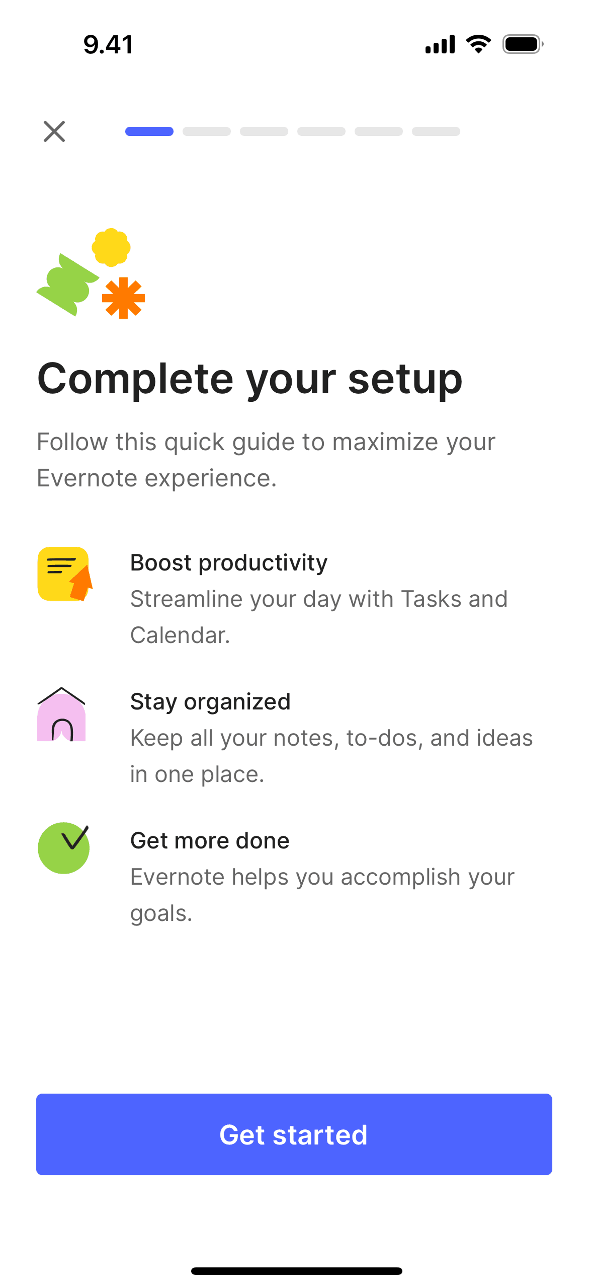
Completing app setup on Evernote (ios) screen 2
Creating a new note on Evernote (ios) screen 2
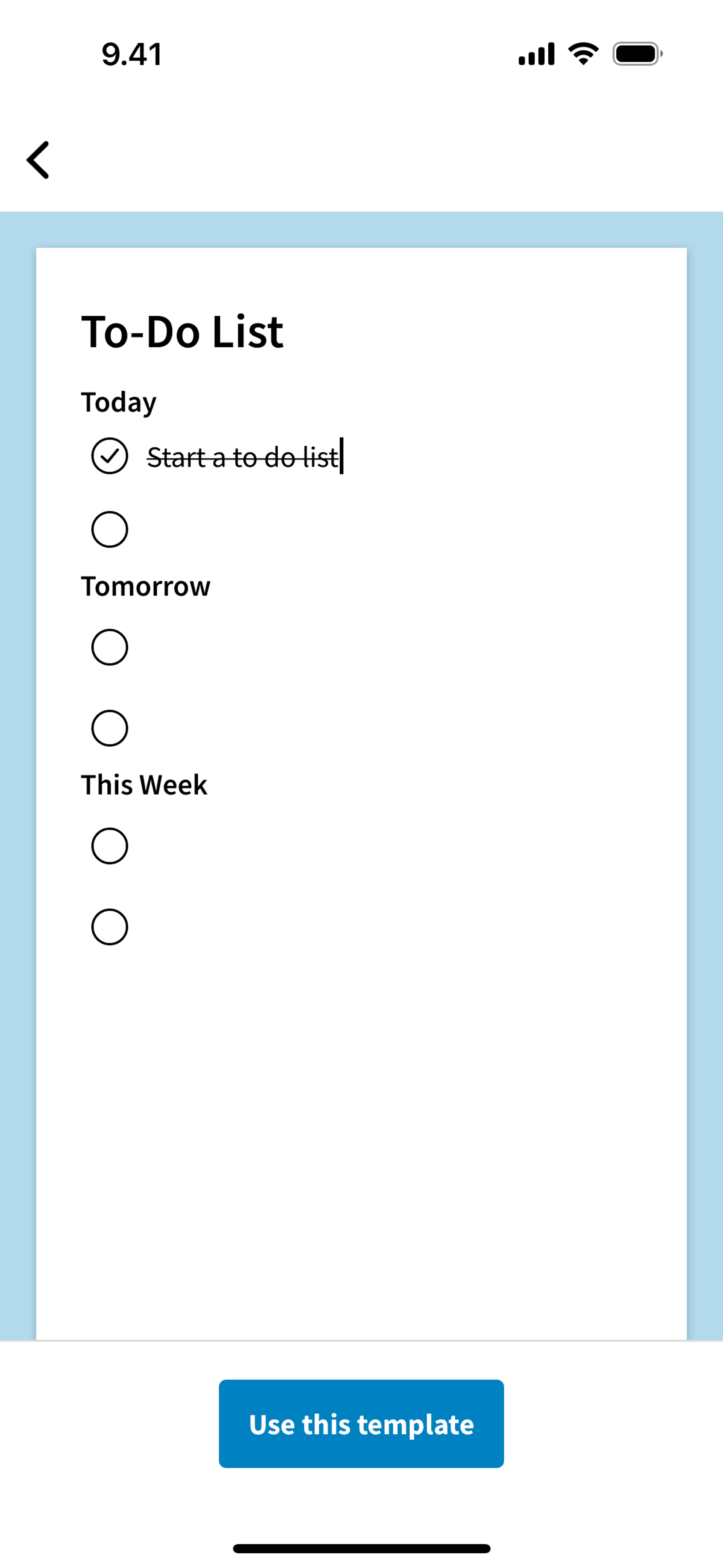
Using a template on Evernote (ios) screen 2
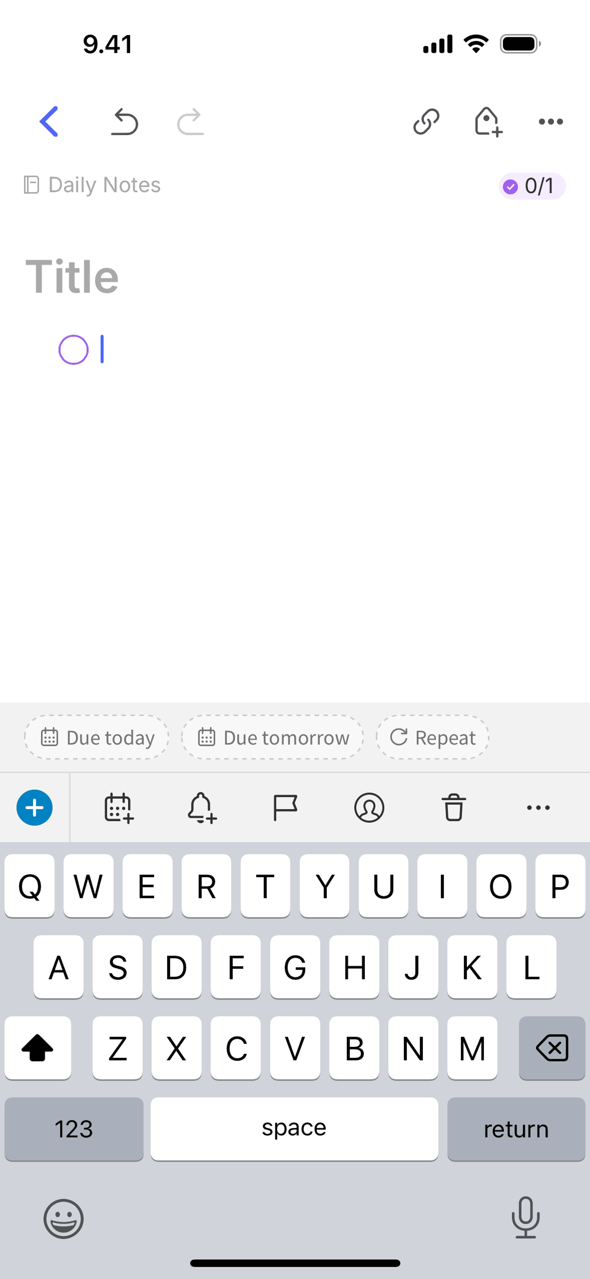
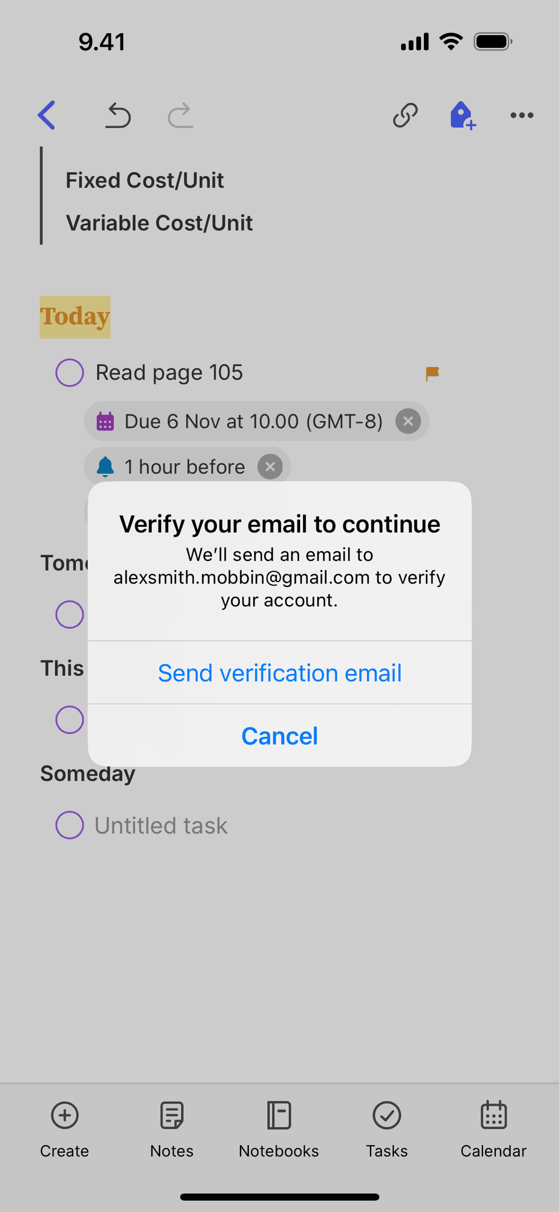
Adding a task on Evernote (ios) screen 2
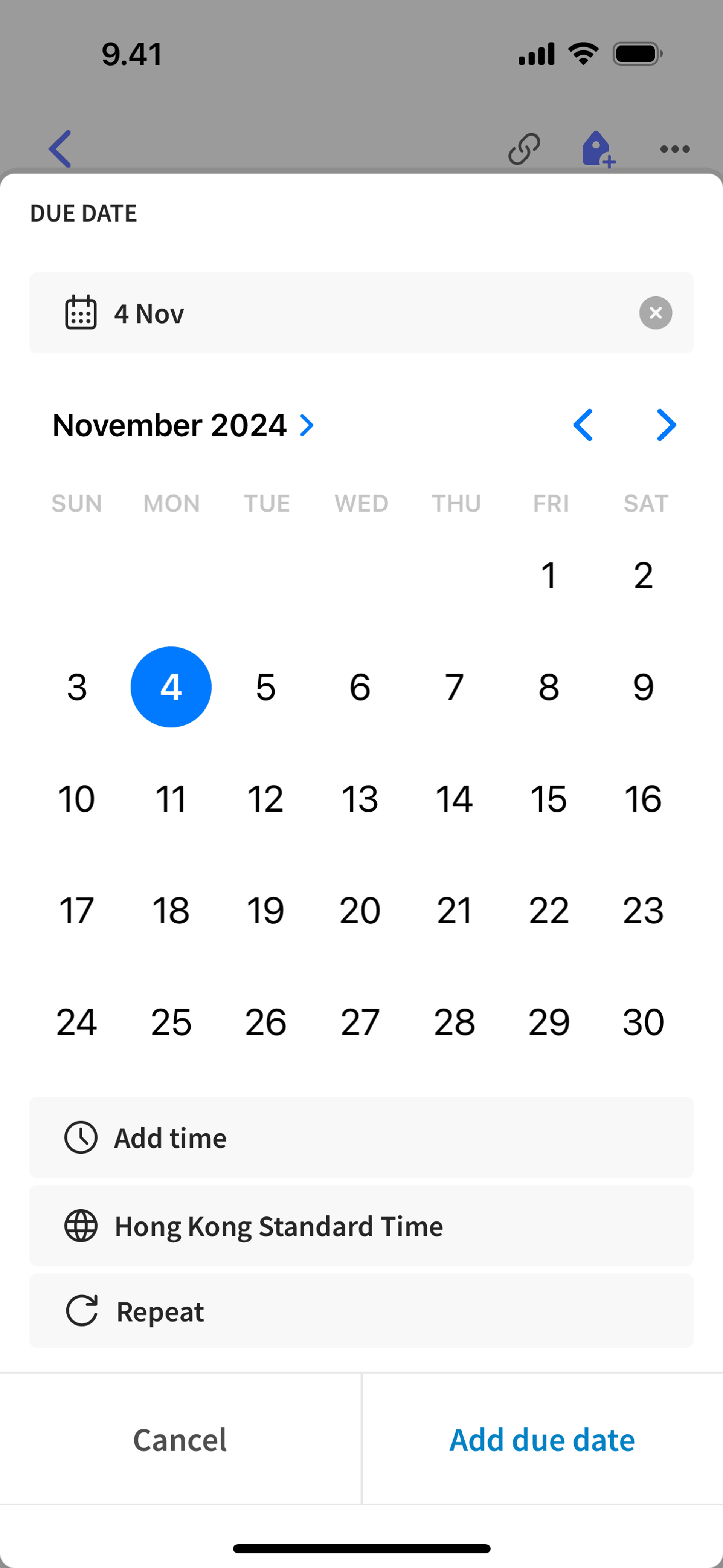
Adding a due date on Evernote (ios) screen 2
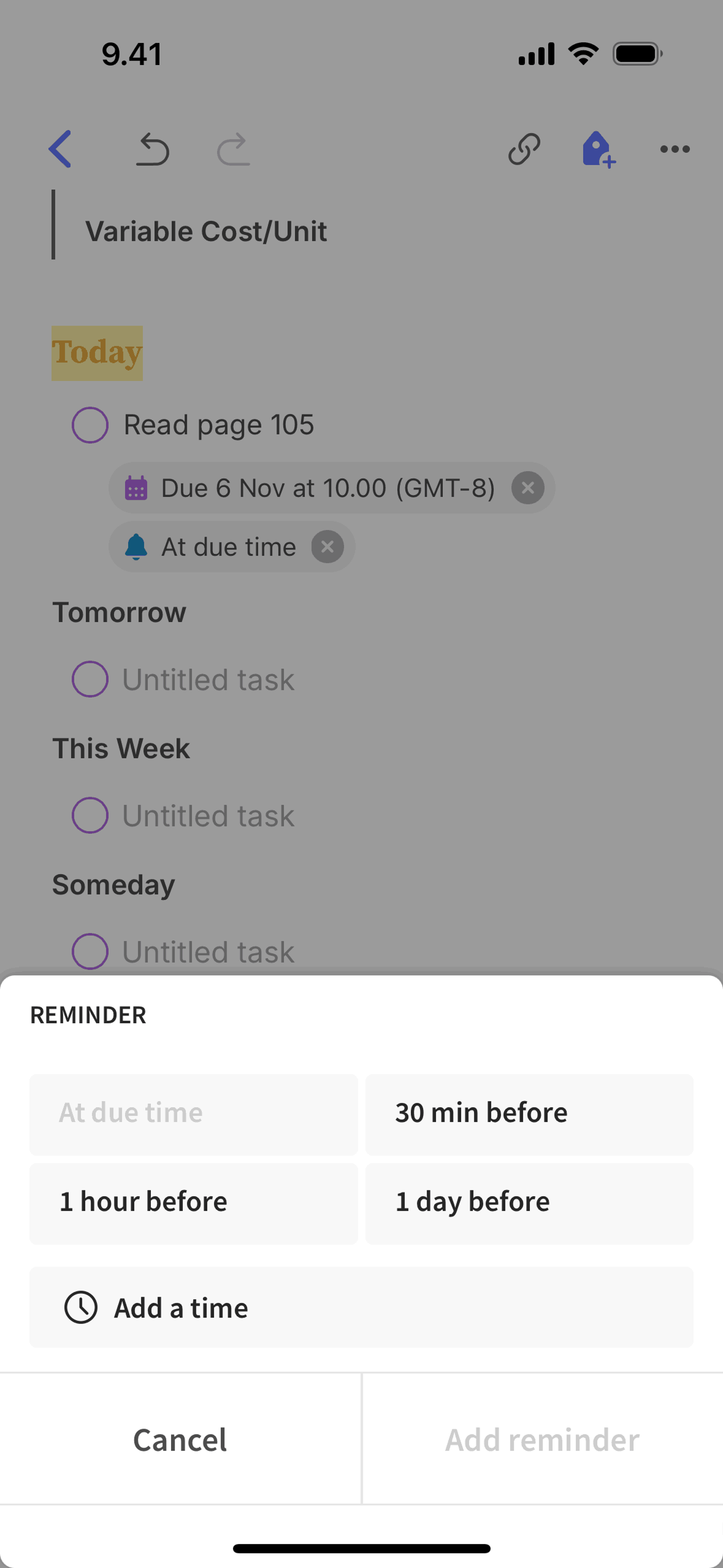
Adding a task reminder on Evernote (ios) screen 2
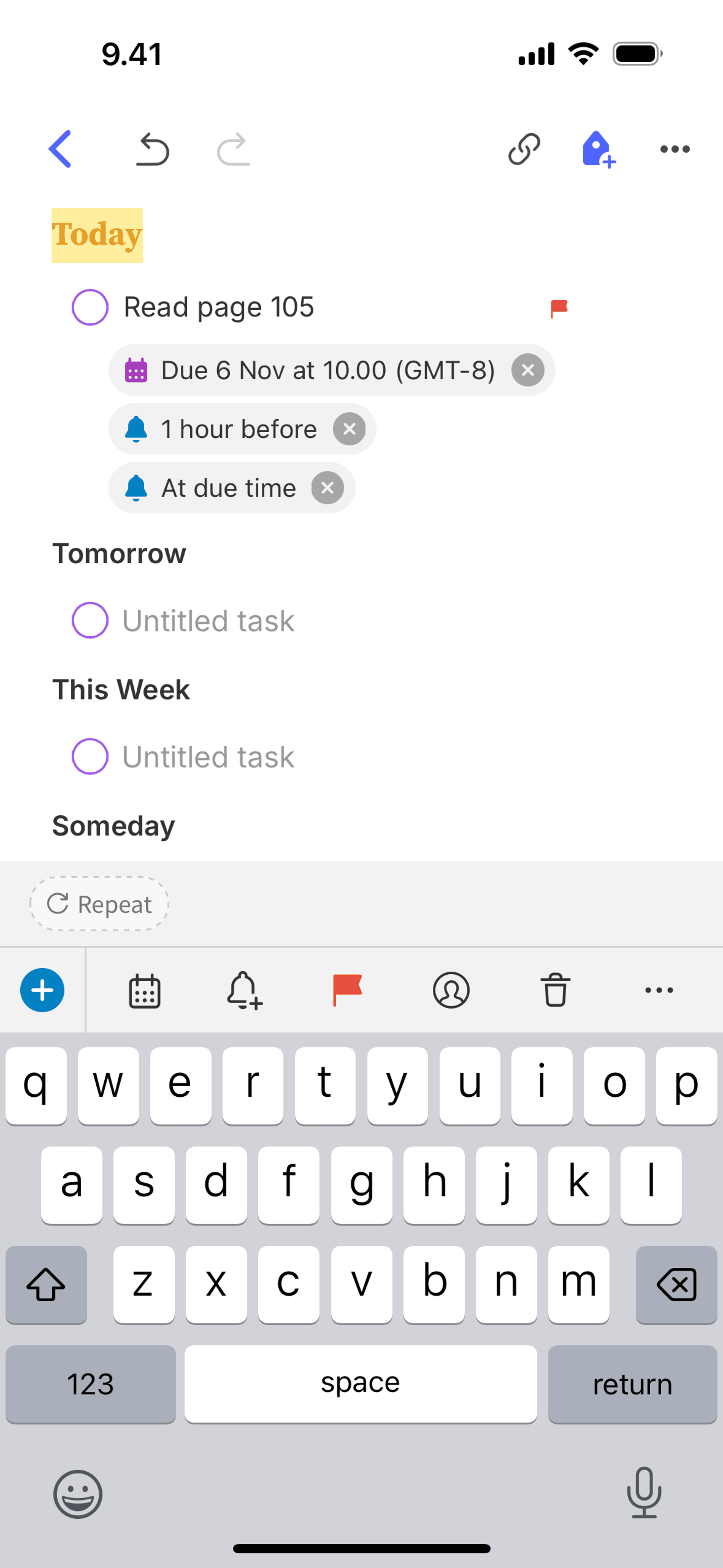
Flagging a task on Evernote (ios) screen 2
Assigning a task on Evernote (ios) screen 2
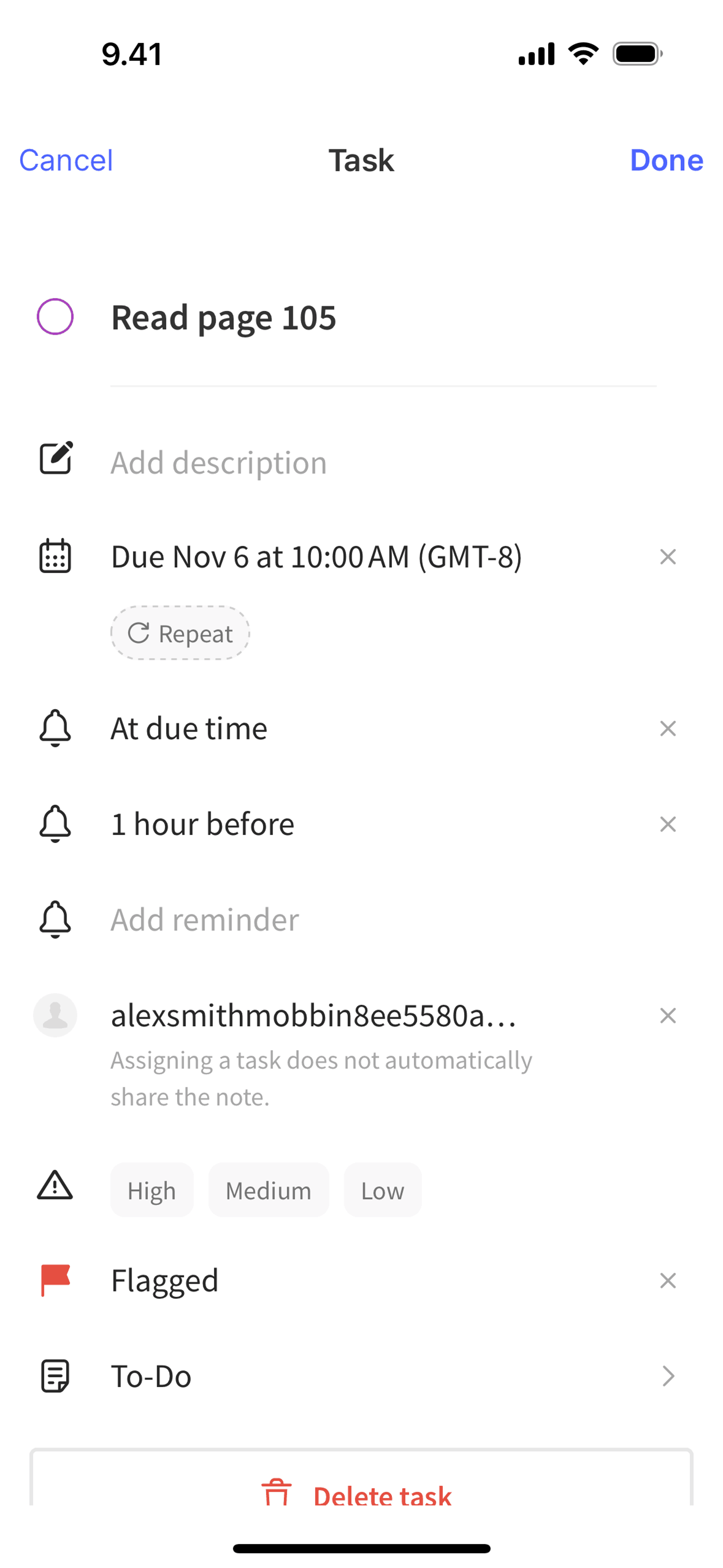
Editing a task on Evernote (ios) screen 2
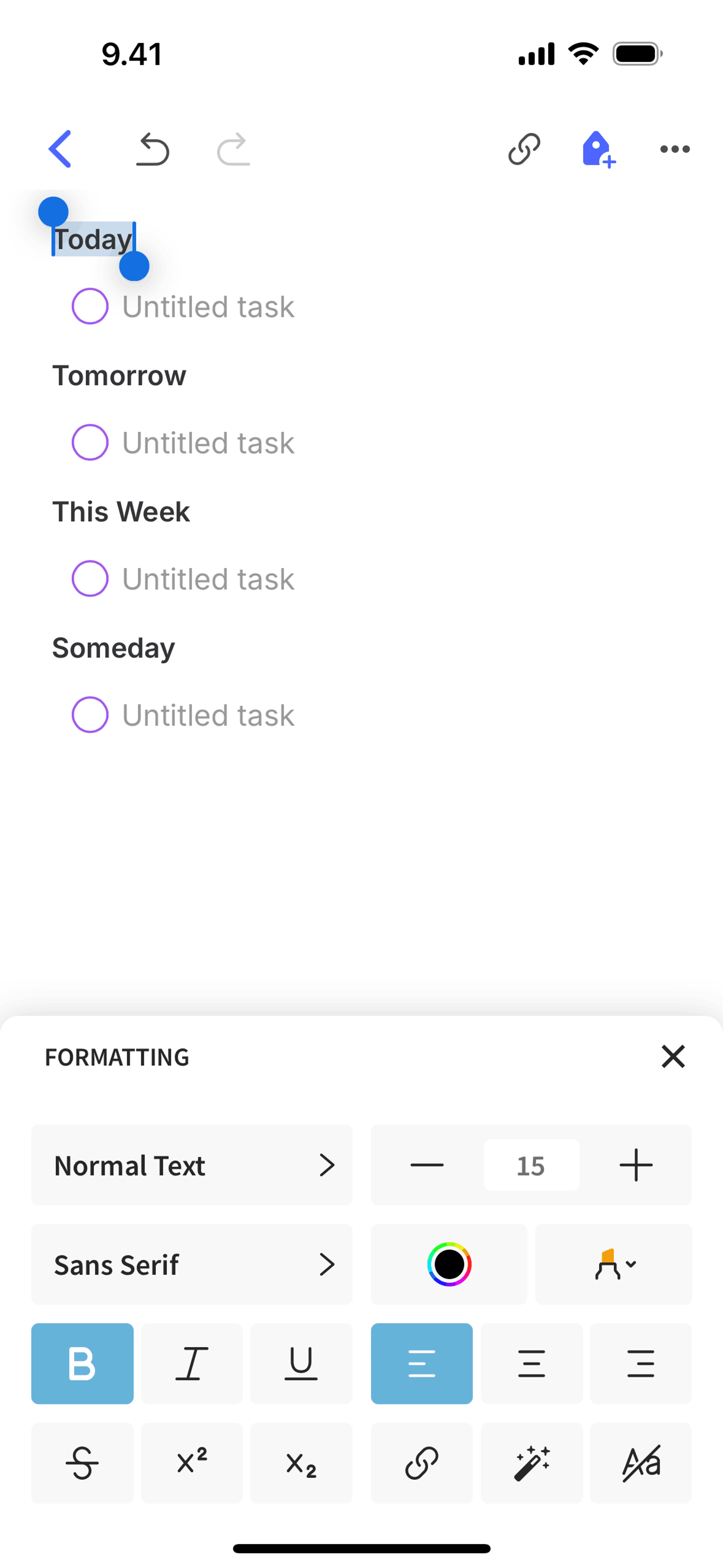
Formatting text on Evernote (ios) screen 2
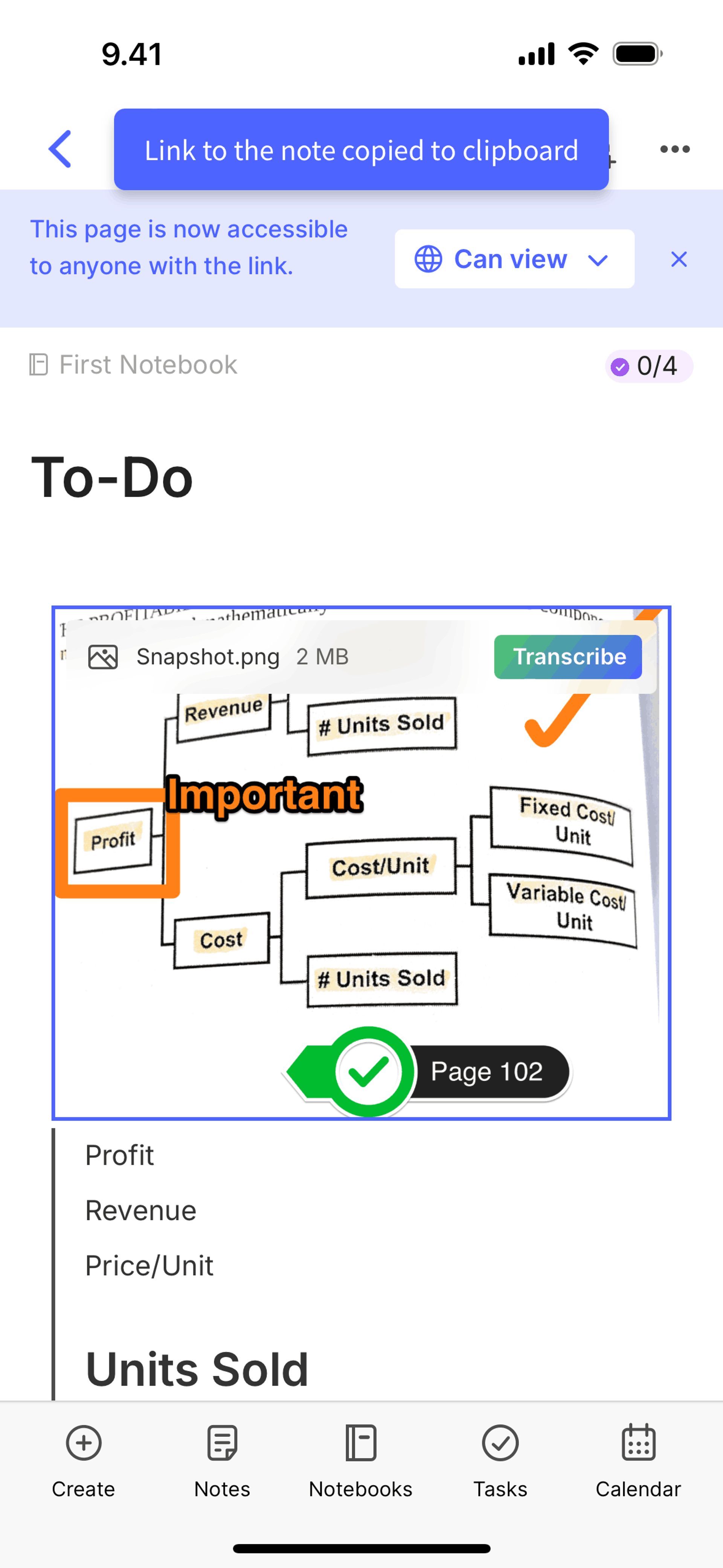
Copying a note link on Evernote (ios) screen 2
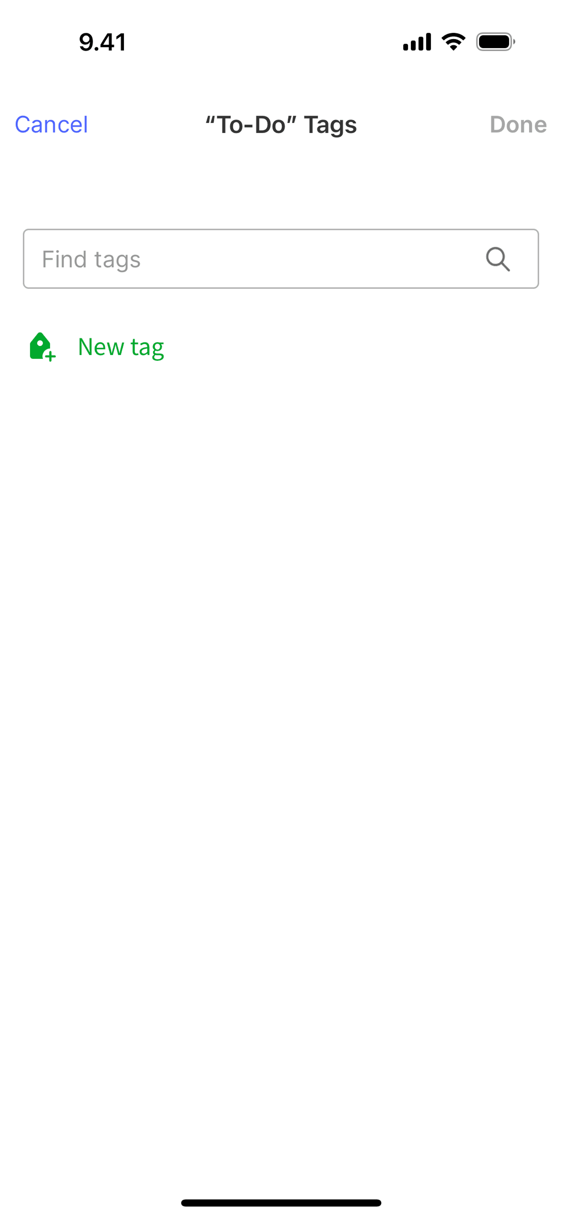
Adding a tag on Evernote (ios) screen 2
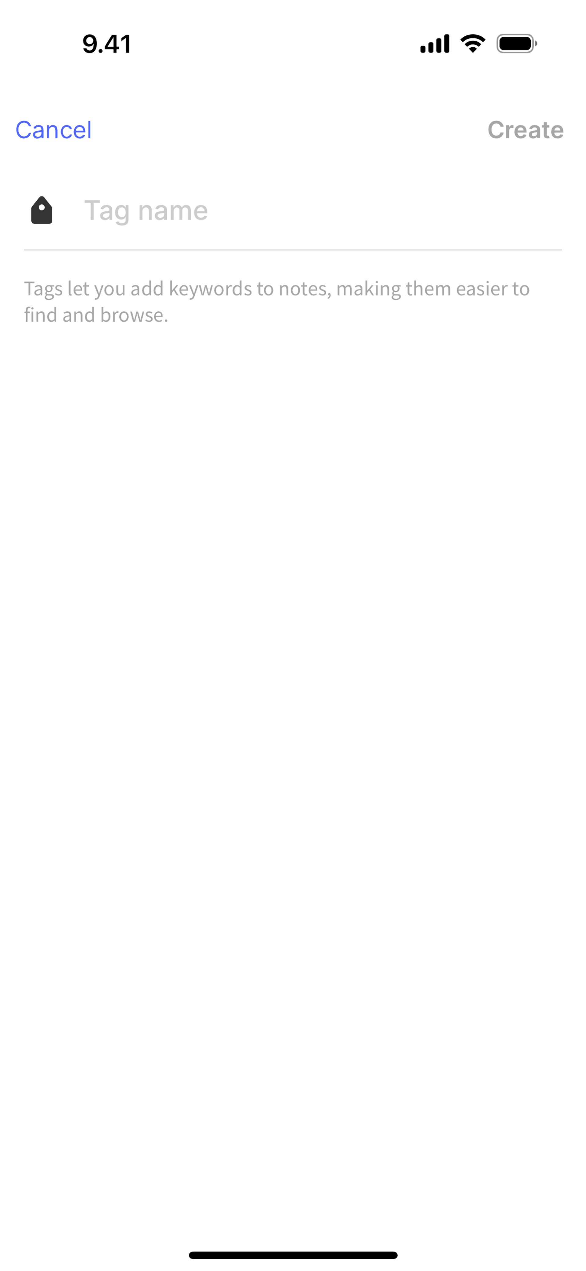
Creating a new tag on Evernote (ios) screen 2
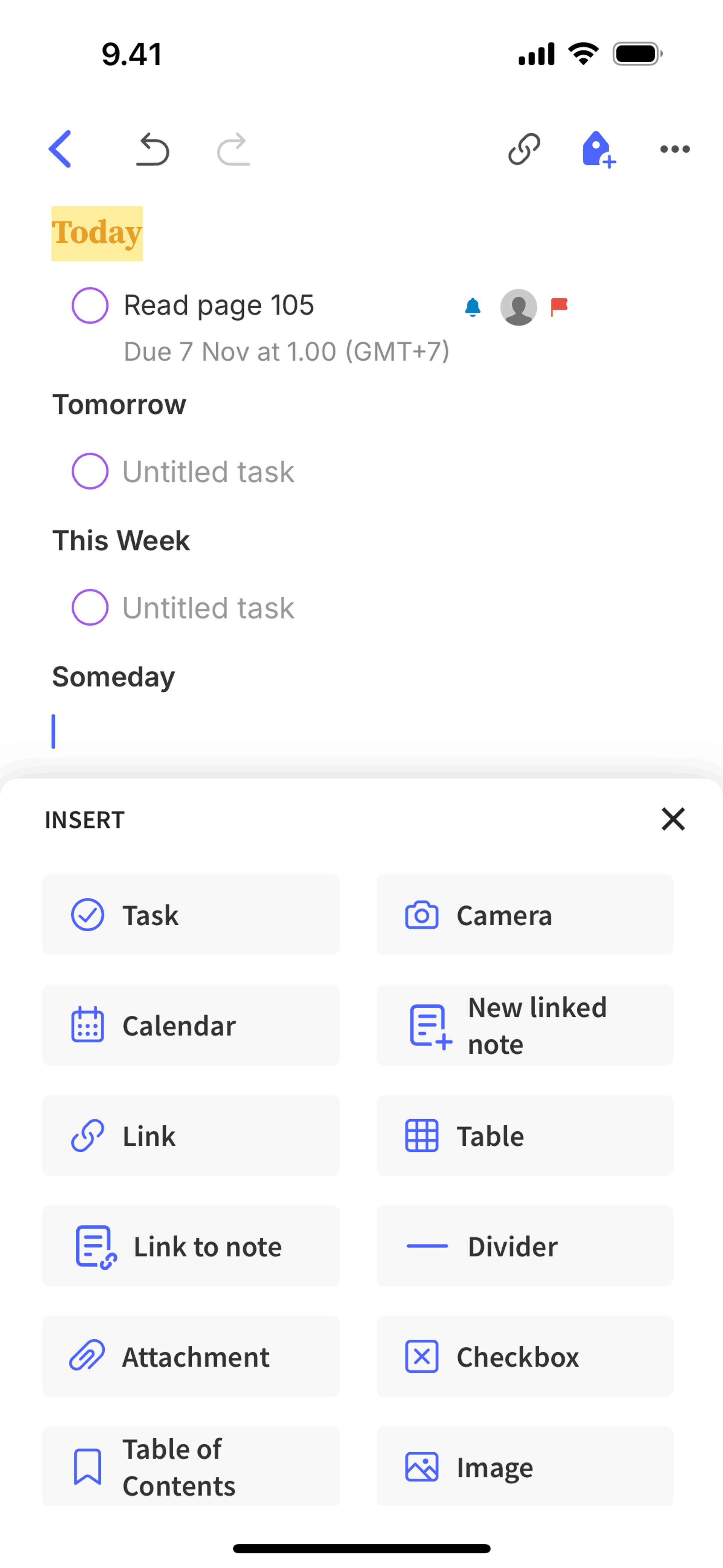
Insert on Evernote (ios) screen 2
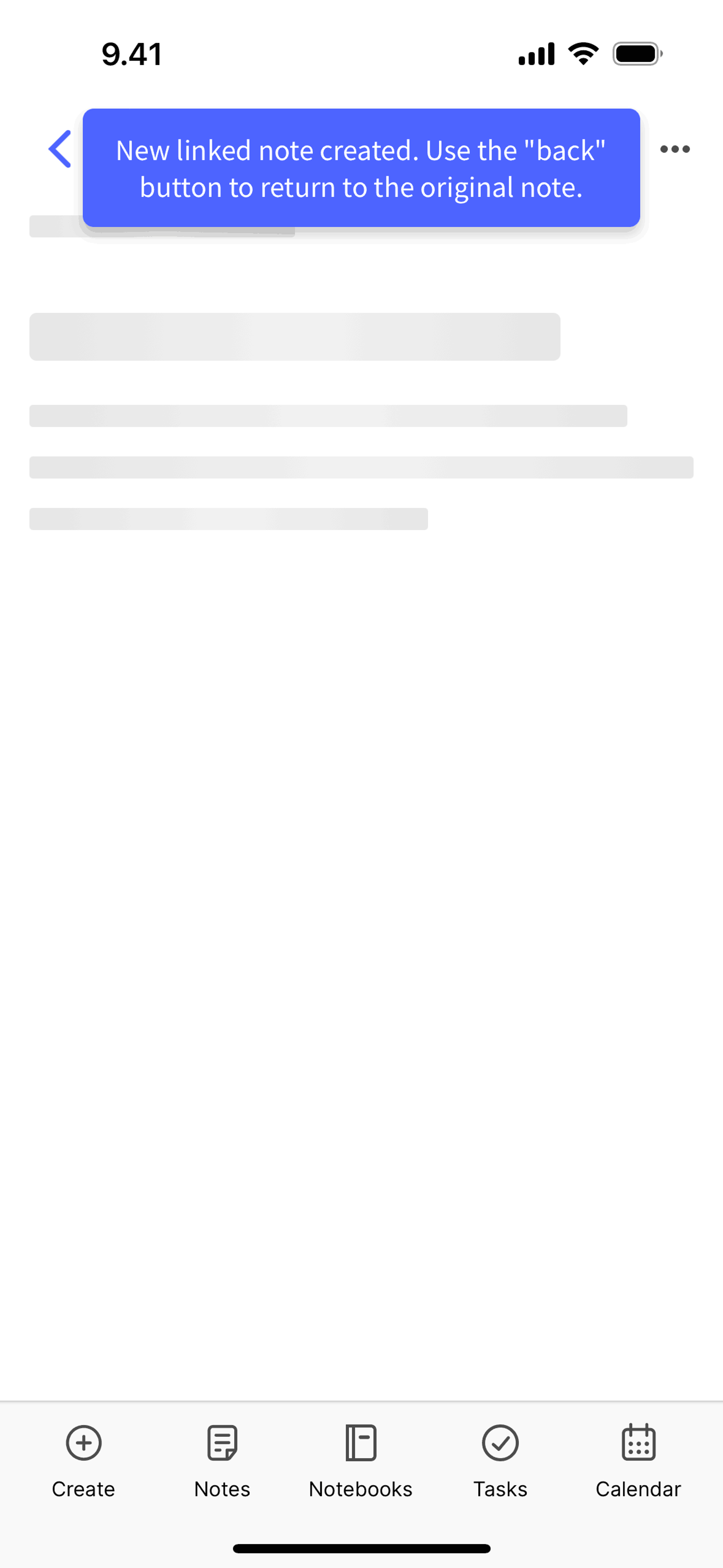
Creating a new linked note on Evernote (ios) screen 2
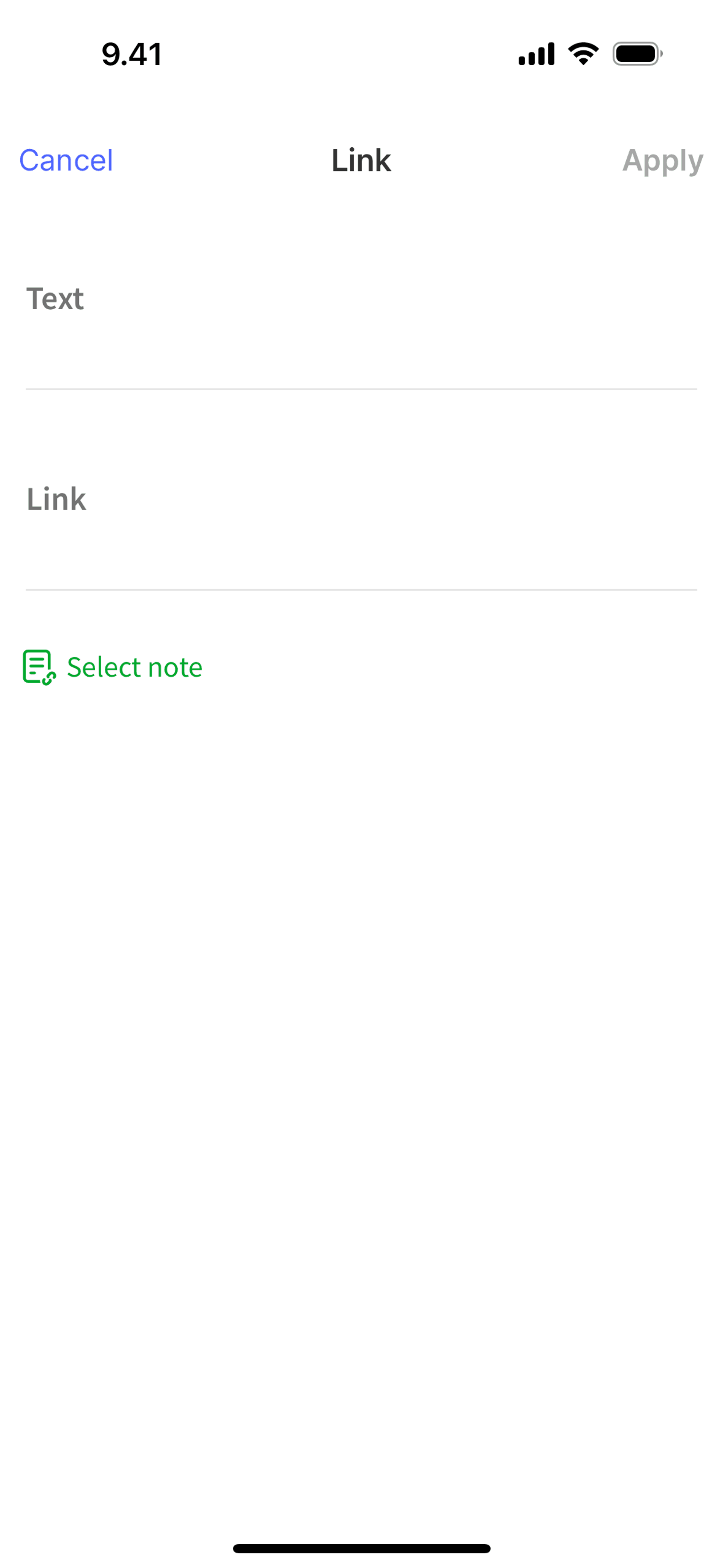
Linking a note on Evernote (ios) screen 2
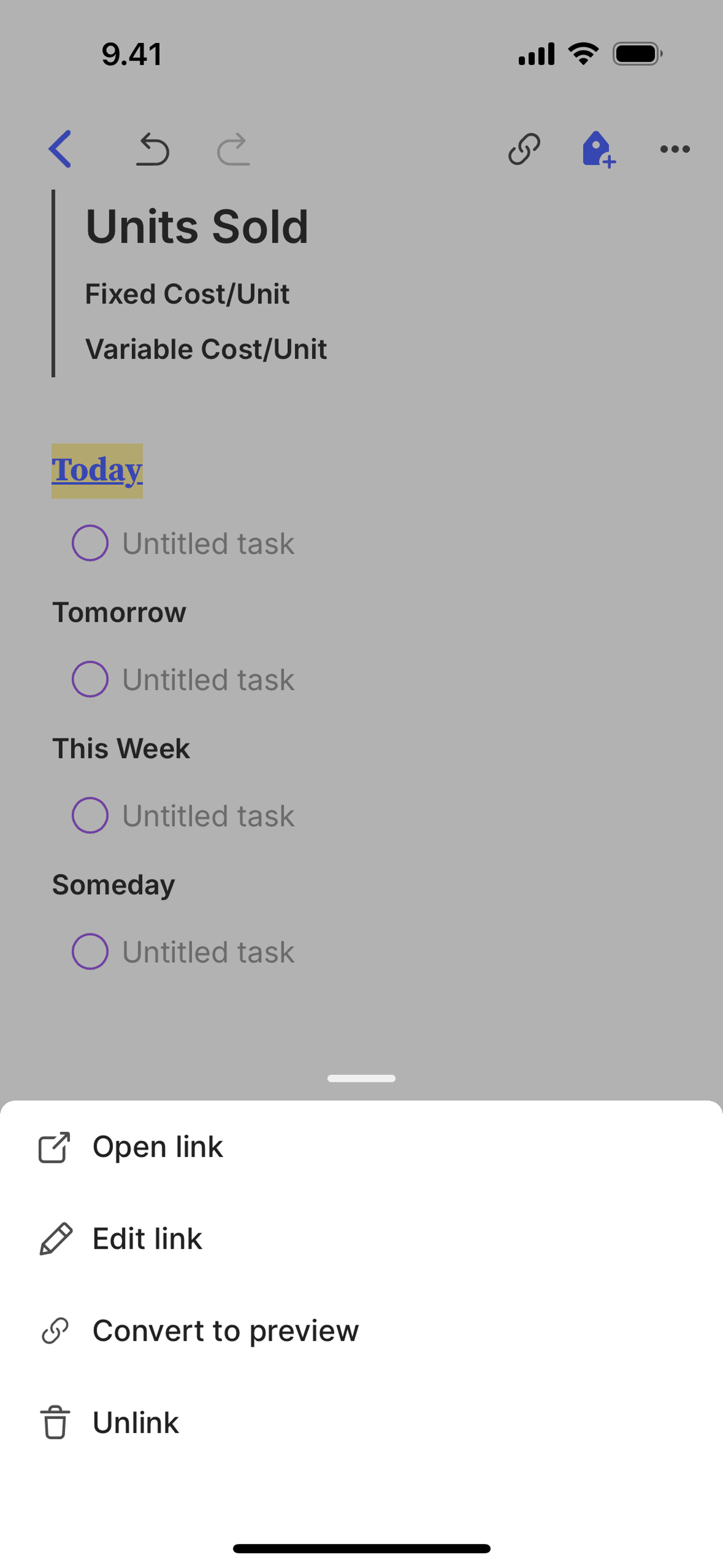
Converting to preview on Evernote (ios) screen 2
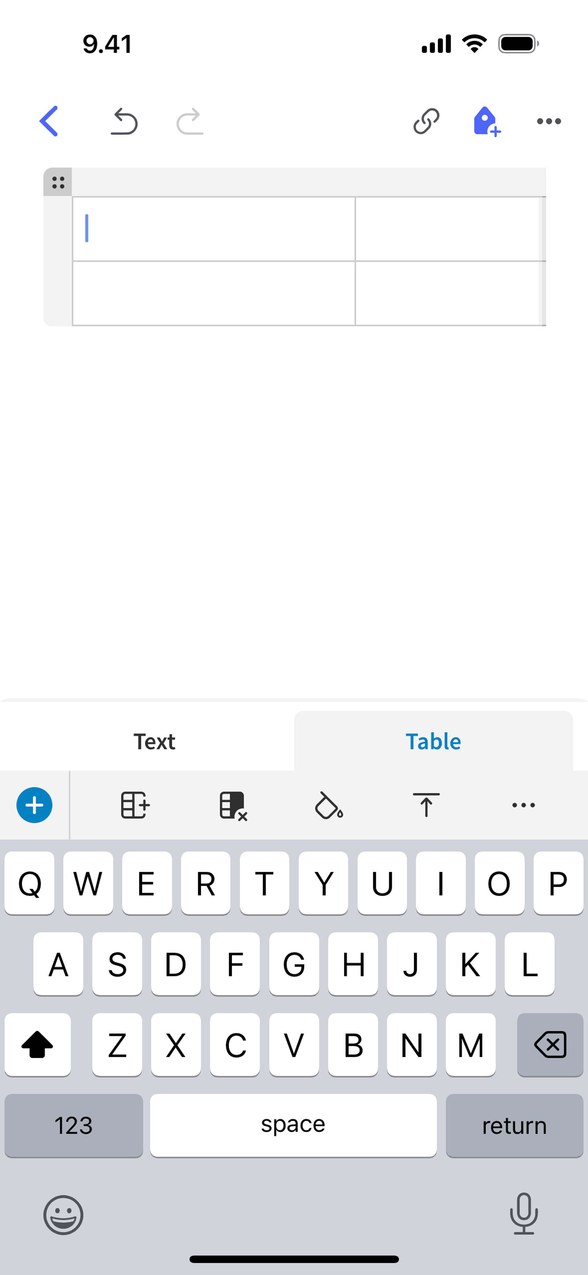
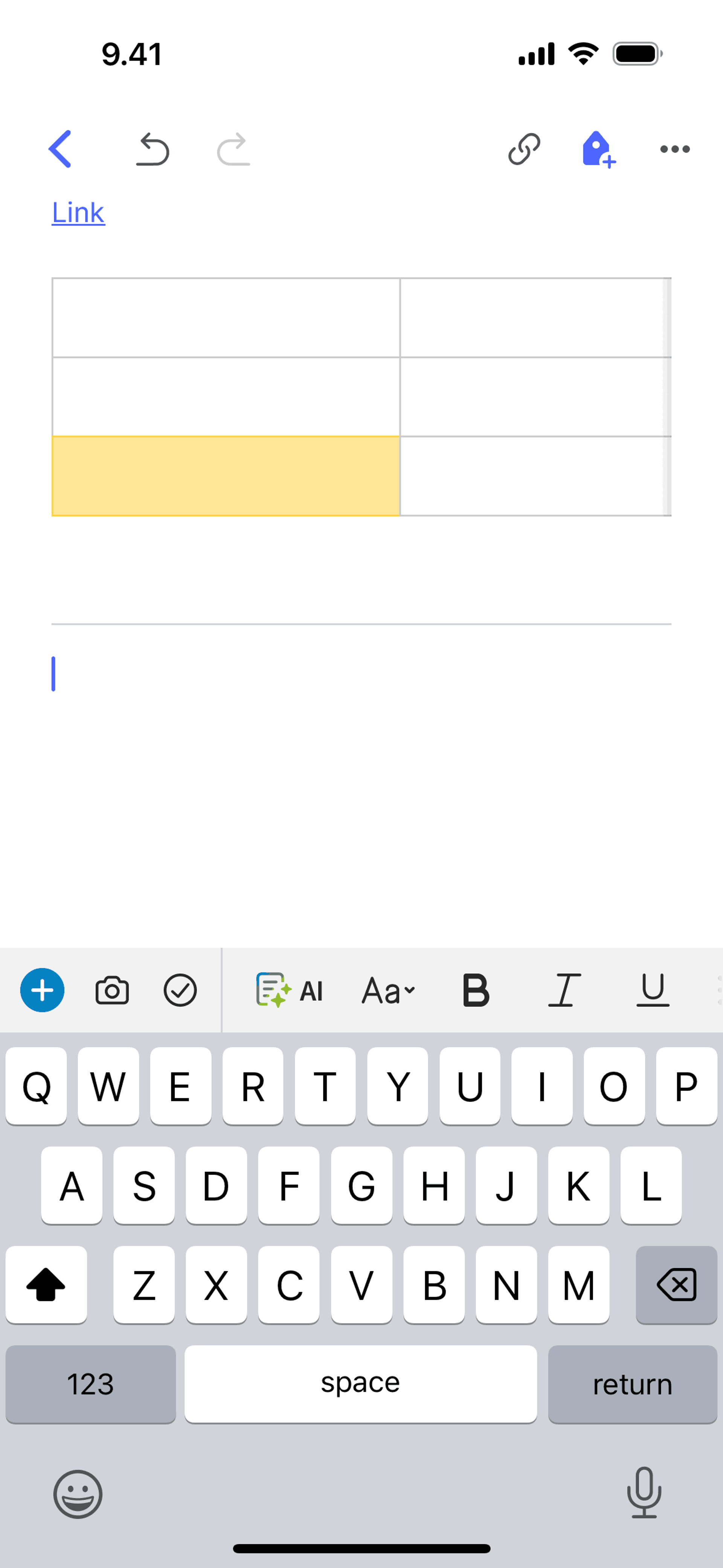
Adding a table on Evernote (ios) screen 2
Adding a divider on Evernote (ios) screen 2
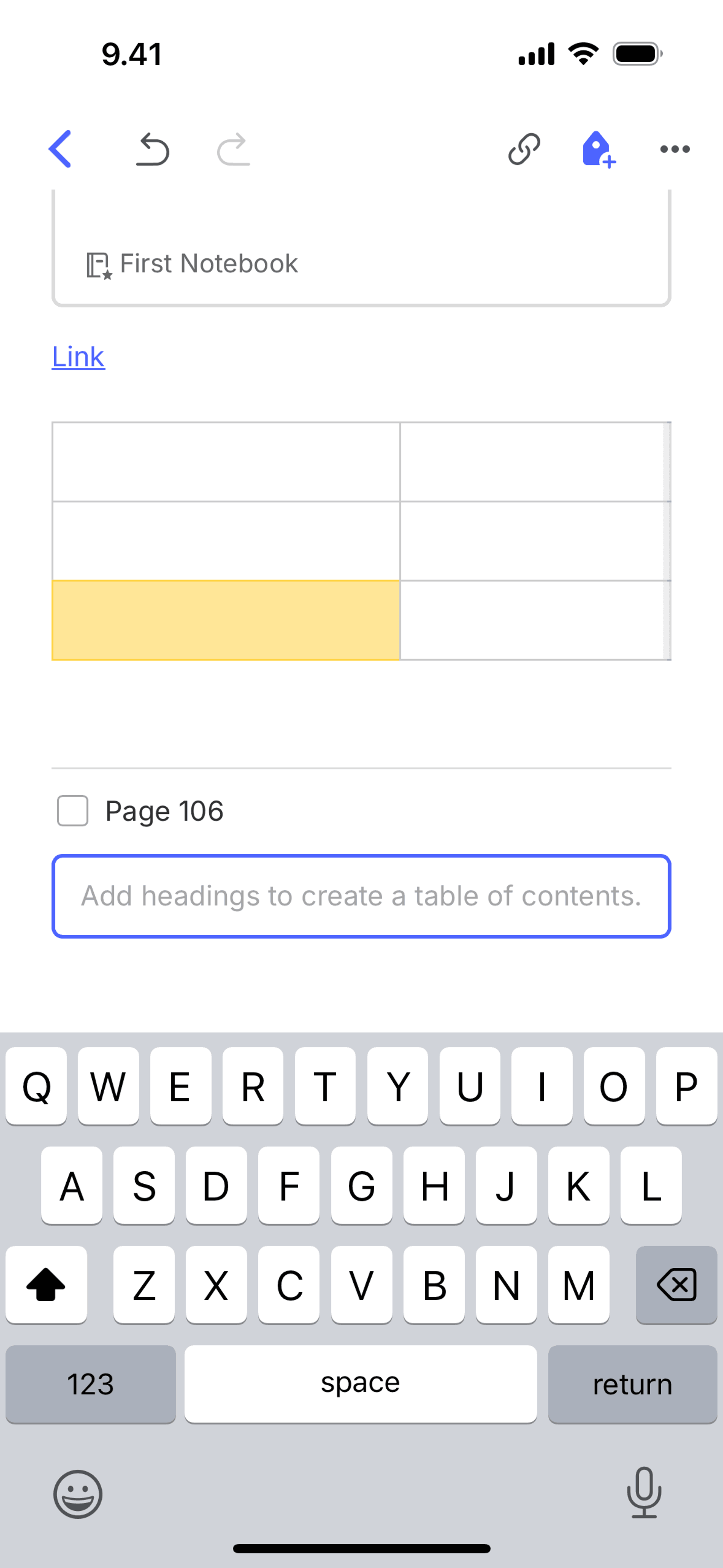
Adding table of contents on Evernote (ios) screen 2
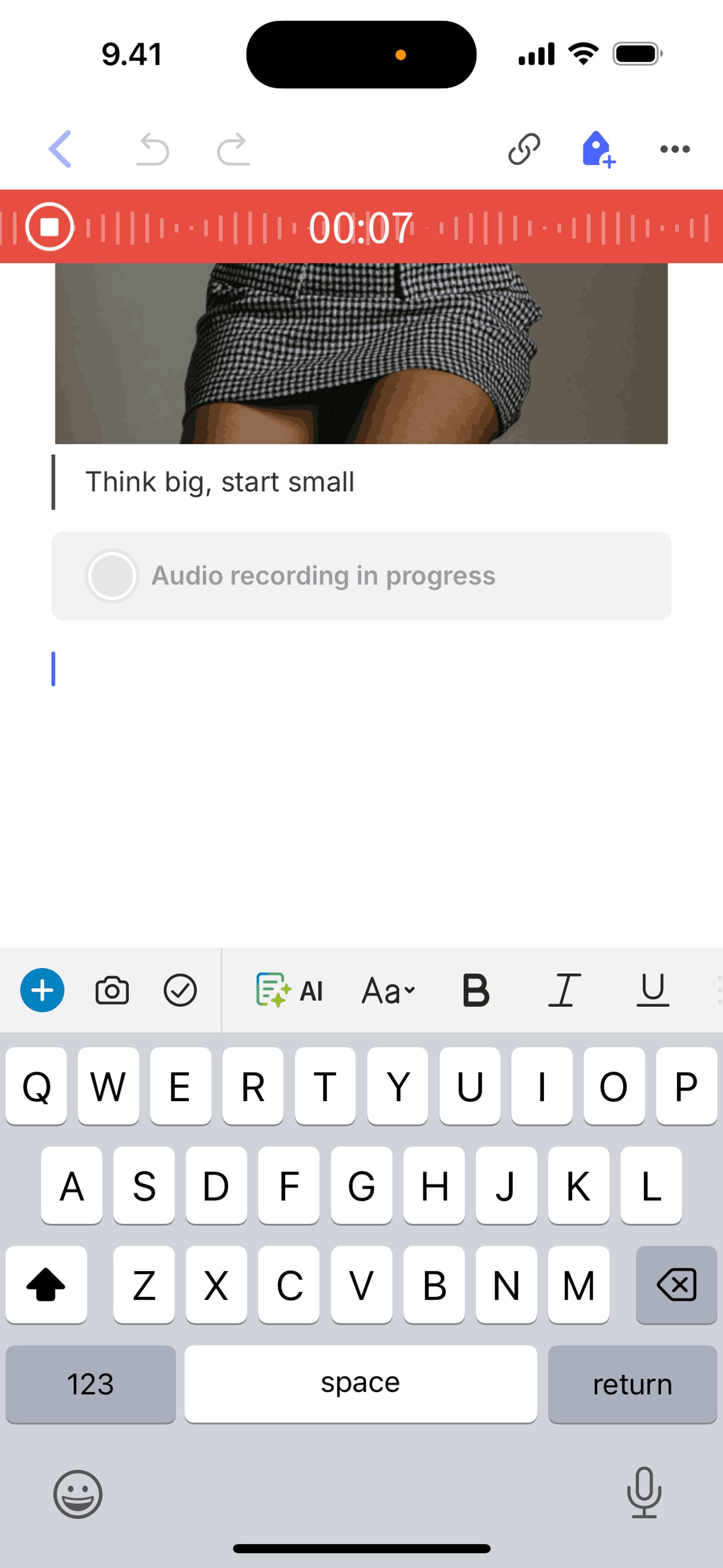
Recording an audio on Evernote (ios) screen 2
Browse 704+ Evernote iOS screenshots on Gummble. Note pad, to-do list, planner. Categorized under Productivity. Study Evernote's onboarding flow, login screens, checkout process, navigation patterns, and more to inspire your next design project.
Gummble has 704+ Evernote iOS UI screenshots available for design inspiration. Browse the full collection to study Evernote's interface patterns, user flows, and design decisions.
In-depth UX teardown and design patterns
Evernote is a note-taking and organization app that captures text, images, audio, PDFs, and web clips in a searchable system synced across all devices. Users organize notes into notebooks and apply tags for flexible categorization. The app's killer feature is universal search — Evernote indexes everything including text within images and scanned documents, making handwritten notes and photographed whiteboards searchable. It functions as an external brain where users dump everything knowing they can find it later.
Evernote's interface balances power-user depth with surface simplicity. The note editor supports rich formatting but defaults to clean, uncluttered input. The green elephant logo and brand color provide instant recognition that reinforces the "memory" metaphor. Recent redesigns have simplified the home screen to surface recent and suggested notes, reducing the friction of navigating complex notebook hierarchies. Search is prominently placed because retrieval matters more than organization for most users — the app works even with messy notebooks because search is so powerful.
Get unlimited access from $9.99/month — cancel anytime.
Evernote is categorized under Productivity. You can study its onboarding flow, login screens, navigation patterns, and other UI elements on Gummble.
Yes, Gummble Pro users can download Evernote iOS screenshots for design reference. Free users can browse all screenshots and view detailed design analysis.
Evernote uses freemium with meaningful limits. Free users get 60MB monthly uploads and sync across two devices. Personal ($14.99/month) unlocks unlimited devices, offline access, and larger uploads. Professional ($17.99/month) adds integrations and collaboration features. The strategy has evolved — earlier versions were more generous with free tiers, but increasing server and AI costs pushed restrictions. The two-device limit is the primary conversion driver for users with phones, tablets, and computers.
Evernote serves knowledge workers who process large volumes of information and need reliable retrieval. The core user has decades of accumulated notes and values the archive as much as the capture tool. Researchers, writers, consultants, and students form the primary base — people whose work involves synthesizing information from many sources. The app appeals to systematic thinkers who treat personal knowledge management as a practice, not just occasional note-taking.
Evernote pioneered the insight that capture UX matters more than organization UX. If getting information in is frictionless, users will figure out retrieval later (especially with powerful search). The multi-format capture menu shows that flexible input acknowledges unpredictable use cases. For productivity apps, the document scanner demonstrates how phones make dedicated hardware obsolete — one well-designed feature can eliminate competitor categories entirely. The tag-notebook hybrid proves that supporting multiple mental models beats forcing one "correct" way to organize.


