


Blank Street iOS Food & Drink interface screenshot 1
Onboarding on Blank Street (ios) screen 1
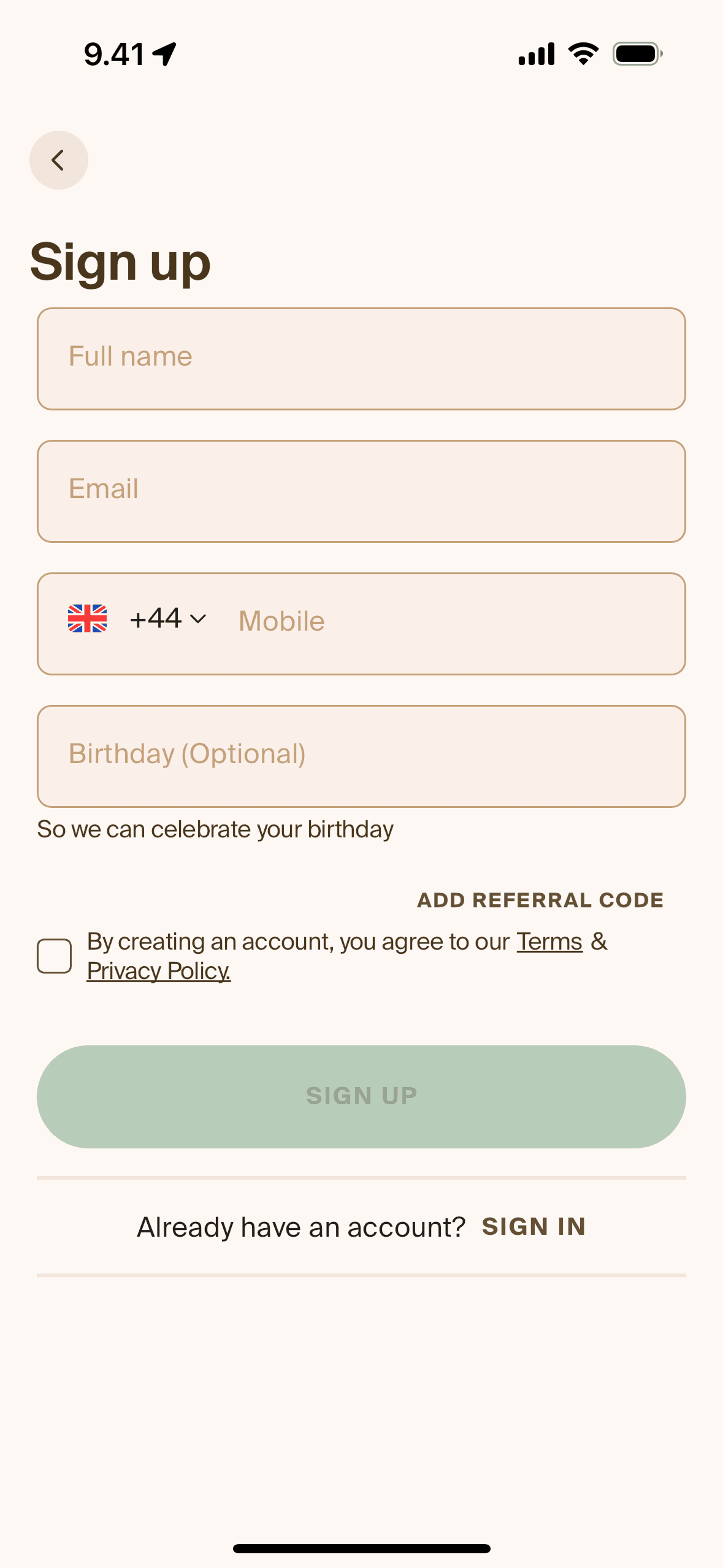
Creating an account on Blank Street (ios) screen 2
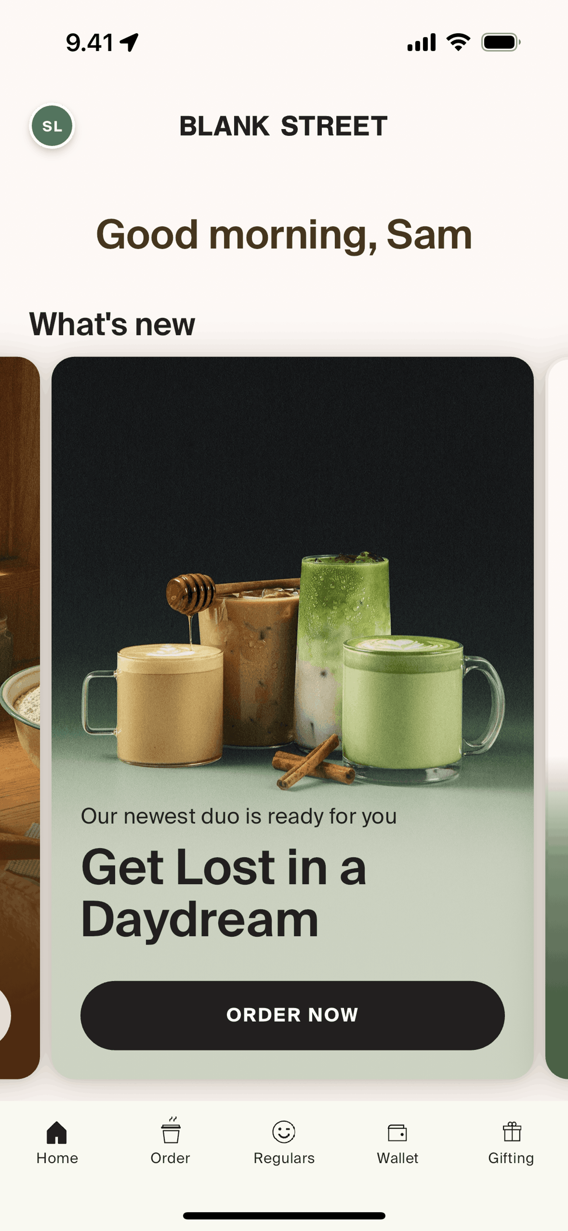
Home on Blank Street (ios) screen 2
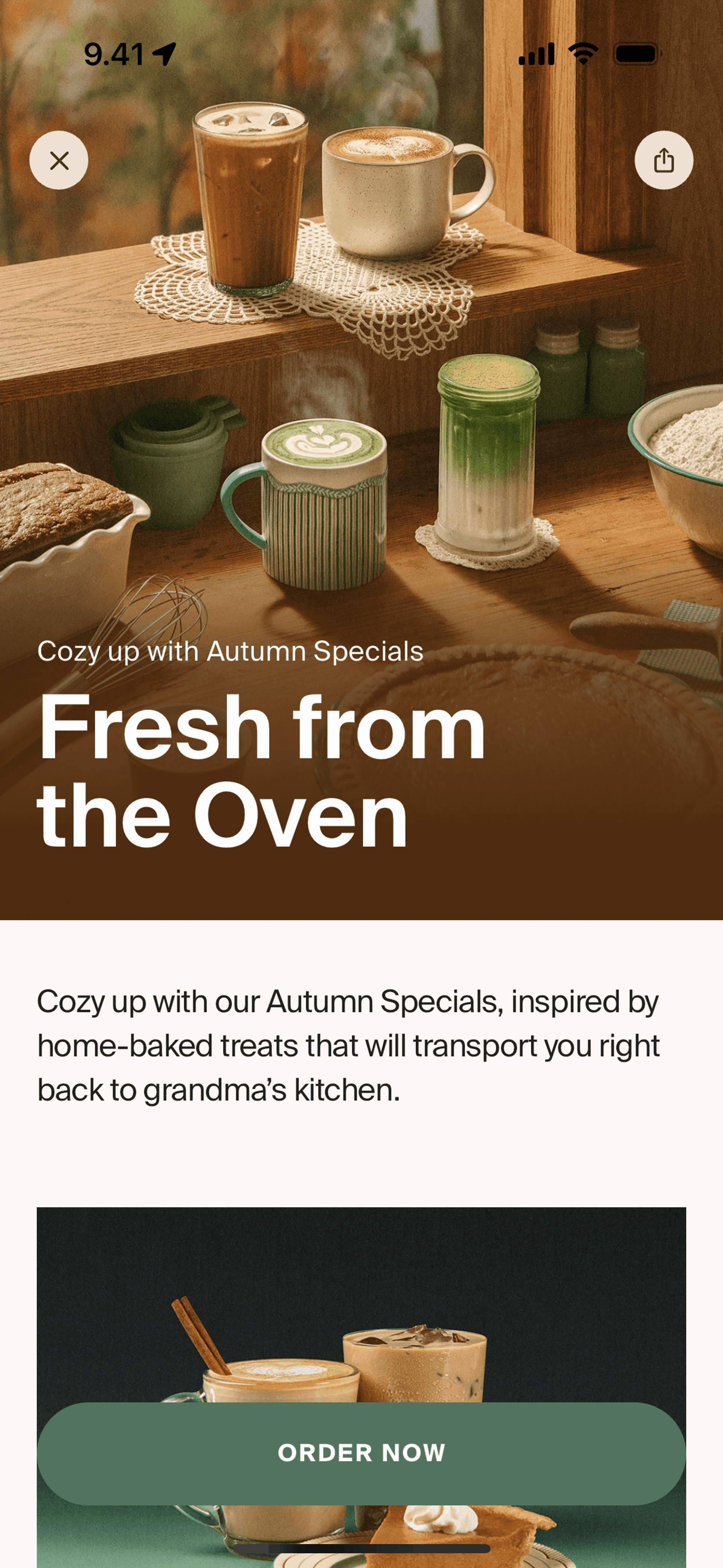
New launch on Blank Street (ios) screen 2
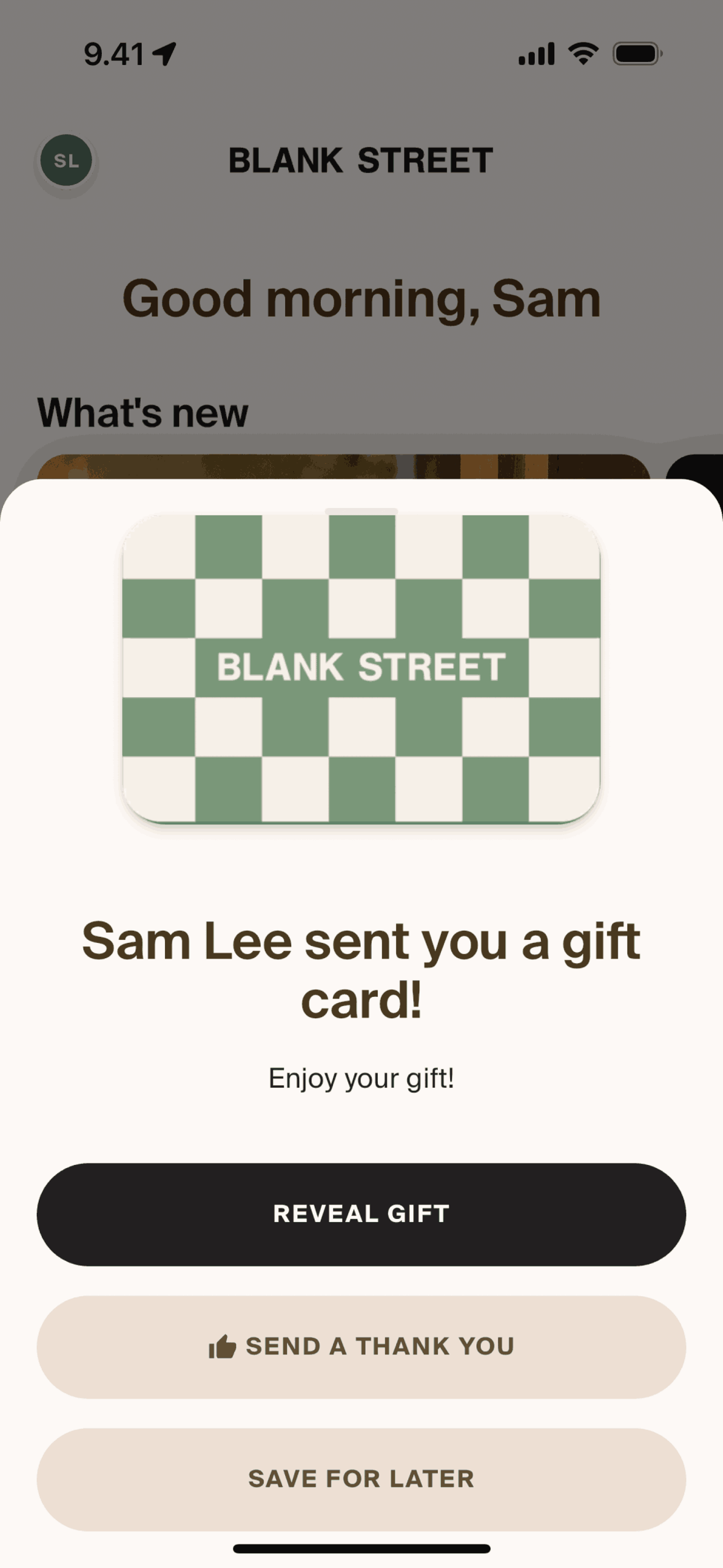
Receiving a gift card on Blank Street (ios) screen 2
Order on Blank Street (ios) screen 2
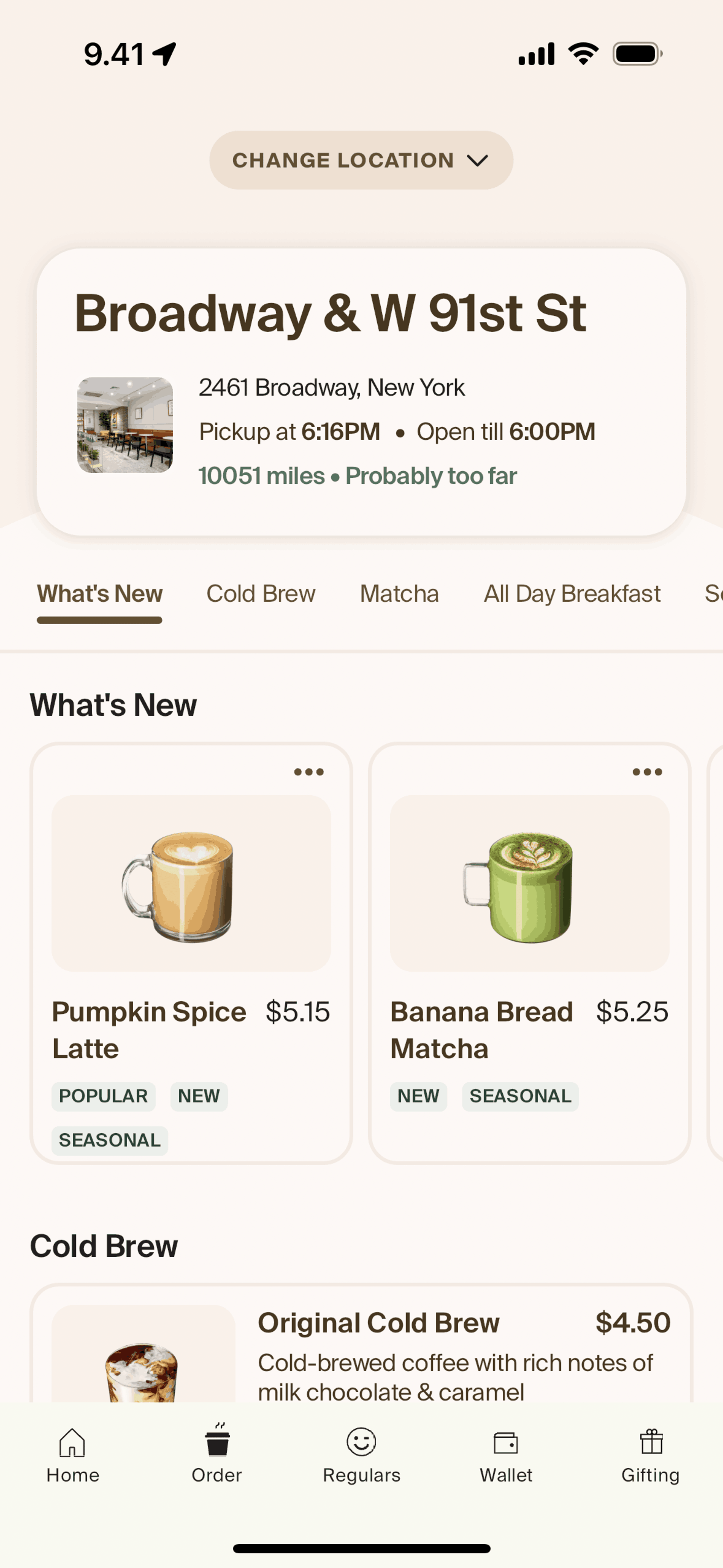
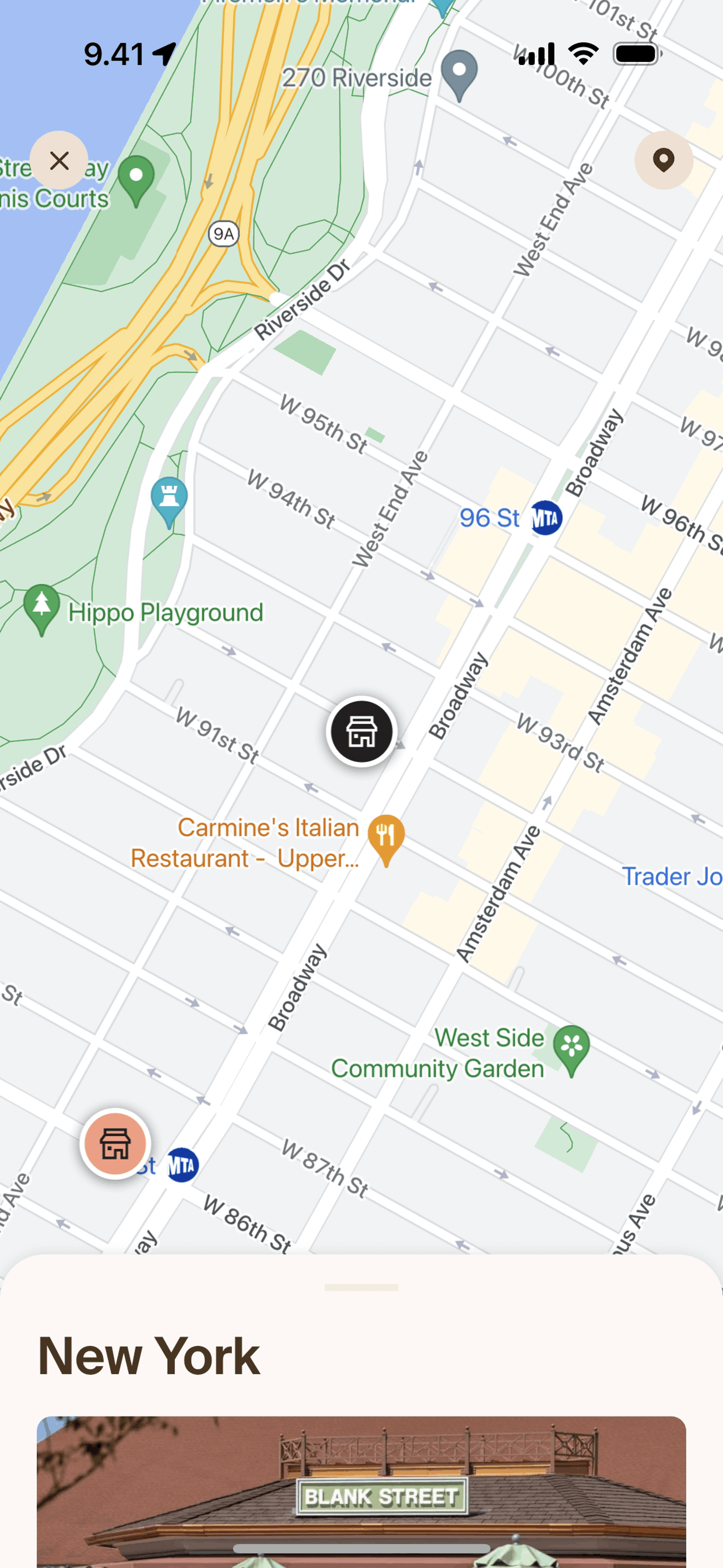
Store details on Blank Street (ios) screen 2
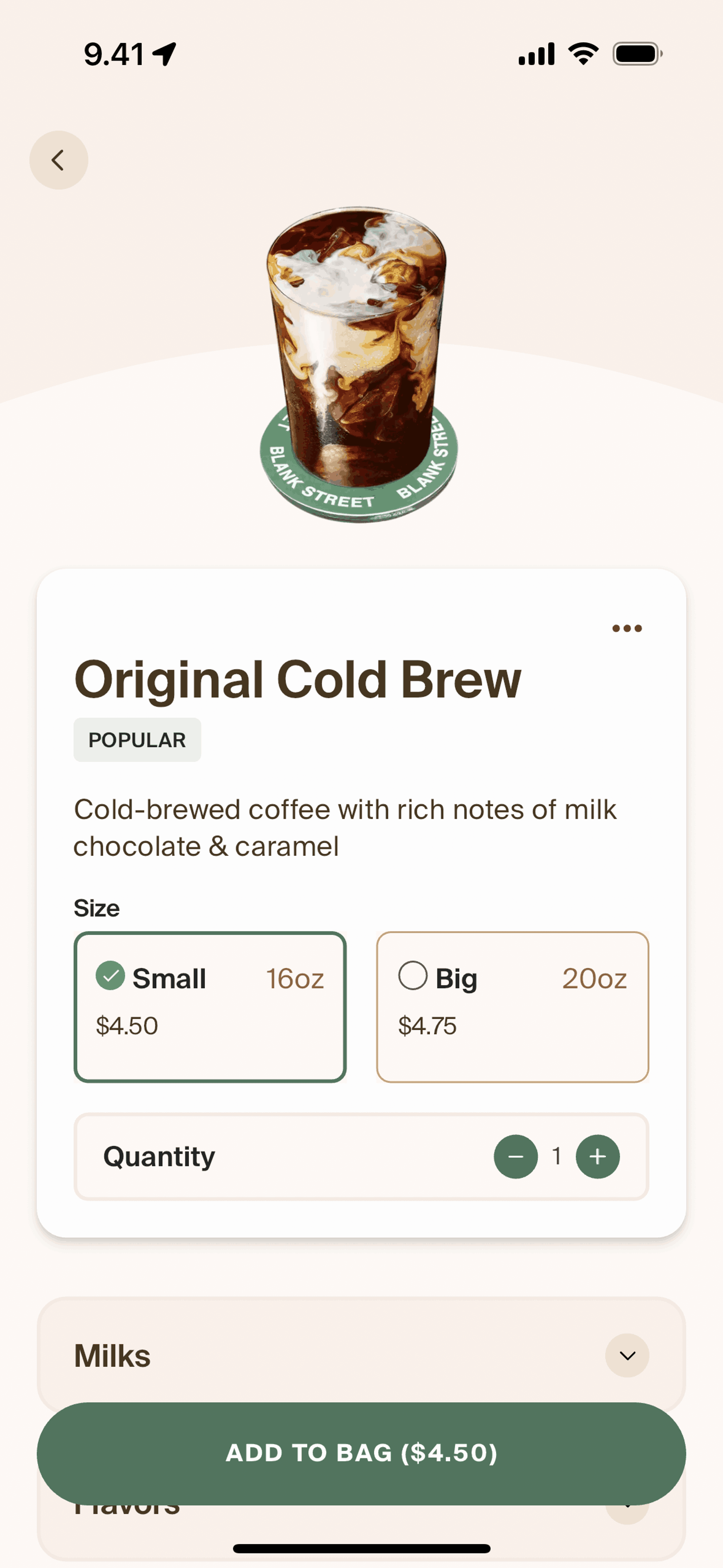
Adding to bag on Blank Street (ios) screen 2
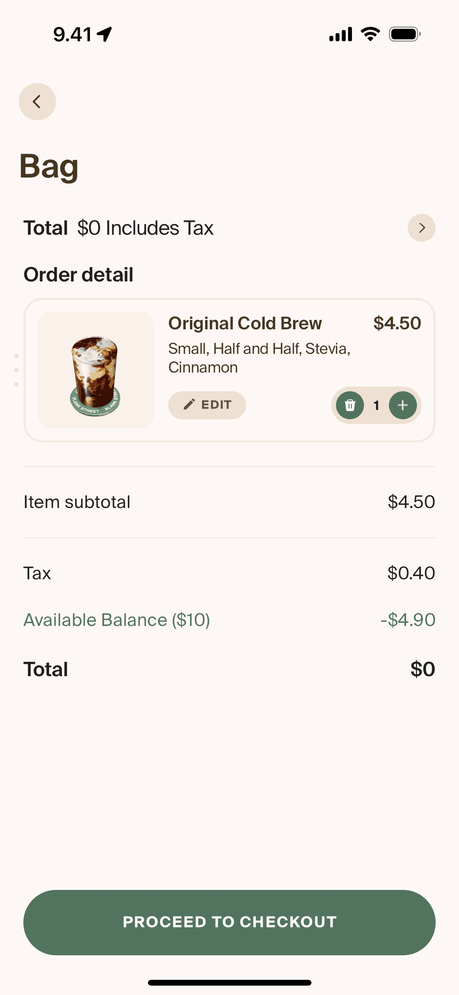
Checking out an order on Blank Street (ios) screen 2
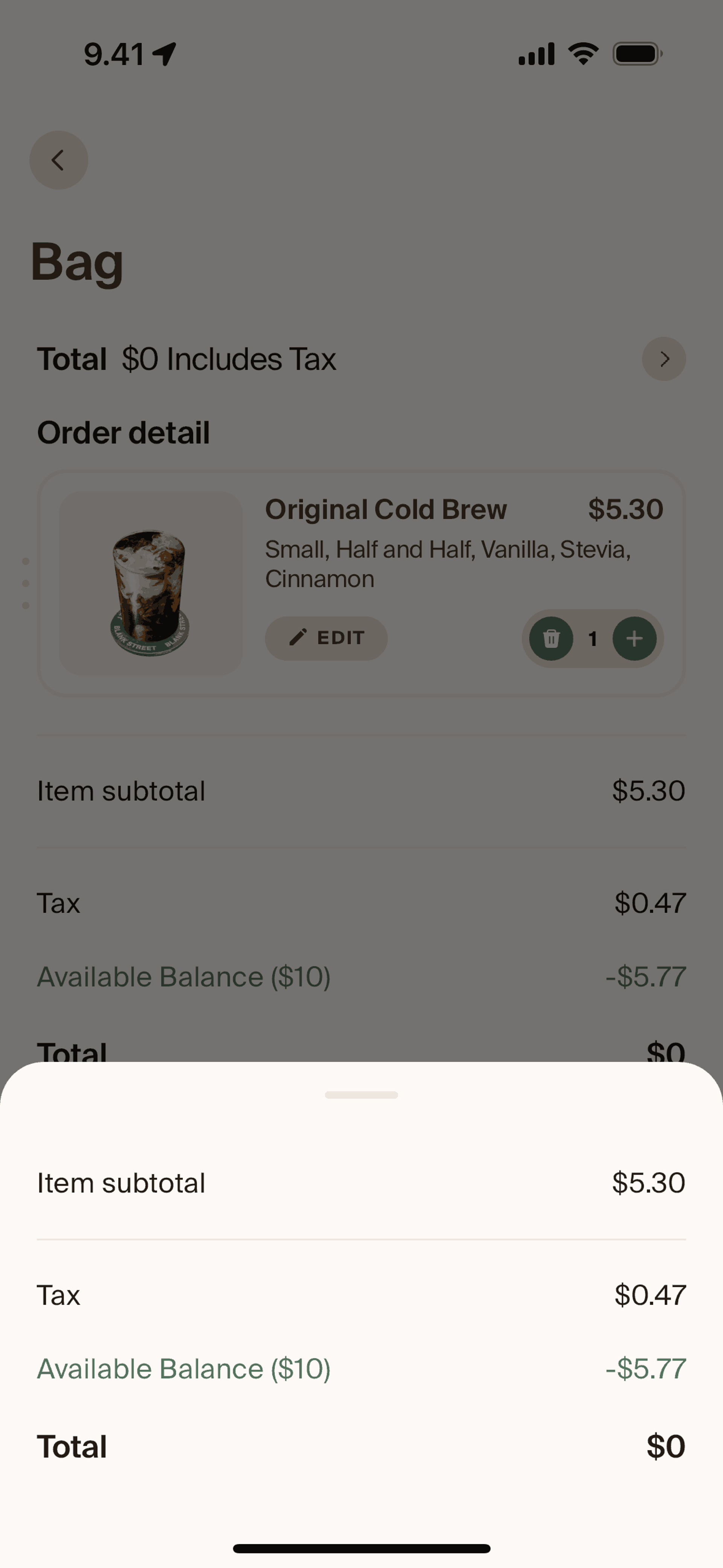
Price detail on Blank Street (ios) screen 2
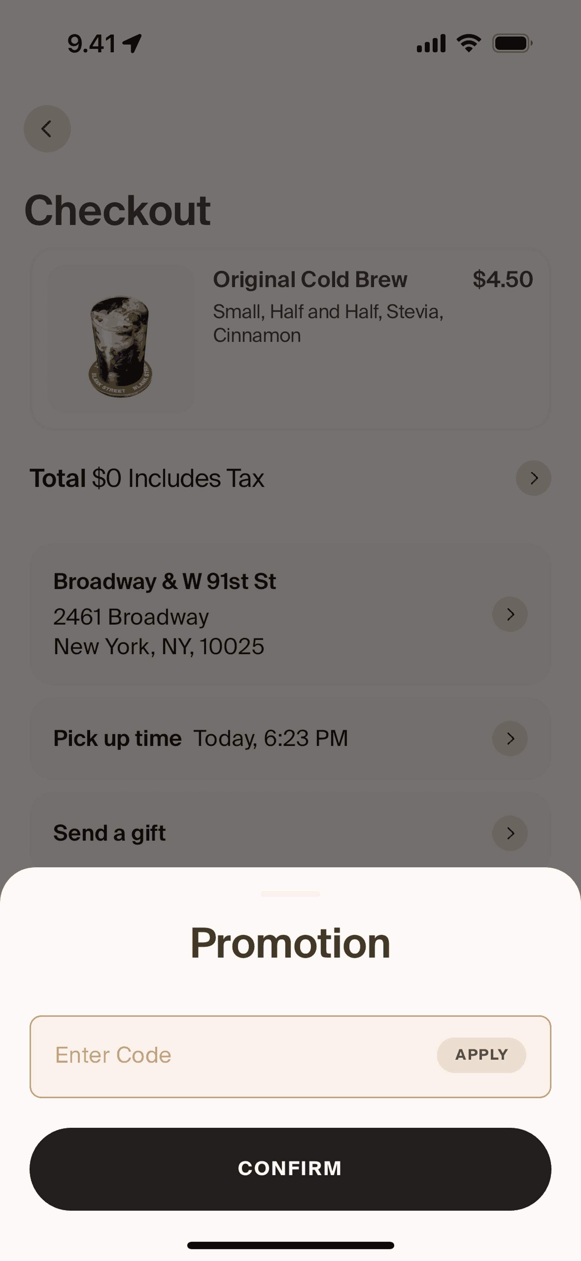
Promotion on Blank Street (ios) screen 2
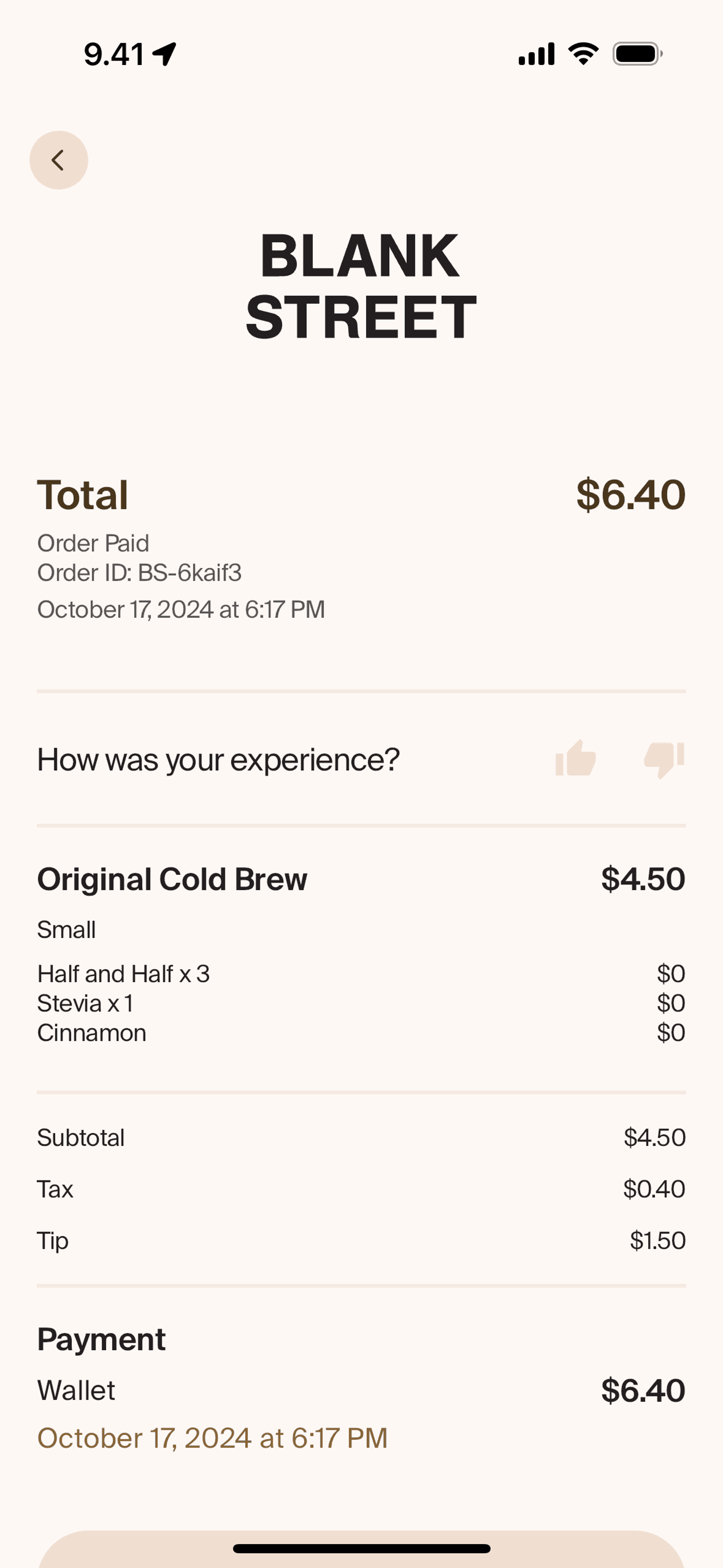
View receipt on Blank Street (ios) screen 2
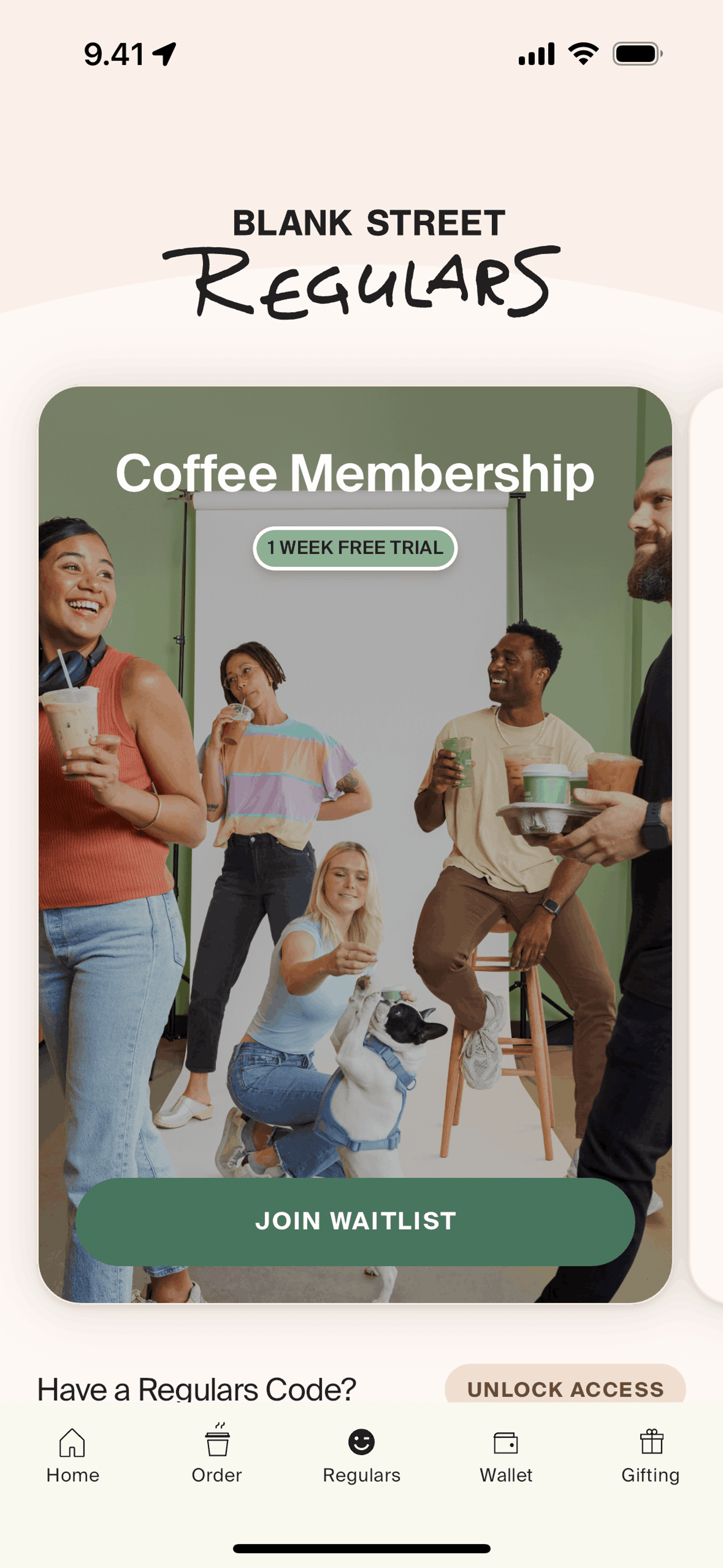
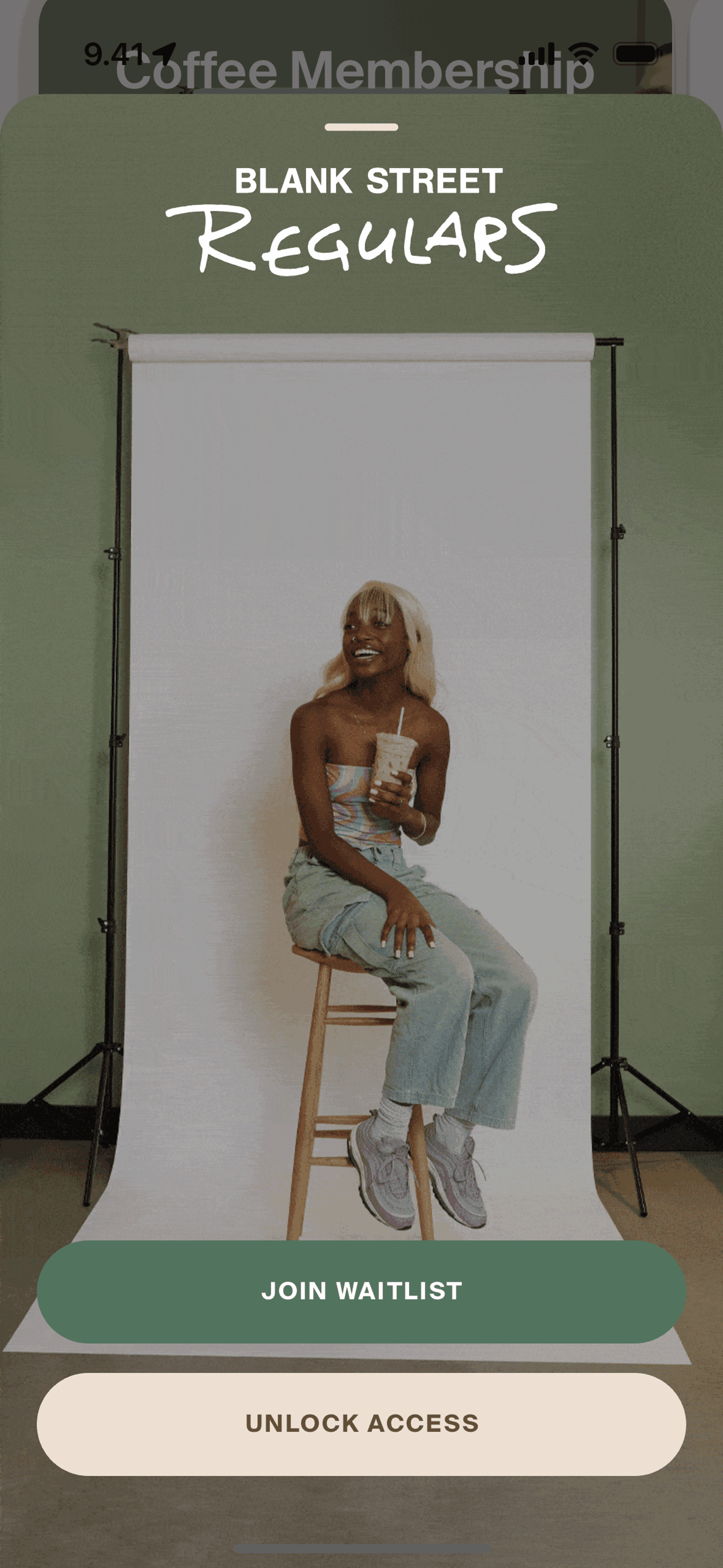
Regulars on Blank Street (ios) screen 2
Joining waitlist on Blank Street (ios) screen 2
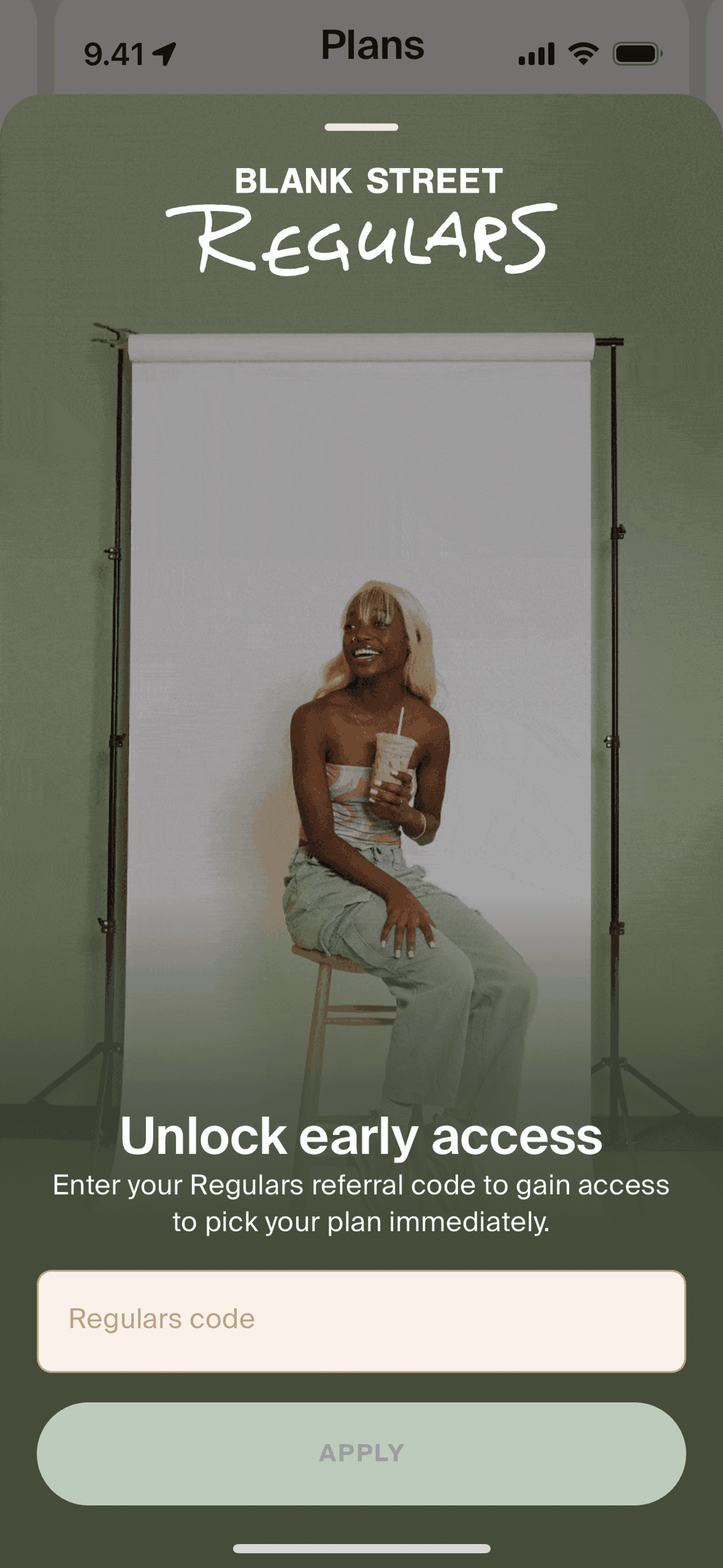
Unlock access on Blank Street (ios) screen 2
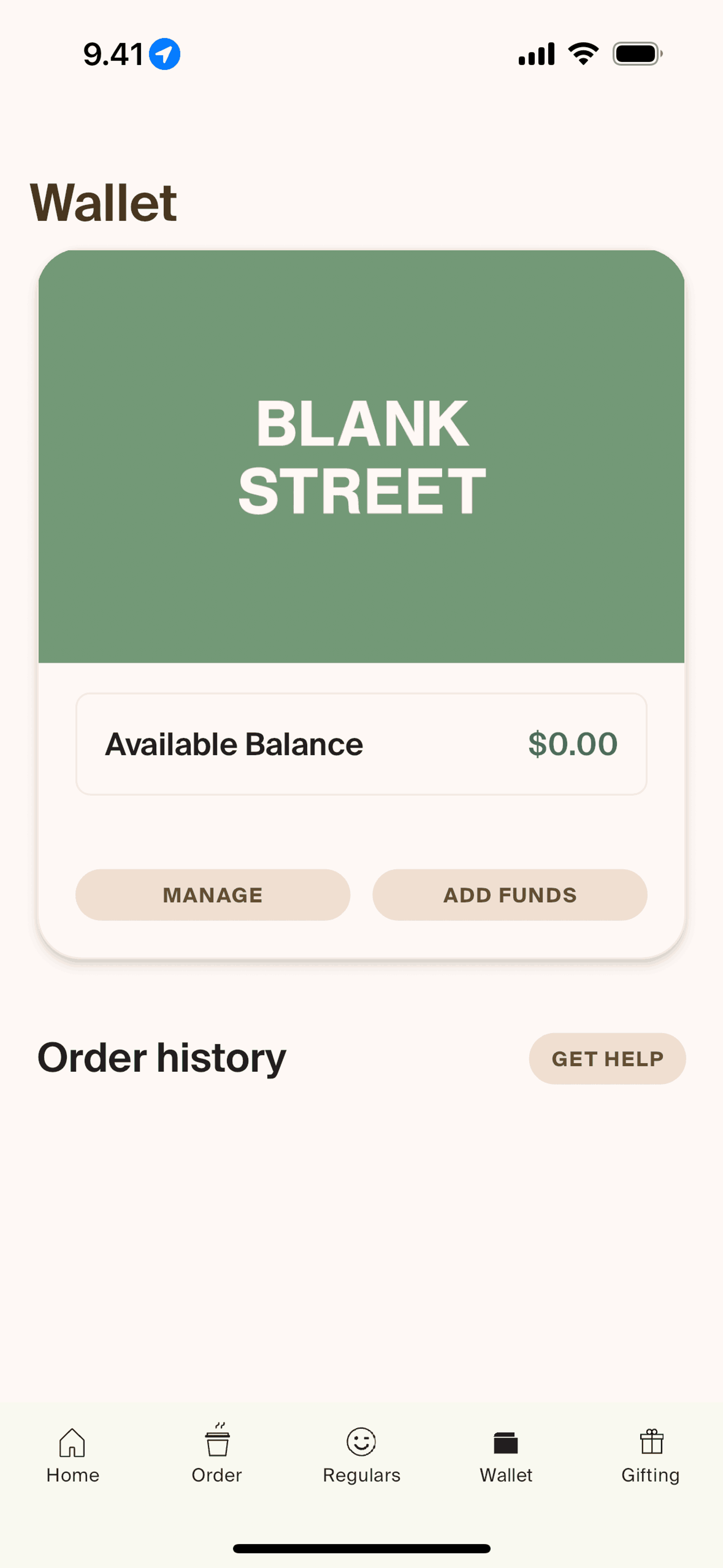
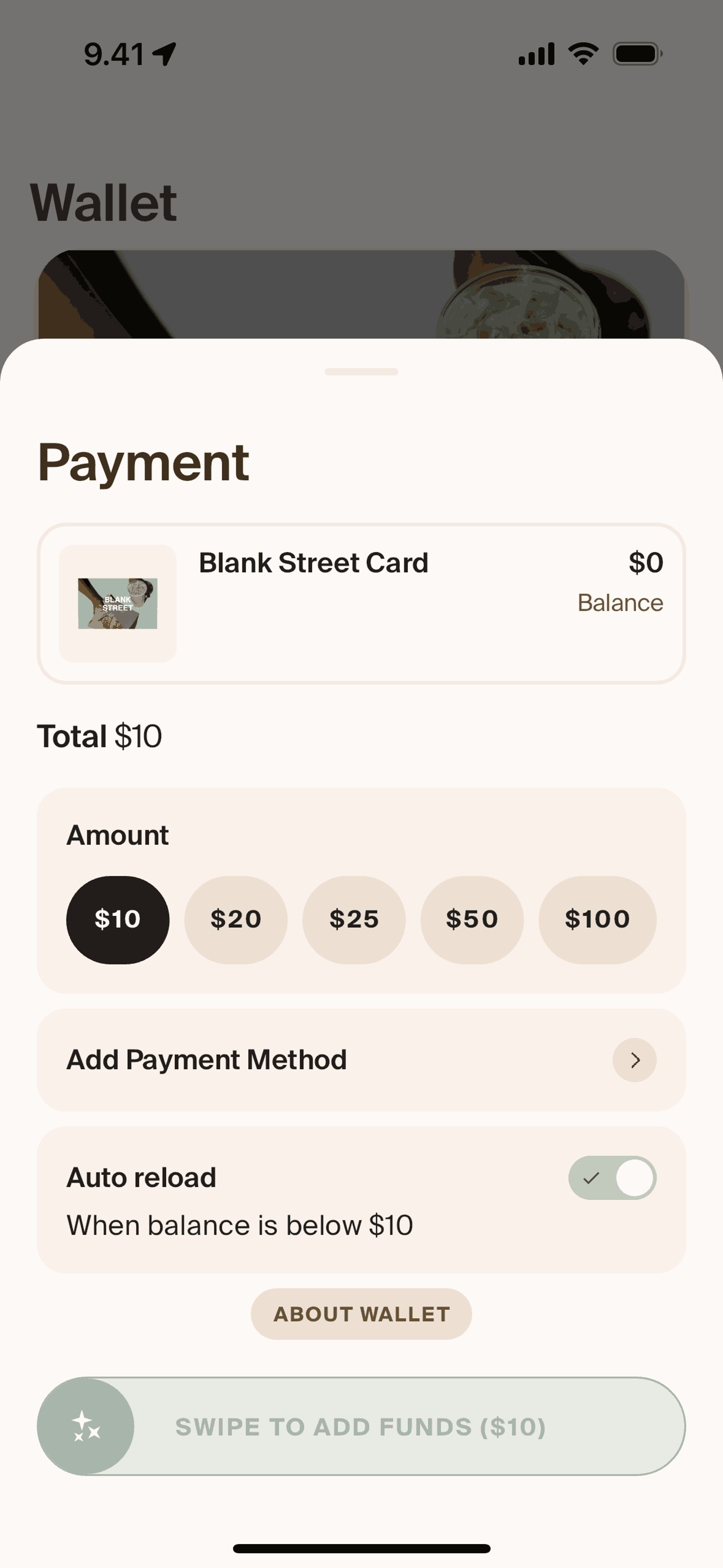
Wallet on Blank Street (ios) screen 2
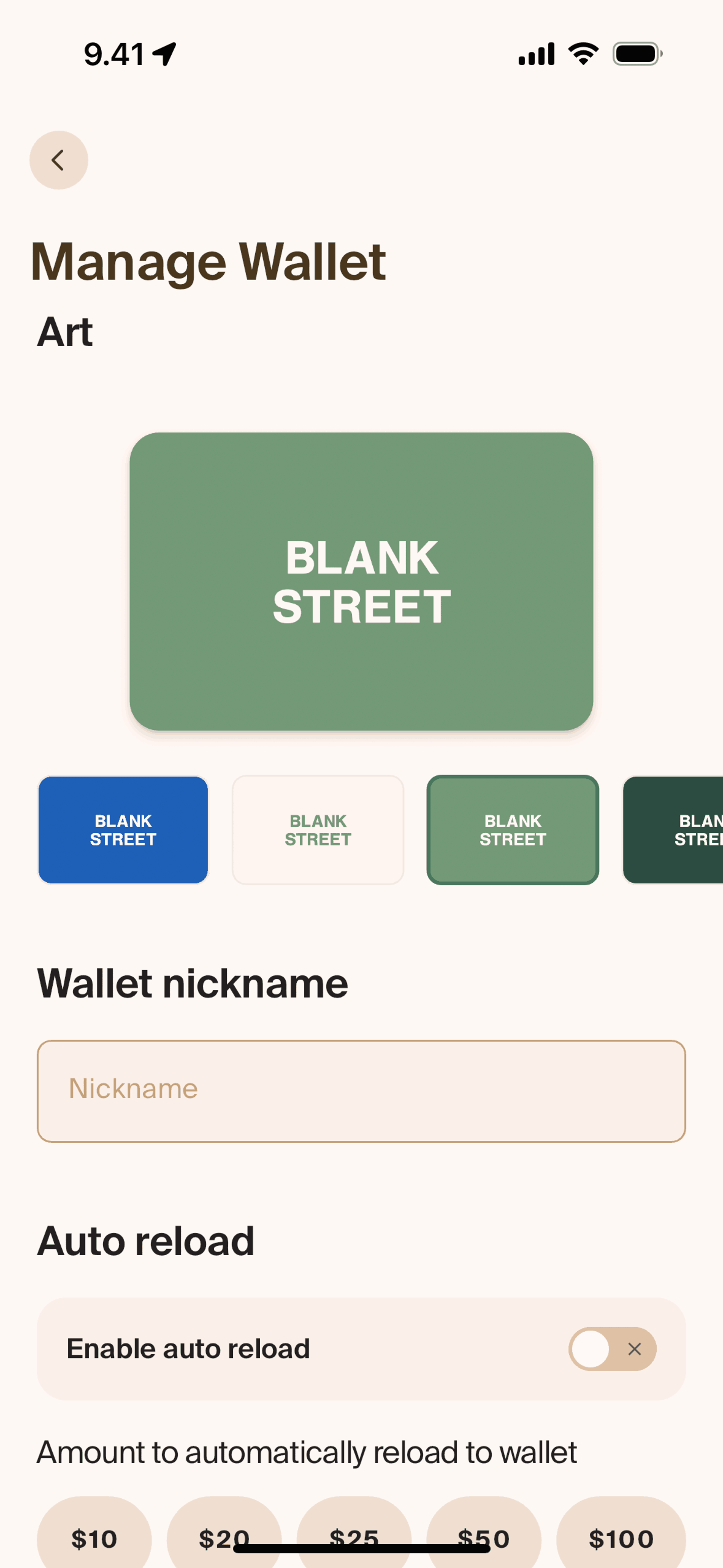
Customizing wallet on Blank Street (ios) screen 2
Adding funds on Blank Street (ios) screen 2
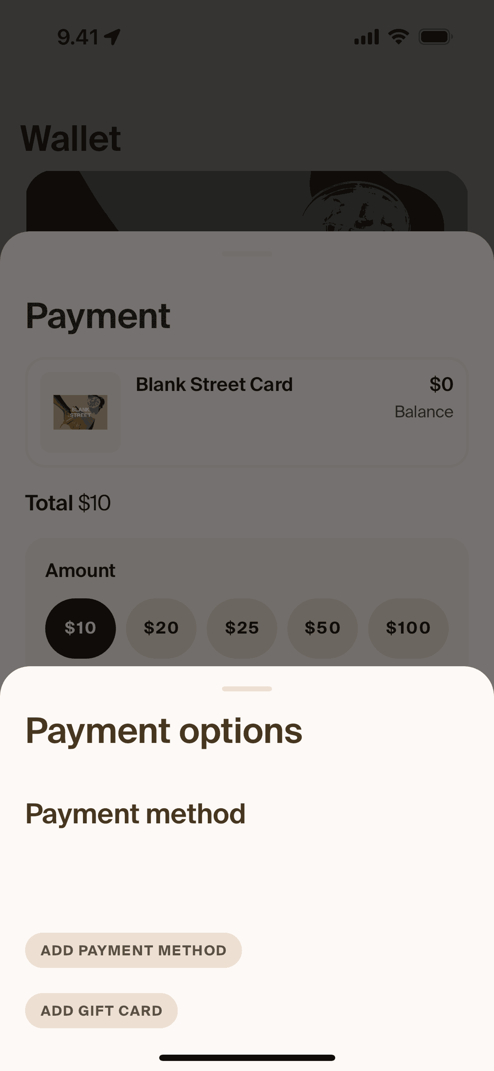
Adding payment method on Blank Street (ios) screen 2
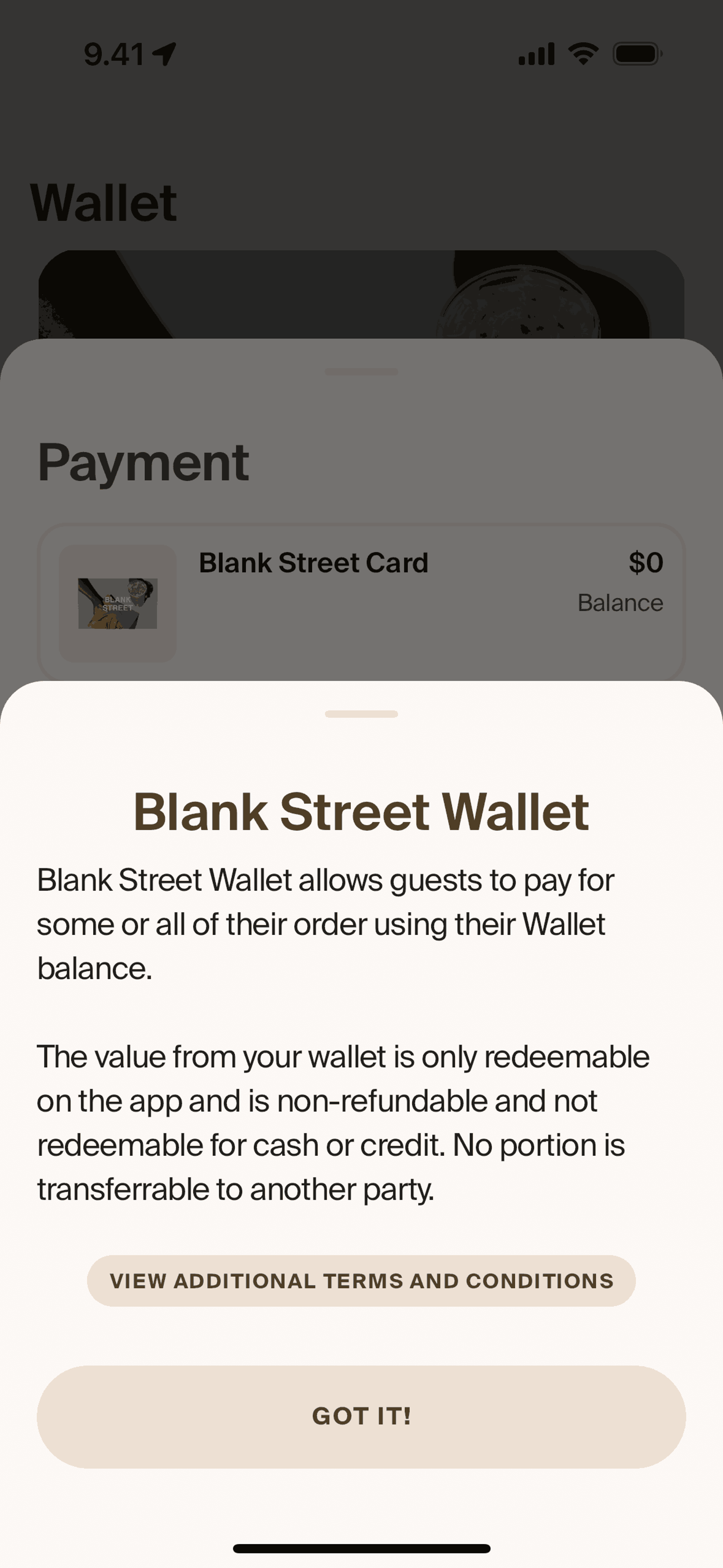
About wallet on Blank Street (ios) screen 2
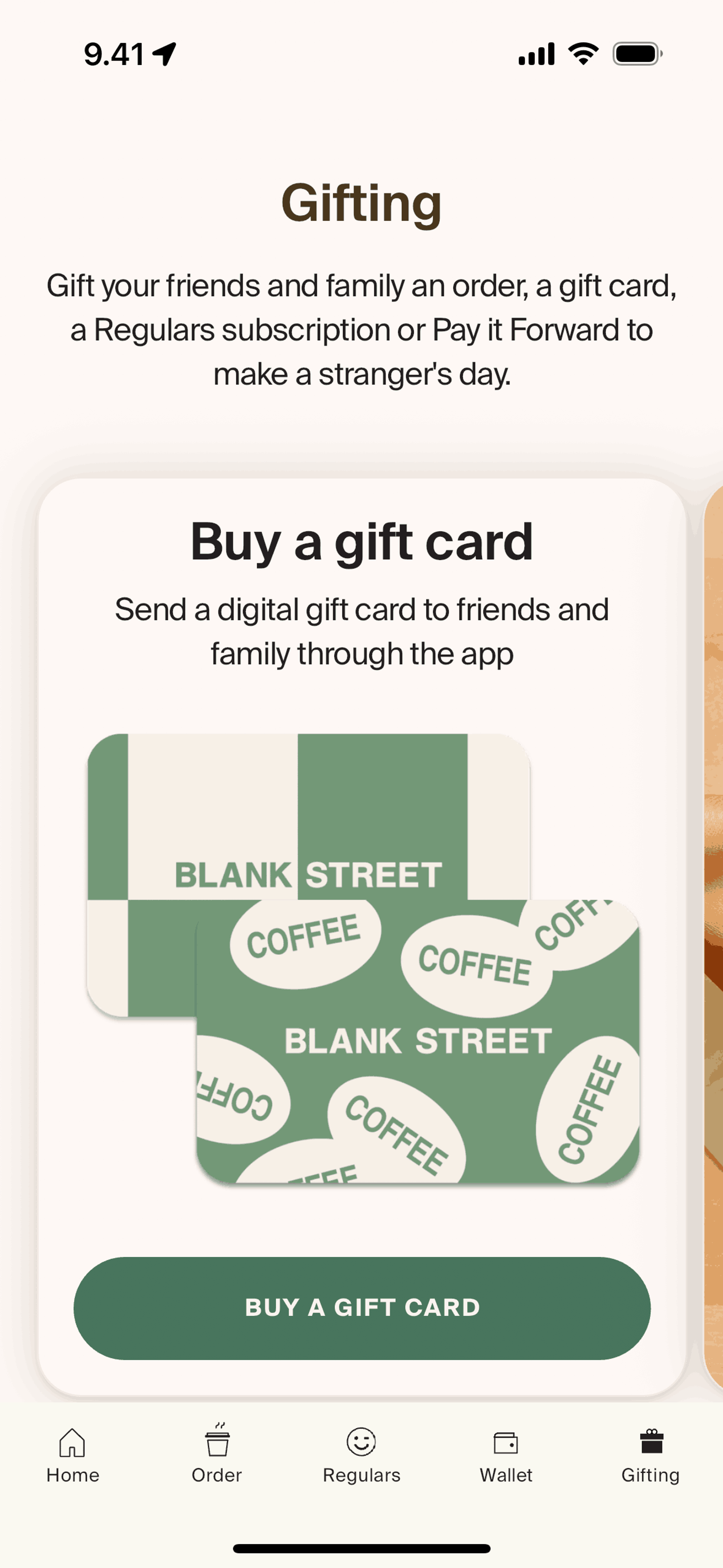
Gifting on Blank Street (ios) screen 2
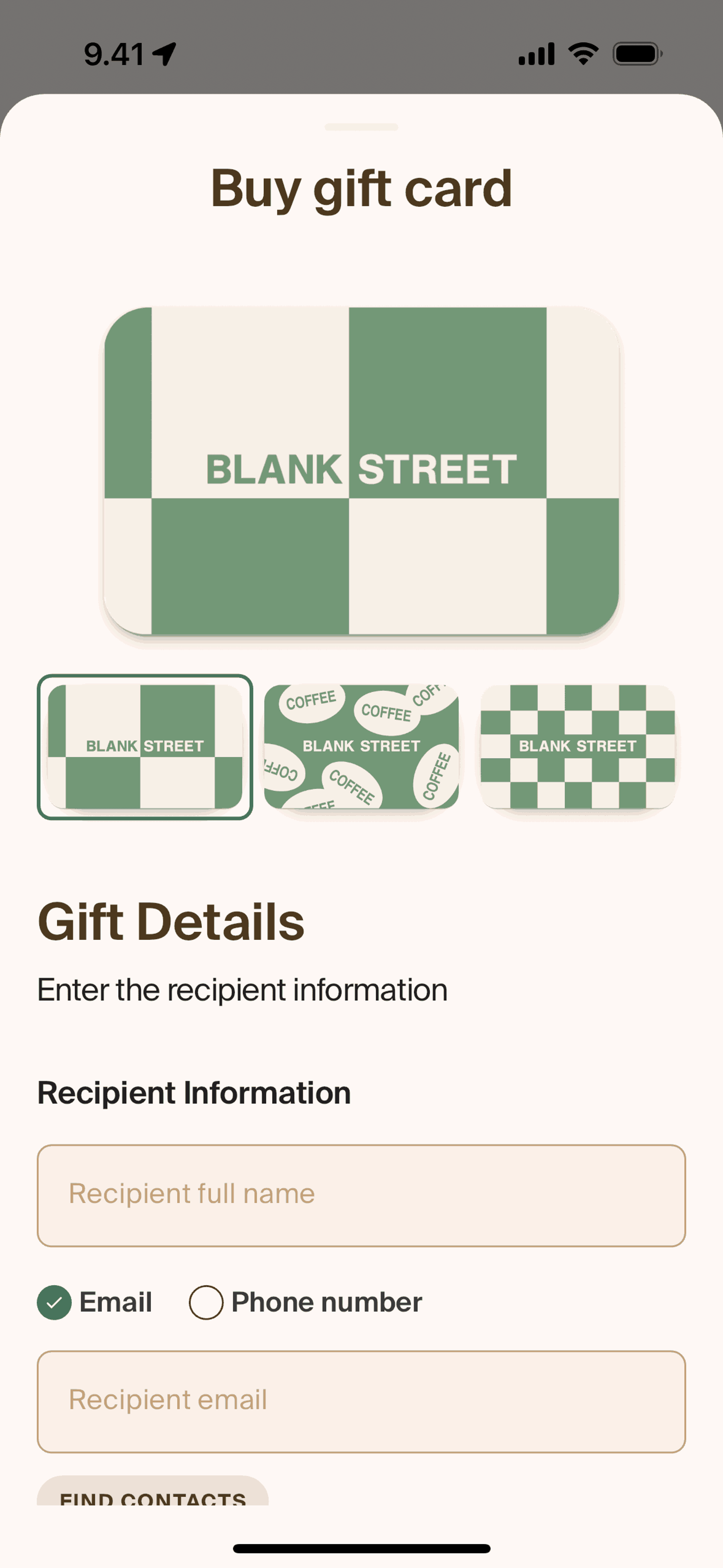
Buying a gift card on Blank Street (ios) screen 2
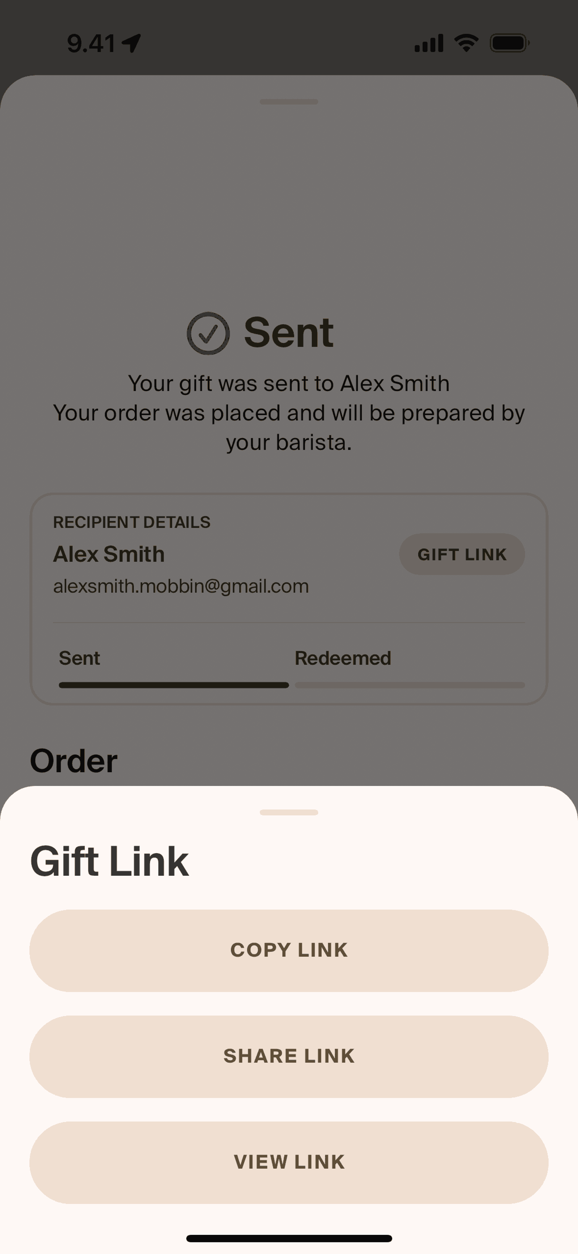
Copying gift link on Blank Street (ios) screen 2
Browse 344+ Blank Street iOS screenshots on Gummble. Great coffee, for everyone. Categorized under Food & Drink. Study Blank Street's onboarding flow, login screens, checkout process, navigation patterns, and more to inspire your next design project.
Gummble has 344+ Blank Street iOS UI screenshots available for design inspiration. Browse the full collection to study Blank Street's interface patterns, user flows, and design decisions.
In-depth UX teardown and design patterns
Blank Street is a tech-forward coffee chain with a mobile-first ordering experience. The iOS app lets users browse the menu, customize drinks, earn rewards, and order ahead for pickup. Unlike traditional cafes where you order at the counter, Blank Street encourages app ordering to reduce wait times and optimize the small-format store operations. The app serves as the primary customer touchpoint, making it a coffee ordering interface rather than just a loyalty card.
Blank Street's interface is minimal and fast — users can order their usual drink in under 30 seconds. The menu uses large product photography with clear customization options beneath. The color palette stays neutral (whites, light grays) to let drink photos pop. Pickup time estimates set realistic expectations, preventing the frustration of arriving before orders are ready. The rewards system is visible but not intrusive, building loyalty without aggressive gamification. Store selection based on current location appears immediately, reducing friction for users who always order from the same spot.
Get unlimited access from $9.99/month — cancel anytime.
Blank Street is categorized under Food & Drink. You can study its onboarding flow, login screens, navigation patterns, and other UI elements on Gummble.
Yes, Gummble Pro users can download Blank Street iOS screenshots for design reference. Free users can browse all screenshots and view detailed design analysis.
Blank Street earns revenue from coffee sales, with the app driving order volume and reducing labor costs by shifting ordering from counter staff to customers. The rewards program ($1 back per $10 spent) creates repeat visits without deep discounting. The tech-enabled model supports smaller store footprints with fewer staff, improving unit economics compared to traditional cafes. Pre-ordering improves throughput by letting baristas batch-prepare drinks during slow periods.
Blank Street targets urban professionals and commuters who drink coffee daily and value convenience over the third-place cafe experience. The core user wants quality coffee quickly without waiting in line — speed matters more than ambiance. The demographic skews younger (25-40), tech-comfortable, and time-constrained. Secondary audiences include remote workers who need caffeine breaks from home offices and students in areas where Blank Street operates.
Blank Street demonstrates that for habitual purchases, reducing friction to reorder matters more than discovery features. The favorites-first interface acknowledges that coffee customers already know what they want — the app's job is to deliver it quickly, not inspire exploration. Pickup time estimates show how setting accurate expectations prevents dissatisfaction better than promising unrealistic speed. For order-ahead apps, store proximity sorting with wait times helps users optimize across multiple locations, turning store network into a competitive advantage.


