ZARA iOS App UI Design — Fast Fashion Mobile Experience
What it does
ZARA is a global fast fashion retailer known for rapidly translating runway trends into affordable clothing. The iOS app brings ZARA’s editorial shopping experience to mobile — users browse lookbook-style photography, check store inventory, purchase online, and manage returns. Unlike utilitarian e-commerce, ZARA’s app feels like flipping through a fashion magazine where every image is shoppable. The app bridges online and offline with features like in-store mode and click-and-collect.
Design highlights
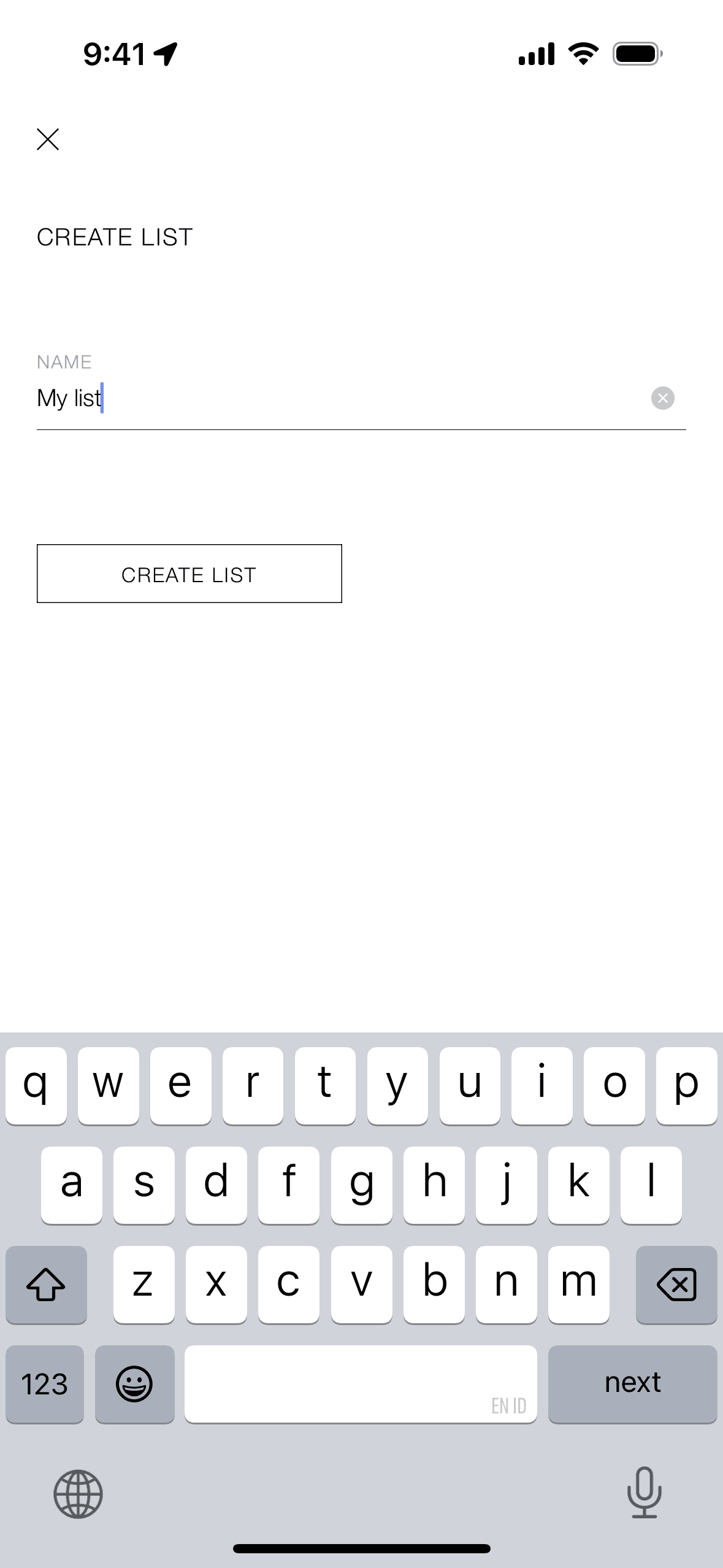
ZARA’s interface is radically minimal — black, white, and photography. No bright CTAs, no promotional banners cluttering the experience. This restraint lets the clothing photography dominate, matching ZARA’s store aesthetic where products are the focus, not signage. Navigation uses a sparse hamburger menu, prioritizing image real estate over persistent tabs. The typography is crisp and editorial. This design language treats fashion shopping as a visual experience first, a transaction second — exactly how ZARA positions its brand against busy fast-fashion competitors.
UX patterns
-
Editorial Photography: Product images resemble fashion editorial shoots rather than e-commerce catalog photos. Models in styled outfits sell aspiration, not just items — users want the look, not just the shirt.
-
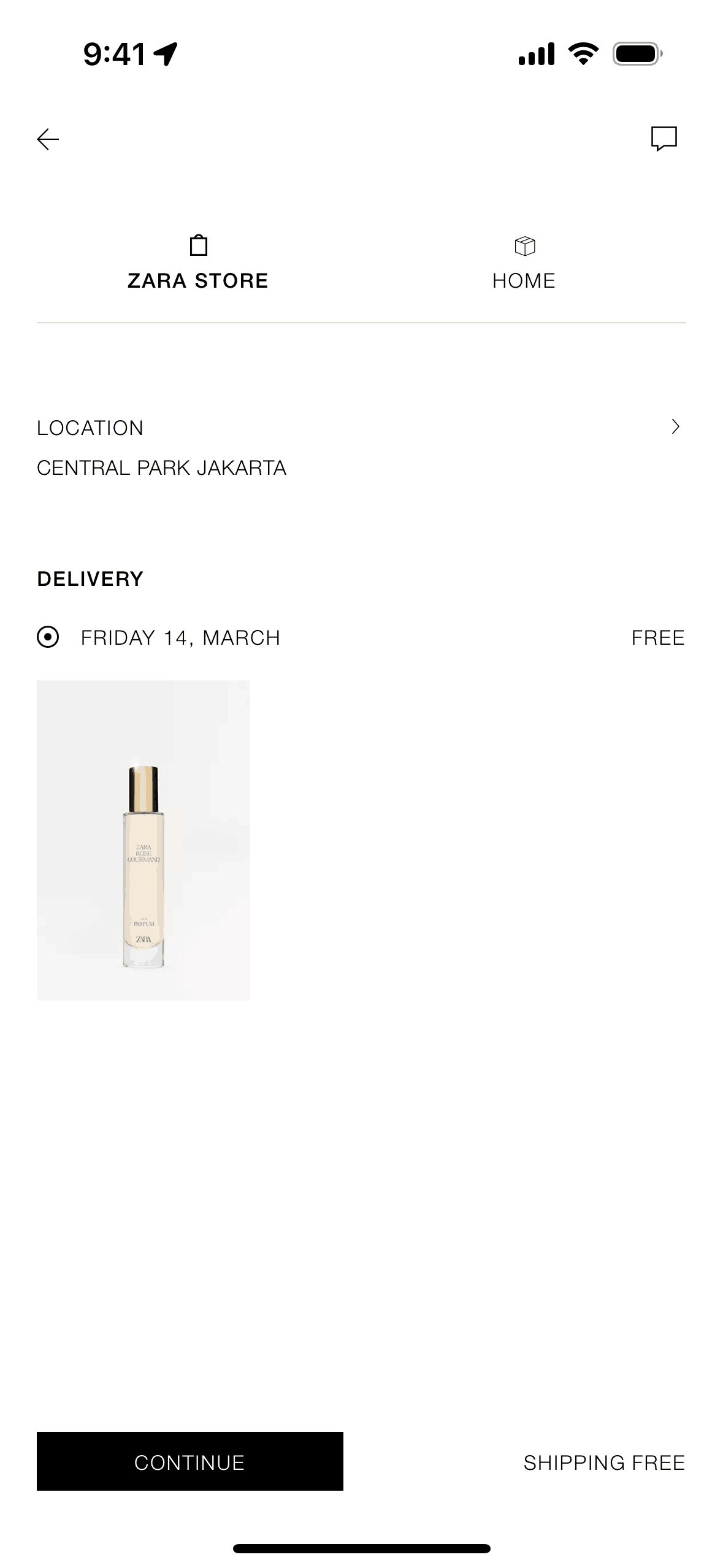
In-Store Mode: GPS detection prompts users to switch to in-store mode, enabling barcode scanning for quick info and stock checking. The app becomes a shopping assistant rather than a separate channel.
-
Store Stock Checking: Before visiting, users can verify item availability by size at nearby stores. This bridges online browsing with physical shopping, reducing wasted trips and supporting click-and-collect.
-
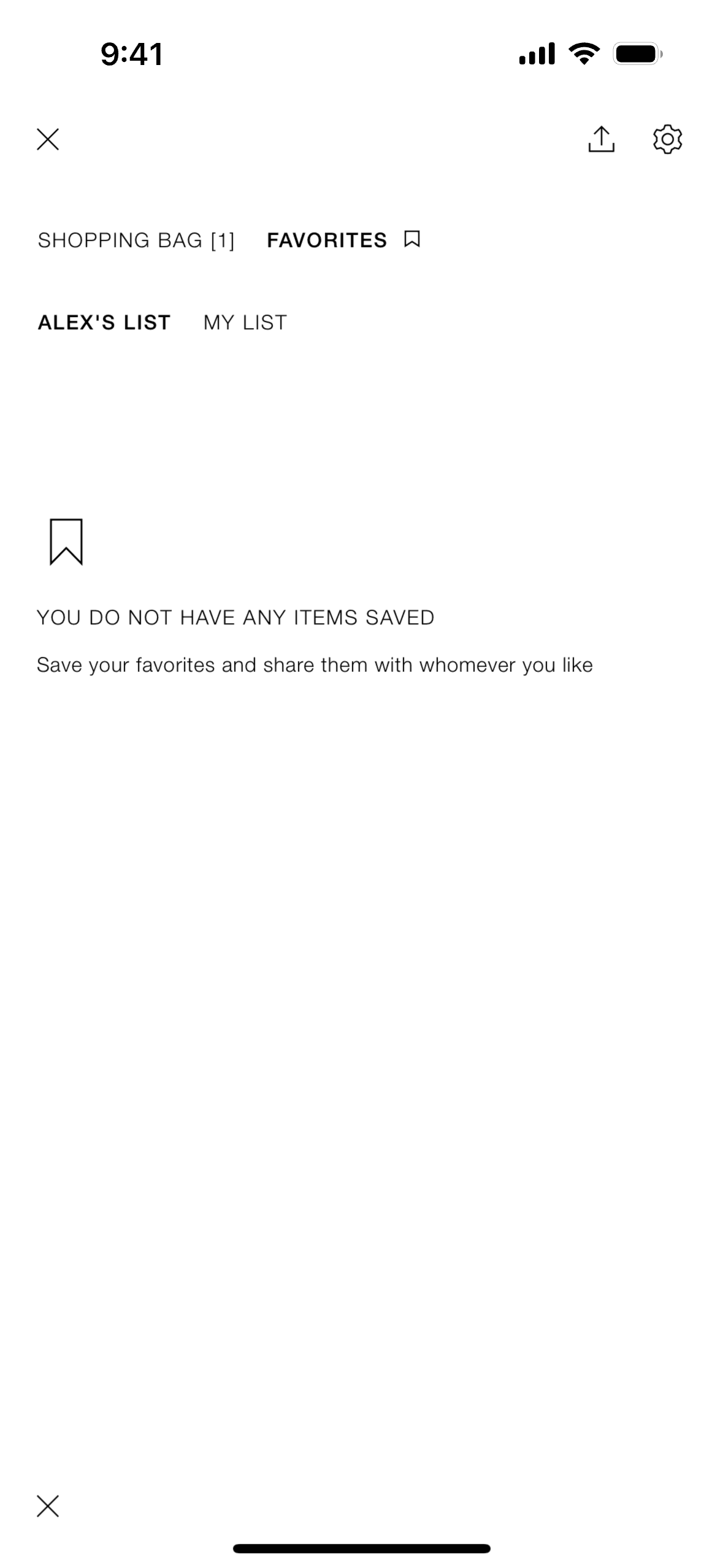
Complete the Look: Product pages suggest coordinating items, encouraging basket building and helping indecisive shoppers style outfits. This mimics the personal styling that flagship stores offer.
-
Visual Navigation: Categories are browsed visually through lookbook imagery rather than text lists. Users scroll through curated imagery to discover rather than searching with specific intent.
Monetization approach
ZARA sells directly through the app with full e-commerce functionality. No marketplace, no third-party sellers — complete vertical integration from design to sale. The app drives both direct purchases and store visits through inventory transparency. Click-and-collect options increase foot traffic while offering online convenience. Unlike department stores competing on price, ZARA’s brand positioning justifies full-price sales with minimal discounting, protecting margins while the app accelerates trend-to-purchase velocity.
Target audience
ZARA targets fashion-conscious shoppers aged 18-40 who want current trends at accessible prices. The core user follows fashion, refreshes their wardrobe seasonally, and values style over brand status symbols. The demographic skews female but men’s collections have grown significantly. Secondary audiences include outfit planners who browse at home before shopping in-store, and click-and-collect users who want online convenience with immediate pickup. The minimal aesthetic appeals to design-sensitive users who reject visual clutter.
Design takeaways
ZARA proves that restraint is a design statement. The absence of sales banners, gamified promotions, and persistent navigation creates a premium perception that justifies pricing and attracts a specific customer segment. Editorial photography shows that selling aspiration (the styled look) converts better than selling products (the individual items) for fashion retail. The in-store mode demonstrates that apps can enhance physical shopping rather than compete with it — bridging channels creates a unified brand experience.
Unlock the full ZARA teardown
Get access to the complete library of ZARA screens. See exactly how they handle onboarding, paywalls, and core user flows to drive conversion.
Join 5,000+ designers and PMs building better apps.