Birchbox iOS App UI Design — Personalized Beauty Discovery
Birchbox
What it does
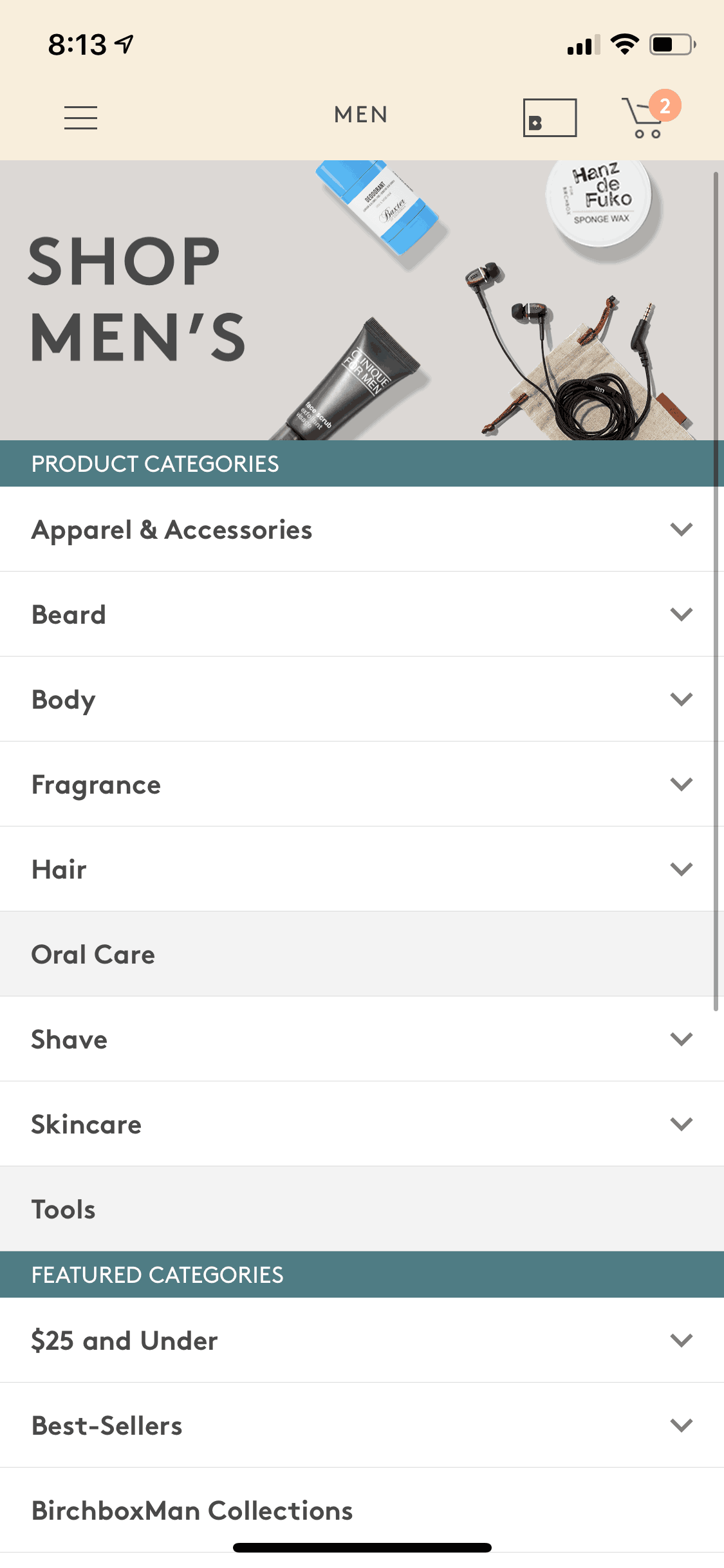
Birchbox is a beauty subscription service that delivers personalized sample boxes monthly. The iOS app serves as the discovery and management hub — users complete a beauty profile questionnaire, receive tailored product recommendations, browse the full-size shop, and manage their subscription preferences. The core value proposition centers on discovery: helping users find new beauty products matched to their skin type, hair concerns, and style preferences without the overwhelm of browsing endless product catalogs.
Design highlights
Birchbox’s interface balances editorial content with e-commerce functionality. Product photography is aspirational and lifestyle-focused rather than clinical, creating a magazine-like browsing experience. The onboarding quiz uses visual selectors (skin tone swatches, hair type illustrations) that feel more like a beauty consultation than a data collection form. The “My Box” feature creates anticipation around monthly deliveries with a reveal mechanic that mimics opening a physical package. Color palette stays neutral (whites, soft pinks, clean grays) to let product imagery take center stage without competing for attention.
UX patterns
-
Visual Quiz Onboarding: The beauty profile uses illustrated options (skin types, hair textures, product preferences) instead of text dropdowns. Visual selection is faster to process and feels more personal than clinical checkboxes.
-
Box Reveal Mechanic: Monthly subscribers see their upcoming box contents revealed progressively, creating a digital unboxing experience. This builds anticipation and engagement between physical deliveries.
-
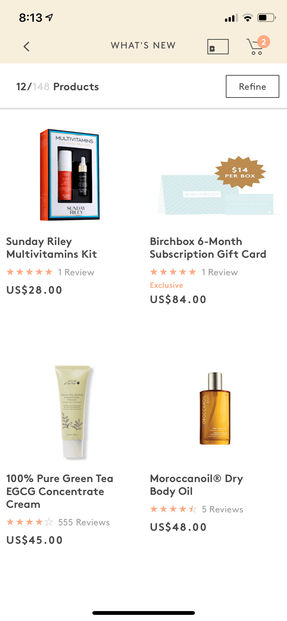
Sample-to-Full-Size Journey: Every sample in the monthly box links to its full-size version in the shop. One-tap purchasing removes friction from the “I liked this sample, want more” conversion moment.
-
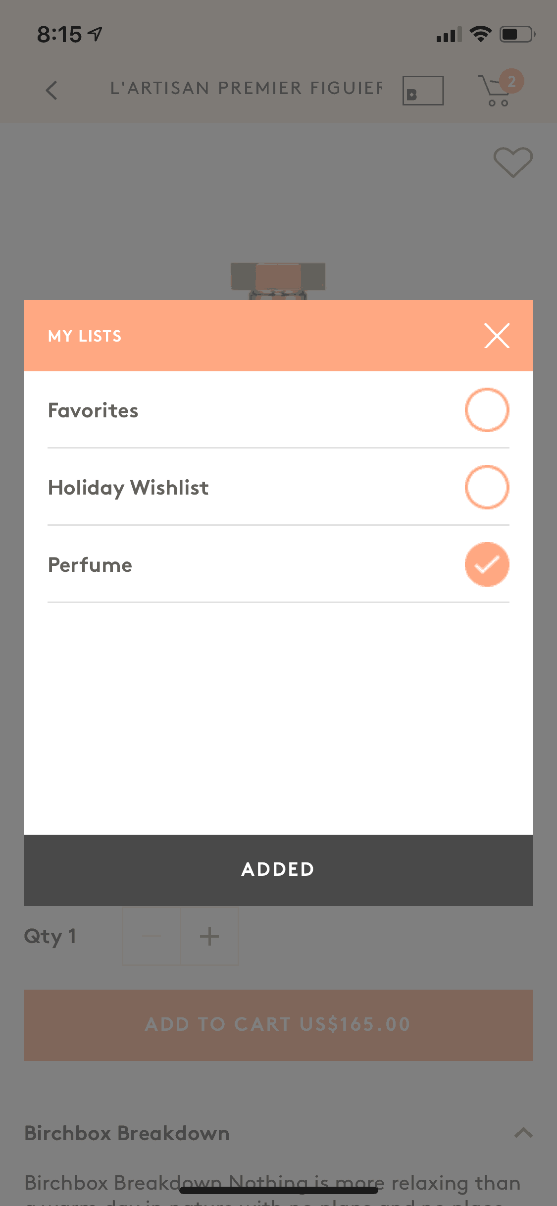
Review Integration: Users can rate samples directly after trying them. These ratings feed back into personalization algorithms, improving future box matches while generating social proof for the catalog.
-
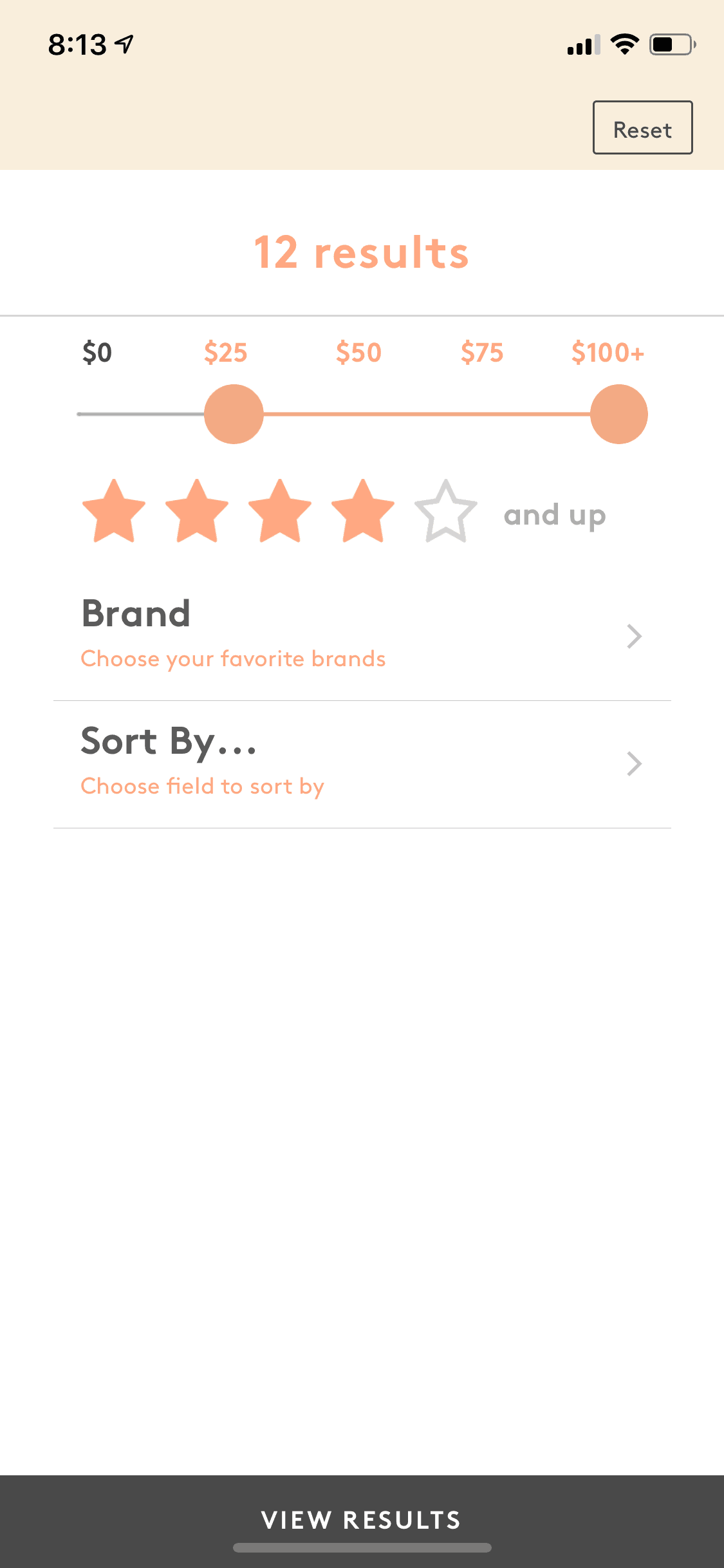
Subscription Management: Plan changes, skip months, and cancellation are accessible without calling support. Transparent self-service reduces churn friction and builds trust with subscribers who fear being trapped.
Monetization approach
Birchbox uses a classic subscription-to-commerce funnel. The $15/month sample box serves as a low-risk entry point and customer acquisition tool. Revenue compounds when subscribers purchase full-size products they discovered through samples — the app prominently surfaces “Buy Full Size” CTAs throughout the experience. Loyalty points earned on purchases and reviews encourage repeat shopping behavior. The model succeeds because samples create genuine product-market fit; users buy what they’ve already tested on their own skin.
Target audience
Birchbox targets beauty enthusiasts who want to discover new products but feel overwhelmed by the sheer volume of options at Sephora or Ulta. The core demographic skews female, 25-40, with disposable income but limited time for beauty research. Subscription appeals to those who enjoy the surprise element of curated selections over the analysis paralysis of self-selection. The app also serves busy professionals who want a low-maintenance beauty routine refreshed automatically each month.
Design takeaways
Birchbox illustrates how to make data collection feel like service rather than surveillance. The beauty quiz asks personal questions (skin concerns, grooming habits) but frames each as “help us help you.” For subscription apps, the box reveal mechanic demonstrates that anticipation is a feature — the waiting period between order and delivery can be designed for engagement rather than anxiety. The sample-to-purchase journey shows how physical products can drive digital commerce when the app removes friction at the conversion moment.
Unlock the full Birchbox teardown
Get access to the complete library of Birchbox screens. See exactly how they handle onboarding, paywalls, and core user flows to drive conversion.
Join 5,000+ designers and PMs building better apps.