Airtable iOS App UI Design — Flexible Database for Teams
Airtable
What it does
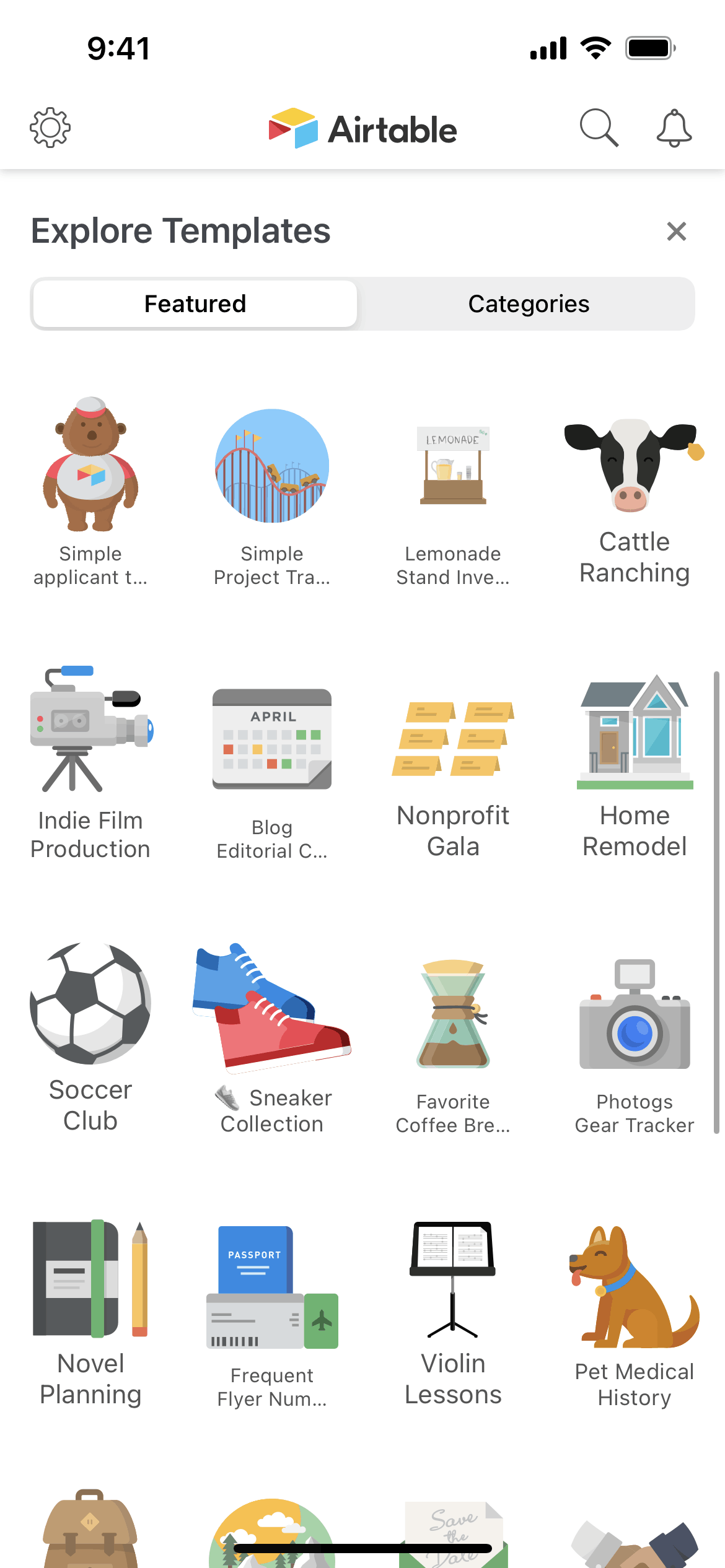
Airtable is a collaborative database that combines the familiarity of spreadsheets with database structure and multiple views. The iOS app lets users access, create, and modify records across projects ranging from CRM to inventory to content calendars. What differentiates Airtable is view flexibility — the same data appears as grid, calendar, kanban, gallery, or timeline depending on the task. Teams use Airtable to build custom workflows without developers.
Design highlights
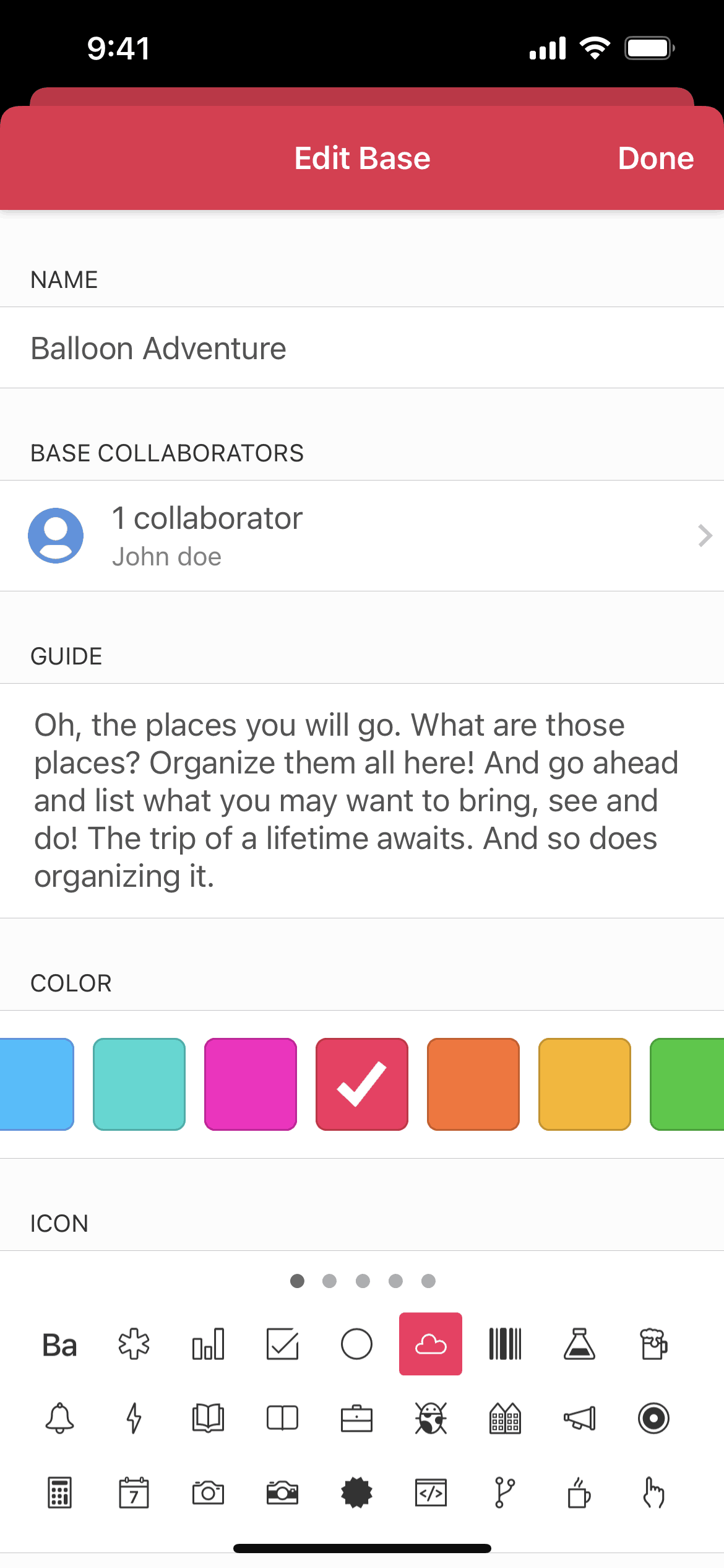
Airtable’s mobile interface adapts complex data to small screens without sacrificing functionality. Cards and lists replace the dense grids that work on desktop. Colorful field types (tags, selects, attachments) create visual interest within records. The design maintains Airtable’s playfulness — rounded corners, bright colors, friendly illustrations — making database work feel approachable. Navigation prioritizes getting to specific records quickly, acknowledging that mobile usage is often reference and quick updates rather than heavy data entry.
UX patterns
-
View Switching: The same table can display as grid, calendar, kanban, or gallery. This flexibility means one database serves multiple workflows — projects track in kanban while reporting uses grid.
-
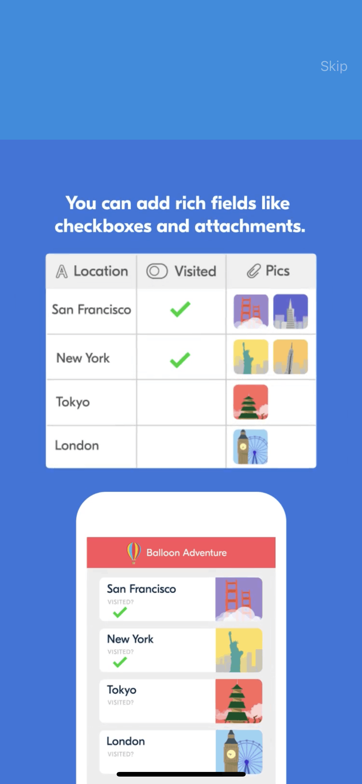
Rich Field Types: Beyond text and numbers, fields support attachments, linked records, formulas, and selectors. This structured data enables automations and integrations that spreadsheets cannot support.
-
Record Detail Cards: Tapping a record opens a card view with all fields arranged for readability. This mobile-optimized detail view supports quick reference and inline editing.
-
Filtered Views: Saved views with filters and sorting create purpose-built perspectives on shared data. Teams access personalized views without affecting others’ workflows.
-
Mobile Capture: Forms and quick-add flows enable data entry optimized for mobile. Field crews, event staff, and on-the-go workers capture information without desktop access.
Monetization approach
Airtable uses tiered subscriptions: free for individuals with record limits, Team ($20/user/month) for collaboration, and Enterprise for advanced features. The generous free tier builds habit before monetizing team usage. Per-seat pricing scales revenue with organization size. Airtable AI and Interface Designer add premium features that drive upgrades. The freemium-to-team model captures individual users who later bring Airtable to their workplaces.
Target audience
Airtable serves teams building custom workflows without engineering resources. The core user needs more structure than spreadsheets but can’t justify custom software development. Marketing teams, operations managers, product teams, and agencies form the primary base. Secondary audiences include individual power users organizing personal projects and students managing academic work. The demographic skews toward knowledge workers comfortable with intermediate-level tool complexity.
Design takeaways
Airtable proves that flexibility can be a feature when paired with good defaults. The view-switching demonstrates that the same data serves different purposes — designing for multiple use cases within one product creates stickiness. Rich field types show how structure enables automation; the investment in data entry pays off in reduced manual work downstream. For mobile productivity apps, the card-based detail view proves that complex desktop tools can work on small screens when information hierarchy is carefully redesigned rather than simply shrunk.
Unlock the full Airtable teardown
Get access to the complete library of Airtable screens. See exactly how they handle onboarding, paywalls, and core user flows to drive conversion.
Join 5,000+ designers and PMs building better apps.