Yelp iOS App UI Design — Local Business Discovery
What it does
Yelp is a local business discovery platform built on crowd-sourced reviews. The iOS app helps users find restaurants, shops, services, and activities nearby through ratings, reviews, and photos from the community. Beyond discovery, Yelp enables reservations, waitlist joining, delivery ordering, and transaction completion. The platform serves the moment of decision — where to eat tonight, which plumber to call, what activities to do this weekend.
Design highlights
Yelp’s interface balances information density with scannability. Star ratings appear prominently with review counts providing credibility signals. Photos from users show authentic business representations. The red brand color creates urgency and appetite appeal appropriate for restaurant-heavy usage. Filter options let users narrow by price, distance, features, and open-now status. The design serves decisive users who want to find something quickly and hesitant users who need social proof before trying somewhere new.
UX patterns
-
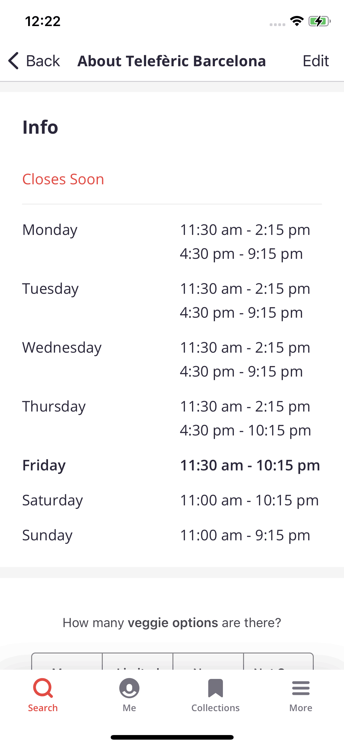
Star Rating with Review Count: The 1-5 star rating accompanied by “(1,234 reviews)” signals both quality and confidence level. High ratings with few reviews trigger appropriate skepticism.
-
Price Tier Indicators: Dollar signs ($ to $$$$) communicate price expectations instantly. Users filter by budget without reading menus, accelerating selection.
-
Open Now Filter: A prominent toggle surfaces only currently-open businesses. This serves the immediate-need use case that dominates mobile local search.
-
User Photos vs Business Photos: Uploaded user photos appear separately from official imagery. This authentic content builds trust that polished marketing photos cannot.
-
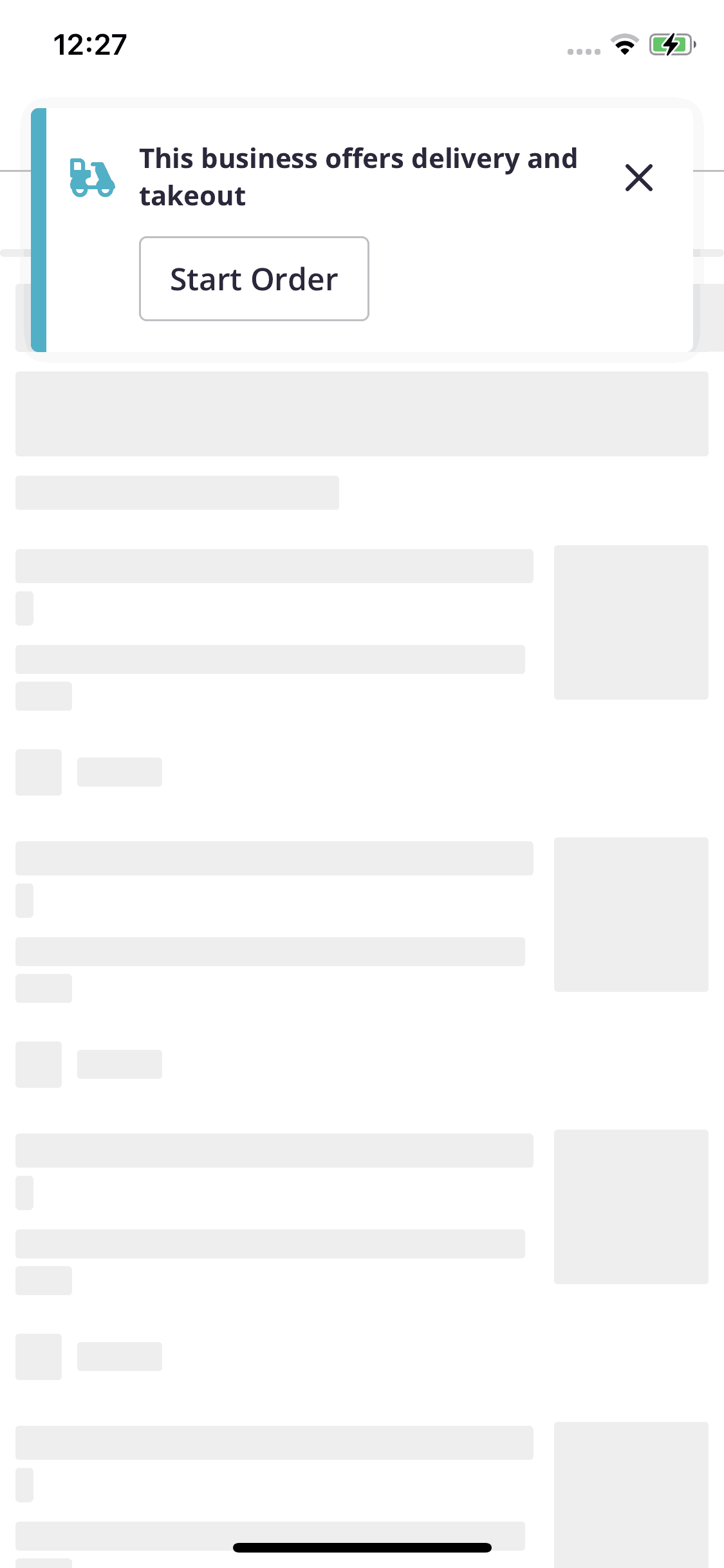
Quick Actions: Buttons for call, directions, and website appear prominently. These high-intent actions complete immediately without navigating deeper into listings.
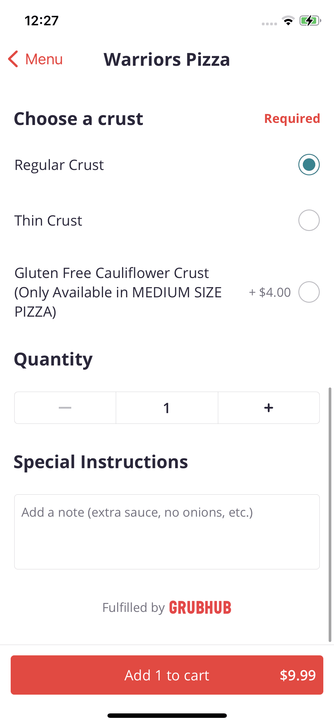
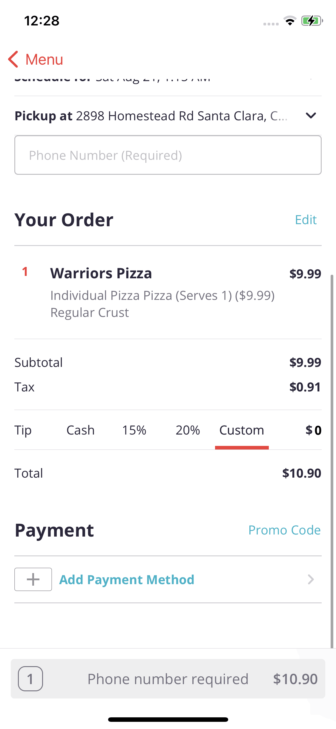
Monetization approach
Yelp earns from advertising sold to businesses wanting prominent placement in search results. Free listings exist, but paid promotion increases visibility. Reservation and ordering integrations add transaction revenue. The review content remains free to maintain user trust — monetizing business desire for visibility rather than consumer access to reviews. This model requires constant balance between advertiser value and user trust.
Target audience
Yelp serves anyone making local purchase decisions. The core user is deciding where to eat, which services to hire, or what activities to try — moments of active local intent. Demographics span all ages in metropolitan areas where options are abundant enough to require research. Restaurant discovery dominates usage, but service categories (plumbers, doctors, mechanics) drive high-value transactions. Users particularly value Yelp when traveling or new to an area.
Design takeaways
Yelp demonstrates that for local discovery, reducing decision time is the core UX challenge. Users want quick answers to “where should I go” — every design element should accelerate that decision. The review count alongside ratings shows that credibility requires volume; a 5-star rating means little with 2 reviews. User photos vs business photos proves that authenticity signals matter; users want to see the real product, not the marketed version. The open-now filter shows how immediate context should reshape results for mobile local search.
Unlock the full Yelp teardown
Get access to the complete library of Yelp screens. See exactly how they handle onboarding, paywalls, and core user flows to drive conversion.
Join 5,000+ designers and PMs building better apps.