DoorDash iOS App UI Design — Food Delivery UX That Drives Reorders
DoorDash
Food, grocery & alcohol delivery
What it does
DoorDash is the largest food delivery platform in the United States, connecting customers with restaurants, grocery stores, convenience stores, and alcohol retailers through a single app. Users browse local merchants, build orders with real-time customization, checkout with saved payment methods, and track their delivery from kitchen to doorstep. DashPass — the subscription tier — removes delivery fees on eligible orders for $9.99/month, incentivizing habitual ordering. DoorDash also operates DoubleDash, letting users add items from a second nearby store to an existing delivery without an additional fee, increasing average order value while providing genuine convenience.
The app handles three distinct user journeys — restaurant food delivery, grocery shopping, and convenience/alcohol runs — each with different browsing, selection, and timing expectations. Unifying these under one interface without creating confusion is a core design challenge DoorDash navigates through clear visual segmentation and context-aware layouts.
Where it shines
DoorDash’s interface is built around one insight: food delivery is an impulse decision constrained by time and choice paralysis. Every screen is engineered to reduce the time between “I’m hungry” and “order placed.”
The home screen immediately surfaces personalized restaurant recommendations based on past orders, time of day, and trending items nearby. Rather than forcing users into a search-first flow, DoorDash leads with curated rows — “Your Favorites,” “Fastest Near You,” “Under $15 Delivery Fee” — that match the user’s likely intent without requiring them to articulate it.
The DashPass integration is seamlessly embedded rather than being a separate upsell surface. Eligible restaurants show a green DashPass badge, and the savings are calculated and displayed at checkout (“You’re saving $4.99 with DashPass”). This makes the subscription value concrete on every order, driving retention without aggressive promotion.
Photography quality is notably consistent across the platform. DoorDash invests in professional merchant photography and maintains visual standards that competitors like Uber Eats often lack for smaller restaurants. This consistent quality creates trust — users feel confident ordering from unfamiliar restaurants because the imagery meets a baseline standard.
UX patterns worth studying
Restaurant Discovery & Decision Architecture
-
Time-Aware Recommendations: The app adapts its content based on time of day — breakfast spots at 8 AM, lunch deals at noon, dinner promotions at 6 PM, late-night options after 10 PM. This contextual intelligence reduces browsing time by pre-filtering irrelevant options before the user even starts looking.
-
Multi-Signal Restaurant Cards: Each restaurant card displays five decision-critical signals simultaneously — estimated delivery time, delivery fee, rating, distance, and promotional tags (e.g., “$0 delivery,” “20% off”). This information density lets users compare options without tapping into individual pages, reducing back-and-forth navigation.
-
Cuisine Category Scroll: Horizontal cuisine chips (Pizza, Chinese, Mexican, Sushi, Healthy, etc.) provide quick category filtering. Unlike competitors that use a full-screen category grid, DoorDash’s horizontal scroll preserves the restaurant list below, letting users filter while maintaining visual context of current results.
Ordering Flow
-
Group Order Mode: Users can share a link to let friends add their own items to a single order. The host sets a budget cap and deadline. This solves a genuine coordination problem — group food orders via text messages are chaotic, and DoorDash structures the process without requiring everyone to have the app.
-
Item Customization Sheets: Menu item customization uses bottom sheets with clearly grouped required and optional modifications. Required choices (size, protein) block the “Add to Cart” button until selected, preventing incomplete orders. Optional modifications (extra sauce, no onions) use toggles with inline pricing.
-
Cart Persistence: Items remain in the cart even after closing the app, with a persistent bottom bar showing cart total. If restaurant availability changes (item sold out, restaurant closed), the app communicates this proactively rather than failing silently at checkout.
-
DoubleDash Add-Ons: After adding restaurant items, the app suggests nearby convenience stores or dessert shops for add-on items delivered in the same trip. This is implemented as a non-intrusive suggestion card — easy to dismiss, but genuinely useful for users who want drinks or snacks alongside their meal.
Real-Time Delivery Tracking
-
Four-Stage Progress Bar: Order status moves through Confirmed → Being Prepared → Dasher on the Way → Delivered, with estimated time updates at each stage. This structured progress reduces the anxiety of waiting and sets clear expectations.
-
Live Map with Dasher Location: Once the Dasher picks up the order, a real-time map shows their location with estimated arrival. The map includes the restaurant location, Dasher position, and delivery address — providing full spatial context.
-
Dasher Communication: Call, text, and in-app message options appear once a Dasher is assigned. Users can also leave delivery instructions (gate code, “leave at door,” specific drop-off location) that persist across orders.
-
Photo Confirmation: For contactless deliveries, Dashers take a photo of where they left the order. This photo appears in the app immediately, solving the “where did they leave it?” problem and providing evidence if a delivery dispute arises.
Post-Order & Retention
-
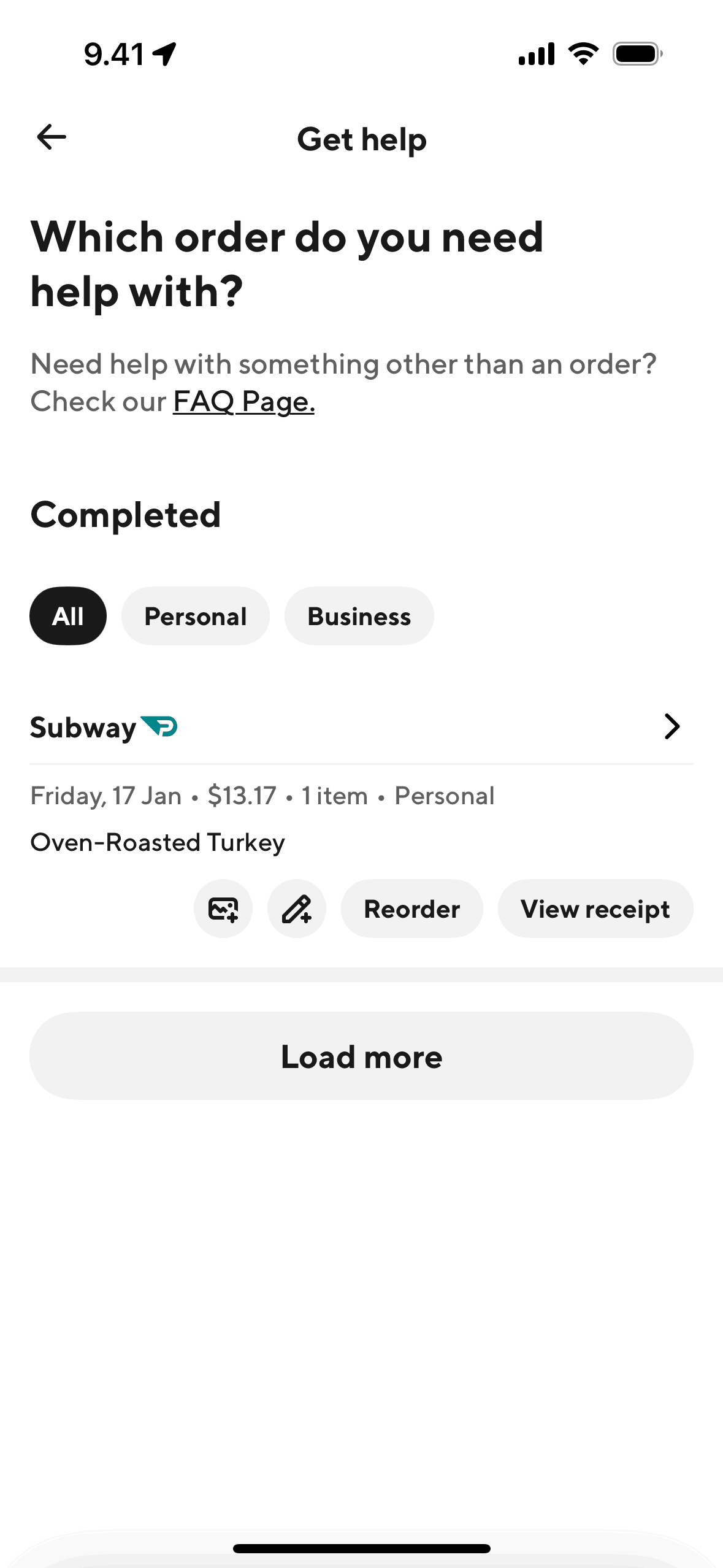
Rating Flow: After delivery, a streamlined rating prompt asks for a star rating and optional feedback on specific aspects (food quality, delivery speed, order accuracy). This structured feedback generates actionable data rather than open-ended complaints.
-
Reorder Shortcuts: The “Orders” tab shows full order history with one-tap reorder buttons. Users can reorder an entire previous meal or selectively add items from past orders to a new cart.
Monetization approach
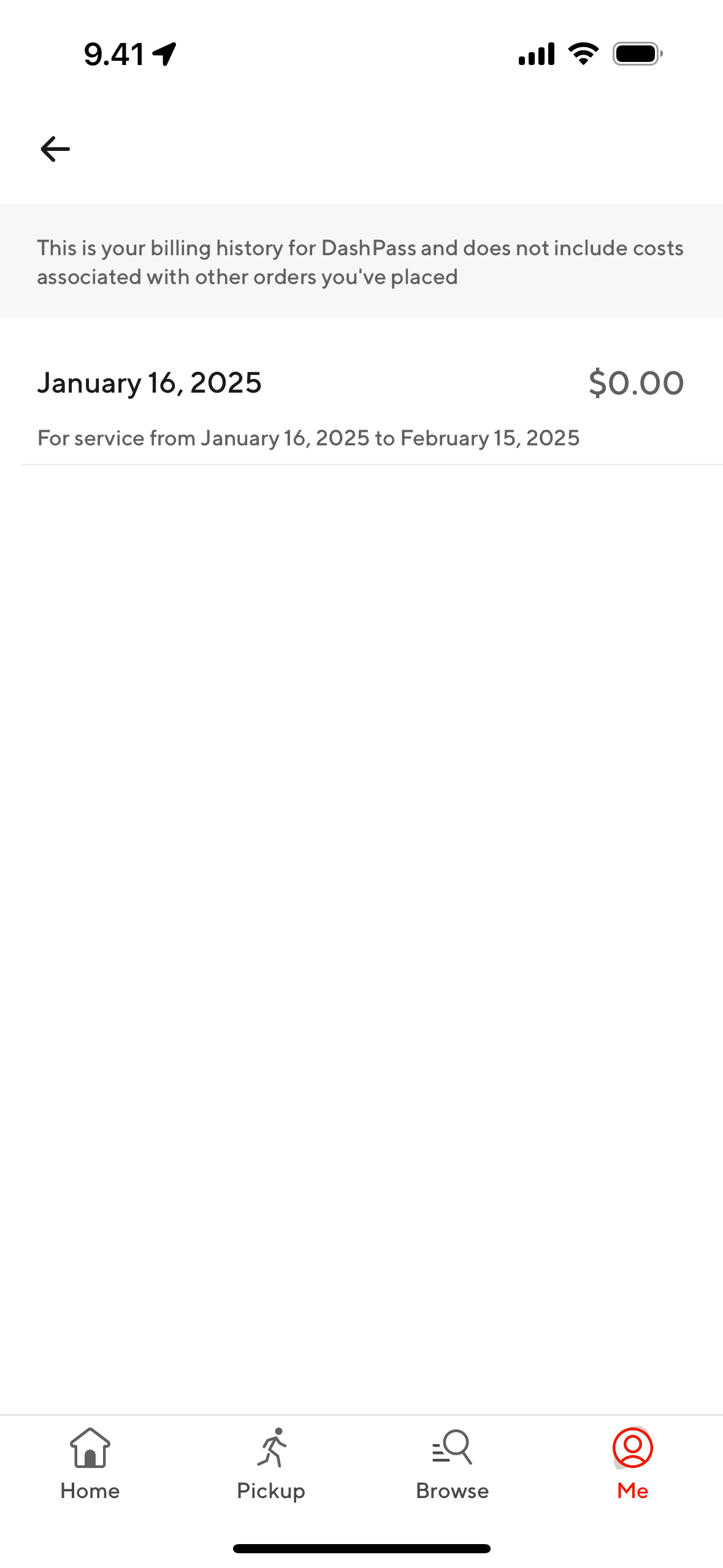
DoorDash monetizes through a layered fee structure: delivery fees (variable by distance and demand), service fees (percentage of order subtotal), and optional tips for Dashers. DashPass ($9.99/month) removes delivery fees on orders over $12 from eligible restaurants, driving subscription revenue while increasing order frequency — subscribers order roughly 2x more than non-subscribers according to DoorDash’s public earnings data.
On the merchant side, DoorDash charges commission (15-30% depending on the plan tier and services used). Merchants can pay for promoted placement in search results and category pages, creating an advertising revenue stream. DoorDash Drive (white-label delivery) provides logistics as a service for businesses that want delivery without joining the marketplace.
The economic tension is real: high commissions pressure restaurant margins, delivery fees frustrate cost-conscious customers, and Dasher earnings face scrutiny. DoorDash balances this by offering tiered merchant plans with different commission-visibility tradeoffs, and by making DashPass attractive enough that subscribers feel they’re “beating” the fee structure.
Target audience
DoorDash’s primary audience is urban and suburban consumers aged 22-45 who value convenience and have sufficient disposable income to pay delivery premiums regularly. The core user orders 2-4 times per week, often defaulting to DoorDash out of habit rather than comparison shopping across platforms.
Secondary audiences include: families ordering dinner on busy weeknights (larger order sizes, consistent repeat behavior), office workers ordering lunch (often coordinated group orders), and late-night users (college students, shift workers) who have fewer alternatives. DashPass targets the highest-frequency users, converting habitual orderers into subscribers who then order even more frequently due to sunk-cost psychology.
The grocery and convenience delivery features target a broader demographic — including older users and parents — who might not use food delivery regularly but value the convenience of having essentials delivered in under an hour.
Notes and opportunities
DoorDash’s search experience could improve for users with specific dietary needs. Filtering by dietary restriction (vegan, gluten-free, halal) exists but is inconsistent — it relies on merchant-provided tags that are often incomplete or inaccurate. A more reliable dietary filtering system would serve an underserved segment and differentiate from competitors.
The group ordering feature, while powerful, is buried in the UI — many regular users don’t know it exists. Surfacing it more prominently during peak social ordering times (Friday/Saturday dinner) could drive larger order sizes.
Price comparison is deliberately absent — DoorDash doesn’t show whether the same restaurant offers lower fees on Uber Eats or Grubhub. This protectionist approach works while DoorDash maintains market share but creates vulnerability if a competitor builds a meta-search tool.
Design takeaways
DoorDash demonstrates that in on-demand delivery, speed-to-decision matters more than information completeness. The multi-signal restaurant cards pack five data points into a compact layout because users make fast, satisficing decisions rather than optimizing across all options. The time-aware recommendations show that reducing the decision set proactively is more effective than adding more filters.
The DashPass integration is a masterclass in embedded subscription value communication — rather than relegating savings to a settings page, every single eligible order reinforces the subscription’s value at the moment of purchase decision. This constant reinforcement reduces churn far more effectively than email reminders.
For delivery tracking, DoorDash proves that real-time visibility is customer support prevention. Every dollar spent on tracking UI saves multiple dollars in “where’s my order?” support tickets. The photo confirmation for contactless delivery is a small feature that eliminates an entire category of disputes.
The DoubleDash feature shows how to increase order value without feeling extractive — it’s genuinely convenient to add a drink or dessert from a nearby store, and the “no extra delivery fee” framing makes it feel like a bonus rather than an upsell.
Unlock the full DoorDash teardown
Get access to the complete library of DoorDash screens. See exactly how they handle onboarding, paywalls, and core user flows to drive conversion.
Join 5,000+ designers and PMs building better apps.