Crumbl Cookies iOS App UI Design — Viral Dessert Ordering
Crumbl Cookies
What it does
Crumbl Cookies is a gourmet cookie chain with a rotating weekly menu that drives anticipation and social sharing. The iOS app lets users browse the current week’s flavors, place orders for pickup or delivery, earn rewards, and track past orders. Unlike static menus, Crumbl’s weekly rotation creates urgency and social buzz — users check the app every Monday to see new flavors and share favorites with friends. The app transforms cookie buying from routine dessert to weekly event.
Design highlights
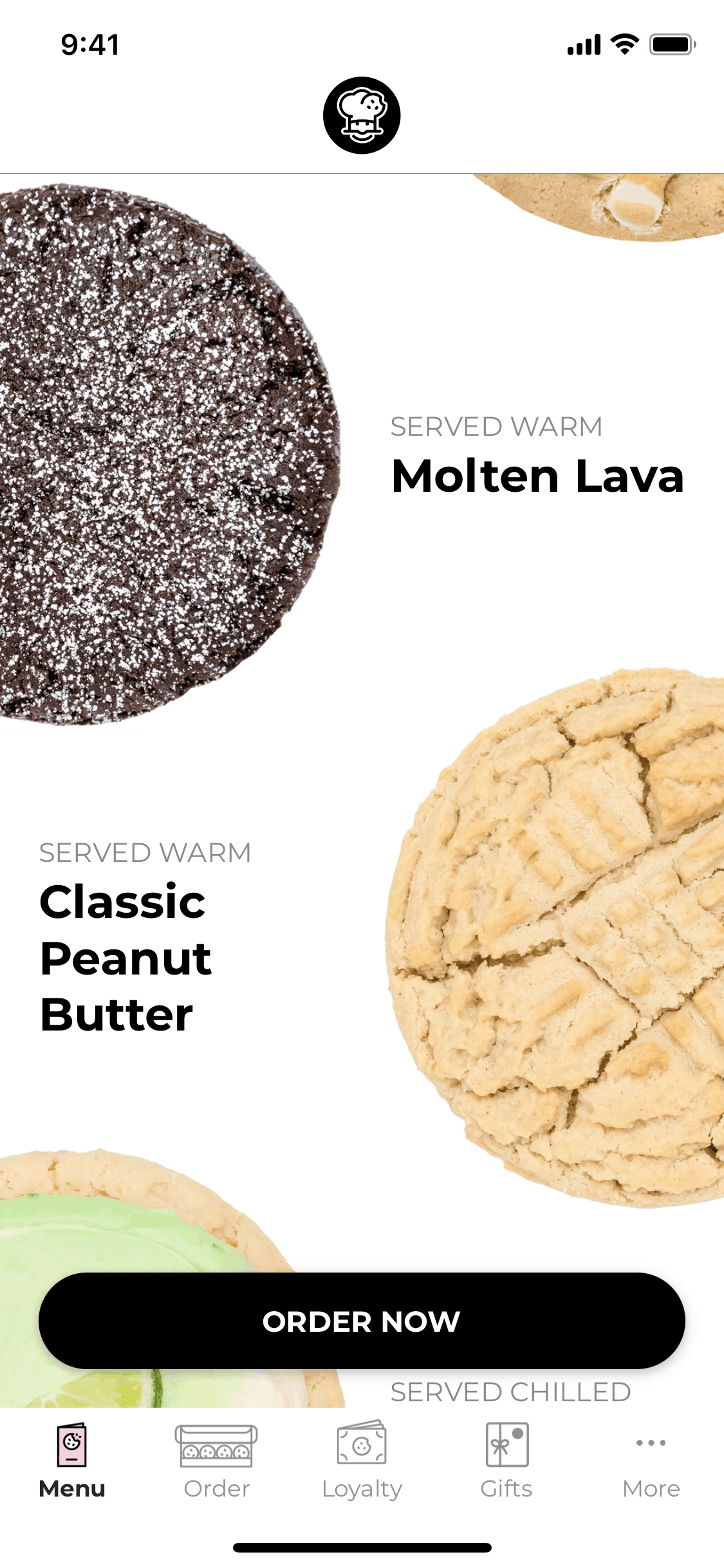
Crumbl’s interface centers on cookie photography that looks good enough to taste. The pink brand color creates a playful, indulgent atmosphere appropriate for a dessert brand. Each cookie displays with glamour-shot photography — dramatic lighting, melting chocolate, crumbling texture. The weekly menu drops like a product launch, with countdown timers building anticipation. The interface is deliberately simple — see cookies, pick cookies, order cookies. No complex customization, no decision fatigue. The design trusts that the product itself (beautiful, indulgent cookies) does the selling.
UX patterns
-
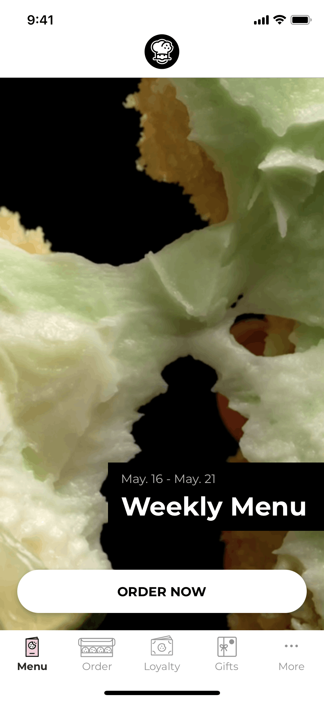
Weekly Menu Reveal: Every Sunday night, the new week’s flavors appear. This scheduled drop creates a ritual that drives weekly app opens and social sharing around “What’s new at Crumbl?”
-
Flavor Countdown: Current flavors show days remaining, creating urgency to order before rotation. This artificial scarcity (real scarcity — they actually change) motivates impulse purchases.
-
Mix & Match Boxes: Orders build into 4-pack, 6-pack, and 12-pack boxes. The bundle pricing encourages larger orders while serving the gift and sharing use cases.
-
Loyalty Rewards: Points accumulate toward free cookies without complex tiers. The simple system matches the simple product — uncomplicated indulgence.
-
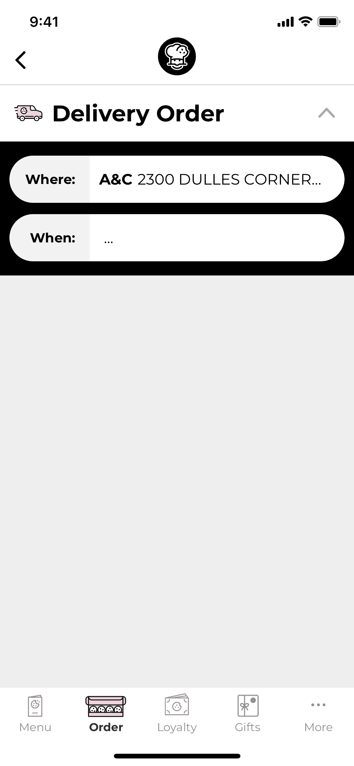
Store Locator + Delivery Toggle: Users switch between pickup and delivery with clear fee visibility. The interface acknowledges that cookie craving urgency varies — sometimes you want it now (delivery), sometimes you’ll wait for free pickup.
Monetization approach
Crumbl earns from direct cookie sales with the app driving order volume and reducing in-store congestion. The rewards program builds repeat visits without discounting — users buy 10 cookies to earn 1 free, maintaining margin while creating habit. Limited weekly availability creates FOMO that drives purchases: “I have to try the new flavor before it’s gone.” Delivery fees and service charges add margin on convenience orders. The viral social content (millions of TikTok views on flavor reveals) provides marketing that competitors can’t buy.
Target audience
Crumbl targets dessert lovers aged 16-35 who engage with food content on social media. The core user follows food trends, values shareability (photos and literally sharing cookies), and treats desserts as experiences rather than commodities. Families ordering treats, office catering, and gift-givers form secondary segments. The TikTok-viral nature attracts a younger demographic that discovers Crumbl through social content before finding physical stores.
Design takeaways
Crumbl demonstrates how artificial scarcity can be authentic and effective when the rotation is real, not manufactured urgency. The weekly menu drop creates a content calendar that sustains social buzz without advertising spend. For food apps, glamour photography is product development — the images that make you crave cookies are as important as the cookies themselves. The simple rewards system shows that loyalty programs don’t need complexity; clear, achievable rewards drive behavior without confusing customers.
Unlock the full Crumbl Cookies teardown
Get access to the complete library of Crumbl Cookies screens. See exactly how they handle onboarding, paywalls, and core user flows to drive conversion.
Join 5,000+ designers and PMs building better apps.